4.29.2019

The fifth week in Aprils colors

I have to tell you I was just a tad nervous to say Yes, to Mary when she asked me if I would play along this month as one of the guest sample makers for the Color Combo team. I tend to avoid looking at this particular challenge as I find it to be the hardest one to not squeak in just one more color or 10. and the idea is to use the ones in the grouping. That, and I do not own all the Stampin' Up colors so, its a guessing game for me. the Good news is I think that this went well for me and I am happy with all the cards I have done this month for them. I think that they are OK with what I did too everyone has been really nice about this so, that was a Whew! what a relief thing :) Yes, over-thinking things tends to make my brain tired.

 This last weeks combo from Barbara is  Calypso Coral, Peek a boo peach & old olive. of which I own old olive as a cardstock and peach as a marker.
and so, using some print screens of the colors I came up with using Tombo #076 and Distress Barn door mixed with peek a boo peach markers for this bloom.
and that printed paper, it is one of the first and only solid color collections of Prints from SU I ever bought, and I was pretty surprised to see it in the hanging file with the cardstock when I went looking but, I thought the squiggly grid kind of mimicked the sketchy look to the stems on this Oh, So Lovely poppy stamp. (also from SU). The sentiment here is from Impression Obsession stamped with versamark and heat embossed with SU old olive powder. This jar is also really old and fortunately still works just fine.

A closer look at the petals. This side challenge was to use a die cut with the card also so, I picked this My Favorite Things Homespun stitches border die to add some texture down the side of the floral panel. This one finished out at A6 in real life. You can find this challenge here to play along, Thanks for stopping by.
4.28.2019

A few challenge cards

 A week ago now,  Shirley had a horsing around free for all challenge. And I had my box of horse stamps out as I had wanted to use this one for the IC but, the serendipity horse I used instead worked better for the photograph I found. So, I was pretty tickled to have a reason to play with this one too. The horse is from Coronado Island Stamping and the sentiment is from My Favorite Things anything but basic birthday greetings set.

 Then the clean and simple challenge was to use a negative diecut, and the weekend before that I had been laughing with hubs hunting buddy over this very thing. he had purchased a new tent, cot, & blind to sit in while turkey hunting this year. ( Hubs has a camper thank you lord) ( I am 20 years younger than hubs friend and I do not want to sleep in a tent anymore lol) not that I hunt but, camping is the same situation. (always we take more than we would use at home for the same time frame) The sentiment inside the tent window is from Riley & co. and the bottom one is from Dylusions.


 There is a tea party request for a lady who likes blues and hydrangea's this week and this is what I came up with. finally just caved and glued it together. the stipple hydrangea is from Stampin' Up! and the paper hug is from the stamp market. ( its has some clear wink of stella on the top layer of letters) and this one is 6" square in real life.


 This week's featured stamper is Nancy who has so many beautifully colored girls in her gallery and I kept coming back to this one because, the snarky sentiment made me laugh. I love that she gave her chick a dressing room mirror too. so, with that in mind I decided to give my little gal shinny silver shoes and make the background look like a frilly girly dressing room.

One of these days I will have to actually do those online coloring classes I have paid for as the folds of her dress just made me want to pull my hair trying to color them. I know that if I took the time to play with this it would come easier to me but, this is something I colored a long time ago with copic markers and today I added some pencil over the top in the shadows, nuvo drops over the top of the pearls.

4.26.2019

Inspired by {at home}

This week Brenda has chosen the At Home Store for our inspiration hunting grounds.
And I ended up finding a few things but, my brain told me if I went this away I could make a few different versions. this is the first of what will probably become a few.

 The fancy eyelashes stamp is from Impression Obsession and the Mae West quote is from Prickley Pear rubber stamps. This was cut with an Waffle flower A7 rectangle die.


This art work can be found here in the store and this challenge can be found here at Splitcoaststampers if you'd care to play along with us. thanks for stopping by.

Type Writer Cards

 This week's featured Stamper is Catherine and I ended up going with her very first upload at SCS for inspiration for this card. I am working on an order for Earl's adult college aged grand kids and this became the first one done for that project. I did switch the colors and stamps and kept the strong vertical line by switching out the skinny line for the sprayed shipping tag, and switched out the circle of text for a torn dictionary page. The typewriter and happy birthday are from the My Favorite Things just my type set and the name was done with a Making Memories magnetic CK stenography alphabet set.

 but, while I had the type writer set out... I stamped of a handful of them in various Versfine Clair colors and did turn two more of them into cards, this one that background paper is a really old one from Basic grey that looks like old Victorian wall paper to me.

Now this one, I happened to have this Ellen Hutson sentiment set on the table off to the side as these were getting pushed around I actually bought this set just to get this everyday punnies sentiment it made me laugh. So the Apple is not quite to scale but, hey smaller would be easier to throw yes? :) the apple is from Karen Lockhart and is up on a foam pop dot over the Tim Holtz base. this one finished out at A2 in real life. That's about it from me, thanks for stopping by.

4.24.2019

WOYWW #516 {8 inches of free space}

Happy desk peeking day, if you'd like to see more spaces or play along 
the link up for this blog hop starts here at our hostess
There is also a new Instagram hashtag of #WOYWW
That is about how much space I generally leave my self to make a card. that base under the floral panel is a 6" square.  this is left over from Monday and Tuesday. Monday there was a negative diecut clean and simple challenge and I started out thinking I would use this old sizzix phone die and then do a snarky call me I will laugh at you sentiment with it, but there are so many bitty pieces even in the negative drop piece part and I was feeling particularly lazy so, the tent die was on top of the phone die in the stack. ( no, my CDO does not include alphabetizing my dies by type they are sorted by size ha ha) anyways, I did do a tent card as Turkey hunting season is going on now and Hubs hunting buddy bought a new tent, cot & hut/blind thing to hide inside of out of the rain, so he has spent a small fortune this year in the effort to bag a bird... and Tuesday the the color combo was live and I had made a leafy background for that, ( you can see it here) that is the pile of the drop pieces. the sheep die I cut up from IO a week or two ago is still waiting and there is a card drive request for a lady that likes Hydrangea's and I had cut the paper hug out some time while I was messing around with this weeks colors and it was just sitting there where the tent is now since probably last Thursday.
and so, yesterday I stamped off a hydrangea ( SU stipple one) and colored it and I was not liking the scale of the two pieces together so, I pushed it around for a while then walked away to go cook dinner. And I never came back until tonight. and its just so nice outside, I am probably going to go back out side for a little while before dinner. I was driving all day and my brain is tired. :) I will be peeking in tomorrow. Thanks for stopping by.

4.22.2019

Tranquil Leaves

 This week's color challenge is up as Tranquil Tide, Coastal Cabana & Balmy Blue. and this was the only week where I owned all three colors as cardstock samples and the dessert option is leaves.
So, I instantly thought of this Lil Inkers leaf pattern coverup die and decided to cut it 3 times once from each color. and mixed and matched layering parts of it together for this card front. There are 3 leaves tucked onto the tail end of the sentiment panel off to the right but, they blend pretty well with the whole design so, its like a really subtle thing to me. even with the sparkle.
The sentiment on this card is from the Unity Stamps Angie Girl Arianna girl ( the one with the angel) I stamped that with some Versafine Clair rain forest ink and die cut it with a SB a2 mat basics b set die. This is mounted to a Tim Holtz pre-made card base so, it finished out at A2 in real life.

I did use some prisma pencils to add some color and outlines to the leaves on the layered diecut, the base here is the coastal cabana and I taped the backside of this for pieces where that color fell out I added in the darker tide color. the top layer is the blue framing. I did for one of the first times ever color outside the lines here and I also added some white gel pen and clear wink of stella in a few places for more pop. My normal would have been to glue it all together and then color so, one thing about doing it this was is I did get into all the crevices and I do not have bloopers of color on the top frame so, it has a really crisp look that made me happy with it after it was done.
That's about it from me, You can find this challenge here to play along and thanks for stopping by.

4.19.2019

Inspired by {Nature fine art Photos}

I have mentioned it a few times the last few months that the organizing my stamp collection is an 
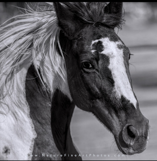
ongoing situation, and the last time I was trying to decided what we should do next time it was my turn. I was not looking at a calendar but, a horse stamp. ( not the one below) and wanting to play with that. So, I came across the Nature fine art photos and chose it because, the horse shot below really grabbed my attention and then I happened across this Serendipity stamps mustang in the box of horse stamps and thought maybe just maybe I could color it to look like a paint.

.
 So, this was stamped on some Neenah solar white with Versafine Onyx black and I tried to really keep the colors to black and white with shades of grey kind of like a black and white photo.
The sentiment is from the Stamping Bella a little horse set, and this one finished out at 6" square in real life.
 This was a trial thing because, there was not too many details on the nose so, I decided I could make the spots cream/taupe so, I could flick in some hair direction. I think if I had left it white there just would not have been as much texture. I also did not get the dark spots as dark as the photograph and I am totally OK with that because, I think that is the beauty of an inspiration challenge is you are using the photo weather it is a trinket or fine art as a jump start.

You can find this photograph here inside the store along with a few others. You can find this challenge here at Splitcoaststampers to play along with us. Thanks for stopping by.

4.18.2019

A few more from VSN


 Jacqueline has a challenge to create a galaxy background using one of the tutorials linked to in the thread so, I chose the Jennifer McGuire version with the distress oxide inks on watercolor paper. The star splatters were done with some ranger distress paint and a white gel pen. that sentiment is from the club scrap firecracker set. So, that whole panel is up on foam tape above the pool colored cardbase and it finished out at A7 in real life.

Melissa has a frosted coffee filter technique challenge and I combined it with this week's featured stamper jump started by this pretty card in Diana's gallery seen here. I did spray my filter with water and crumple it and spread it out and dry it and do it again moving the colors around and so, it does not have that unblended look like camo but, I do like how this turned out, the filter was cut with the largest spellbinders hemstitched oval die and the top sentiment is from Impression Obsession and the happybirthday and bitty cup are from Stampin up.

Dawn has a challenge to use Acetate and one of the tutorials she linked to in the thread went to this Acetate tent card and I gave that one a whirl, I did originally have a piece of Hero Arts ( they sent some acetate card bases in one of those kits somewhere along the line and I cut one in half and then when it was all done the card leaned forward from the top, and that looked odd to me so, I carefully tore it apart and found an old box of ink jet transparencies in the closet ( that now look yellowed in their box) and cut one of those a little larger than A2 and now it leans towards the top. I did do some logging and removed the center trees from the tree line in the outside front of the card so that the deer were more easily seen. I think I will do this again sometime and without the time constraints of a VSN I think I would add some clear stickles to the inside layers of the scene so they pop a little better. I think I have 5 or 6 more left but, I have not really counted yet, and there has not been time to do anymore during this week yet. That's about it from me, thanks for stopping by.
4.17.2019

WOYWW #515 {piles}

Happy desk peeking day, if you'd like to see more spaces or play along 
the link up for this blog hop starts here at our hostess
There is also a new Instagram hashtag of #WOYWW
 
 So, from this angle things do not look too bad, you can see the last card I made after work on Monday and (its below) was done following a tutorial at SCS for making a sunrise card ( found here ) and a bit of the pile to the left of new things ( which has kind of grown)

 I followed this pretty closely, and when I got to the adding blacks to the ground part, at the last minute you guessed it, I got some black in the sun. so I grabbed a baby wipe and mopped and it sucked up all the yellow too, so, when I went back with a tiny makeup brush to add some yellow to tit again, it got a little dark. the sentiment is from the reverse confetti God is good set, and the tree & grass are from the sweet n sassy silhouette landscape borders set.

 but, when you see the same thing from the side you see the piles are spreading so, this is what I came home to on Tuesday and I decided I "had to" clean up before I started playing again. And I still need to make my sample for this weekends IC. ( I am hosting) there is no minute like the last one right?

 So, the piles of new stuff on the left kept falling off the table and I decided maybe I should you know get the stamps out of the wrappers and put some off the table. and I happened to flip over that package of dies that says paper hug on the front side...( the hello die is on the back hahaha)
Made me laugh. there were some sales and new releases what can I say, I have not done a bunch of shopping in a while and it all just came out together the last little while.

Oh, and this is here because, I am not sure what you all thought was a Tim Holtz thing but, the thing on the cart is a metal ( galvanized) tin type serving thing that I picked up from Pottery Barn a few years ago that they were selling for people doing back yard bbq type parties to organize the food things outside. (and I thought the bottles would all be corralled on it nicely) and then after I shot this one I glanced up at the ink on the back of the door and it irritated me enough to start reorganizing that, so really I have a bigger mess this morning than I started out with. Those suitcases normally have the pads of paper in them where I can close the lid and slide the one on the floor under the cart, but when the pads start getting mostly used I tend to rip them up and sort them by colors into hanging files in the file cabinet and since the buying these pads does not seem to be ending that will be another sorting thing soon I guess. and yes, there are still two stacks of stamps on the floor. soon, I hope I will get back into finishing that off. I hope you all have a beautiful Easter Weekend if you celebrate.
So, that's about it from me, thanks for stopping by.

4.16.2019

A catch up post

 A week or so ago there was a clean and simple challenge to make it funny, and at the time this was what my desk looked like at work...
The bear is from stampabilities and the sentiment is from club scrap woven strands greetings set.

 This was something else that occurred to me at the same time but, i figured since the base was red it wasn't all that "clean" so, I never uploaded this one. The gal is from Inkadinkado and the sentiment is from Riley & Co.


 There was a Try a new tech. challenge to use your clear block with ink as a background around the same time the funny cas happened and then later in the week there was a ways to use it called something along the lines of 4 squared. ( or something like that) and so combining both of those challenges I did this background with a small 1" block 4 times behind the poppy.

 The stripe poppy is from Impress. that sentiment is from Mama Elephant birthday greetings set.

 And then the featured stamper challenge that same week had Angie being the destination and I found this card in her gallery that made me think oh, long tall sally... so, I started digging in my girl stamps looking for a tall one that had not seen ink for a while and ended up using this Stamps Happen Dolly Mama and adding the My Favorite Things sentiment up the side.

I had used those arteza pencils for her because, the colors are a little brighter ( and more outside my comfort zone) I figured she called for brights and then added some liquid pearls and star dust gelly roll pen over the top of the pencils. I am not having much luck blending them as of yet without streaks, I might try mixing in some prisma and polychromos pencils with them next time around.  Thanks for stopping by.

4.15.2019

Pretty Colors this week

This week Karen has chosen Lovely Lipstick, Mint Macaron & Vanilla as the colors with a side of roses. So, I started with a cream-ish piece of mulberry handmade paper that had been turned into a gelli print with acrylic paint and a Tim Holtz embossing folder. of the three colors I do not have the lipstick color from SU. and so, this is guess work. The rose border is a stamp from The Ink road that was stamped with some versamark on Vanilla and heat embossed with some Ranger Sage powder. which actually looks pretty close in real life to the mint cs. I colored the flowers and leaves with some distress oxide worn lipstick & bundled sage inks and then added some shadows with polychromos pencils. ( I used a reverse confetti stitched hex tag die to cut that) the Penny Black sentiment was stamped on some really old speckled cream su cardstock and cut with a Taylored expressions postage stamp stacklet die, the edges were inked with some Distress Oxide worn lipstick ink. The little heart brad in the top of the tag is unknown, but probably My Minds Eye. ( figured it worked with the sentiment even though the color is a little more faded than the paint) You can find this challenge here to play along. thanks for stopping by.

4.14.2019

VSN {so far}

 Jeanette has a challenge to include a map on the project, so when I finally found a piece of map paper it had such a vintage color to the Minnesota roads map I ended up going vintage for the whole card. that old truck is from Hero Arts and the sentiment is from My Favorite things.

 Kim has a challenge to be inspired by the trip advisor web site and there are all these boxes with things to click on to go here or go there and I really had no where I wanted to go when I was looking at the site and I had seen this travel poster printed paper on the same pad the map paper came out of ( Carta Bella are we there yet) and thought ok do not over think this. that sentiment is from Paper smooches.

 Ann has a challenge about duck boat travel, so you needed a boat and a duck and my ducks are those tiny ones in the sky flying in formation... I ended up adding just a few pencil shadows to this after the fact but, this one squeaked by in the time limit because, I kept hitting the watercolors with a heat gun.

 Melody has a challenge to show some luggage. the one on the right is from Deep Red and the fancier bags on the left are ( unknown at this time but, guessing Unity) and that sentiment is Gina K.

 Lisa has a challenge to show shoes. and I still have no clue where I got this sentiment from but, the combat boots are from Deep Red. the topo map printed paper is from Kaiserkraft.

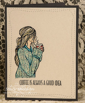
 Polly has a challenge to show what you do while you are in hurry up and wait mode while traveling and I drink coffee and watch people... the gal is from Unity Stamps and the sentiment is from My Favorite things.

Misti has a challenge to show a street legal vehicle ( for a road trip) and I have had this Crafters Companion stamp a long time now so, I googled old Route 66 signs and colored the sign that way but, the old signs the letters and numbers are white on the signs... and that ended up clashing for the red I gave the bike so, I may just add more red to the sign later... there is a bunch of stardust gelly roll pen and clear wink of stella on all the chrome too so this one sparkles in real life. the other sentiment are from the Paper Smooches set. and that's what I have done so far. thanks for stopping by.

4.12.2019

Inspired by {Disney Music Emporium}

This week Angie has us looking through the Disney Music Emporium for inspiration. And I came across this Toy Story CD cover shot and thought ahhh... 
A very long time ago when J was little we watched this so many times and he had a small collection of rubber stamps, which he gifted to me somewhere after Jr. High school age when he was "cleaning" his room and seeing that CD brought back a lot of those kinds of smiles.


 So, I outsmarted my self and I took a photo of the stack of distress Oxide inks I used on this card ( last weekend) and when I was doing the desk peeking day blog hop I had uploaded that with the string of desk shots... and I deleted it from the Google photos... and it sucked it right out of my cell phone. so, lets say its probably 5 or 6 colors on the balmy blue to make that background. To create the "clouds" around the sentiment I had originally used a Distress white marker and it did fade the background but, not to the extent I wanted so, I ended up adding some distress white paint over that. The "frame /mat was done with some pacific point cardstock. This one finished out at 5 1/2" square in real life.


These stamps are really old and probably retired from All Night Media. The buzz lightyear comes with a sentiment wrapped around in him in a circle that reads to infinity and beyond. But, it really didn't work for me making a snarky miss you card so, I did stamp these on some Neenah solar white, cut them out with scissors and removed that sentiment. I also used a balmy blue marker on the spaces between Woody's body and his arms as that was stark white after that.  
This sentiment is from the My Favorite Things Sassy Pants best friends set.
you can find this CD here in their store and you can find this challenge here at SplitcoastStampers. Thanks for stopping by.

4.10.2019

WOYWW #514 {mid tidying}

Happy desk peeking day, if you'd like to see more spaces or play along 
the link up for this blog hop starts here at our hostess
There is also a new Instagram hashtag of #WOYWW
 
 So, this is a Tuesday afternoon shot as I will be driving all day today. and When I came home I had this little pile of cards sitting off to the side and I decided to get some price tags on them as they are headed to the booth next fall to get them put away and off the table. I do ask people when I do it if I can have them back and I do recycle them. they are sorted by dollar amounts inside that basket. the pearls are still out from a featured stamper card on Sunday.

 Off to the left the pile of backgrounds I have made along with 3 cards that are still thinking and new purchases under that. ( I flashed them at you last week) after I shot these I did use the border stamp set for next week's color combo sample.

 
 off to the right, so this side got cleaned up on Sunday afternoon that pile past the paper cutter was higher than the paper cutter when I started. all that is there right now is a piece of cardstock that has brayers of paint wiped on it, a piece of watercolor card and a piece of cardstock that I had dry brushed off some acrylic paint on once and then the scraps of a card I did for the featured stamper challenge the other day. yep, I even dusted off the bottles of paints and stains and sprays in that organizer on the stand. ( I usually have a piece of crochet lace on it and it went to the laundry room and has not been hauled back up here yet.) So, that is about it for me. thanks for stopping by, it will probably be tomorrow before I see any desks. 
 

4.08.2019

Colors for The second week of April

 This week's color combo is Daffodil Delight, Grapefruit Grove & Berry Burst. and I do not own any of these colors so from Squinting at a print screen this is what I came up with...

I heat embossed the Simon Says Stamp Ornate background on some 140# Mixed Media sheet from Strathmore using Stampin' Up! white powder and some Distress Oxide Candied Apple & Spiced Marmalade and rubbing the colors to get a little more of the peachy tones in the overlaps. This was die cut with a Waffle flower Lacy layers die. The card base is some textured Bazzill this was my iffy-ist color so there is not much peeking out. That sentiment is from My Heart Stamps for you and it was cut with a My Favorite Things pierced fishtail banner die
The blooms are pre-made ones from Wild Orchid Crafts and I did add some Wink of Stella clear glitter pen over the petals but, its really not visible even in real life. that Trim is Vintage. This one finished out at 6" square in real life.You can find this challenge here to play along with us, thanks for stopping by.

4.06.2019

Inspired by {Tesalate}

This week's Inspiration destination Julie has chosen for us the Teaslate Beach Towel store.
The ones I had saved to play with were covered with leaves and blooms and the blooms won. 

 So, I ended up heat embossing this Stampendous peony panel on some Neenah white with SU pewter powder and coloring this with pencils. I cut it out with scissors and added it to a pre-made "pool" colored A2 Impress cardbase. The sentiment is from the Pretty Pink Posh thoughtful greetings set.
A closer look at the coloring and yes, I did bump the pencil into the edges of the embossed wells/walls over and over so, I ended up with colors a little darker than the towel but, I did get the streaky petal look I think.

The towel that inspired this. you can see it here in their store and find this challenge here at Splitcoaststampers to play along with us. Thanks for stopping by.