2.29.2016

some Monday Smiles.

 ah, it made me laugh... ( Riley & Co. sentiment) the flames were embossed with an Darice folder on the orangeish cardstock and then that was inked over with a distress pad.

another one of those fun things this one the sewing machine is from Stampers Anonymous Tim Holtz line paired with this new sentiment from

 The tape measure ribbon was from Micheals at Christmas time. The embossing was done with an Anna Griffin feather folder. This sentiment is from two lips stamps. 

 This one has a story... it was given to hubs after the CPA muttered under his breath he would have killed him after hearing hubs took in all 6 of his RX frames to the eye dr.'s and had them put his prescription into all of them... This was jump started by seeing the writing on the wall on this post inside a pinterest board for this week's Inspiration Challenge. The sentiments are from the SU set called words of truth, and the glasses are from Taylored Expressions spectacular.

 I was asked to do an Humorous & Enduring Birthday card for an older gentleman I have never met and the only other piece of info they gave me was he has a big white beard... so...
with this in the back of my mind all weekend I was really tickled to see all the funny cards in this weeks featured stampers gallery and I used this transportation card as a jump start with less layers and tossed in the humor... hopefully it will work. the lady is picking it up today.
The mileage sentiment is from Art Impressions, the sneakers are from Deep Red and the happy birthday is SU teeny tiny wishes.

 Something just for the heck of it, that flower was a white Martha Stewart daisy sticker... and I painted the inks on the petals and blotted it. Its not very absorbent but, it is also not smearing either (eventually) The sentiment is from Paper Smooches fun and flirty set. Daisy D's is the MFG info on this paper and I believe they no longer make paper. ( or I do not see it for sale in stores over the mountains from me anymore)

 I have to look up the Poppy...
but, it was water colored last week and then cut with an Labels 8 die. the sentiment is from
Paper Smooches. This one is A-7 in real life.

Just because, this scrap of paper was still laying on the table and the one above with the daisy sold the day I took it to work... Sentiment is from Hero Arts. Paper is an old one from Daisy D's. ( It's 6" square in real life)

2.26.2016

Birdhouses again


 This weeks featured stamper Jenny had this darling card in her gallery that I loved so, I picked it of course because of the birdhouses... Changes were to use a large previously colored Impression Obsession Birdhouse for the diecut ones and to build a collage "nest scene" from things that were in the depression glass tea cup on the table. the denim ribbons are both from Micheals, the Brown lace is May Arts and the white circle floral lace element is vintage ( as is the button) which has some scrapers floss tied through the holes. The You're freakin awesome is from the Hero Arts set with that name and the Thanks is from lil' inkers.

 A closer look at the coloring. ( it's been months I have forgotten what it was but suspect distress markers)

now these I made a really long time ago and just never got around to posting the photo... the houses were cut with an old Quickutz die and the birds are from the Memory Box set called resting birds, the tags are from an SU hand held punch tied on with some scrappers floss.

2.25.2016

Lavender Fields

 I just loved this Lavender stamp the first time I spied it in the Seeds of Hope set from Two Paper Diva's. ( this was stamped multiple times across the watercolor paper (Strathmore) and the sign was masked in.) then I ended up paper pieceing the mellow moss part to give it some just depth. This was taped down to a cutting board while it was being colored and drying which really helped with some of that warping you see. The panel is up on scotch mounting foam tape above the Strathmore Premade watecolor paper card base. This is A-7 in real life.

A closer look at the coloring, this was stamped with Veresafine Onyx Black and then colored with QoR Watercolors. this was my first attempt at actually using real tubed watercolors like a "real artist" ( haha) I know what you are thinking haha, I also used "real watercolor brushes" but, seriously about the only thing I found different with them over using the waterbased markers or the pan type watercolors is the colors are a lot more intense so, it takes more water to dilute them when mixing. And I don't have very many colors so, it's an flash back to remember how to make new colors from childhood you know? ( its a very handy thing to own a marker in any color you want and yes, I do make custom colors from my markers but, its very basic and takes very little water I guess) So that is what I have learned doing this. that and I do like it, so you are going to be seeing more of this kind of thing for a while yet to come thanks for stopping by! :)

2.24.2016

WOYWW # 351 {a timelapse}

A studio table with a mess view... (if you want to play along the link up starts here at our hostess Julia's blog)

 This is a tuesday evening shot... lets see off to the left are some art impression stamps I had on my wish list at Amazon for a while and I was putting together an order for the wider frog tape ( yellow container far right) and the post it note tape (box under that) so, I had tossed some of those has to be an add on stamps into the cart. along with an stencil of draped vine leaves. (also is anything that just got hauled up stairs from being water colored and needing to become a card)
 a closer look at the center. some unmounted stamps I have had a little while top left view that just have not been put away yet, some of the masking tape was used to do the wagon in the center view scene. and it I did use two pieces of tape to create the mask and it worked pretty well ( because, I did not stamp over the top handle part most likely) some extra flower pots for stacking consideration. Oh, I also had a new identi pen in that order too.
( I use this to write on the plastic envelopes I store the dies and clear stamps in much faster and cheaper than printing labels) The laptop computers ( Gina K ) were also water colored on the edges of them so the one card I ended up trying with that I used a gyro tool to cut out the center and put the computer on pop dots over it.

 Now, this is what happened to stall all the card making from last week until yesterday. I was in the middle of doing something totally different ( procrastinating about making a birthday card for Hubs ( whose is friday) and ds ( whose is next week) and something set me off. Oh, I got a text for a order of 8 birthday cards ( that had to say "grand son and grand daughter" on them, so I was tearing through sentiment stamps digging thinking of course I have that... ( I do not) I have some Gina K ones that I had mounted to wood years ago that are , father, grandfather, son, hahahaha... so, and they are scripty not cut up able like typewritten fonts. at any rate I have a lot of skinny one line sentiments ( this is just a drop in the bucket) and I thought well you really need to get these things better organized because, I am wandering around the room to look at wood mounted words, then foam mounted woods and I thought if you unmount them you could put them all together... and so it started. and Yes, I cut apart that whole sheet in this shot ( and two before it) and it is such a sticky nasty mess I thought how does anyone ever do this...
and then I did some more. this was the end of the sheets I had in the closet. so, then I went on line and started picking peoples brains... and the answer came back.. use a hot knife. ( check Amazon is a handy thing, I think it will be delivered today or tomorrow) now all I need is a glass cut board. so a run through the grocery store on the way home should take care of that. ( now all I have to do is hope the cord on the thing will reach the table hahaha... ) oh got more foam sheets coming too. ( this I think is going to work better in the long run. a lot of people suggested leaving them as neekid rubber and putting some glue on the backs and I thought about it but, the thing is some of these stamps are getting close to the 20 year mark and the rubber is feeling a little fragile compared to the newer ones. so, I am thinking the foam may extend its life as they age. who knows if that is true or not. and nope, I am  not going to do big images just the sentiments I think. ( the bulk of my collection is sentiments)
so, these last two sheets are off to the side out of the above photos.

ETA My grocery store does NOT carry glass cutting boards, only plastic or wood... so, if you use a hot knife, will a wood cutting board work??

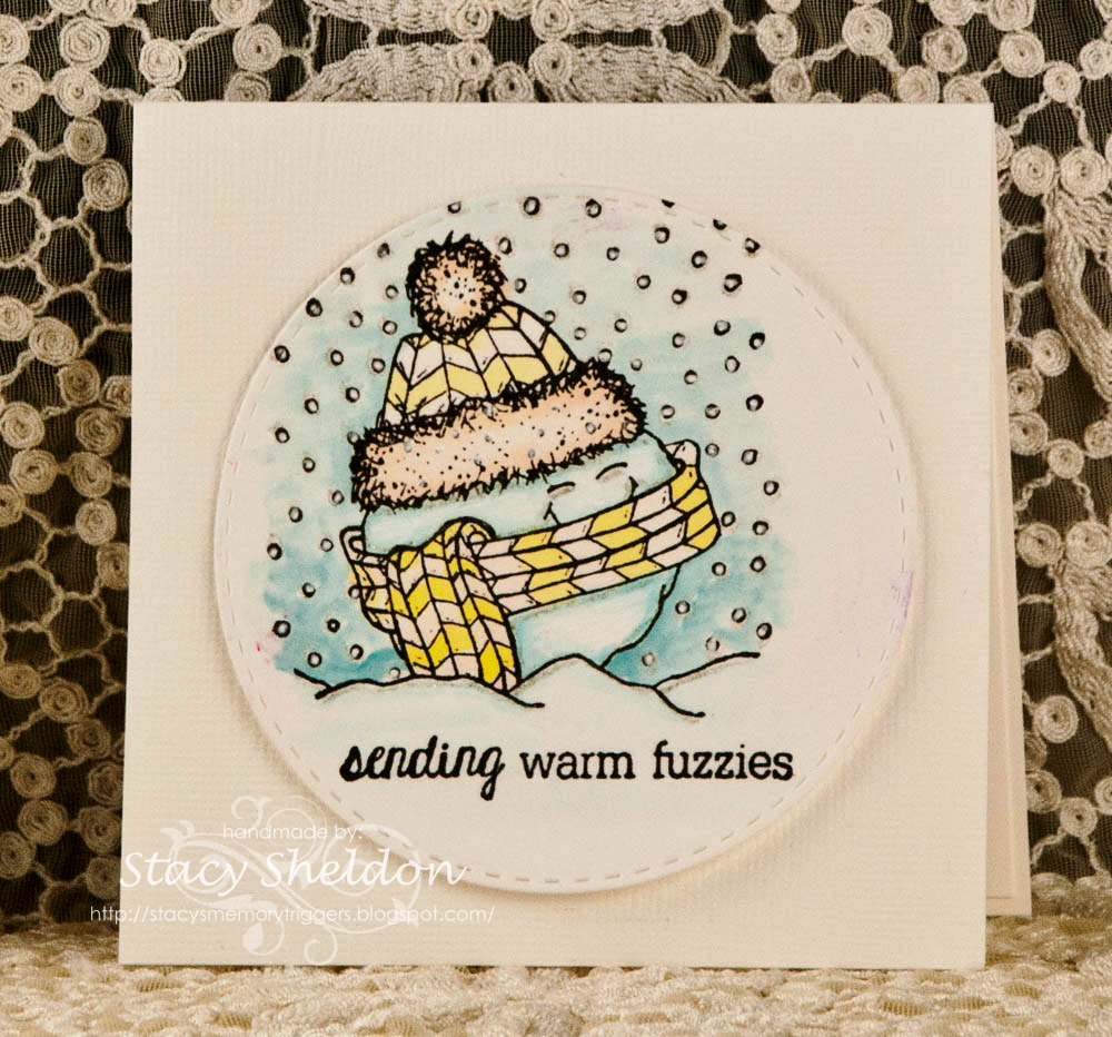
PS#2: the watere colored things that have been come cards so far were all lumped together in tuesday's post... 'cept the Two Papers Diva's ones from the center... so consider your selves peeked... 

2.23.2016

Adventures in watercoloring continues

 a closer look, thinking that this one was the watercolor makers phase. I have been playing with all the water coloring things I have been collecting and actually turning some of them into cards too.

 The green frame was done with some Kuretake watercolors for a piece that was used on a two paper diva's St. Patrick's day card that I have not posted yet... (so, this scrap is up on pop dots over the mice/bird image)


another Markers one. this one was barely wet so it did not warp as bad as some of the others done on smooth cardstock.

 These birds are from whippersanpper and the sentiment is Unity Stamps.

 Same birds with an Hero Arts sentiment.

 SU stipple hydrangea with distress inks.

 the sentiment is from Hero Arts.
that lace is unknown.

 hmmmm guessing the mouse/bird is Penny black and that get well die cut is from Paper Smooches.

 The leaf is from Fred B. Mullett, done with distress inks on the leaf and watercolor pencil for the background.

 That sentiment is from Two Paper Diva's ( same leaf, similar colors)

 a closer look at the sweet and sassy poppy background with an Hero Arts for Simon Says Stamp prayers diecut.

 The poppy was stamped with distress inks and colored with them also.

 a closer look at the blooms. ( Altenew Persian Motifs) stamped with Distress antique linen and colored with kuretake watercolors on smooth neenah.

 This is 5 1/2" square in real life.

 an Orange blossom version. ( not really sure what color these flowers should be, so my brain said lets go bright) or rather the colors in the kuretake pallet seem to lean on the bright side. hahaha
the diecut panels are taped together on the backside for the embedded look.

now this one almost got tossed. trying for a snow look is really hard with the watercolors I have so, that may be something I stick to copic's with. he looks like a frozen snowball for sure ( Unity Stamps) this is just a bitty one.

2.18.2016

Weathered Fence Cards

 An angled shot to catch the paint views on the dandelion.. ( this was done with a super fine sharpie paint pen where you know how it comes out in a puddle?) the puddle was on a a scrap piece and I dipped the tip of the pen using it like a paint brush into the puddle to draw paint over all the sprays in the seeds after the water coloring was dry. The Weathered fence  and the sentiments Dandelion Wishes were stamped with Versafine ink on Neenah cardstock. And colored with mostly distress markers inks in Walnut stain, Antique Linen, Weathered Wood, Old Paper, Peeled Paint, Moss & Sage. and a Little bit of prisma pencils.


 The Frame was cut with an Simon Says Stamp stitched rectangle die. ( this has quickly become the most used die I own because, its large enough to fit the whole scene in for me as I tend to make larger sized cards) both of these cards are A-7 in real life. the stamped panel and frame are up on pop dots over the baked brown sugar base.

 Now, this is nearly the same thing but, on watercolor instead ( the fence was stamped on with vintage sepia Versafine ink) The bird was stamped on Neenah (solar white smooth) and cut out with scissors. so, it is up on a pop dot over the fence. The bird and sentiment are both from the wanna hang out set.


This one is a little more clean and simple and the water colored panel is up on pop dots over the bazzill textured base.
The sketch challenge at two paper diva's is still on going you have a few days left to enter for your chance to win free gift certificates to the store. you can read about that and play along here.

2.17.2016

WOYWW #350 {under-consideration cards}

If you'd like to know why the mess is on display head over to our hostess Julia's blog where you can play along with us.
 Ah, these are tuesday evening shots. what it looked like when I walked up the stairs left over from monday. Monday I shot glued and shot the leaf cards off to the left. and piddled around with the other water colored things in the center but, decided to just let them sit. ( it was too dark to shoot after the leaf cards were made anyways) so, The view below actually shows what I am pushing around at the moment. The identi pen is out of ink and I have not tossed it so that I can remember to buy a new one. Yes, it would probably be easier to write it on a shopping list but, leaving it out in the way takes a couple of oh, yeahs for that to happen...


This is a better view of the center. I had had some new stamps come in and of course they were stamped on scraps to be played with and some older things. these critters were all water colored a week or two ago. so, they are you know on the learning curve not as good as some things that have come after them but, they are still cute and use able. The birds I think are whippersnapper and the mouse/bid hugging I want to say is Penny Black but, I'd have to go dig out the stamps again to be certain. The yellow get well sentiment is a paper smooches die. after these photos were taken with my cell phone I did glue a couple more of them together before it got dark. and I will do a post with the cards later maybe after work. Happy Wednesday Ladies :)

2.14.2016

More Watercolored Florals

 A look at how some of the things that were started being colored earlier in the week ended up... this Poppy is the single (largest) background Poppy from sweet n sassy stamps. colored with distress inks. this is the one that was done on the smooth side of the ranger watercolor paper which is a little more white in real life to my eye, and so, it also held the defined lines of the stamping a little more than the lumpy off white versions. ( that have not become cards yet). this one, I did not like how the background turned out and that paper had tried to pill up easily ( compared to the lumpy paper) and so, I cut it off and thought if you keep it simple you could swing thing to work for the IC challenge. ( there is a list of 100 color combo choices you can see them all here.) For which I chose #95 the back to school one with the colors of pink, orange, yellow and brown and some how in my head when I went to assemble the card it just looked good on this very pale green. ( that the center of the bloom is ) haha and then after I went back and looked at the list I realized there is no green in that 4 color combo... Such is life, the bloom is on 1/8" pop dots and the frame is on 1/16th" so there is a little depth to this when tilted. and I ended up using the entire 12" sheet to make this base and the framing & mat panels for the bloom. This card is 6" square in real life.


So, I tried it again with color combo # 4 which to my eye looked like two purples and two greens... so, when the card was done and I used green's to mat it, it really made the greens take over I guess. The hydrangea panel is up on pop dots. So, it probably would have popped better on something creamy colored like the watercolor paper. ( maybe next time, I had diecut the lawn fawn scripty hugs from the same wc paper and it looked too pale on the panels so I did scribble some of the same colors from the petals on it. I am not really sure I like it but, at least it looks different than ( all the usual cards of mine) which I guess is the goal. This one is A-7 in real life.


So, these Poppies are also from Sweet n Sassy stamps the Precious Poppies set and they really I did not color over them as many times as the large background versions. The Hey Beautiful is from Paper Smoochies fun and flirty set and it was stamped over the top 2 times with versafine to be bold enough to POP over the background. and this was done inspired by this pretty card in Michele's gallery for the featured stamper challenge today. This is 6" square in real life. so changes were to remove the scallops and ribbon and I flipped the sentiment down to the bottom.

2.12.2016

Simple diecut cards

 A while back there was a challenge about neekid stamping... to make a background and stamp a line image over the top of it, and this is what I did and then I thought about it some more and thought... there is no stamp lol... so, I never uploaded this one to the gallery at splitcoast. The base is Mello Moss and this one is A-7 in real life. that copper shimmer bloom is an Poppy Stamps die and the background is a scrap from this card.  (yeah, don't look at the upload date of the other card that really surprised me)
funny side note we are in the middle of Hubs is making cabinets for the space (the L) part of a room that used to be a breezeway between the garage and the house before it was connected a couple of years ago. so, in the laundry room. the room this hallway connects to is a basket of fabric that I am "going to" iron on the papers that make fabric into iron on papers lol... and while hunting for this old card to link to I found the original ironed on die cut clean and simple cards I made that made me go out and buy this basket full of fabric and I guess its been enough years that the time has come.

 This one June gave me a few die cuts to play with this new rose from SU. ( I am really impressed with the size of it.) I did pat on some green ink to the leafy parts and this is glued to the vellum with liquid glue. The scrappers floss through the button was colored with a copic marker and the vellum was machine stitched to a scrap piece of cardstock so, there was a way to glue that down.
and this was done for a "anything plaid" challenge a while back. the sentiment ( top blue part) is from SU and the bottom thanks is Stampendous.

This monday the Clean and Simple challenge asked for a Valentine with a heart... so, this is the one Hubs will actually receive this weekend. The background was done with Kurtake watercolors. ( they look red in the pan and end up fading to shades of pink) the heart brad I have had for so many years I no longer remember who makes it. that sentiment is from Unity Stamps love is grand set and the heart & arrow die are new ones from Simon Says Stamp. This is only 4 1/2" square in real life.

2.11.2016

Quick gift tag

 When I first got this watering can I did stamp a handful of them on scraps of (unknown printed) paper and this was one of those versions That I ended up decorating the can instead of adding something to display in it.
The sentiment on this is from the Lucky Me! set and the can is from Bloom Wildly. The stamped (top) heart is from the Branching out set. and the larger stitched die cut heart is from lil' inkers.

The shipping tag was sprayed with various dylusions inks and dried ( a long time ago) when I make messy things I do them in batches and then when I need something fast there are bases started to work with. The gingham ribbon is from May Arts and the ric rac is vintage. the sentiment was diecut with a Spellbinders labels trio die and the Stamped Heart was colored with waterbased markers and a gold gel pen for the dots. and the diecut heart was done with Kuretake watercolors. ( it's one of the pieces cut out of background that leaked under the tape. )

2.10.2016

WOYWW #349 {watercoloring}

 Welcome to the mess :) ( its really not that messy this is a cropped view the better desk shot is upside down) If you'd like to play along with us you can find the link up for this blog hop here on our hostess Julia's Blog.


the what it looks like standing view... the hydrangea's in the foreground were what the poppies looked like before colors were added. ( just water over the stamped ink) I am kinda liking the sketchy vintage look to them and debating if I want to color them or not.


meanwhile the water coloring continues... someone asked on last weeks post about the blending and I grab what ever is handy, usually a clear block but lately I have been using this lid from some QoR watercolors (that I put all the tubes in an old flower pot) and so with the dents in this lid I was using it for a pallet for water based markers. I have a bunch. ( Distress, SU, Tombo, Spectrum Aqua, Zig clean brush etc.) ( I mix brands) and I have been experimenting with making the backgrounds of the stamped images with watercolor pencils...
These are all Sweet and Sassy stamps poppy background stamps on watercolor paper. what I am seeing is. the two on the right are on old watercolor paper that I no longer remember the brand it came in a pad at a big box store and I cut it into small pieces when I got it home ( years ago) the one in the top left is on some Tim Holtz ranger watercolor paper stamped on the smooth side and for doing this, it is retaining the definition of the stamped image better and it seems to want to "pill" easily compared to what ever the other is... and I think the fact that I like vintage things the off white appeals to me more for these particular colors and image that that top white one so, it may end up tossed later...none of these are "done" I just had a little bit of time to my self after work yesterday and this is how I spent it.

 Speaking of which (tossing things)... this was a very hard thing to do but, I have started tossing images that are just not what I wanted. ( are you shocked? I am shocked) I have always been OK with tossing some things here and there but, I have been doing so much water coloring lately that it seems like there is more error in the trial than there was for other coloring mediums with me...