4.30.2013

buy a house


Just for fun, I have been picking up incomplete falling apart games at yard sales off and on the last few years, one of the monopoly games I saved all the paper cards and money and the charms... so, found this the other day when I got out the bag of burgundy scrabble tiles, and the IO sentiment was stamped and diecut on that scrap pp a long time ago. ( no clue on the paper mfg info anymore) the little wooden house is like those studio calico ones (thin) but, came from Micheal's. I inked it with some bright green pigment ink. The sheer ribbon looks better with these green's in person. 

4.29.2013

Christmas in April (catch up edition)


All of these cards use images colored in January or before... So, in February the challenge Ina had for us was out door fun... so I colored up some of these IO snowball fights ( one and two ) and never turned them into cards, making things for the spring fair took over and I got in an I do not want to do Christmas cards slump. because, I had no idea what I wanted to do with the images but, told my self I could handle 3 of a kinds and have two to mail and one for the booth. These the snowmen are stamped on Neenah, colored with copic's and gel pens and have stickles stardust on the snow. you can click on any of these photos to enlarge them just hit your back button to return its not a slideshow. the dotted printed paper is diecutswithaview and has glitter on it. the bases are soft sky and these are A-6 in real life the lace is vintage. 


a closer look. the sentiment is also Impression Obsession and the mini brads are from recollections. the sentiment was cut with an spellbinders tag die and the snowman panel is a labels 8. 


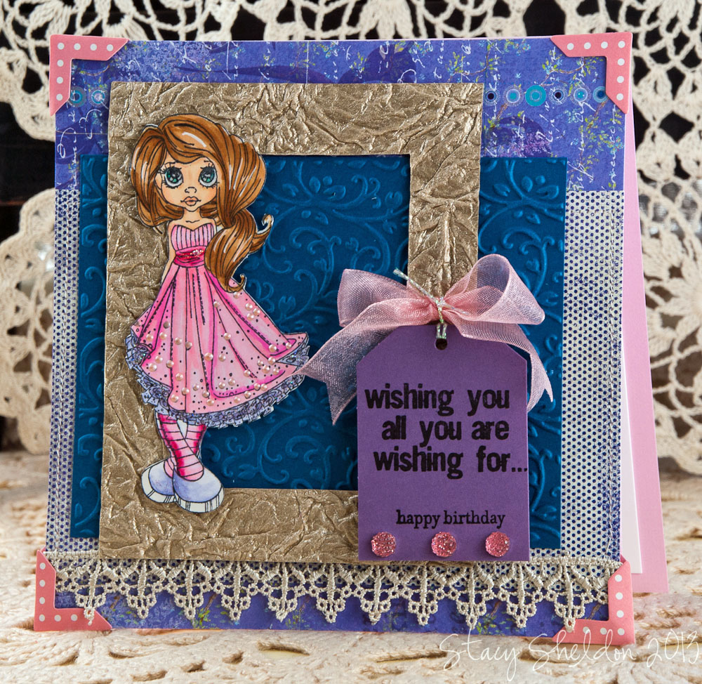
I have lost my cheat sheet of what that chevron printed paper is but, both stamps are from IO and the sentiment was cut with an oval hand held punchie. 


this one the bling was very hard to shoot. you can see it in the top right more than the angled bottom shot. 


In March Susan asked people to treasure hunt for something old on their Christmas card, or stamps that do not get played with often enough or things like that. so, I have not used this IO Santa horses stamp that much and I chose it to start with and came across these burgundy scrabble tiles bag in the closet. ( I am a slight hoarder) I have never used these so, I pulled out the bag and made a few words on the table and decided this one would work. the horses were colored with Copic Markers.
Hat is R56 , R59
Horses are E0000, E40, E41, E42, E43, E55, E81, E84
Fence is E34, E37

They were die cut with an labels 25 die and the ric rac is vintage, the stripe pp is from fancy pants the other paper ( i forgot) and this one is 6" square in real life. 


Now in April I am hosting that challenge and it is to create gift tags from the scraps of your Christmas card projects so here are three blue ones done from the cards above and things laying on the table and previously stamped sentiments. the tag is an PTI tag sale 6 I think. 


This photo was supposed to be at the bottom of the post and for some unknown reason it will not let me drag it back down there, ( don'tcha love technology?) The May challenge that Sue has is for a sketch SC161 and this is my version of that. It is A-6 in real life, the scrabble tiles are actually a shade of burgundy that looks better in real life on this card then in the photograph. the Background stamp is from peddlers pack done in versafine crimson red on some cheap GP110 years ago. the doily is from Martha Stewart. The sentiment is from Stampendous. it was cut with an long deckle rectangle. the ribbon is from May Arts, the embossing folder has no name on it. ( sizzix thinking a basic grey Christmas one) was done in some stardream shimmer pink. the mat is cranberry crisp and the base is pink pirouette.  


Okay back to March, the stocking are from Unity hung by the chimney Stamped with Neenah, colored with Copic's, this was die cut with an labels 25 die and the edges are inked with creamy brown chalk. the sentiment is from just rite deck the halls. the big brad is unknown, the printed papers are from lost and found MME, The paper tape is vintage and had ripped when I tried to use this as a ribbon on a gift package so I have been cutting it into snips. the staples are bitty Tim Holtz ones. 
This is A-6 in real life.


Same Unity set, slightly different colors this version is 5 1/2" square in real life on an PTI kraft base, the printed papers are from the Memory Box Mistletoe pack. the Stockings were diecut with an romantic rectangles die. the diamond pp is from the scrap bin and unknown. the button is vintage, that ribbon came from either Joanns or Michaels years ago in the Christmas section. 


the two on the edges are 3 1/2" square and the center is 3" square done with previously stamped sentiments and scraps from the march cards above. for the April challenge. 


also In march, I have never used this Stampendous jolly Santa on a card ever I don't think so pulled him out of the tin too. colored with copic's. the Saint Nick printed paper is from fancy pants, cut it with scissors then corner rounded the bazzill base. this one is 6" in real life. the seam binding is Cherry cobbler. 


and that leaves us with the rest of March cards these are a loose CASE of this beautiful card by Susan
mine are 5" square in real life, the first one ( on the right) when it was done I decided the hand cut banner was just too short, so I made the one on the left a little longer. the ribbon on the one on the right is from May Arts and barely has glue under it, so that also prompted the change on the one on the left to embossed cardstock from the holly ribbons folder. both of these I switched out the holly paper in the banner to embossed cardstock and then added in some stickles candy cane and lime green for bling. the ornament is from the SU set something decorations I think. (forgot) I have never used this on a big card before because, it just looked like it was swimming in the ocean to me on a card front so. it was a lucky day to find Susan's in the gallery. the bases are sundance felt natural white the other colors are Neenah classic cream and Speckletone Sand, the green is kiwi kiss, 


4.25.2013

Lamb's and Piggy's

4 days old.


all our sheep have the same color eyes.


this is a male hampshire pig. ( which is supposed to be a meat breed) dunno, we always had pink pigs and so did hubs family so. this is something new for both of us.


He was very busy today dug some ( mini ) sized holes in his outdoor pen and pretty much talks to us and has a lot to say. is very interested in the sheep. 


has some bowls and bedding inside the barn.


Now there are 8... the last female sheep had a lamb about 7 pm tonight. its another boy. 


He looks a lot like his dad too. and he is larger looking than the one born 4 days ago. 

This Little Piggy


was delivered bright and early this morning. 


4.23.2013

FS324 Crackled Poppies


I had come across this gorgeous card in Robin's gallery this morning and thought, you have to steal time to play today. ( we had a lamb born on Sunday morning so) it was an all day card between steps. I had flipped this to landscape and then hours later when I tried to mount it on the card base it was way wider than 5 inches haha. so I had to cut off the punched scallop row that I had moved to the bottom and switched out some vintage lace to the side instead. the flower stamps Hero Arts and colors are also slightly different. The thing I found out with this one is it takes umpteen layers of UTEE to reach the glass look on a A-6 sized panel. I think this is the largest piece of cracked glass I have made so far. the base is gina k. kraft 5X7 and the layer above that is speckletone sand with the french script background done in vintage sepia with some creamy brown chalk on the edges. the copper shimmer mat funny thing I punched it and had it glued to the floral panel before I started to melt the powders it didn't want to let the heat through going through two layers so, pulled it off and set it aside and  did reuse that same piece hours later. ( its usually trashed if I pull something apart mid card. so that was interesting I was thinking it was the heat on the glue that allowed it to happen, but then Chautona posted yesterday in the cbc thread that if your gonna wreck a card to do it with shimmery cardstock because, the glue comes off it fairly easily. and I have had that happen with Bazzill cardstock a lot too so it must be the plastic in the bazzill or the what ever makes the shimmery one slick that releases that glue) who knows. just thought it was interesting. 

4.22.2013

Spool Cards


A long time ago when I made the first round of spools. ( these were traced and cut by hand from an pattern found here. ) and then stamped with the sanded background stamp and have been sitting on the table for a good 6 months or more I'd guess. and I kept putting this white wilton doily on them thinking that looks cool but, its just too big... then yesterday it hit me oh smack your forehead use a smaller doily... so, these are Martha Stewart diecuts from M's that have other bits and pieces that were laying on the table layered to them. the seambinding is a little over a yard and unwinds so these are like little gift cards for a paper crafter, the doilies are only held on by the bitty clothes pins. 


sentiment is an dollar bin one ( I think ) all these sentiments on these cards were stamped on scraps and die cut a while back. the roses are from wild orchid crafts and the clothes pins were a gift from June I think she got them from sunshine crafts online maybe sunshine discount crafts ( something like that) 


the daisy cupcake is an lockhart image that was previously colored on some neenah and was cut out so the edges of the white were inked with an N0 copic to give it more of a shadow then an I missed that spot look ( haha) the enjoy is from Stampendous.


That butterfly is from some old double sided printed paper but, I've forgotten the mfg. info since then. ( an PTI die) the for you is from SU on an I think those are Martha Stewart hand held tag punchies. ( would have to look I have a whole bag of them that are stamped and punched from old tiny scraps) the button is a craft one and the thread is Karen fosters scrappers floss. 

4.21.2013

And then there were 7


today waddles ( what hubs has been calling here since Mary had her little lamb ) had a baby boy.
on this herd shot Mary's little lamb is the one on the far left and she is almost as big as all the fully grown sheep. 


this one is at about 3 hours old


this one with hubs was about 1 hour old. 


he was about 3 hours old when he finally got this one figured out. 

4.19.2013

Ally & Beeble


Another Emerald Faeries stamp Ally & Beeble colored a while back (with copic's, and gel pens, and has some stardust stickles painted over that) This one is 5X7 in real life. the printed papers are from die cuts with a view far east mat stack. the sentiment (Hero Arts) was stamped on a previously diecut oval tag. ( think it could be certainly celery) the base is not bazzill so, it may be dcwv also. ( its very thin) the lace is vintage and the rhinestones are heidi swapp. 


Just a closer look at the bling. 

4.18.2013

SC432 Make It


had a pile of stained tags that had dried on the table when I went upstairs after work last night, and I had seen this weeks sketch challenge at work and thought... the pink is nice... so this became a card that a way... The pink scrap was run through that new SU hexagon folder, finally used it. ( rolling eyes here) inked the edges with an burgundy marker, the sentiment was stamped with some crimson red versafine on that tag. thinking its stain was the velvet distress. then the finding has some white gel pen and the making has the same burgundy marker. the faux nib and tiny staples are also Tim Holtz stuff's. the hexagon pp is from My Minds Eye. used some pinking shears to trim the tag a bit to fit. its 6" square in real life. 

4.17.2013

Wishing You


Spent some time coloring this Saturated Canary image with copic's last night... nope I know what your thinking this is not a digital print out. there are some of the designs out in real (blue) rubber now. from a co. called little darlings saturated canary. I found these on Ozaak and they are a little more affordable then the other place I seen them for sale online at. ( can't remember that stores name anymore) then I spent some time second guessing my self about these colors, where would the light hit etc etc... sometimes I have to laugh at my self. so the skin tones are getting better, hair is coming a long... folds in clothing... eh, something to learn next I guess. that is why I bought this stamp. the eyes are color able, that hair... 

this is 6" in real life. the Nevaeh image was stamped with memento on Neenah and colored with copic's, and gel pens and then had some stardust stickles painted over that with pink liquid pearls on the dress. the enchanged evening pti cardstock was rak'd to me from Melissa years ago, ( thanks chickie!) it was run through an crafts concepts budding vine folder. the gold texture was die cut with an old old sizzix originals rectangle frame. the printed papers are from memory box. the corners are from heidi swapp, the  lace is from recollections and is machine stitched to the printed paper layers. the tag is from SU way back when they sold die cut tags of the cardstock, best guess is its perfect plum, the top sentiment is from tim holtz words for thoughts and the happy birthday is from SU. the pink goosebumps are from queen and co. the pink sheer is unknown and the iridescent cord is from May Arts. 


painted over her eyes with diamond glaze to help them POP too... it was nearly impossible to photograph. 

Sunny Pockets


This was done just because, Jance sent me a couple of these chicken wire backgrounds to play with... so this one got inked with some rusty hinge distress and then sewn to the graphic 45 paper. the pocket ( daisy d's) was die cut with an sizzix die a long time ago. thought it looked OK with this background so just added some vintage buttons on the PTI card and its just clipped to the pocket ( that is up on pop dots) with that mini clothes pin. ( this was a gift and its not as thick as the ones from is it doodlebug? one of those scrap co.'s keeps making them pre colored if you've bought them these are skinnier width wise but chunkier in depth thickness on the project. and they spring apart really easy. they came from that discount place online um sunshine crafts? something like that. anyways this one is not quite 5X7 it ended up being shorter because, the scale was off at 5X7. 

4.16.2013

Some Birthday Cards


My friend Janice Rak'd me this Our Daily Bread Poppy and Lace to play with and so, its colored with copic's and a little bit of a shimmery gel pen with some bisque liquid pearls on the lace. the printed paper is from recollections and is shimmery. the kraft base was inked with some creamy brown chalk and some rusty hinge distress ink to bring up the details. the mat under that is a shimmery copper. the sentiment is from MSE but, I grabbed the wrong pad (gray) again and stamped that first so when I went over it with the black it gave it a shadow look. ( I may re-do that) the lace is vintage, the ribbon is offray. 


My friend Alice gave me a stack of this bingo paper a while back and I knew that I would only use it in little pieces so right after I got it home I cut it up... best guess is it could be simple stories second guess is MME. but, I dont remember anymore I've had all these elements sitting like this on the table since I got this Art Impressions sentiment in the mail a while back intending to color up an bingo jean to go with it all and finally decided I kinda like the way it looks with just these things so here it is. the bingo chip is vintage.


another one for one of the guys at work, thought this tim holtz folder looked like welded riveted metal... so, this sentiments just been laying around since I cut it out awhile ago and so added some grey ink to some and some karen foster screw mini brads. this one is 5X7 in real life.