8.30.2022

Watercoloring a White Flower

 This week Brenda has shared with us a negative type painting to do white blooms with just a touch of paint for texture / depth? on the petals. You can find this tutorial here on YouTube. The name of that video is how to paint a white flower from creationsceecee. 


I remembered the whole use the binder clips from last weeks challenge and since these were still on the table from that and already splattered with paint I decided to grab them again. first round of paint wet.


 Decided to shoot round one dry so you could see how much it fades and that it only warped a little at this point. 

Second layer of background paint ( wet) 


So somewhere between the second layer and this one I erased the pencil lines, added the white bleed proof ink splatters and the gold trim ( which was not very dark) so after I picked it up from the board here ( the only thing holding it down is those binder clips) I pained a second layer of gold paint everywhere you see it. 


I left this panel under a box of metal dies all day trying to press it a little more flat to cut it with a waffle flower rectangle die so that the blackberry cardstock base could peek around it for framing and that was not so successful. So out came the foam tape ( which at least stretches it kinda sorta flat on the card front) I did stamp this sentiment after the card was "done" but, I cannot figure out which set this one came from. ( the rubber is purple and its on cling foam so your guess is as good as mine) I hope you are all doing well. If you'd like to play along with us this challenge can be found here at Splitcoaststampers. Thanks for stopping by.


8.26.2022

Inspired by { Peanuts Worldwide}

 It's my turn to host the Inspiration Challenge at Splitcoaststampers this weekend because, I was fortunate enough that Amy switched weeks with me so, I could spend more time with my son and his girl while they were here. And a while back I came across this fun Peanuts collection on Pinterest seen here and knew it would be a fun thing to play around with. And the last few years I have spent some time collecting old stamps on eBay and Etsy. So, a handful of theme are Peanuts gang ones and I wanted to do something that mimicked the comic strip layout so, it was more of a scale thing to fit these 3 in to the spaces inside this Newton's Nook die. and I picked this particular strip as it had me smiling.

I had "won" the smooching snoopy stamp a few weeks ago while the seller was on vacation and it really just arrived in the mail last night. ( what timing) but, I was pretty surprised by how tiny it is in real life. So, the Penny Black sentiment I tucked in here probably makes it a little too sarcastic when you notice that Lucy is frowning in these scene's. The card stocks here are Neenah earthstone and Papertrey Ink smoky grey. So, I barely got the paintbrush wet to add color to the blocks. You can find this challenge here at Splitcoaststampers to play along with us. Thanks for stopping by.


8.23.2022

Watercoloring A Night Sky

 This week Angie has shared with us this tutorial for doing a night sky water coloring Seen here on YouTube from This Writing Desk.

So the binder clip idea caught my eye and on the first round of paint I decided to add some to the edges of this taped off sheet. ( its not a pad, its taped to the backing board off an old used up pad) this is Phthalo Blue on Arches 100% cotton cold press. 


So second round of paint I added in some Payne's grey. ( not the blue version) and right after I shot this I realized there just was not enough paint on it, so I added some more real quick. 

Along with some splatters of Dr. PH Martins bleed proof white ink. and I decided that using the size 8 brush for the splatters made them much too big so, I did end up grabbing a small maybe size 2 brush for the rest of the splatters you see going past this.

I know she did this is like two layers but, it took me a few more to get a depth to the sky. So this is 3rd layer of paint.


Scribbled in some Paynes grey tree tops across the bottom and more splatters. My shooting star was a bigger blob of paint and it was a little on the thick side I though but, I did not try lifting it. 


I had originally cut the watercolor paper to A6 so I could have a big border when the tape came off but, as I looked at it I decided to trim it down a little so more of the cardbase could peek through. I did consider putting the sentiment onto the inside but, instead added a single wash of the phthalo blue paint over it so it could blend a little better than a stark white one since its such a big sentiment. This finished out at A7 in real life. I hope you all are doing well, You can find this challenge here at Splitcoaststampers to play along with us. Thanks for stopping by.


8.19.2022

Inspired by {Carson Dellosa Education}

 Amy has found a fun site for teachers to find things to decorate their classrooms with besides teaching materials and I loved the farmhouse and boho lines, Where I came across this set of mini posters and I looked at that and said to my self it looks like a sheet of printed paper that needs cut up kind of a thing. You know what I mean right? the ones geared towards scrapbooking is what I mean. So, I grabbed this pad of printed paper from Simple Stories called Simple Vintage great escape and started cutting two of them with Matting Basics 6X6 square dies ( from both the A & B sets) the black photocorners are from Pioneer.

And I finished it with this cute, simple flat card. The base here is some Green columns from Neenah, the inside is lined with solar white and this is 6" square in real life.  If you'd like to play along with us you can find this challenge here at Splitcoaststampers. I hope you're all doing well, Thanks for stopping by.

8.16.2022

Watercoloring a Pinecone

 It's my turn to host the watercoloring tutorial on Splitcoaststampers this week and I have chosen this Pine Cone from Diane Antone Studios seen here on YouTube

I took this shot while it was drying to remember the brushes I used but, I looks like a Princeton Neptune Script #1 and a 1/4" Silver Black Velvet Striper ( which has angled bristles ) ( it was the closest I could come to what I seen her doing with what I had and I think it worked pretty well) 


A closer look at the dried painting, The white here is a combo of Windsor & Newton White Gouache and Dr. PH Martins bleed proof white. I tend to mix white in the same spot in the palette frequently so, its hard to say now if they have mingled or not. All the other colors are Daniel Smith paints.


I used a paper trimmer to put this down to about A6-ish size and mounted it on foam tape with Pioneer photocorners on some Stampin' Up! Cinnamon Cider at A7. The sentiment here is from the Simon Says Stamp Tiny Words Christmas set stamped with some Versafine Clair Nocturn on the Arches cotton paper. That's about it from me, I hope you enjoy this one as much as I did. You can find this challenge here at Splitcoaststampers to play along with us. Thanks for stopping by.


8.09.2022

Watercoloring { Line Wash }

 This week Linda has shared with us this sketchy line wash style of painting where you sketch over your pencil sketching with a Micron pen ( or any waterproof ink pen) for bold lines. You can watch the video tutorial here on YouTube.

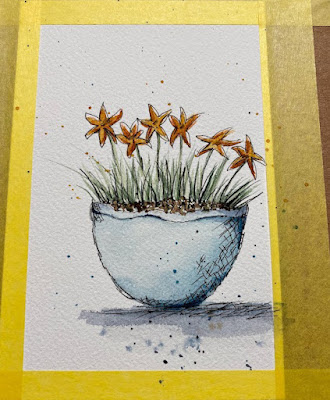
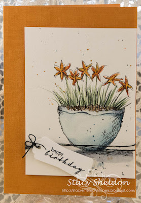
I did watch the video but, I did not follow along with it doing this, the whole thing I did was from memory after watching it so, the bottom of the pot is a slight trace around a blotter tool on my table and then my flowers seemed to look like stars to me which I thought was a fun twist. 

So, I decided to make my grassy star flowers shades of yellow. First layer of paints. 

Second layer of paint with more pen work throughout, more splatters.

Decided to add a few more pen lines around the blooms to get the white space and more cross hatching. 

The Painting was done on some Arches cold press with Daniel smith paints. This panel is up on foam tape over the textured Bazzill base. The sentiment here is from the Hero Arts Tulip set stamped on some Neenah solar white and die cut with a spellbinders framed tag die. This is tied on some black hemp string wrapped around the painted panel, so there is a couple more foam pop dots under the end of the tag to keep it flat. You can find this challenge here at Splitcoaststampers to play along with us if you are so inclined.  I hope you are all doing well, Thanks for stopping by!


8.06.2022

Inspired by {Art Fresco Table Project}

 This week Kia has shared with us a collection of artist decorated picnic tables seen here. I landed on this one with the butterflies and decided it would make a quick cool card. 


I started with a sheet of this green painted stripe looking printed paper and ran that through the big shot with a Stampin' Up woodgrain folder and then inked over the top of it with Citron Distress Oxide ink. The Tim Holtz butterfly was stamped with some versafine on Arches Hot Press WC paper and painted with Daniel smith paints and cut out with scissors. ( so, I whacked off one of the antennas so, I just used a Micron pen to draw some to the printed paper layer) The sheer ribbon is unknown and over an inch wide so I decided to tie some knots in it for interest and tucked that around the printed paper layer. The base is some green from Gina K Designs and I finished this one out at A6 in real life. I hope you are all doing well. If you'd like to play along with us you can find this challenge here at Splitcoaststampers. Thanks for stopping by.

8.05.2022

Inspired by {Minted}

 This week Julie has shared with us the Minted site where I seen so many thing I bench marked as possibilities but, I kept coming back to this simple shades of green with all the movement piece of art work seen here. I also loved all the white space it has.

In the back of my mind as I have been looking at the sites that I am doing samples for at the moment, what I need are a few Guy birthdays and a few Anniversaries. And I also knew I had this pad of printed paper from Micheal's recollections line called Gilded Ink. ( it looks like alcohol ink backgrounds )  


 And so, this was done really quickly using the main sentiment from Riley & Co. and the tiny sentiment from A Muse. with some Versafine clair nocturn ink. The cardbase here is something from my unknowns folder and it finished out at A7 in real life. The dark spots in the ink pattern are really some what looksl ike gold foiling. ( it was a little hard to shoot and not have it appear totally black)I am thinking the shimmer from the gold really kicks it up a little into special even though it is a fairly flat design. That's about it from me, I hope you are all doing well. If you'd like to play along with us this challenge can be found here inside the "Inspiration" forums at Splitcoaststampers. Thanks for stopping by.

8.02.2022

Watercoloring Geraniums

 This week Kia has shared a tutorial on painting Geraniums in a Vase seen here on YouTube. The artist also has a printable sketch seen here on her Facebook photo album page. I did not have much luck printing it so, I grabbed my phone and walked around the house shooting the ones I have blooming here at the moment. ( they look a little leggy and sad with all the heat we have been having so, a trim came after this) 


Front Porch steps pinks and reds Zonal Geraniums

Cropped view, you can click on these and see them larger and use your browsers back button to keep reading. 


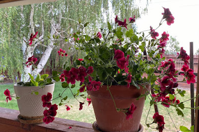
an Burgundy/Red Ivy version. (Ignore the dying grass, we are focusing on keeping all the fruit trees, veggie garden and flowers watered more than the lawn during this continuing drought. )

A closer look at the petals this is so gorgeous in person. 


another pale pink this one is also a few years old.


This one is about 5 years old now, ( I haul it into the garage for the winter) 

Found this fun striped petals one this year, and the burgundy ivy one behind it too. ( its different than the one on the porch) 

So what I am seeing on my plants is the "ivy" leaf ones are more vine type movement and they are pretty much no reds on the leaves either. This one is darker than on the porch and more of a solid color on the petals. 

Now these, I put these in the garden shed last fall not in the garage, hubs thought I had "too many" flower pots in the garage so, I was willing to let these go. ( ha, they survived with no water all those months) went dormant and here they are baking away at the back door. I was pretty excited about that after the fact as this color does not seem to be in the stores this year here.

Its forest fire smog-y and hot hot hot here so, its hard to see in the photo but, the one on the left is more of a pale salmon ( as is the pot behind it) and the one on the right is a little deeper of a coral shade. I have a lot of allergies so, I never cut the things from my yard and put them in vases inside so, I decided to do a potted plant of Geraniums for my sample. 

Izzy is trying to decide if Tim on the lawn mower is a better bet for getting that ball in her mouth thrown.  

So, I really wanted something with larger flowers like the sketch in the video ( which is on the left here) but, I could not see it so, I grabbed this stamp that had small flowers and tried to sketch them with a graphite pencil.


But the little details kind of disappeared as the first layers of paint went on the sketch. ( this was done on some Arches cold press cotton paper) 

Second layer of wet paint here. ( hopefully it blends and fades a little when dry) This is Daniel Smith watercolor paints. 

I finished this out with a Classic Cream piece of Neenah that was run through the Anna Griffin Acanthus embossing folder and colored with Distress Oxide inks in a faux Patina type colors. The base is some thinish shimmery light blue and the sentiment here is from the Stampin' Up Teeny tiny wishes set die cut with a Stitched rectangle die. This is 6" square in real life. You can find this challenge here at Splitcoaststampers to play along with us.  Hope you all are doing well & thanks for stopping by.