3.31.2022

Dirty Dozen April Christmas Card Challenge

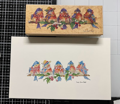
 It's that time of the month again when the newest prompt for those of us playing along with the Dirty Dozen Christmas card challenge this year see the new theme. So, I knew which stamp I wanted to attempt to color and I have been feeling lately that some of the really complex stamps with tiny detail areas are going along easier for me with watercolor paints rather than say pencils or markers.


I had also decided to open that pad of Arches Hot Pressed 100% cotton watercolor paper because, the rumor is it smoother than the cold press and I knew that with the tiny details of this stamp I would be frustrated doing it on cold press. So, I stamped it with Versafine and used the index sticker on the block for a general guide on this first round of paint.


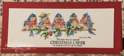
I added a second layer of paint to some spots, filled in other spots I skipped while it was wet so it would not bleed too badly and added this Stamping Bella sentiment from the Festive Gnomes set. I figured it would work well since the name of this Stamps Happen Carolyn Shores Wright stamp is Christmas Caroling. I just love all her birds and I am pretty tickled with how this turned out. The base (SU ridinghood red) was cut to be a Slimline and I used a Waffle flower die to cut the watercolor paper. That's about it from me, You can find this challenge here in the special forums for fan club members inside SCS to play along with us. Thanks for stopping by.
3.29.2022

Watercoloring {Birch Trees}

 This week Brenda has shared with us a quick abstract Birch Tree line scene seen here on YouTube.
I was really amazed by this because, I assumed it would be such a difficult thing to paint. So, I loved the tape off the sheet with masking tape tip of the video. And I did do that. I did flip mine to landscape view as I did not have sky above the trunks or soil below them in the scene.

A view of what it looked like wet as I walked away from the first round of paint. I did use some really wide Frog tape so I tore it to be skinnier and not so perfect for the trunks. 

I had assumed that If I added a few more Skinnier trunks/branches to the view that they would have that first round of pale wash for a base. I didn't cut off the tape edges off the board as I knew I had to peel them up at some point.


Peeled the strips off and I used a brush to add these trunk details and a few bare branches towards the top. I did not use the card method shown in the video because, I have never seen one of these trees look like that. ( it was a little too abstract for my tastes) and so the trunk details are shades of browns, greys and greens here. 

This finished out at A7 in real life, I did not add a sentiment as I am not so sure what I am going to do with it yet. I did add more shading to the edges of the trunks after the last round dried and a little more stripes/ detailing to the trunks. You can find this challenge here at Splitcoaststampers to play along with us. That's about it from me, thanks for stopping by.


3.25.2022

Inspired by {Sugar & Cloth}

 This week Amy has shared with us the Sugar & Cloth site and I happened across these felt looking Easter bunny baskets on their Pinterest Boards. And I am just a sucker for textile items and I also knew I had this vintage Imaginations Bunny stamp that I wanted to try painting. So, I stamped it with Versafine morning mist ink on Arches 100% cotton watercolor paper and did. 


I knew I wanted to have both the grey hare and the pink hare to be part of the design and the yellow went very quiet here into the flower clusters. So, I painted the body mostly with the Daniel Smith shadow violet color mainly because, I knew it would separate and you would see all those shades of blues and pinks in it when it dried. So, I did add just a tip of purple and blue to bump that up a little.  


I had painted this on a pretty big piece of paper knowing the bunny would have lots of wiggle room this way, and I had originally thought I would tie on a ribbon or some lace but, then while the paint was drying I seen a sneak peek of the VSN challenges coming up, and one was a stamped panel layer on the base. and then I went ahead and cut a second layer from some older Basic Grey to use as a mat since both these dies are stitched designs to play along with that whole sewn basket theme. And then I had chucked that and I decided to leave it flat-ish anyways without a textile. You can find this challenge here at Splitcoaststampers to play along with us. Thanks for stopping by.

3.22.2022

Watercoloring Perspective

 This week we are taking a look at a video that shows a scene with just a few elements to have that sense of perspective. You can watch the video here on YouTube.


So, I started out painting the one on the left ( first) with Daniel Smith paints on some cold press Arches 100% cotton paper. And I had not quite enough water on the paper to do the tree spread, so I had the bright idea to take some water to it and remove the preliminary distance tree/bushes with water and try it again. And so, I got some tree's to spread the way they did in the video so, I set it aside and tried it again before I forgot what it looked like. And then I had these two pieces and I actually liked the one on the left better, it had more, just more to me. and I figured since I already had one that looked "close enough" to the sample to work I could just you know tinker with the one on the left and so, 


I thought the "pond/water" part looked more like a meadow and the backwash of green above the tree line could pass as hills, so I added more trees getting progressively darker as they came forward and made the pond a meadow. added a little more drama to the sky. ( which was harder than you would expect to do it without getting it strange and broken seeing as there were already tree branches and birds in that area).


Cut a sheet of Bazzill down to do these as 5 1/2" square cards. I just may turn them into Fathers Day cards. ( have not decided yet) but, I still like the one on the left more. You can find this challenge here at Splitcoaststampers to play along with us. Thanks for stopping by.

3.15.2022

Watercoloring a Scene

 This week Angie has shared with us this tutorial seen here on YouTube about painting a scene with watercolors and not mixing muddy colors. 


This is what the first round of paint looked like dry. I had seen that she used brusho's on the hill side while it was wet and although I have some, I reached for a dark shade of green color burst instead as I knew it would have less airborne mess in my space. ( its allergy season here and I am already sneezing day and night so...) the colors were dark and and not just shades of greens so, I did add so more darker greens grass type strokes on the hill and a few more darker shades of brown branches to the tree and a few birds seen below. 


And it finished out like so, this is 6" square in real life.


The base here is some textured Bazzill and this is lined inside with some smooth Neenah solar white. You can find this challenge here at Splitcoaststampers to play along with us. Thanks for stopping by.

3.12.2022

Inspired by { Baba Souk}

 This week Kia shared with us the Pinterest boards and web site for Baba Souk where I found this Pink Butterfly pin on their Wonderland Board. I love the softness and translucency of the wings so, I set out to try my hand at painting something similar. 


 what the pin looks like, you can see it larger by clicking on it or the site link above.


I stamped the Penny Black Blue Wings stamp with Versafine on some Arches 100% cotton cold press and painted it with Daniel Smith paints. This panel was cut with a spellbinders square die and popped up with foam tape over the base that is from My Favorite Things Tickled Pink cardstock. This one I wanted to keep that clean and simple theme so, I did not stamp a sentiment on it and it finished out at 5 1/2" square in real life. You can find this challenge here at Splitcoaststampers to play along with us. Thanks for stopping by. 

3.08.2022

Watercoloring a Feather


This week the watercolor Wednesday challenge is playing along with this video tutorial on YouTube seen here. I seen that after it was mostly done here, that it looks like the bulk of the veins? are they veins on a feather? should have stopped when they came to the blue background area and I had done mine all the way down the center stem.  After this was shot, I did use a tiny brush to try again for some paint removal highlights in the blue again after this was shot, it didn't make much difference actually. The brushes I used for this are on the palette above. I used the angle brush for the "flat" and it was a little too soft and wide so, instead of cleaned white highlights I got some water bloom streaks. :) I showed it to my husband at this point and he's like oh, its a branch in the winter eh? ( dormant? dying? ) and I said, ah its supposed to be a Feather...

And so, that called for a snarky don't toss it kind of a sentiment in my mind... This particular one is from the Simon Says Stamp sassy flaps set. The card base here is some kind of "paper bag" style color kraft. ( its pretty thin and flimsy so, I am going to line it with some Neenah on the inside later. The paints here are Daniel Smith and the watercolor paper is 100% cotton cold press from Arches. You can find this challenge here at Splitcoaststampers to play along with us. Thanks for stopping by.


3.04.2022

Inspired by { Desire to Inspire}

 This week Julie has shared with us the desire to inspire site where I came across this dino wall paper and it was one of those holy cow that is entirely too many colors first thought and second thought was you have those Whipper Snapper stamps that have not ever been inked... So I tried. I think the pink splatters are probably not quite enough pink for the amount on the wall but, I feel like the other colors are represented.


The stripe print here is from the scrap bin, the blue glitter covered base is from Core dinations and the Happy Dino Day and sentiment were stamped on some Arches 100% cotton cold press. ( This was painted with Daniel Smith watercolors) when it was dry I decided to add some white gel pen near the eyes and a little bit of Polychromos pencil to a couple of crevices. This is popped up on foam tape.Just a silly one from me this week. If you'd like to play along with us the challenge can be found here at Splitcoaststampers. Thanks for stopping by.