6.30.2023

Inspired by {Decorator's Warehouse}

 This week Julie has chosen the decorator's warehouse for the inspiration site destination and I started out reading this blog post here 60+ Inspiring Christmas trees, and I started grinning at this one in particular and this one also. I just love the whole red and white and gingerbreads. And at this point I decided I was going Christmas for my sample and I had some Candy Cane dies out on the table because, I had done one for the Dirty Dozen Christmas card sample earlier and I decided I needed a bunch of candy and sweets. 


So, then I just started cutting scraps and gluing the layers, edging some of the edges with vintage photo inks.


and every day I just picked a different die and kept cutting thinking I would make a little stash of things to decorate with. and this is where I stopped. I didn't actually make a whole complete thing but, have a variety of red & white and brown things to decorate with sooner or later. If you'd like to play along with us you can find this challenge here at Splitcoaststampers. I hope you are doing well, Thanks for stopping by.

Dirty Dozen July Christmas Sample

 It's that time again, on the first of the month the Samples peek for the Dirty Dozen Christmas Card challenge prompt. You can find this months challenge here in the special forums set aside for Fan Club members. So, being on the team I know in advance what the theme is and I decided to start poking through my dies & stamps this month. I decided I wanted to try tucking sweets into a Stocking. I usually just decorate the stockings. I decided to use the old Stampin' up holiday Stocking die that was from Sizzix BigZ line a long time ago and cut it with some gingham and red & cream textures from Hobby Lobby to give it that homespun look. There is also some Vintage Photo distress Oxide inks along the edges. I used a brown ink fineliner pen to do the faux stitching.

The Gingerbread cookie is  Personal Stamp Exchange Stamp done with Acorn Versamark ink on Watercolor paper and was painted with some Daniel smith paints and cut out with scissors. ( I did two of them when I was doing it and have one for someday) 


while I was thinking about it, I realized this stocking die was too large to be on a card front and I decided it would become a big tag because, of that I painted the backsides of the gingers. 

The candy cane die here is one from Spellbinders, done with scraps. that ribbon is an older one from Martha Stewart. and I had taped these things to the inside. and cut a second set of pieces to cover all that up. 

That sentiment stamp is a Stampabilities one found recently at Hobby Lobby. And I have to tell you how much that took me by surprise. ( I had assumed Stampabilities closed its doors years ago) 


The with love sentiment is from Great Impressions. This was cut with a Simon Says Stamp stitched tag die from their bundle of stitched shapes set. The crochet trim at the bottom of the rim cuff on the stocking was found at Hobby Lobby last year. ( I do not live close to one so, I maybe go into that store twice a year)I did use the tiny Tim Holtz stapler on the edges of the trim so it would not unravel. The button is vintage and has some natural hemp string through the holes. That prim stitched eyelet heart is a die from Impression Obsession. ( the smaller eyelet edged one) 

That's about it from me for the moment, I will be back in a bit with this week's Inspiration sample thread. Thanks for stopping by.


6.27.2023

Watercolor Texture from Tissues

 This week Linda has chosen this tutorial from Debbie Walker seen here on YouTube. And I decided this would be a twofer thing in the sketch watercolor pad. ( to work on doing the details small enough to fit on card sized canvas) which is the main thing I want to know as far as water coloring all the things goes. :) 


 So, I started with some "water" and although I could see some white spaces appear, when I pressed too firmly with the tissue it blotted up all the paint and left behind the texture of the wc paper instead of a print from the tissue. 

So, I decided to add more paint to the water press in more texture build a rocky shore and you know blot with tissue again. ( this is the wet shot)

And this is the finished dried shot, So I did write the date and what this was supposed to be what I learned on the side so I could remember if I came across it again. and I decided since I did not save space for the bloom part of the video to skip that part. I think doing this going forward I may need thicker or darker paints to make it work better and perhaps a lighter hand with the tissue. If you'd like to play along with us you can find this challenge here at Splitcoaststampers. I hope you all are doing well, Thanks for stopping by.


6.25.2023

Inspired by {McGaw Graphics}

 This week Amy chose the McGaw graphics site and pinterest boards for the inspiration challenge and I came across this print of the couple under a red umbrella in the rain and I loved everything about this. 

So I stamped the Unity Stamps Harmony girl from Angie Blom and I stamped her both on some vintage dictionary page ( Dance) and watercolor paper. and proceeded to add Daniel smith watercolors to both.  I did paper piece the text version over the watercolor paper when they were dry. I wanted it to feel moody so I did go dark with the rain.


I needed more texture as I had a pale grey Bazzill base cut for 6" square so, used some Hobby Lobby crepe paper on the side and then used foam tape under the watercolor paper. the grey sheer ribbon is really old from SU ( maybe going grey?) and the sentiment is from Tim Holtz snarky sticker pad, I just poked a hole in the end so I could tie it on like a sentiment strip diecut. There is also some white gel pen, Stardust gelly roll pen with Stickles crystal glitter glue on the dried paint in the rain parts here also.

I am pretty tickled with how this finished out. I hope you all are doing well, Thanks for stopping by.


6.20.2023

No Plan landscape

 This week Brenda has chosen this abstract no plan painting from Creationsceecee seen here on YouTube.

the title of that painting is actually embracing spontaneity - atmospheric watercolor landscape. And I think this was the hardest thing I have actually tried to do. I did watch it all the way through and then started this piece here 


On a piece of Arches cold press about A6 in real life with some Moonglow and Blue Apatite genuine. 

Instead of a branch into the scene the background became hills with forest trees on the rise. 

And then trying for a peeking out and up from under some kind of foliage some green appeared. The greens here are Cascade Green and yellow green. And nope, it does not look anything like the inspired by piece.  What I learned is, I do not do well with "no plan" and I really did not have enough room to make the paint run. If I mess with this anymore it will no longer be much of a no plan landscape. So, I left this to dry the rest of the way like this. and we will see if it grows on me later. 

If you'd like to play along with us, this challenge can be seen here on Splitcoaststampers. Thanks for stopping by.


6.16.2023

Inspired by {Heirloomed}

 Hi, It's my turn to host the Inspiration challenge this week at Splitcoaststampers and I came across this Heirloomed site and loved so much of what  I seen. On the Farmhouse Design & Decor Board I found this front porch pin and I loved the humor of using old Chicken feeders as planters. Galvanized tin always catches my eye. And I spent a bunch of time poking around for something to hit me to make and kept thinking about pin and what I could do to be more of an inspired by piece than just replicating the scene.

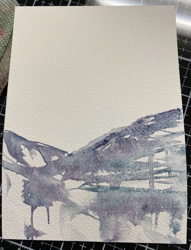
One of my goals is to actually start using some of these things I have been collecting so out came this Marianne Designs Marleen's Shelf die and I grabbed some scraps of watercolor paper and started with a layer of paints. 

the ladder part of the shelf I think is wood and I decided to do the top front edge of the shelves with a play on galvanized colors. 

when the first rounds of paint dried I cut them out and then kept adding layers of Daniel Smith watercolors to them. 


So they started to look like this.

And then I started looking at my garden / plants dies mostly for scale rather than mfg. and found this 

Joy Crafts spring wheel barrow set had 3 potted plants that looked like they would fit and The Sizzix Garden shed set had small flower pots and a watering can. I knew I had the IO watering pitcher but, it is about half the size of this shelf you see here. 

I did use a bunch of shadow violet on the pots trying for an aged distressed look to the greys since it what variegates as it dries? 


I did not actually use all the bits and pieces I painted for the card but, this was the things I did do before I built the card. 


The sentiment here is from Impression Obsession and it was diecut with a Penny Black full bloom stitched nested frame die. Some of the flower pots and the watering can are up on foam pop dots. the bitty brads hanging the "sign" are from Recollections. the corrugate is from Die cuts with a view and the white washed board printed paper is from the Craft Consortium pad of wood grain prints. This one is 6" square in real life and headed out to DS's girlfriend soon. ( she drags him to Lowes &  Home depot on a regular basis) which still makes hubs and I chuckle as that was his most un-favorite store to go to growing up. I hope you are all doing well, If you'd like to play along with us you can find this challenge here at Splitcoaststampers. Thanks for stopping by.


6.13.2023

Watercoloring Rainbow Circles

 This week Angie has chosen these Rainbow bubbles in watercolor by Kristin Van Leuven seen here on YouTube. 

I meant to go downstairs and find some canning jars but, decided to see what circles I had in my studio that might work and found a few old glass pieces and some lids from crafty tools. 


 I did this on a partial sheet of Arches cold press watercolor paper with Daniel Smith watercolors, on the not quite flat vintage milk glass trey. I did rock the glasses trying for complete circle coverage and I ended up faking some of these circles with the paint brush. 


And I think it turned out pretty cute in any rate. So I cut out a corner with a Spellbinders 6" square matting die and then mounted that to a pre made Paper Zone 5 1/2" scarlet cardbase.

This sentiment here is from Riley and Company. I did use a Misti to re ink it several times as the watercolor paper has texture and I probably should have done a skinnier sentiment as going over a trio of bubbles made it harder to read at the top but, the whole thing says " I don't always craft on the weekend... BUT WHEN I DO nothing else gets done and you're on your own for dinner. " and the whole thought of it makes me laugh as my husband does the majority of the cooking around here. If you'd like to play along with us, you can find this challenge here at Splitcoaststampers. Thanks for stopping by.


6.06.2023

Watercoloring White Roses

 This week Kia has shared this video from Sandy Allnock on glazing layers of watercolor paint on a white rose. You can find this here on YouTube.  And I decided ( since I had only after work to pull this off today) that I would just start digging through open rose stamps to see if I had a large one. 

I found this one from Stacy Stamps and stamped it with some versafine morning mist on Arches 100% cold press watercolor paper, the paints on that china are Windsor & Newton Raw Sienna, Daniel Smith Transparent rd oxide, Payne's grey blue, Cascade green, aureolin. ( pretty much every color wet was mixed with the Payne's grey blue. there are no straight colors here. 


 what was left of those colors after I stopped painting. ( its an out of order shot but, gives you the idea) the milk glass was found in a thrift store for 2.00 when I was actually out hunting for something to mix paint on as most of my palettes have pretty tiny wells.

I have never colored this image before so, I decided to make the what is probably air space behind the flowers leaves towards the bottom edges and sky towards the top to give some contrast for where the petals were going. 


Second layer of paints. and the reality is, I could have added a lot more layers. And maybe I will next time but, I was trying to get this "good enough" and done. and I have to say sometimes that is a big help for me to have a deadline and not just putter around adding more and more. :)


I trimmed the watercolor panel down with a Tim Holtz deckle edge paper trimmer. backed that with a scrap of darkish grey. and made the base from some greenish grey Bazzill. This is 6" square in real life. and that bottom corner was very neekid looking SO, I found this Riley & Co. sentiment (drop down)  already stamped & diecut (MFT Mod Rectangle) on some Neenah millstone and matted that with the drop piece of dark grey. roughed up all the edges of the dark grey and tucked in some grey shimmer May Arts ribbon around that corner. It's kinda busy now and I am guessing a little different than what I tend to do on a regular basis so, as far as that goes. I am pretty pleased with this. If you'd like to play along with us, you can find this challenge here on Splitcoaststampers. Thanks for stopping by.