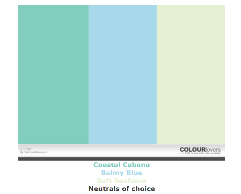
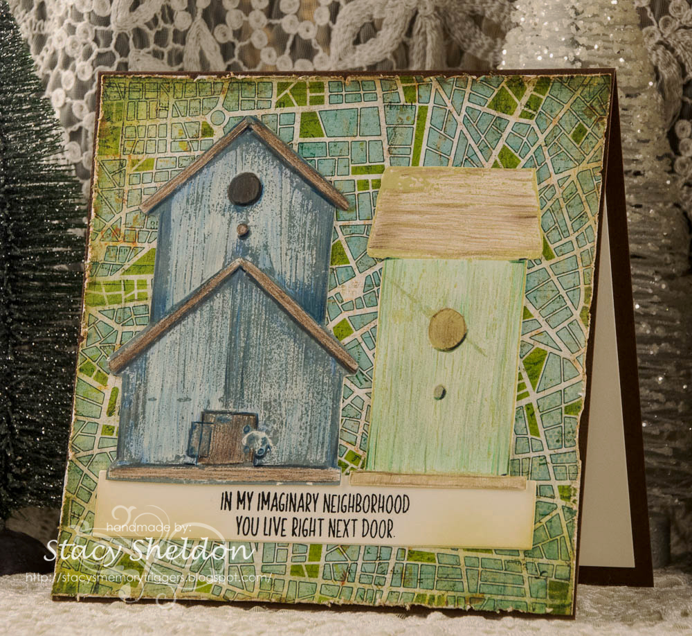
Showing posts with label Any Occasion. Show all posts

11.29.2024

Inspired by {the tin bin}

  Hello & Welcome, It's my turn to host the Inspiration challenge as there are 5 Saturdays this month in November and I am traveling today So, the ladies on the team are keeping an eye on things until I am online again. I knew I wanted to do something simple as it was just a busy week and that is just going to continue through the end of the year now right? Their store front can be found here. And their pinterest boards can be seen here. I seen this red house Ornament here in the thread at Splitcoaststampers. ( its the last photo in the thread) and I will have the links up and working after I return. And I loved that and started poking around in my birdhouse stamps. And I was like no no no, and I thought of these bitty almost salt box styled houses from the really old Memory Box village dies set and I had this Penny Black Immense Enjoy die sitting on the table along with this Christmas paper from Kaiser Craft and I thought, I really like this combo, The red texture paper here I think is from Hobby Lobby. ( its not marked the piece I cut) 

And I really liked the colors and thought they went with the primitive vibe of that house. I probably should have tucked in a bitty tree but, I really liked the browns, creams and red combo and I left it off.  seeing two of the homes would fit in the open space of the O here I decided to go with a from our home sentiment and of course I stamped it directly on that printed wood grain. crooked. yes, you knew that was coming right? So, I re-stamped it on a scrap of kraft cardstock and die cut it twice with an Impression Obsession die from the deckled set. I did cut it twice to get it trimmed down on the ends to be more closer to the edges of the stamping. The edges of that piece were inked with some DOX vintage photo ink. And that was about it but, I decided it needed a little more contrast and used a scrap of the red texture for a mat. This one is A7 in real life. That's about it from me, I hope you are doing well & enjoying this long weekend if your in the states. If you'd like to play along with us you can find this challenge here at SCS. Thanks for stopping by.

7.10.2020

Pretty Leafy Colors


when I seen these colors I remembered them as what you see below haha...

Which turned out really cool and I love this but, I think with the wood grain printed paper behind the water colored leafy frame die cut that it made it a little dark, so I did use more white with the combo in the second card seen below that was combined with this weeks sketch challenge. This Slimline foliage die is from Trinity Stamps and this sentiment is from the Stampin' Up set called Simple sayings 2. I did use some Mission gold and Daniel Smith watercolors on that. ( it was originally the same shade of green as the mat under the wood grain print.) this one finished out at 4" x 9" in real life and the leaves are not glued down so it does have some depth to it.


The second trial at this week's colors combined with the sketch seen below. I think that Kris sent me this Cornish Heritage Farms backgrounder image a very long time ago, I know I missed out on the chance to buy it before they closed and I no longer remember what ink this may be, so I have been hoarding it a long time.
The tree's and smaller frame are from the Memory box Pine forest frame set and the second frame is the drop piece ( spacer) that ends up you use it to space the second stitched frame out from the smaller one but, I saved the drops and just used them both. The sheer dotted tulle is from Stampin Up and the sentiment here is from the Mama Elephant holiday messages set and that is up on some foam pop dots.


These tree's were pained with mostly Daniel Smith watercolors and one mission gold green over the top of that and then when the paint was dry I did add some crystal stickles glitter glue to some of the boughs. ( this was shot wet) The base on this one is soft seafoam and the card is A2 in real life.


A glance at the sketch. (you can find that challenge here)
That's about it from me, thanks for stopping by.

7.07.2020

A catch up post


evidently I did not post these when they happened but, a while back the inspiration headed to unsplash where I found coffee inspiration that jump started these two cards. the cup diecut is from Penny Black, the sentiment here is from Riley & Co.


Same thing for this one ( tool wise) on this one the cup was cut from a previously pained with acrylic paints piece of scrap cardstock.


The featured stamper challenge went to Teresa's gallery a while back where I found this fun card to jump start mine. The umbrella is from Rubbernecker and the sentiment is from My Favorite Things.


recently the clean and simple challenge was to add stripes, so these are scraps of soft seafoam from when I made all the divider cards for my unmounted stamp bins.. The sentiment is from
Hero Arts and the flower is a Tim Holtz diecut on watercolor paper colored with markers.


The technique lovers challenge shared this fancy fold back in May and I had recently received this Stamping Bella curvy doctor girl in the mail and decided she would "fit" in the center pop out space. the sentiment here is from Impression Obsession.


Last Thursday Toni had an add some dust to the ways to use it challenge and my "glitter dust" was in the pen forms on this. the stamps are from Whipper Snapper and the bling is a clear wink of stella with a stardust gelly roll pen.


This is a combination of last week's sketch and the free for all challenge ( which was to stamp two different background stamps in two colors on top of each other) so, the dancing leaves die is from Penny Black. the sentiment is from Clearly Besotted. the fine lace background was stamped with bundled sage distress oxide and over the top of that the French script was stamped with forest moss DOX but, I think that the script ended up looking a little brown after so, the stamp may have been not perfectly clean when it was inked up. there is also some antique linen DOX inks on the edges of things here and the printed paper is a really old one from Basic Grey.

and this cleans out my to be uploaded folder which tends to annoy me when there are too many things waiting for me to get around to blogging them. I think I find it easier to do single card posts when its a card I shot multiple photographs of different angles of. such is life. I hope you are doing well and staying healthy, thanks for stopping by.

4.20.2020

Inspired by {tags}

Not too long ago I picked up a new computer which ended up being an exercise in fustration trying to remember and reset so many passwords. and one of the sites that was the hardest for me was pinterest. but, I finally got into my real original account and I decided to look at things I had saved. and one of them was this board from Linda Shulist that has incredibly 6K+ tags saved to it.
and I started scrolling through that and found this tag from Stamping Mathilda, which just made my jaw hit the floor. and lead to me digging out every piece of clear packaging I could chop up in my room. ha ha

 And so this is what came from that. The bird is from Judi Kins, the diecut leaf is from sizzix Tim Holtz, the clear packaging was from some Sizzix steel ruled dies I picked up both for Christmas last year and some after Christmas holiday sales in January.

 And I started messing around with various embossing folders and tag dies.  but, the thing that kept annoying me was that packaging, its really scratched so the tag when held upright you see all the scratches really well. And then I thought OK just make them distressed and vintage feeling not an issue. but, I really like how the totally clear bird tag turned out so, I had also received a few bottles of new Alcohol inks in the mail last week and thought ok, if you add a bit of color it will hide the scratches. And so it did.
 The sentiment here I added to the bottom of the tag with red liner tape and then used a second strip of cardstock across the back at the same place so that it hides the tape and it made the tag taller. ( this sentiment is from Hero Arts Snarky Christmas messages set, the large snowflake is a Sizzix die the tiny blue one is from either lawn fawn or lil inkers ( I have both of their sitched snow sets and they are similar in scale) The tag was embossed with an Anna Griffin cuttlebug folder.

 This one the sentiment is from Unity Stamps and the holly/berries that are from the hero arts set called Holly Jolly, ( its dies made to cut a stamp set but, they work just fine for felt) The embossing folder here is from cuttlebug called goochie script.

 Now these are Sizzix dies that have a matching embossing folder. the one on the left was run through the goochie script folder and the one on the right was used with the folder that matches the die. the gold piece on the left was part of some frilly layered set I had cut a long time ago to get something out of the middle ( a spellbinders set) and I had saved this drop piece thinking it would be useful some day. the sentiment on these are from the Mama Elephant Merry Christmas Messages on the right and I am pretty sure the left is also a Mama Elephant sentiment but, my mind has gone blank.

This one I had cut the fa la la (Mama Elephant scripty) a long time ago from some cherry cobbler. ( the tree, Sizzix originals Christmas tree #2 die) is a drop piece from something I made years ago. you are getting the idea that  this batch of tags really went along the lines of what ever was in front of me was tossed on them right? I had used a gold leaf pen to trace along the edges of the star above and decided to add some gold to the berries of this holly embossing folder that was used on this tag. There is a bitty SU pine cone charm tied on this one at the top. I think the for you stamp is probably a Hero Arts one.  The two tags that are not finished yet really curled when they came out of the big shot so they are being pressed flat. That's about it from me so far, if you'd like to play along with us you can find this challenge here at SCS. thanks for stopping by.

5.31.2019

Inspired by {the Crown Prints}

This week Julie has sent us hunting inside the Crown Prints site which has some of the most adorable pastel animal prints I have ever seen and I came across this Pink Chevy and smiled from ear to ear.

 The Vintage Cadillac is from Prickley Pear but, I figured from the side view it has, it could totally pass for the vintage chevy in the IC shot. ( seen below) I stamped this real quick with some versafine clair nocturne on Solar white and colored it with two shades of pink pencils, one dark grey and a stardust gelly roll pen. The sentiment here is from the lil' Inker designs clean lines for the guys set.
I had earlier in the week thought it would be easy enough to mask off the car to give it a blue sky with some stencil or something. so, instead I gave it a printed paper sliver framing around the rectangle die I had used to trim it. The pink you see here is Stardream rose quartz? ( something like that, it shimmers)

 A closer look at the coloring. We got a new 7 week & 2 day old puppy yesterday and so, this is probably the fastest card I have made in a good long while. It's amazing how fast you can move while your fingers are crossed that the baby will sleep for 5 more minutes ha ha.

You can find this print here in the site and this challenge here in the Inspiration Forum at Splitcoaststampers. Thanks for stopping by.

4.14.2019

VSN {so far}

 Jeanette has a challenge to include a map on the project, so when I finally found a piece of map paper it had such a vintage color to the Minnesota roads map I ended up going vintage for the whole card. that old truck is from Hero Arts and the sentiment is from My Favorite things.

 Kim has a challenge to be inspired by the trip advisor web site and there are all these boxes with things to click on to go here or go there and I really had no where I wanted to go when I was looking at the site and I had seen this travel poster printed paper on the same pad the map paper came out of ( Carta Bella are we there yet) and thought ok do not over think this. that sentiment is from Paper smooches.

 Ann has a challenge about duck boat travel, so you needed a boat and a duck and my ducks are those tiny ones in the sky flying in formation... I ended up adding just a few pencil shadows to this after the fact but, this one squeaked by in the time limit because, I kept hitting the watercolors with a heat gun.

 Melody has a challenge to show some luggage. the one on the right is from Deep Red and the fancier bags on the left are ( unknown at this time but, guessing Unity) and that sentiment is Gina K.

 Lisa has a challenge to show shoes. and I still have no clue where I got this sentiment from but, the combat boots are from Deep Red. the topo map printed paper is from Kaiserkraft.

 Polly has a challenge to show what you do while you are in hurry up and wait mode while traveling and I drink coffee and watch people... the gal is from Unity Stamps and the sentiment is from My Favorite things.

Misti has a challenge to show a street legal vehicle ( for a road trip) and I have had this Crafters Companion stamp a long time now so, I googled old Route 66 signs and colored the sign that way but, the old signs the letters and numbers are white on the signs... and that ended up clashing for the red I gave the bike so, I may just add more red to the sign later... there is a bunch of stardust gelly roll pen and clear wink of stella on all the chrome too so this one sparkles in real life. the other sentiment are from the Paper Smooches set. and that's what I have done so far. thanks for stopping by.

4.06.2019

Inspired by {Tesalate}

This week's Inspiration destination Julie has chosen for us the Teaslate Beach Towel store.
The ones I had saved to play with were covered with leaves and blooms and the blooms won. 

 So, I ended up heat embossing this Stampendous peony panel on some Neenah white with SU pewter powder and coloring this with pencils. I cut it out with scissors and added it to a pre-made "pool" colored A2 Impress cardbase. The sentiment is from the Pretty Pink Posh thoughtful greetings set.
A closer look at the coloring and yes, I did bump the pencil into the edges of the embossed wells/walls over and over so, I ended up with colors a little darker than the towel but, I did get the streaky petal look I think.

The towel that inspired this. you can see it here in their store and find this challenge here at Splitcoaststampers to play along with us. Thanks for stopping by.

3.31.2019

Flowers in Chintz

This weeks featured stamper is Proudarmymomof2 and I happened across this pretty card and just loved the off the edge look to the framing.

 
So, to make changes I did flip this up to portrait and used a stitched die on the mat for framing instead of the raised embossing. I also switched the stamp and colors. The flowers in chintz is from Karen Lockhart stamps (retired) and the fabric trim I have had a long long time. ( I think it may be Making memories but, really I don't know for sure anymore) the printed paper is from My Minds Eye, the green is SU seafoam. and this one finished out at A2 in real life.

A closer look at the coloring, this was done with polychromos and prisma pencils on Neenah solar white. Thanks for stopping by.

3.30.2019

Pretty Colors

This week the color combo challenge is one that I actually own packs of all three colors card stocks.
and the colors are Powder Pink, Seafoam & early Espresso. with a side option of add a printed paper.

So, I colored this Unity Stamps (as we go along) bouquet with pencils ( polychromos & prisma pencils) This was die cut with a Poppystamps double stitched frame die. and diecut the Hero Arts (you are loved) with a Spellbinders labels trio die. And then when I got to the add a printed paper I found this chevron print from Basic grey that looked like the cardstock colors to me ( this actually looks better in person) and then when I added the watermark to the card shot I kept thinking the neutrals in that printed paper appear yellowish on my screen. (in real life this blends better) however after it was glued I decided there was entirely too much of the print for me so, if I were to make changes I would totally make that strip skinnier. This card finished out at 5 1/2" square in real life, thanks for stopping by.

3.29.2019

Inspired By {snurk}

This week Stef is guest hosting the Inspiration Challenge and she has chosen the Snurk store online.
When I first started poking around in the store I did the usual and looked at the linens and happened to click on a long version of a staged room shot for the bedding seen below and what struck me instantly was the bright purple flowers hanging on the wall and the exposed bricks and my mind was off and running. So, over the last two weeks I have managed to use both of the Floral images I have been hoarding for so long I had forgotten I was gifted with them, last week it was the potted Geranium. This week is the PSX Heather image that was gifted to me from Chautona Havig.

 I have never seen Heather growing but, I had assumed it is a shade of purples and greens. So, that is the way my mind went and my bricks are a little on the yellow tinged side but, I think you get the idea here. I did rub some Distress Oxide vintage photo and spiced marmalade over the embossed basic grey print to add more color to it, cut it out with scissors and then cut off one corner so I could have it peek out from two corners under the bloom.

 While I was pushing these pieces around I did play with having the flower hang upside down because I could have tucked the Gina K sentiment over the stamped floral names in the image and in the end I decided to leave it like this and tell you it is more along the lines of an inspired by piece than an true CASE. The flower was colored with polychromos & prisma pencils and the frame is a Poppy Stamps double stitched frame die, This is up on foam pop dots over the brick layer and this card finished out at A7 in real life.

You can find this bedding here in their store. And you can find this challenge here at Splitcoaststampers to play along with us. Thanks for stopping by.

3.22.2019

Ways to Use it


This week for the ways to use it challenge Cathy picked a theme of how does your garden grow... and I went with a fantasy garden. I have tried planting these Agapanthus flowers in my flower beds 3 times now, and every spring ~ nada. nothing comes up again for me. ( I had them in beds near the house hoping it would be warm enough for the tubers to survive but, I think it's just too cold here in the winter) because, those are also beds that I can keep the gophers from eating the tulip bulbs in. So, I was really tickled when I had seen Hero Arts had come out with this set recently. I stamped the leaves, stems & blooms with Distress oxide inks and colored that with some polychromos pencils. the background was done with some Soft sky and DOX ink in puddles that I kept mostly to the edges for texture, I did not get too close to the flowers so, that it would not run. This one finished out at A6 in real life. Thanks for stopping by.

1.18.2019

Inspired by {ETSY Birdhouses}

This week we are headed to ETSY to be inspired by all the different things you can find under the birdhouses search feature there. I found so many cool birdhouses. I was drawn to all the rustic versions of them and some fun shapes and colors.

 For my sample I started out stamping the birdhouse on the right with some Old Paper distress Oxide ink and used the first birdhouse below as it's color inspiration. and then When I started on the second one on the left I had thought I seen that church as blue and white. and I had stamped this in Weathered Wood oxide ink. they were both colored with polychromos & prisma pencils.
and after I realized I did change the colors of the second house but, I think it still gives you the idea. both of these are from Impression Obsession and the sentiment is from the Concord & 9th City Stacks set. The printed map paper is from Basic Grey and it finished out at 6" square on the textured Bazzill.

 This cute little door knob perch birdhouse can be found here.

And this Church birdhouse can be found here.  I just love these even though all the birdhouses in our yard are just plain unpainted cedar wood. I do have some painted ones in my Laundry room as "art" You can find this challenge here to play along with us, Thanks for stopping by.

A few Challenge cards

 On Sunday's the featured stamper challenge happens, and I came across this cool card from 
Lori seen here. I just loved everything about it, the tall shape, the pops of the red lady bugs, the fringy grass. So, to make changes, I switched all the stamps and moved the red from the bugs to the blooms and I intended to make a one layer card but, after I cut my cardbase I realized the printed paper I had stamped and colored was 1/4" an inch too short. ( I didn't want a mat) so, since I wanted a card that would fit into a regular business envelope, I decided to pull out my Martha Stewart fringe scissors and a scrap to add to the bottom. the ribbon is one from Micheal's a while back. This card finished at 4 1/4 x 9" when it was done, the coloring was done with polychromos & prisma pencils.

 On monday the try a new technique was to double stack your stencils so your biggest background window is the lightest color of ink and the stencil over that gets a darker color.
which looked really cool in the samples shared ( there is a tutorial here) and so, when I got home and looked at my stencils, most of them do not have big hole patterns. I tend to collect the skinny detailed texture ones so, these roses had some of the biggest window holes I could find. which for a few moments made me think I "need" more stencils but, the truth is I don't really use them enough to "need" more stencils. (yet haha) and I do like how this turned out. the sentiment is from an Impression Obesssion set with a pair of stick people and one of them is holding the others back stick)
its name is "my friend".

now this was just a funny thing, I am still sorting stamps and this fish stained glass window ( IO) was on the table to be sorted and the Clean and Simple challenge this week is to do something round. and so, I colored this on a sheet of Neenah (smooth) white cardstock with some zig clean brush and spectrum aqua marker and added a little bit of crystal stickles to the fins and then. ( I had been sorting stamps) evidently I got some ink on my hand and didn't notice until the fish was colored and the card base ( this started out as a one layer card) had this smear. so, I set it aside and Tuesday I came home and cut the circle out with a Memory box stitched circle die and tucked in the Hero Arts sentiment. this one is A2 in real life.
Every year I think this is the year I am going to be one of those bloggers who does each card it's own blog post, and every year it never happens... and somewhere I read maybe yesterday that one of the days this week was the day people throw in the towel on their new years resolutions and I laughed and laughed. Thank for stopping by.

9.16.2018

Inspired by {QiQi Gallery}

This week the Inspiration hunting has commenced here inside the QiQi gallery at Etsy
You can find this challenge here to play along.

So, I found this piece ( seen below) and loved every single detail, the colors the textures. and I set out to try this with alcohol inks and embossing powders. the old copper I have is some really old large granular stuff from Stampa Rosa that is similar to Ultra thick embossing enamel. 
( it did not go well with Yupo paper) 
So, starting over I came up with a piece of blues and greens I loved and cut two squares small enough to get two cards from the sheet.

 This is the first one and I used a piece of Shimmery stardream Copper for a raised frame on some pale aqua shimmer base and this one is 6" square. and then it sat like this for a while because, I just love the background and did not want to take away from that.

 So, I picked up the scraps and did this 5 1/2" square version with the other piece. the base on this one is shimmery stardream copper. the blue frame on this one is DCWV and the sentiment panel is from Stampa Rosa and is up on foam dots.

 And then when I went to put them away I happened to see this previously stamped Hero Arts (you're beautiful set) sentiment on the SU sea foam banner and thought those colors work and wiggled it in and called it done.
So, the happy part is the background is still mostly visible.

The beautiful artwork that inspired these cards can be seen here in the QiQi gallery. If I could find a blank space for this it would totally be on its way to me already. :) Thanks for stopping by!

8.04.2018

Dare to Get Dirty {day 1}

Today kick's off Dare to get Dirty 2018. This is a thank-you fest of inspiration, special tutorials and sponsored challenges that are held for Fan Club Members at SplitCoastStampers. 
You can find out more about how to join the fan club here.  
Because, these are special for members challenges I cannot tell you what the challenges happen to be.
And the Master list of all the challenges here if you are like me and work out of order.
 
 
This one the stamped cup is from Darkroom door and that sentiment is from Whippersnapper.
 And so, since I knew that Julie had picked this Brit & co. site ahead of time for this week's inspiration destination I did combine that with one of today's challenges hosted by Dina ( seen here)
From the inspiration I mostly focused on the colors and the theme of the story here about (*gasp!) giving up coffee... (one thing I am certain about is that is not happening here)

 This is a peek at the IC photo that inspired this card and you can find that story here on their site.


I thought it was pretty.
 This was done for my own challenge found here.  The jar of wishes is from Unity Stamps and the sentiment is from Stampin' Up! itty bitty greetings.

 This was done for Jeanne's challenge found here. The Noel is a Stampin' Up! stamp from the Many Merry Messages set and the tree diecut is from Penny Black called Christmas Elegance.

 This was done for Lydia's first challenge found here. The geraniums are from Karen Lockhart and the happy birthday I really think is SU but, I cannot find it in my evernote program. so, its something to look for (later)

 This was done for Mary's challenge seen here.  This one that sentiment is from the Hero Arts June 2018 kit of the month and that seagull shadows is from Impression Obsession.

For Julie's first dare to get dirty challenge seen here.  This one those fern die cuts are from Spellbinders and that sentiment is from the My Favorite things set called anything but basic Birthday greetings.
Thats about it for me, I do not have everything for tomorrow done as of yet, so I will be playing along live later in the afternoon, thanks for stopping by.