4.30.2023

May Dirty Dozen Christmas Card

 It's that time again, the first of the month when the new theme rolls over for the Dirty Dozen Christmas card challenge. You can find this month's prompt here in the special forums set aside for Fan Club members at SplitcoastStampers. 


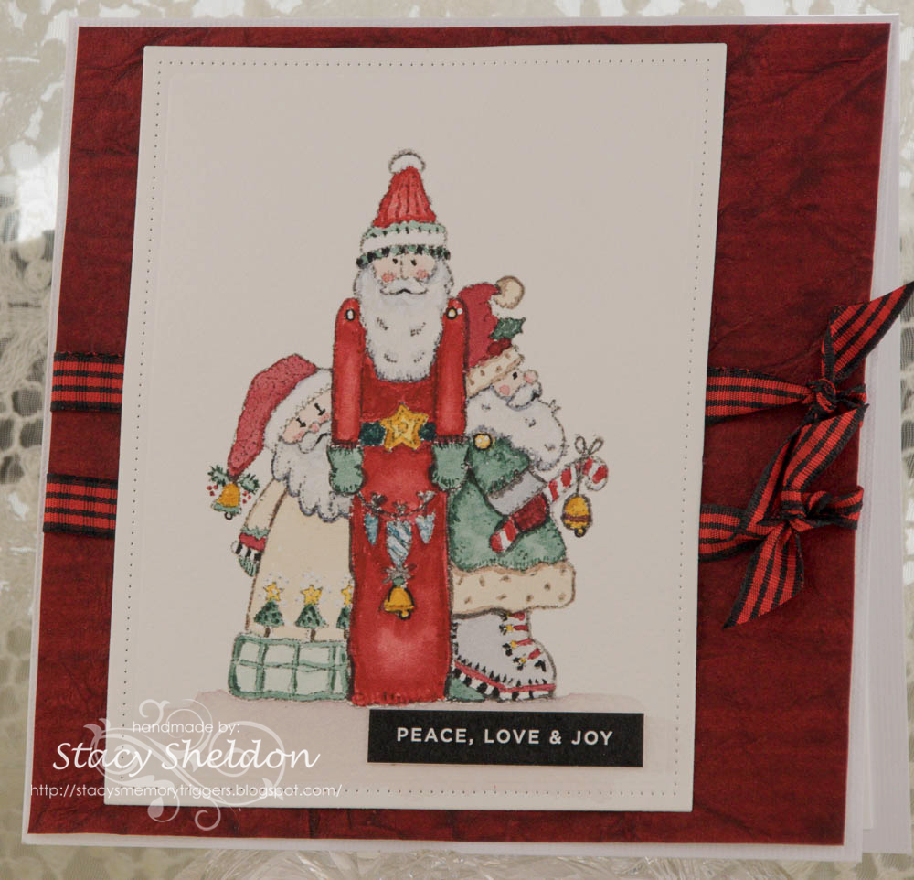
I have spent a many a happy hour looking at and for old retired Penny Black stamps on line the last few years after I realized they were not selling the old stamps anymore or any stamps on wood blocks. This one is "Santa Club" #1238K from 1998. It's my most recent one to land on my table here and It just makes me smile to see. I did stamp it with some Versafine morning mist on Arches cold press watercolor paper and painted it with Daniel Smith watercolors. and a bit of white gel pen on the button holes and black and white places.  This panel was cut with a Studio Katia Darling ribbons & dotted frame die. The sentiment here is a reverse printed one from Simon Says stamp. the gingham ribbon is from May Arts. the red crinkled paper is from the paper studio and its finished out on some textured white bazzill at 6" square in real life. Just a simple one. there are so many shades of red on this that it really did not photograph well. I have a harder time shooting digital red's than any other color so, its not so contrasting in real life. That's about it from me, I hope you are all continuing to do well. Thanks for stopping by.

4.28.2023

Inspired by {great big canvas}

 This weekend Ardyth is guest hosting the Inspiration challenge and so, I punched in flowers and I found these really loose watercolored poppies. And I thought that would be a good challenge for me as Loose painting is something I have to work at. So, when I went to do it, I cut a sheet of Arches cold press cotton watercolor paper to 6" square so I could have some wiggle room and I had some big brushes on the table and left over paint in ( all the palettes) so, instead of red poppies I did change the color to a more pink-ish shade. 


I used a size 16 round, a small mop brush and a size 1 script for the stems, This is first layer of paints.

got it wet again and added another round of paints ( Daniel Smith)
and again, more paints with some more splatters. the white is Bleed proof white from Dr. PH martins. I did when this was dry run it through my big shot for a while to try to press out some of the curves it got drying just laying on the table. I think this is going to become a Mother's Day card so the sentiment will go on the inside. If you'd like to play along with us you can find this challenge here at Splitcoaststampers.


4.25.2023

Watercoloring a Loose Hydrangea

 This week Brenda has shared with us this Kristy Rice video doing a hydrangea with a single brush seen here on YouTube. So, after watching the video all the way through ( her request as you watch it) I picked up a scrap of cotton watercolor paper and an angled brush and did this.


 and I decided the bristles were just too short to do the curves so I flipped that sheet over and grabbed a size 16 round brush as that was her other suggestion for a brush to do this with.

So, I thought OK this brush is OK but, the scrap is just too small so I pitched this sheet and grabbed a scrap of Strathmore 400 series paper.


and started over. 

added another layer. and switched to a 1/2" oval wash brush as it has a fine point and a slanted type side to the bristles.

and another layer.


and started dragging some of the paint around under the leaves and flower head as it was just too starkly white around the loose flower so, more paint and more splatters and more water.

I had considered cutting the sheet down to much smaller and then decided to add the black wide frame so that it could break it up a little, found this silly little snarky printed sentiment from the AALL & Create SHARP TONGUES # 4 pack doodled around the edges of that with a black micron pen. and popped the frame ( time for tea wide stitched frame) up on foam pop dots and called it good. the base is an A7 pre made base from paper source. If you'd like to play along with us you can find this challenge here at Splitcoaststampers. Thanks for stopping by.


4.18.2023

Watercoloring simple landscapes

 This week it's my turn to host the Watercoloring on Wednesday challenge at Splitcoaststampers and I have chosen this duo of simple landscapes from MarenaArt as I loved the lavender field one.


what I loved most particularly about this video is how she did her sky in them. ( first round of paints wet)

second round of paints, and at least the sky shows up better dried I had worried I did it way too diluted to get any texture while it was wet.


I really thought oh, there is not enough paint on it during the second shot as I glanced at the phone so, I did immediately put on another layer and first round of splatters.

and some white bleed proof white splatters and then I thought oh, the front hills should have more green to them so, that received another swipe of paint also.


I did manage to get some of the splatters in the sky oops. 


But, I also really liked how it turned out even with flower splatters in the sky so, I trimmed it down and mounted it to some SU blackberry bliss. The sentiment here is from Impression Obsession stamped with monarch versafine and die cut with a labels 8 die. This one is 5 1/2" square in real life. That's about it from me, if you'd like to play along with us you can find this challenge here at Splitcoaststampers. Thanks for stopping by.


4.15.2023

Inspired by {Belk}

 This week it's my turn to host the Inspiration challenge and I landed on the collection of pins from the Belk Store. ( they have one of these in the mall where J lives & it is a nice dept. store) 

at any rate the lady who needed custom car thank you cards a while back also needed a housewarming and a Coastal Vacation thank you cards so, I seen this plaque inside the Store and thought ah ha. 

and when I started digging through my home stamps this old one from Stamps Happen caught my eye. 

So I stamped it twice once on watercolor paper and then again on some printed lacy looking paper and cut the center out with scissors as the ivy border just did not want to stamp perfectly on the lumpy wc paper so. I did use the color index sticker on the block as a jump start and I realized after while the paint was drying this has a lot of pink on it. So the browns are in the printed Basic grey paper and the close to cocoa cardstock that has a bit of a pinkish tint to it to my eye. I did trace around the sentiment with a micron pen and the congratulations is going on the inside. This is A7 in real life and the challenge is hiding here if you'd like to play along with us. 

Her vacation card I ended up making off of next week's IC  and so you will see it soon. and then after she was told those two cards were ready she needed one more for her old Conductor who is receiving an apple award soon. This one the congratulations is from Tim Holtz, and the music notes are from an old Sizzix originals green die. This one is 6" square in real life. the request for this one was just music on the cover and congratulations. the thing that gets me about this Darice embossing folder is. ( I do not read music by the way) it looks like it has notes right side up and upside down on it. and I cannot tell if that is supposed to be that way or if its just one of those artsy things. Anyways cross your fingers she likes these I did this coming home early with a headache and have no time to re-do it. I hope you are all doing well, Thanks for stopping by.


4.11.2023

Watercoloring Coneflowers

 This week Linda has shared this video here on YouTube from Paintinghyun about doing some wet loose cone flowers.

So, I think as I was doing this I think this works better if you are using a larger piece of paper. I think some things are easier for my brain to shrink then others.And I found this to be a challenge actually.


So, first layer of paint wet, I had drawn these tilted so the perspectives were a little more like the video but, as I added more paint and water to it, It was drying before I could move the paint around this time. It's a funny thing when the weather changes. it really makes a difference.


how that paint dried, I really did not think to much about this and almost tossed it in the discards pile but, there was no time to really start over. 


So, I added more paint over the top of it. ( that tends to work with other things) but, for this particular piece I felt like the whole time I was looking at it, I either should have made these flowers much smaller or made the paper much larger or both. so, at this point this is where I stopped and I may try this again in a more real style the loose thing is hard for me. I did use a size 8 brush on this and the paper is about 4" by 4 1/2" ish. ( its kinda curled at the moment)


So, I decided to give it a second chance as I still had these colors left over on the mixing palette. this one is a 6" square piece of Strathmore 400 series watercolor. 

Moving to a larger piece helped I think. but, I did have the same its drying too fast situation happening with the not as good grade of paper. 

Shot this one off the table and it looks a lot darker from this view than real life. It's also close to sundown here. At any rate I think I would like this better if I had tried a few different things regarding that background it just did not take the splatters well as it had taken too long and re wetting it did not go over that well either. 

 If you'd like to give this a whirl you can find this challenge here at Splitcoaststampers to play along with us. Thanks for stopping by.

4.07.2023

Inspired by {Dans le Lakehouse} pinterest boards

 This week Kia has shared the link to the Dans le Lakehouse boards and site and I had not looked long when I chuckled to see a "backyard Chickens" boards where I seen this floral chick and it had to my mind a folk art vibe going on. And that made me think of those old folk art paper chickens Michelle used to do on Splitcoaststampers a long time ago. ( I have done this before ) and I thought the shape of the bird would work doing it this way. 


 So I started out free handing a bird shape from memory. ( all those links you see above I hunted down after the fact because, by the time I had gotten this far with it from memory I knew the bird was off a little but, could not remember why. I kept tinkering with the idea of adding "straw" under the belly. and then after I shot this. ( the panel to the right is what was glued on the inside) I realized looking at the old chicks that the hearts for the chin and crown of the head were missing. but, at this point I also had the eye and beak glued on so, I just worked around that. 

And finished her out like this. Both of those sentiments are from Art Impressions done with some Acorn Versafine ink. The heart wing is from an old yellow Sizzix originals primitive heart die and the small ones on her face are from a Mama Elephant frame set that had a heart and the Ellen hutson primitive hearts set. This is A2 in real life. the woodgrain and dots are scraps and the textured brown is tea stained leather from Hobby Lobby. the lace is vintage and then I had to laugh as one of the original chicks has that same lace on it. I thought the loops played with with the dots that were chosen for color more than shape. But, I intend to give this to hubs hunting buddy soon and he has mentioned in the past when I have done floraly things for him they are not real "manly" so, I figured aqua dots were a better choice than flowers. That's about it from me, if you'd like to play along with us you can find this challenge here at Splitcoaststampers. Happy Good Friday & thanks for stopping by.


4.05.2023

Painting Spring Sheep

 This week Kia has shared with us this Karen Rice video of Spring sheep here on YouTube. I have to be honest, a year ago I probably would have been too intimidated to even watch that video, so today I have to tell you that its not as hard as you might imagine when you view the finished piece she has. ( and she has other season's of sheep so someday I am going to watch them also I think) Anyways, I watched the whole video through from start to finish this time and then I sketched a row of sheep similar to what is shown in the video with a graphite pencil that dissolves in watercolors. 


I messed up the legs on the sheep on the left's front but, I had remembered that she just painted over them anyways. And the thing of it is, if your pencil dissolves, you will have to just make up legs anyways. 

I used my largest ( newest) brush a 16 round to do the water layer on the paper. and then used the 8 to start painting. These are Daniel Smith colors. 


I did give the table salt a try on that first layer of paints. 


when the salt came off, it did work a little bit. I didn't make big clumps of salt for lots of resist though so, its subtle. and or the paper had dried a little too much in the tree's to make it work up there by the time I had paint on the foreground. 


When I started adding my tree trunks I had some challenges with that having some of the trees continue down into the scene (under sheep bellies) so, since the colors were pretty similar it gave my sheep a million legs ha ha. 

The white splatters here are Dr. PH martins bleed proof white, off to the side are all the brushes used on this painting. 

So far its just like so, an A7 Piece of arches cold press cotton watercolor with the scene on it. I have not actually made it into a card front. If you'd like to play along with us you can find this challenge here at Splitcoaststampers. Thanks for stopping by.


4.01.2023

an Inspired by Playing cards VSN challenge sample

 I am hosting one of the VSN challenges this time around for the theme of what's on the menu seen here at Splitcoaststampers. ( mine will go live later this evening) and I knew that Julie had picked the playing deck cards site. and knowing what all the VSN challenges were I knew that Sharon had picked a do left overs challenge. So, I have been letting my scraps pile up in anticipation of having a good choice to sort through. 

Knowing the theme was foody I decided to put in a few different ideas inside the cards site and finally went Coffee where I hit pay dirt with these cards seen here

So, I grabbed this Impression Obsession big mug die set because, I have not played with it before and started cutting up some of these scraps to get the mug.

I knew I had this recollections "kraft" that I keep calling paper bag because, that is what it looks and feels like in person. the white crepe and tea stained leather are from Hobby Lobby. the cup base is some Chatterbox, the plaid here is from Bazzill called warm flannel. the red tiny tag was cut from some basic grey and the top of the cup is on foam pop dots as the textured scraps are kind of lumpy. The base of this is some shimmery red from paper accents. and this is A2 in real life. The Hello is a sticker from Tim Holtz that has that feel of a thin dymo label tape to it. You can find the Inspiration challenge here.  And all the VSN challenges here. Thanks for stopping by.