1.31.2023

Dirty Dozen February card sample

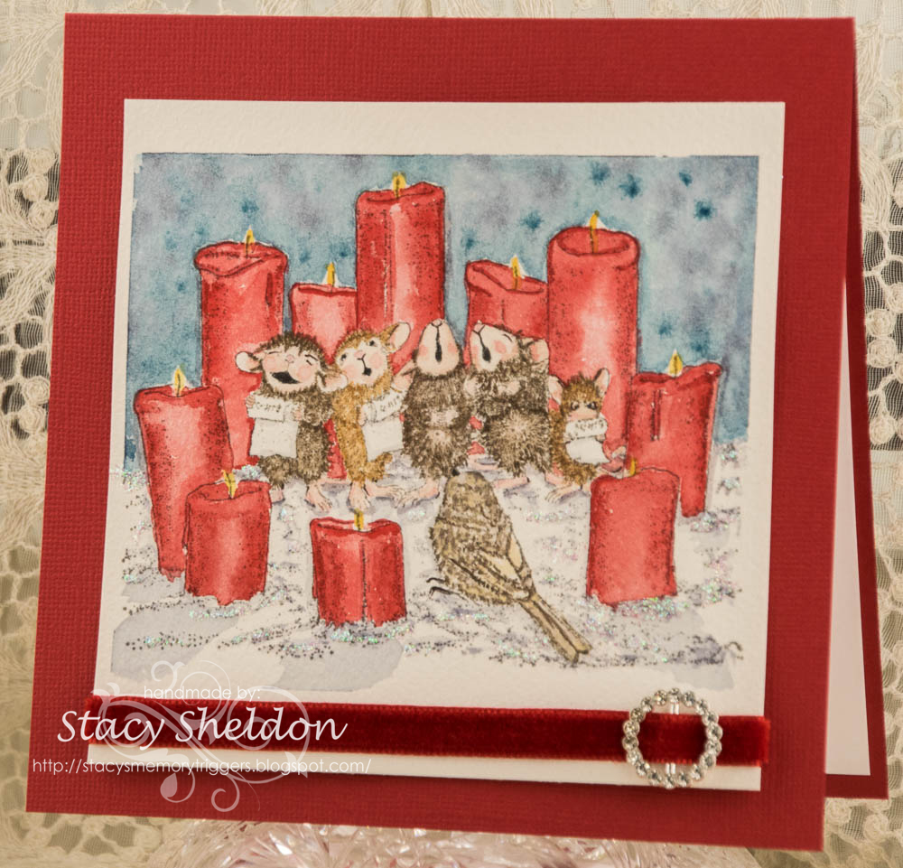
 Painting This one was a longer process than I thought it would be. (It's been 20 some odd degrees colder than normal the last little while so, paint takes longer to dry) I picked this stamp to use for this month's Dirty Dozen Christmas cards prompt found here inside the special forums set aside for Fan Club members at Splitcoaststampers. 

I stamped this Stampendous Candle Chorus House Mouse stamp with Versafine grey ink on Arches cold press wc paper and painted the first layer of "sky" hoping to end up with a night sky. 

This red is Windsor & Newton red. ( it is really red to me, the darker shades of it has a smidge of green mixed in) added some shadows to the snowy ground. ( Or I think it is supposed to be snowy ground, that sounded better in my head than dirt) :)

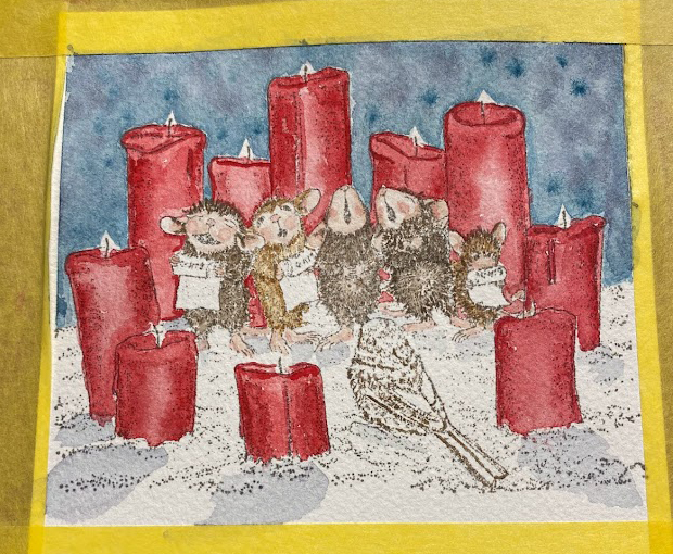
another round of paints on the candles, sky and a bit on the mice.

more paint on the mice, bird, wicks 


 I probably could have kept adding paint to this for a couple more days but, I needed the sample to go live tonight. So, this afternoon after work I put some stickles glitter glue on the snow. 


I had intended to stamp an old PSX candle sentiment on the inside but, that stamp is being camera shy and I decided to open this Simon Says Stamp Christmas Blessings Stamptember set I had picked up last year and have not inked as of yet. (yes, I probably have more sentiment stamps than images... but, that does not stop me from buying more)(and its not one of the sold out sets if you are interested)  and then today I had some happy mail. 


My friend June gave me some of this Tim Holtz velvet ribbon as a gift and I had googled ribbon sliders one day, I know I have some plain Making Memories ones that are like silver ( those are also hiding) but, I found this pack of hearts, squares and circles on Amazon a while back and they came today. I was hoping they were going to be just a tad smaller than they are to use with this velvet but, this does not look too big. So, some of that made it onto the card front too. I have heard of people using alcohol inks to change the colors of these but, I just wanted the sparkle.

The velvet is so thick though, that wrapping it around the wc paper, it does not allow the wc paper to hit the front of the card base on the bottom so, I am debating about putting some double sided foam tape under the wc paper between it and the base. ( the thing is with it being so cold here and the plastic content in Bazzill papers, I have a little bit of wiggle room for moving things.) if it was hot I would not even try it. That's about it from me, I hope you are doing well & thanks for stopping by.


Watercoloring Valentines

 This week Kia has shared with us this video from Maria Raczynska, that has 3 different Valentines day card ideas in watercolor. I did choose the middle one with the negative painted hearts and stitched doodled looking hearts between them. So, I started this with stamping the painting bunny by Ann-ticipations on some cold press Arches watercolor paper. and I did free hand the space where the heart would go with the paint brush. ( and I probably should have stamped the sentiment before I painted the background, as the one I chose from Impression Obsession is a retired rubber one and I got the I right in the shadow of the heart where the brush was. ( you know after all the paint was dry ) 

first round of paints wet.

more paints, tried making the ground be a shadow-y purple-ish shade to not distract from the bunny much. 

When I drew the first tiny heart with the bleed proof white I had left it open and I quite liked that effect and then I made my stitches go straight down, and then I add-libbed some leaves... and that made the rest of them become a stitched quilted look of blooms growing along the bottom edge. 

A look at the inside. that sentiment is from Riley & Co. This card finished out at A7 in real life. I am still on the fence about all the purple in the background.  ( I think it makes the bunny blend into the background too much.) but, that's OK You can find this challenge here at Splitcoaststampers if you'd like to play along with us. Thanks for stopping by.

I just mounted this flush to some textured dark pink Bazzill which finished out at A7 when it was all said and done.


1.27.2023

Inspired by {Mud Pie}

 This week Amy has shared with us the Mud Pie site & Pinterest Boards where I came across this pin on the same weekend that had started making "Galentines" cards. (it's the day before Valentines to send cards to your gal pals...) (you'd think it would be the day after so that candy would be half price lol...)

Okay back to the card. I had started out flipping through my stamps with "hearts" or scenes with hearts that I could wiggle into becoming "galentine" notecards more or less so, when I seen that baby boy's birthday party color combo I had just seen this Stamps Happen Cat & Hearts Stamp where the index sticker has a mostly Patriotic color combo on it. 


So, I stamped one off on some Arches cotton watercolor paper and painted it with Daniel Smith watercolors ( the red is Windsor & Newton red) tucked in the sentiment from the Taylored Expressions Love everywhere set. The red textured layer is from Provocraft. The stripe print is from a Park Lane pad. The chevron ribbon is unknown as is the red fiber & tiny heart brad. I did use real sewing pinking shears on the water colored panel as it just cuts better than the "deco" scissors. I have a pair dedicated for papers in the drawer. And I think this turned out pretty cute. ( even if it does not look all that much like the shot that jump started it) That's about it from me, I hope you all are doing well. If you'd like to play along with us this challenge can be found here at Splitcoaststampers. Thanks for stopping by.

1.24.2023

Watercoloring Mountain Reflections

 This week Linda has a video for us to try on youtube from Julia Lis Art doing a mountain scene reflection.

So, it starts out with wet the back side of the paper then the top then start the base layer of paint and let dry. ( this is supposed to make the paper not warp)

Yeah, so this is first layer of paint dried. at this point I decided to just keep painting on the top of the paper and did not bother to wet the back side again after that first round.

Second layer of paints.

Evidently I did not shoot the other layers of paint as they were happening. one thing about this was there was an add more trees to the beach and I did have too much water on the brush that round so my closest trees ended up as a brown blur. ha ha. If I were to try this again, I'd probably make mountains that look more like what I see out my window. I thought the blue mountain was hard because, I do not have a visual in my head for what it "should" look like. So, this was a memory game thing from what I remembered about the video.

 The sentiment here is from Hero Arts, This was stamped with some versafine after all the paint was very dry. The base here is something aqua blue ish from Hobby Lobby in an A7 size. We did give this to his dad for his birthday today and he seemed to like it. 

If you'd like to play along with us, you can find this challenge here at Splitcoaststampers. Thanks for stopping by.


1.20.2023

Inspired by { Frankie Print Co}

 This weeks inspiration destination was suggested by Angie Bode (ohmypaper!) And that was such a help to me. While I was poking around in their Pinterest boards I came across this color combo and thought Christmas. I know right? ( totally not what I would do for Christmas) 

 and then I added in a POP of Red. and thought ok that is too much red.

I had recently decided to take a chance on a generic embossing folder sold on Etsy and Amazon. I do not know if it is a knock off stolen design or not. ( I spent months before I plunked down the money looking through known mfg sites for something similar) the closest things I have seen are from a co. called Do Crafts X cuts. ( they print the black on the top layer of their folders and do some in Square formats )

So I ran that sheet of printed lace paper through it in the big shot and it ripped the paper. so, I used scissors to remove the wonky scallops off of it and just used the raised stitches as a frame for the Inky Antics Snowman with light strand from Tammy DeYoung. I did paint him with watercolors on that printed paper. Added some antique linen and Vintage photo oxide inks to the edges. roughed up the edges of both it and the star print under it from the Be Merry pad by Couture Creations. The base is Bazzill and the Sentiment is from Altenew Holiday tag sentiments set done in Versafine Pinecone ink.

 
and the turned around it did it again. This version the snowman was stamped on some Arches cotton watercolor paper as I had debated paper piecing it onto the image above and decided at the last minute not to. The sentiment on this one is from the Papertrey ink Just believe set. the green lace is vintage, the burlap string is May Arts the green printed paper is from the Maja Designs Traditional Christmas pack. The white paint on both of these is Dr. PH Martins bleed proof white. 
This one is A6 in real life and the top one is 6" square. You can find this challenge here at Splitcoaststampers to play along with us. Thanks for stopping by.

1.17.2023

Watercoloring Red Mugs

 This week Brenda has shared with us this tutorial on YouTube by Sisa in Wonderland. The video has her drawing her mug, with a tower of whipped cream on it and a star shaped cookie tucked on the rim. and I loved the colors but, I knew looking at it, that it would take me forever and a day to draw that. I also knew I had dies that had not cut a single thing yet, and in my head it sounded like hey, you can paint this and get all the details on the die cuts. win win. ha. 


The mug shaped tags are from Hero Arts, ( two piece mug tag) the cookie stars with icing pattern on the bottom are from Stampin' Up frosted gingerbread set and the larger mug on the top right corner with the candy cane is from The Ton Christmas Mug. these pieces were all cut from Strathmore 400 series wc paper I am trying to use up. 


First round of paints, they did warp right up. 


It's kind of funny just how much they warp when wet on this paper. it has almost a resist to it. ( not cotton ) 


more layers of paints. still wet.


So, I have a thing for Rae Dunn Mugs, esp. the red ones. and I have this sentiment set from Maker Forte that has that long tall farmhouse almost look to it called build a modern Christmas. after this layer or paints were dry I did stamp the words on with some Versafine Nocturn. and it really resists the watercolor paint also. And it took FOREVER to dry. I had the bright idea to glue on the creamy tops when I thought they were dry and transferred the black ink all over the cream and the red cups. So, they did received a couple more layers of paint after this. and I decided to add the words to the big cup and a few layers of paint on the center of it after stamping. the ink still resists the paint. either way stamp over the paint or paint over the stamping. Oh and the cookie with the iced frosting layer has been set aside into the use it up someday pile. ( it didn't mimic the what is being taught in that video so much) and because of that I also resisted the idea sprinkling some chunky glitter into the whipped toppings too.

A closer look at the painting on the larger tag. The tag base here was cut with some Recollections printed wood grain and a piece of thin white to back it under the mug from the largest tag in the Essentials by Ellen tag trio set. The whipped topping is up on foam dots so there was room to wiggle that cookie into place. The tag reinforcer hold diecut was from the spellbinders shortie tags set. the red sheer is from Stampin Up and the textured gingham is unknown. the iridescent cord is from May Arts.  


 The white on the cookie is some Dr. PH Martins bleed proof white. I have finally after all this time figured out not to put so much water in it so that it can dry 3-D ( yes, that is a thing) 


The red burlap string & iridescent cord on these is from May Arts. I have not decided if I want to tie on smaller tags with name to them yet, so I cut it a little long and will tuck all of these into the pile of Red & White tags I have going on building up to this years Big Day. If you'd like to play along with us you can find this challenge here at Splitcoaststampers. Thanks for stopping by.


1.13.2023

Inspired by { Jodi McKee's Pinterest boards}

 Hi, this week Kia has shared with us Jodi McKee's Pinterest board collection that starts here. And on her Table Top board I seen this. An interesting side note, I am not in Canada and Pinterest made me sign in again to see her boards. And it does say "CA" in the pins I did look at and save.

So I let the paper do the heavy lifting and made this.

The printed paper has foiling on it from a Recollections Pad called Gilded Ink. I had diecut the print with a sizzix Tammie Tutterow die called Shortie Tags, The banner stitched tag tied on the top if from the Impression Obsession Anna Wight set called Small tags and the sentiment here is from the Penny Black To You stamped in Versafine warm breeze. The ribbons on the top are unknown and have just a hint of gold in the skinny pink one and then the gold elastic is from Stampin' Up!. If You'd like to play along with us you can find this challenge here at Splitcoaststampers. Thanks for stopping by.


1.10.2023

Watercoloring a grove of cherry blossom trees

 This week Angie has chosen a video from Harriet De Winton on doing a perspective with Cherry Blossom trees. 


I did tape mine down and I probably have a little more paint than I was supposed to but, I really enjoyed this one and like how it turned out. I did fling in some birds to the sky at the last minute before I walked away from it.

I used the Misti to add on the sentiment from Impression Obsession ( a bunch of times) as I do not have good luck with inking sentiments on watercolor paper. This painted panel was cut out with a spellbinders 6" matting basics die ( not sure which I have both the A & B sets) and the base here is some textured Bazzill that finished out at 5" square in real life. You can find this challenge here at Splitcoaststampers if you'd like to play along with us. Thanks for stopping by.


1.06.2023

Inspired by {Vintage Graph}

 This is a round about story, being on the teams for both the Inspiration challenge and the Watercolor challenge we know what they will be ahead of time to make samples. And this week the Watercoloring challenge used this video from Noteable Ink. All the video's tend to have a finished piece shot at the beginning of them and what caught my eye on the first glimpse of this video was the tiny mop up panel to the right. and I thought, OK you could do that. and so, there were challenges last week. For making a project inspired by a clock for the Inspiration. And the free for all was to do a recipe / kitchen related cooking project. And I knew that I needed a mop up panel for this week. 

So I deliberately made these panels on the glass mat and let the water and paint land on it. 

Second layer of paints.

The background panel on the recipe card. 


And after doing three panels, I decided there was enough paint on the glass mat to make a mop up panel. wrong.


that is all the paint I mopped up. So, I said to my self I guess you will fake it until you make it.


So I dumped a bunch more paint ( same colors) and water onto the mop up panel and 


smeared it around a bit and ta-da a mop up panel. At this point I went back to the video for the watercolor challenge and watched it again, and realized. it was a make snow with embossing powder and your blue watercolor paints challenge so... I did not have a sample for the watercolor challenge and I set this aside. And then I moved on to looking at the next Inspiration challenge site and found you are going to laugh. This pin of the Grand Canyon National Park and I started to laugh, I am sure that the colors caught my eye just because, I had totally screwed this WC challenge up. and I thought well, you may as well just do it. 

which leaves me with this simple card, for $20 I'll falsify your birth certificate. Happy Birthday. That sentiment is from Conners Collectibles and This was die cut with a time for tea wide stitched frame die that I embedded back into it self. the base is an unknown pale grey and this one finished out at A6 in real life. If you'd like to play along with us, you can find this challenge here at Splitcoaststampers. :) Thanks for stopping by.


1.01.2023

Dirty Dozen January 2023 Christmas

 Happy New Year :) I don't know about you but, I am still totally in make all things Christmas mode. And this particular stamp is still out on display on the wall behind the table I stamp on. I did stamp on it with some grey versafine on smooth hot press Arches watercolor paper to paint it.

I think the most handy thing I have ever learned about watercolor is, paint your background first. I did on this first layer of paint add a little to the outfits and shadows as I knew I would be adding more paint after this dried.

Next layer of paints. 

I wanted to let that image be the focal so, I find this crepe paper that you can find by the sheet at Hobby Lobby fills that need for texture for me without adding a lot of bulk or business. The sentiment here is from Stampin' Up's Itty Bitty Christmas set cut with a My Favorite Things stitched banner die. both of those panels are up on foam tape over the crepe texture. I actually did have someone in mind to give this to so this did go out in last years Christmas mailing and I don't remember exactly how large it is, but, It is either 5 1/2" sq or 6" square ( probably 6) If you'd like to get a stash going for your self for next year this challenge prompt can be found here inside the special forums set aside for Fan Club members. Happy New Year! and thanks for stopping by.