1.31.2022

Dirty Dozen February Christmas card

 It's nearly the first of the month so, the newest challenge from the Dirty Dozen Christmas cards are all being loaded as you see this from the team. (you can read about that here at splitcoaststampers.) 

In my head knowing the theme I had grand ideas of what I would do and I really just overwhelmed my self thinking about it, and I put it off till the last minute where I came home from work and tossed this one together using this snow angel because, it was previously painted on some Arches watercolor paper with Daniel Smith paints.

I did cut out the frame using a paper rose lots of squares die ( the largest one in the set) and counter sunk the watercolor panel behind it. The sentiment is from the Altenew holiday wishes set ( this is my favorite sentiment in that set and I use it a lot) it was stamped on a scrap and die cut with probably a slimline stitched die but, I'd have to go check to see which one. 

This was done with some Daniel Smith watercolor paints and then the other day I was using some Prima paints on the watercolor challenge sample ( which will go live tomorrow night) and I seen this off to the side on the table and gave all the previously colored snowmen sitting there pink cheeks from the Prima tin.) It's hard to see but, that star really has some glimmer sparkle to it in real life from the iridescent gold paint. 

An angled view, I did end up lining this card with some smooth Neenah solar white after this was shot. The card is just a smidge smaller than 6" in real life as I used some "natural" cardstock from SU that when they first came out with 12" square sheets they were really a little smaller than that so, I am trying to use it up so I stop scoring it on the 6" line ha ha. Another thing I have noticed about me the last few years is I do not want to stand in line at the post office with all my Christmas cards anymore so, I have noticed that I am not putting lumpy things on them for the most part unless its being made for someone that I will hand deliver it to. one thing about it, I am totally looking forward to having these extra cards following along with the theme each month when it gets to the time to mail them out. I have even stamped the backs of them all so far this year with a made by me stamp. That's about it from me. Thanks for stopping by.


1.28.2022

Inspired by {natural life}

 This week Kelly has shared with us the Natural life site and pinterest boards where I kept coming back to this quilt. I loved the uplifting messages on it and I knew I had "quilt" stamps. but, I wanted to do a get well/thinking of you type card for my friend at work so, I did just mainly use the "quilt" as the jump start rather than the visual of colors/prints on it. 

It was not happening to get it to photograph but, there is stardream gelly roll pen on the stitching of this quilt ( Personal Stamp Exchange ) that was colored with pencils and cut out with scissors here. the words are Reverse prints cut out from Simon Says Stamp. 


I did add some of the left over drop pieces of the printed papers to the inside liner. that solid-ish dotted burgundy texture on the cardbase is from the Kaiser Craft Ma Cherie pad, the black plaid is from the Echo Park plaid coffee & friends pad, the smaller print burgundy under the quilt is a Basic Grey Scrap. the whites are are from Neenah and the ribbons are layered.  


I did cut out the basic grey print with some Pinking Shears and just tied a knot into the top layer of ribbon. ( that pinkish one on top is from May Arts but, the wider burgundy underneath I have forgotten who made it sorry) This one finished out at 6" square in real life. You can find this challenge here at Splitcoaststampers to play along with us. Thanks for stopping by.


1.26.2022

WOYWW # 660 {a lot}


Happy desk peeking day, if you'd like to see more spaces or play along 
the link up for this blog hop starts here at our hostess
There is also a new Instagram hashtag of #WOYWW
 

 this mornings view of the mess. There are closer looks at last nights watercoloring post. ( which is the usual lately I take so many photos leading up to Tuesday night I forget to do one on Wed AM.)

a custom stamp I found on etsy. From this seller


Just messing around with it, the for you is from a MFT die set that was out ( those round tags) think its part of the blueprints line but, I don't know the number off the top of my head will look and edit. 

I just love these vintage Sandi Gore Evans snowmen and so, this was a eBay ( Christmas ) gift to me from me ha ha


So I did watercolor a few of them for fun one day maybe a few weeks ago. 
I did get a second custom stamp from etsy but, it looks like I have not photographed it as of yet. (just like what you see but, with my name on it in that font ha ha) and I have only been using it on the back sides of cards. 
A lot of people I know are sick right now so, its been quiet and stressful here. Hope you all are doing well, Thanks for stopping by.

1.25.2022

Watercoloring Easy Shadows

 It seems like there is such a learning curve to learning to watercolor with all the variables. how much water, what the quality of the paper and paint and so on are. That sometimes the actual real things such as shadows are a secondary thing in a lot of the tutorials it seems like, or they are "abstract" and there are none. For me I consider my self still learning. learning to translate where I see the light with the way I am coloring things. So, I was really tickled when I found this weeks tutorial that shares a simple way to add a shadow, using watercolors. this is something I have done in the past with pencils and markers so, it was nice to see it works with a water based paint. I think the main key thing to making it work is letting that shadow layer dry. This tutorial can be seen here on YouTube.


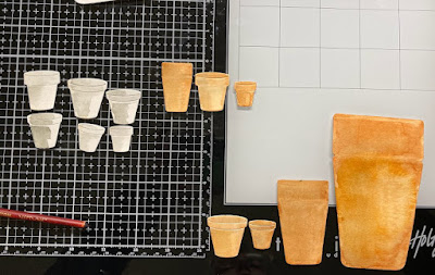
So, I decided first off to just paint a pot without sketching it first and that was pretty slow going, I was not impressed. And I decided to start digging for flower pot dies and I cut up a bunch from Impression Obsession, Memory box & Spellbinders. I have never ever used those Spellbinders pots as the lip/rim of the just does not stick out enough for my vision in my head of what pots "should" look like but, since they come considerably larger than the others I figured they would be easy to practice painting on. ( faster than sketching)

So, first rounds of paint on these and I decided to leave them alone. these were all cut from strathmore 400 series cold press wc paper. and the paints on all of these are from Mijello Mission Gold  36 piece set. This was maybe the second or third set of colors I had ever bought (in 2016) , and I picked it up because it was supposed to have colors for "nature" type coloring. one other thing I figured out along the way is, making that "thirsty" brush... you're not supposed to dip it in the water to clean the brush first, just wipe it in the paper towel. yeah, you wash the brush you pick up too much water and it blooms.

So, after that first rounds of paint had dried I decided to go over the tops of the pots again with more color to see if I could "fix" them, without over working the paper to the point of pilling. Know what I mean? and I think it mostly did look better ( see below) I also added more colors of paint to the pots with shadows with more of a hard edge on them in the top left corner and I still have three pots with just shadows on them to play with some time. 

You can click on any photo in this post to enlarge it and then use your browsers back button to continue reading. at this point I decided that I probably should make a project that could you know end up being used. So, the card below was built. I have a little container of strathmore watercolor die cuts that were cut from scraps of other projects in the past just for the whole short cut of painting on them some day. In the past most of them were colored with markers. but, I dug out a couple and used these same paints on a couple of tulips from Penny Blacks first blooms set and tucked them into a couple of pots with a frame from a Memory Box Pine forest frame set. 

The pot on the left is glued to the Neenah cardfront and the pot on the right is up on foam pop dots. The sentiment is a rubber stamp from the Taylored Expressions Love everywhere set. That sentiment was stamped on some Neenah earthstone and I decided to add a smidge of grey paint on the cardfront under the pots for a shadow there. the shadows you see around the sides of the pots are real ones from the dimensions. That's about it from me, If you'd like to play along with us this challenge can be found here at Splitcoaststampers. Thanks for stopping by.


1.23.2022

Inspired by { Calendars }

 This week the Inspiration team was poking around inside Calendars dot com and I came across this Peanuts one seen here and decided ah ha... you've probably seen the vintage stamps I have been collecting from that cartoon the last year or two and I decided on using these two newer ones to me as I felt like they could use a whole spectrum of sentiments in my room too.


 These are both A2 in real life, I had originally thought to do them as one layer cards but, since these stamps are still on their blocks and the foam has sunk on some sides of them the first round of impressions on the card fronts ( even using a stampamajig) turned out blurry) so, out came some simple square and circle dies to make mats and cover that up. The one on the left is called Charlie Brown & Linus from Stampabilities and the sentiment on it is called I swear it will be funny from Riley & Co. the one on the right is called A Note From Snoopy (Stampabilities), and the sentiment is Google Things ( Riley & Co.) The square dies are from Waffle flower and the round ones are from Hero Arts. You can find this challenge here to play along with us. I hope you all are continuing to do well, Thanks for stopping by.


1.18.2022

watercoloring {an abstract ocean sunset}

 This week the watercoloring tutorial is following along with this sunset done in some abstract nearly pastel shades seen here

The first trial with this was done inside the strathmore practice pad I have been using for strokes and things.(the one on the left seen below)


and I was really not impressed with the waves or the sun it self so, I watched the video again and seen there was a lot more pink on the water, which ended up being the second trial on the right.

and I had it in my head this would look better as a skinny scene maybe a scene that was divided into thirds and you know with lots of white space. So, I grabbed another sheet, and did not tape it off and tried it again.

which is that messy edge one on the near right/bottom of this view. and I was like OK the sun & clouds are getting better here but, still not what I wanted to see. I think it was really hard to do this in these colors as abstract is not my thing. and I knew I had some brighter colors in those prima palettes so, that is what these first three were done with.


So, I told my self ok lets do this one more time, and this time I taped off a skinny space in the center of a sheet (slightly crooked) but, the white space was the main goal and I used the Kuretake gansai paints for a color change. and I think this is OK. I mean it was OK enough to die cut it with a pink fresh studio slim stitched rectangle die ( one of the ones with no stitches on it) and mounted it to some Stampin Up strawberry cardstock. I think this is one of those things that gets better with time but, it is going to take a lot more paper and time to improve this one on my end I think. ( the wadded paper towel for the sun lifting spot did not go well on the strathmore paper, it made the paper pill) so, with more practice on the waves, maybe I will feel better about practicing this on better paper. It's kind of a funny thing how some things I just know will be better on better paper and other things I get cheap in my mind and practice practice err bang my head on the wall using the cheaper paper. I probably should just move the cheaper paper to my die cut it up pile and stop trying to paint scenes on it, but that hasn't happened yet. I am moving closer in that direction though. That's about it from me, you can find this challenge here at Splitcoaststampers to play along with us. Thanks for stopping by.


1.14.2022

Inspired by {Virginia Living}

 I happened to come across this cool Red Birdhouse for sale through the Virginia Living store online and it sparked the thought that, I don't as a general rule color my birdhouse stamps red. 

So, I Started flipping through my birdhouse stamps looking for a larger one and with the thought that red could be for Christmas and settled on this one from Imaginations. (It's # J890) and I believe that this company is not making them anymore so, its something to hunt for on the used markets if your interested.


 I stamped my birdhouse on some Arches 100% cotton watercolor paper and painted it with Daniel smith paints. The edges were cut with an Spellbinders hemstitched rectangle die and then I picked this clear sentiment from Simon Says Stamp's Inside Christmas greetings set with the Misti and when I went to re-ink it I said to my self oh, the card is crooked in the misti and I straightened it, so you guessed it the second stamping went blurry. Yeah, that's a thing. So, I stamped it again on a scrap of Neenah earthstone and cut it close to the letters so I could glue that over the blooper sentiment.

The lace here is vintage, the red printed paper is from The Paper Rose Amberly Grove pack of 6" papers. and the Stripe under it is from a pad from Moda Scrap called Sudtirol origins collection. The base is some Coredinations Tim Holtz antique linen and this is 6" square in real life. 

You can find this challenge here at Splitcoaststampers to play along with us, Thanks for stopping by.


1.11.2022

Watercoloring Drill Compound Strokes

 This week the Watercoloring challenge is taking part in the drill that is part two from the vertical hold last week to a sweeping compound stroke in the form of leaves. The video tutorial is found here on YouTube.

And so, I grabbed my strathmore pad I practice strokes in and did that for a page. 


And I thought Ok I am ready to do some leafy branches. and I pulled off some sheets from a small strathmore pad. and did 3 of those

And I was not really all that thrilled with these so, they went under the brush for another round of leaves over the top.

I tried to get some more shadow-y see through mostly water ones worked in. And I showed the pile to hubs and he said Oh, you made willow tree branches. ( which was not the look I was going for) so, I watched the video yet again... and I noticed that even though the drills are to do these skinny leaves. the branches have rounded fuller looking leaves. So, I grabbed more paper and started doing that, and one of them the branch just went wrong from the get go so I flipped it over to the back side. ( its just practice right?) and wouldn't you know it? the upside down painted one I actually liked the colors. 

So it became a Christmas card like so.

Complete with some splatters and a Stamping Bella Sentiment from the Festive Gnome Sentiments set.

This one finished out at A7 in real life. all the paints you see here are Daniel Smith and were all done with a size 6 round Neptune brush.  This is turning out to be my favorite brush of all the ones I have collected for the last little while. ( I have two of them now ) (yes, really)

So, I was pretty excited about this card and  then I looked sideways at it and I realized it really does not look much like the tutorial, so I flipped through the finished panels. ( there were two that went straight into the bin and I forgot to get a mug shot of them first) and then there was this one. which Finally looked kinda sorta the way it was supposed to.


The burlap string here is from May arts, the painted panel is up on foam tape and that whitewashed board looking printed paper is from Recollections. This one finished out at A6 in real life and there is no sentiment on it yet, as I do not know what I am going to do with it. You can find this tutorial challenge here at Splitcoaststampers to play along with us. Thanks for stopping by.


1.07.2022

Inspired by {Tea Cups}

 This week the Inspiration team at Splitcoaststampers is showcasing ideas from a board of collected tea cups that Kia built. And I had seen that Amy & the team at Coffee Lovers are doing something different this year with a monthly Christmas caffeinated challenge and I thought maybe just maybe I could marry these two into one card. I knew the first throw down for the caffeinated challenge was to include a snowflake on the project so, with that in mind I did settle on this pretty gold & white tea cup and saucer set seen here

and somehow ended up with this

I knew I wanted it to sparkle so, I cut the teacup shape with the largest Hero Arts nested cup die, (and mine is one of the old style before they started making them with a finger hole die in the set) from some Shimmery Stardream Opal cardstock. I then ran that through the Anna Griffin Slimline snowflake embossing folder and then cut the larger gold snowflake from the Echo Park winter time set and the smaller stitched white snowflake from the Lawn Fawn stitched snowflakes set. These are up on foam pop dots over the cup and topped off with a gold gem. The sentiment here is from The Reverse Confetti Seasonal Say it all set stamped with some versafine on Neenah earthstone cardstock and colored with a gold wink of stella pen. I also added more gold to the embossed snow with that same pen. The gold scallop frame was cut with both pieces of the Pink Fresh studios mini slimline stitched scalloped rectangle die. ( the part between the stitching is where it splits and I have mine taped together on the back side of the paper with scotch tape) The base is also Stardream opal cardstock and this finished out at A7 in real life. This is my first Christmas card for next years stash and I am pretty excited about that. You can find the Inspiration challenge here to play along with us, and the tea set below that I used as the jump start for mine. Thanks for stopping by. 


1.04.2022

Watercoloring drill Vertical hold Circles

 This week the water coloring tutorial is following along with a tutorial that is to hold your brush vertically and paint circles. and she used a size 12 brush ( that I had to break mine out of the package to use ) but, I had the same brush so that was cool to see. At one point in the video she says something along the lines of if you cannot do a circle without your hands shaking maybe you should lay off the coffee. ( I painted mine while drinking coffee) are they perfect? no, but I did hold the brush vertically to do them. 


I am not really big on circles but, I think I do like the wiggly aspect of this, the first row through the center was the first batch I did. and I was looking at it thinking if you did it in drapes it would look like a garland and I had thought to do something Christmas-y maybe. and my other thought was you have this whole hungry hungry caterpillar look going on with the wiggles. I almost doodled some legs on the long one in the middle. 

Instead I tried to do some garland type circles. Maybe I should have made some of them more dramatically bigger than the others but, I was pretty pleased with this just from the colors I had chosen. 

Daniel Smith Phthalo turquoise, Cascade Green & Quincridone burnt orange.

after this panel dried I had thought to maybe use it as a focal point and layer it over the first practice sheet and I added more circles to the first sheet so it would look more random bits of color peeking out from behind. I ended up setting that idea to the side and making two cards out of these. which was a surprise to me. 

The smaller one on the left got its sentiment ( that one is from an older Club Scrap set called Creative License Greetings, ) because of the fact that these pretty much took me all afternoon on Sunday to end up with finished cards. the one on the right the sentiment is from Impression Obsession &  I did use a waffle flower A7 rectangle die set to make it look more like embedded die cuts. the ribbon on that one is from May Arts & the sentiment is up on foam dots. That's about it from me, you can find this challenge here at Splitcoaststampers to play along with us. thanks for stopping by.


1.02.2022

More Tags

 Since I have zero J tags and or B or D or any of the other letters I use besides old tags for me and hubs I am still making tags to have a little cushion of a head start for next years Christmas. And all the Christmas is still out here old and new. 

So I found these mini wreaths at Micheals and they went on deep discount sale after Thanksgiving so, I picked up a few packs thinking they would work on tags. This tag shape is a die from Moda Scrap called Diamond Tag. its hard to see through the printed paper but, there is some stitch detailing on the edge. The sentiment here is from Simon Says Stamp Fa La La set.


The snowman on the left is from Judith and he was colored with Daniel Smith Paints. The B die is from Altenew, the tree is an old yellow sizzix Pine die. Which when I look at it I thought oh this will be a fun one for little Country projects so, I had cut a few from scraps in Christmas patterns. The heart here is from Ellen Hutson folk heart set. The big die is from the Mama Elephants Tags a Lot set, and it was run through a embossing folder from Simon Says Stamp called Holiday Greenery. the flower is a layered mulberry sticker.


This one the primitive star is an Sizzix die that was used to cut the faux leather fabric that had been ironed to (mind just went blank but, its the iron on fuseable web type sheets that make fabric into press on patches type of a thing) The tag here is a Mama Elephant tags a lot diecut with some acrylic paint over the cardstock. the J is from Altenew. The snowflake is a diecut with a Hero Arts gem on it and the sentiment here is from the Mama Elephant holiday messages set.

The sentiment on this one is from the Unity Stamps Old Traditions Set. The B here is from the My Favorite Things stitched alphabet set, the tag it self is from the Ellen Hutson tag trio set. the Poinsettia is an Sizzix Tim Holtz tattered Poinsettia that was run through its matching embossing folder. that great big brad was a gift from Paula a long time ago for one of the wish rak exchanges I think.

This is the same large die from that EH set. The deer here is one from Gourmet rubber stamps - Emerson line and it has a sentiment under the deer that reads deck the deer. and I placed the Club Scrap watercolor Christmas set believe over the top of that. The deer was painted with some Daniel Smith paints, the J is from MFT and I am also hunting for that tag die info as it is also not in the evernote file ( or the "tag" of it is not ha ha. 

This one was done for my friend at work who is all over anything glitter. the holly is a Tim Holtz Sizzix Holly Branch pieces (without the branch) the No Peeking tag is from Avery Elle and the tag it self is from Altenew Holiday tag die set. SO between these and the gnome tags it feels like a good head start for next season. Thanks for stopping by.