2.28.2022

Dirty Dozen March Christmas Card

 Are you playing along with the Dirty Dozen on this years round of Christmas card prompts to get some done all year long? This is my team sample for this March theme. ( you can find all the details here in the special chat forums for Fan Club Members.) 


I started this card cutting the three layers of the Birch Press Designs Radiant Ornament set from Strathmore 400 series watercolor paper and painting each layer with a different mix of watercolor paints. The hanger/ topper piece is just glued to the top layer ornament so, there is a foam pop dot under it where its tied onto the ribbon. ( that ribbon is an older one that was found at Micheals in the Christmas section. and the burlap string is from May Arts (they still make that) The distressed check pattern paper is the back side of some Basic Grey pear tart print. The Sentiment here is from the Kaiser Kraft set called Christmas Feeling. I ran that through the big shot twice inside a stitched mini slimline die from Trinity stamps to get the length right ( edge wise to the other 3) The base here is some textured Bazzill and this one finished out at 6" square in real life. Thanks for stopping by.

2.25.2022

Inspired by {Annie Cloth}

 This week Amy has shared with us the Annie Cloth site & Pinterest boards where I found this top here.


 I love the drama of the colors and the floral aspect so, I set about trying to recreate that. I would totally wear that if I came across it in a store in person. as a disclaimer I have never shopped at Annie Cloth. I have that whole if it looks too good to be true thought process in the back of my mind when I see the price tags. For my card I started with a scrap of Arches 100% watercolor paper and added a wash of blues to it. When that dried I stamped the Hero Arts Silhouette background flowers stamp with the top of the stamp at the bottom of the panel with some Distress Oxide bundled sage ink. I knew that this would eventually bleed into the paint so it would give the panel a no line look ( I hoped) at this point I decided to tape off the edge of the panel and added more paint on and off over several days. and at some point I decided to re-view the top and I had to laugh at my self, it has a green sky and a blue ground. It's ok I think I still have the vibe that it has and I did finish it.

So when I removed the tape I decided to add a little bit of white gel pen to the mostly red/orange blooms and trimmed it down to really close to the taped edge as there was a little bit of the first layer of paint and ink on the out side edge its turned out kind of interesting to me rather than being stark white. 

I did stamp this Penny Black sentiment to the inside panel as I have a bunch of family birthdays this coming week and a half. I finished the card off with adding a layer of foam tape to the painted panel.

Which popped it up over the bazzill base. I knew that when I started this that Lee has a VSN challenge to do a "rainbow" of colors on something. and I told my self about the only thing I could think of that would use all the rainbow colors without being just a rainbow on the card front was to do something floral. So, I am going to tag this for that challenge too. It's 6" square in real life. You can find this challenge here to play along with us. Thanks for stopping by. 


2.23.2022

WOYWW # 664 {well loot of course}


Happy desk peeking day, if you'd like to see more spaces or play along 
the link up for this blog hop starts here at our hostess
There is also a new Instagram hashtag of #WOYWW
 

 what you see when you arrive at the top of the stairs, on the other side is what just may become my IC sample on friday. ( I add more paint to it every time I come up here) we shall see. 

what you would see if you looked down. all 23 of these old Diamonds stamps arrived in the mail on 2-22-22 (wasn't that fun to write on everything yesterday?) :) only one of these is a duplicate for me. So, it was an exciting thing to win on eBay because, with so many stamps in the lot it really knocked the price per stamp down over buying them one at a time. 


the other eBay win that arrived on Tuesday. I had shot this one first before I unpacked the box of Diamonds. Really that's about it here. just the room is getting closer to being shot. ( er, I put more stuff away) (yes, some of it went into the closets. some went into the trash) mostly the closet. but, I have less of that hoarders episode going on which makes me happy. interesting side note, having some stamps out on the wall to see has actually made me use some of them. (more than normal when they are tucked away in boxes) I did one for the ways to use it bird challenge last week from that Stamps happen one on the wall with the red birds. 

I wanted to see if I could paint it so, I did. its up on foam tape over that base. the name of the stamp is Stamps Happen the birds and the bees.  Thanks for stopping by.


2.22.2022

Watercoloring a Rainbow Dandelion

 This week the Water coloring tutorial challenge is a rainbow of colors in a loose "Dandelion" seen here on YouTube. 

So I started out and applied a first round of paint like so. ( there was no sketching on mine to start with I just painted) 


 Those splatters were hard won. I do not own a small flat brush so, using the round brush it wanted to keep its water/paint in the brush ha ha.

Second layer of paint (wet) hitting the brush with my other hand harder for more splatters. 

Third layer of Paint & Water ( wet) 


I thought I was "done" here but, then I went and re-checked the video and there was supposed to be "seeds" in the center part. I moved to a smaller brush to do the seed stems & highlights.

Oh, and I decided to use white acrylic paint watered down for the white highlights here instead of white gouache. ( the first round of that faded to nothing as I believe the watercolor paint was still mildly damp under it perhaps) so, the white was applied twice. And at this point I called it done. 

You can find this challenge here at Splitcoaststampers to play along with us. Thanks for stopping by.


2.18.2022

Inspired by {Simply Woven Always Vintage}

 It's my turn to host the Inspiration Challenge at SplitcoastStampers this week and I have chosen this sweet vintage site called Simply Woven Always Vintage because, I came across this shot of the tiny bottle brush trees in the crocks here and swooned. I have no clue why these tiny trees appeal to me so much but, they do and I have a few of them now. So, seeing how other people display them catches my attention when I am skimming. 

So, I also have *cough* an undisclosed number of rubber stamps I have been collecting the last few years that have not been played with as of yet, and I knew that this Holiday Planter from Impression Obsession was in there. Score, it has both trees greenery and a crock along with a wooden container ( the wall has an exposed board or something in the IC shot I picked) I stamped this with some versafine Clair nocturn on Arches 100% cotton cold press watercolor paper and Painted it with some Daniel Smith paints.


 I then spent a lot of time looking at my rectangle dies thinking to do some stitched edge and making that painted panel smaller but, this was just a smidge too wide for most of them. This cardbase is a deckled edge Strathmore watercolor one that is slightly less than A7 in real life. after a while I gave up on that and pulled out this distressed plaid print from Maja Designs ( its an older one from Sweden) the name on this side of the paper is I wish - Santa will fill my stocking. So, I cut a piece to be a mat and then stamped this Simon Says Stamp sentiment from the Inside Christmas Greetings set with versafine on the drop piece of some Neenah earthstone ( that is the liner) inside this card. I did rub the scissors blade over that scrap to ruff it up as the print of the plaid is a little on the distressed side along the edges. ( it's hard to see ) I did daub some Windsor and Newton white gouache over the top of all the greenery after trying for that speckled snow look but, it mostly faded when dry. I have not decided if I should add a second layer of that paint over it or not yet. That's about if from me, you can find this challenge here at SCS to play along with us. Thanks for stopping by.


2.16.2022

WOYWW # 663 {a shopping fool}


Happy desk peeking day, if you'd like to see more spaces or play along 
the link up for this blog hop starts here at our hostess
There is also a new Instagram hashtag of #WOYWW
 

 So as it happens the shades we ordered in January arrived in February.

Like so, they pull up from the bottom or down from the top. and are a slight insulation barrier against the heat/cold outside. but, light still passes through them. 


This was my desk on the 9th. there has just been not as much time to get these posts together as usual.  I think its the coming up with something chatty to say. ( and I do need to run out the door and drive to get the ice today) so, I am going to hit you with a lot of photos and run.


this was a week or so ago, that snowman die in this loot shot is the one from the desk shot above it. which did make it into a tag like so.

I spent a lot of time trying to decide if the shadows were "good enough" the prints are paper pieced onto the die.

A closer look at that, his name is Patches the snowman from Cheery Lynn designs.


One day there was a clean and simple challenge to add a heart on it, so I water colored this one that is an older D.O.T.S. heart.  I did finish that and post it on scs but, I may have blogged it too as the finished card is not in the uploads folder this morning. will edit later.

I have been spending those eBay cards and finding things on ETSY too. 


this is this Mondays haul, 4 auctions were delivered on the same night. So, as it stands these stamps are just like this on the table this morning. The funny part is they all travel through the mail at different speeds so, Its a little overwhelming to have them land at once but, I am still plugging away at making space for these things. That's about if from me. hope you are all doing well, Stay safe out there.


2.15.2022

Watercoloring Abstract Angels

 This week the watercoloring Wednesday challenge is playing along with this Christmas Angels warm up video seen here on YouTube.


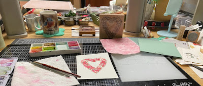
So, I don't actually own an easel for painting on. but, I did see my phone stand was empty the day I started these & grabbed that to prop the paper up on since, I was not you know doing things to hang on the wall. 

I decided to do the first couple following the directions with just the two shades of paint colors she mentions and a size 8 round brush.

Shot wet with first layers of paint. ( and I tend to like them with less paint then more paint) but, the where to put the shadows for the arms and chest was hard for me for some reason.


Second layer of paint on these two ( the one on the right with the yellow/gold tones was first and the blue was second) This is strathmore 400 series wc paper. 

And then I decided the others were "too big" for a card if they were going to dry in a good way for that, so I decided to go smaller and started a couple on Arches cold press 100% cotton paper. 


this is second layer of paint of the cotton angel #1 above. ( its on an A2 Sized piece) 


I didn't really like the gown of #3 so started a number #4 (these are in the order I painted them in this shot with the far left being the first) 


And then I had the bright idea that maybe I could "fix" what I did not really like about a couple of the above angels with more water and paint ha ha. ( these reached over-worked defcon melt down status here)

Second layer of paint on #4 and I decided to use a smaller brush, because, its a smaller piece of paper ha ha. 

As it stand this is the status of these angels tonight. (20 minutes before they go live I am typing this) and I torn between blue #2 and gold #4 ( right sides of this photo) as to which one I like the best. I like how the blue one actually looks like she is looking down and I like the gown on #4 has more of that Ethereal look going on.

at this point I will probably try for smaller yet again before doing these to turn into cards. 

If you'd like to play along with us you can find this challenge here at Splitcoaststampers. Thanks for stopping by.


2.11.2022

Inspired by {Window Displays}

 This week the inspiration is headed out to see a collection of window displays that Kia has shared with us. When I came across this one I totally stopped looking because, I knew I had this patchwork printed paper from Stamperia that was nearly a dead ringer for that window ( seen here

what this paper looks like off the pad. So, to keep with the fabric quilted theme it has going I decided to place an A2 Essentials by Ellen piercing plate #2 ( its the smaller holes one) background die over the village part of the printed paper. ( the paper is 6" square) so, that added a little more texture to that part of the sky. 

I used some textured pretty shade of blue Bazzill for a 6" card base under it and then added some Tim Holtz word stickers right over the paper from the Christmas Noel pad. ( the dear are the sounds of Christmas, hear them singing and little winter bird) are stickers. Seriously this was a 10 minute card, of course now that I have managed to make a 10 minute card for reals... its 25 years too late to make it into Stampington & Co.s magazine and I did not stamp a single thing on it lol. (that used to be a goal of mine to create a 10 minute card...) I've come close a lot but, even the simple ones take me longer than that. That's about it from me. You can find this challenge here at Splitcoaststampers to play along with us. Thanks for stopping by.


2.08.2022

Watercoloring an Eastern Bluebird

 This week the water coloring throw down is playing along with this Eastern Bluebird video seen here on YouTube. I own so many bird stamps I knew I would enjoy the learning curve of trying to paint one, I did not sketch any of mine ahead of time though. 

I had decided to do a couple of connecting circles in a mix of pale buff titanium and added the red breast and blue back/ head colors of that while it was still wet for a wet on wet blending. I liked the colors I had chosen and stuck with them for the whole flock of birds I ended up painting. there is a smidge of payne's grey in the buff Titanium and that is what the legs were also. So I let this dry.

and the one from photo number one is the one propped up on the light next to the grumpy blue bird coffee mug. which is where the colors for my birds inspiration came from. ( it saved me from walking back and forth a million times to the video to see what she had used) (honestly I like my colors better) 

the hardest part of this for me is deciding how far over the wing should come on the belly. I decided the first one was too skinny and I really did not like those flowers on the branch.


So, I kept adding more glaze of paint on the birds every time they dried trying for some depth to the painting. the top one here, I did not like the leaves after I added them to the budding branch and the head/neck area was off too. So the bottom bird seen here is what ultimately was finished into the card below. I also switched off from the size 8 round to a size 2 round in both a Neptune and an Escoda Perla.

These were done off an on over most the afternoon and evening on Saturday, and at one point I did drag out some Carolyn Shores Wright Stamps Happen Bluebird stamps because, I knew the colors were wrong around the eyes, neck cheeks and wanted to see how someone else had colored them. ( and I am a total fan girl of her art) so, those can be see off to the side at the top of this view. 

Other changes I think I would make if I were to do this again would be to make that a solid tapered tail rather than this split thing here.  I recently played with some Tim Holtz die cuts and one of the birds in that set had a dove tail split looking like what I painted here. It's funny how everything comes out as far as inspiration/influence goes. I do like this version with just the buds of blooms on the branches, and how the feet/legs turned out. I wish the white I had added around the eye had not faded so much but, such is life. 


To finish this off I added the sentiment from the Essentials by Ellen set called back yard bird friends and put the painted panel up on foam tape over the SU Succulent card base. This one finished out at 5 1/2" square in real life. You can find this challenge here at Splitcoaststampers to play along with us. Thanks for stopping by.


2.06.2022

A catch up Post

 I played along with a few other challenges in January and never stole time to blog about them so, here are a few. 

This tiny pooh bear is from all night media called Pooh's Heart. The sentiment here is a reverse printed one from Simon Says Stamp, its framed with a piece of Vellum run through an Anna Griffin Layers cut & emboss set. this is up on foam pop dots to give it some wiggle room over the ruffled May Arts ribbon. that printed paper in the background is an old one from Basic Grey.

Pooh was painted with Daniel Smith paints. Did you know the copy right for Winnie the Pooh hit its expiration this week? ( it did) so, there are brand new Pooh stamps so far I have seen at Unity Stamps ( I have ordered some for me) (you can find those here  and here if you are curious.) This card was jump started by this card from Marilyn seen here

This one was done when Ardyth was featured stamper, I had loved this card she did here with the vellum gate fold and then later came across this CAS bird card and it all kind of morphed in my head.

On my version, I used a Mama Elephant mod heart die to cut a window into the card front and then used some textured vellum from K & Co. to cover that. The bird here is from the Tim Holtz Feathered Friends die set cut from some previously dyed watercolor paper that had been dyed ( years ago) with left over Paas Easter Egg dye. ( it takes a while to lose the vinegar fumes so, I still have a stack of this in various colors to play with in the file cabinet) I did rub some salvaged patina oxide over some edges of the die cuts on the bird to help define them. The eye is a tiny recollections pearl and the sentiment is from Impression Obsession. 


Last week Kathy was featured stamper and a few weeks ago the Clean and simple challenge was do to something with "getting healthy" for the new year, and I had this lipstick sentiment out for that and then never got any farther with it. flash forward to last Sunday. Kathy has a lot of Snoopy in her gallery and I came across this one. And decided I could use that as a jump start for the colors of mine. This Snoopy is from Stampabilities called Operation Bowl. The sentiment here is from Inkadinakado. They were both stamped with some Versafine on the Neenah and the color was added with water color paints. that panel was cut with a Pinkfresh studios blanket stitched rectangle die. The red pre made base is a sparkly one. 


The Clean and Simple challenge last week was to put a heart on it. So this D.O.T.S. heart was stamped on some Arches watercolor paper with red versafine and painted with Daniel Smith paints. That panel was cut with a Spellbinders hem stitched rectangle die which decided to come un tapped before it went all the way through the big shot so, luckily the see through parts were still OK and so I cut this down to the very edge of that in a paper trimmer. The pink base here is some pre made Stardream and so, it is also very sparkly in real life. That's about it from me, thanks for stopping by.


2.04.2022

Inspired by {Wall Sauce}

 This week Julie has shared with us the links to Wall Sauce and their Pinterest boards. And I went into it looking at color combo's as I have a small pile of previously painted images on my table I would like to see become cards. Win Win I found this one . which if you hit the photos next button it shows you a dreamy pale blue green watercolor piece.  I grabbed this sheet of printed paper from the 49 & Market pack and ran that through the big shot inside a Marianne designs Linen embossing folder. 

The panel to the right of the printed paper was some Neenah earthstone that I ran through the big shot inside a Leane Creatief embossing folders called stars. I love that they look primitive. and so I added a light wash of blues and greens watercolor paints over the top of the embossing on both panels.

So, flipping through my images I picked up this Snow angel that is a Serendipty one that you can find at Impression Obsession here now. I just love that rustic carved wood look it has. And I gave it those kind of faded white washed look. This was done on some Neenah solar white with Daniel Smith paints and cut out with scissors. 


The printed paper panel was trimmed with pinking shears and the Sentiment which is from the Stampin' Up Itty Bitty Christmas set on a green scrap and cut out with a banner die, the sheer pale aqua ribbon is unknown and the cardbase here is some green, probably bazzill. This one finished out at 6" square in real life. Below is a look at the wall paper that jump started this card


 and Here is where you can find this challenge at Splitcoaststampers to play along with us. Thanks for stopping by.


2.01.2022

Watercoloring Simple Valentines

 This week the watercoloring challenge is following along with one of Emma Lefebvre's tutorials for hearts and lines as simple Valentine cards seen here on Youtube. 


The one on the right was the first panel done on some Strathmore 400 series wc paper and the one on the left was the second one done on some Arches 100% cotton paper. both of these were taped to the what is the back panel of empty Strathmore pads that is use for painting boards when I do tape something down and it cracked me up that the Arches paper is the one that decided to warp off the tape. That panel I also ended up add-libbing some heart outlines to the mix of the color flow hearts. I never got around to doing the stripe versions. 


The one on the left was cut from the first panel that uses a square from the Paper Rose lots of squares die set and the outside of the frame with all the hearts embossed into it ( that die does that cuts and embosses that frame) is up on foam pop dots for interest. The one on the right, is from the second panel and I used a couple of the dies in the Waffle Flower Lacy Layers A7 rectangle set and then taped them back together on the back side of the cuts. I don't remember which tag die that is but, the button is a craft one tied onto the sheer ribbon with some May Arts burlap string. and that card finished out at A6 in real life. That's about it from me, you can find this challenge here at Splitcoaststampers to play along with us. Thanks for stopping by.