 This is an PIF image and it totally escapes my mind what its real name is... once it was colored was at an equal loss of what kind of a sentiment you could use with it... so added this definition from SU and thought ok... this one is A-6 in real life.

4.29.2010
Quality
This is an PIF image and it totally escapes my mind what its real name is... once it was colored was at an equal loss of what kind of a sentiment you could use with it... so added this definition from SU and thought ok... this one is A-6 in real life.
4.28.2010
Belated Birthday
 To Me this hedgehog looks like its really rushing to catch up and give away these flowers so thought that worked with the sentiment. deliberately dragged some of the brown pigment off the centers of the flowers to make them look floofy.
 This is 5X7 in real life. Was lucky enough to get this Hedgie from Carries recent sale and had a chance to color one last night. Labels 8 die, SU note paper punch, the chocolate cardstock was an RAK from Alison and the shimmer orange-ish cardstock is from an mat stack, the base is bazzill.
4.27.2010
Spring Blessings
 This is an wish rak image from Alison ( Thanks so Much!) its from the New Gina K set "spring has sprung" Its colored with prisma pencils. When i was done coloring this i asked hubs do you think the image is tilted funny? ( the way the bird looks up from the rocks on the ground) and he said, ha that birdy is flying trying to see the snail... but, that thought never entered my head as i colored it so i made my ground a sloped hill under its feet.
 This is an A-2 sized card *gasp*, it always cracks me up to make what i think of as a bitty card... the image is die cut with an labels 8 spellbinders die and up on pop dots, added an sentiment from the Lovely Labels (Gina K.) set in versafine vintage sepia. the check pp is from K&Co. and the blue textured Bazzill came to me in an fabulous RAK box from Leigh Anne. the lace is wrights (from the notions dept.) i have picked up tons and tons of this stuff at yardsales new in the package for next to nothing, and as far as i can tell all they have done over the years is change the wrappers a bit, but the color of this hemming lace seem to all be sold even today. so I debate with my self if i should call it vintage or not, it is the wrapper it came out of is trashed ( the plastic wrap was falling apart) but, I'm pretty sure you could just go out and buy this same thing.
4.26.2010
So Sorry that Stinks!
 was about to call it quits with this card but, the lavender paper flower were just the wrong shade, so grabbed a copic maker. the one used on the hat band of this image and colored over it... worked like a dream, however the yellow flower was above the top purple one and the ink bleeds FAST... so the purple is now on the top... I got these from Impress ( thinking some may be "savvy stamps" flowers, they came with the stamens in them.
 This was done in bits and pieces had the girl stamped with versafine and colored (barely) with some copic's done and laying on this mat of ocean tides for about a week now, and kept setting it aside to do challenge cards or other things, there is a layer of 1/16 pop dots between the image layer and the mat layer. when I finished the sketch card the other day this scrap of pp was laying on the other side of the work space and that made this card just kind of fall together rather quickly. its A-6 in real life, the lace is vintage and has an yellow tint to it as does small spots in the pp.
 So after i had inked over the hat flowers that got me thinking so, grabbed a jar of prima flowers ( these were brown and white polka doted before hand and started dragging the brush end of these copics ( 33,34,35) from the centers out towards the edges to look like hmm not really stamens but, more of a depth type thing. may need to go over the white one some more in the daylight, but like how the brown one turned out.
4.25.2010
Happy Mail Catch UP
 From Alice, isnt that sewn rippled paper cool? :)

 From Shannah :) love this
 cropped view
 Thinking this could be the very first card i have ever received with an Inchie on it, this ones from Debi :)
 From Alice, the butterflies stamped on transparency or vellum or something the light will pass through :)
 From Meg :)
 Thanks so much Ladies!!
You Rock
 This was actually an 15 minute or so card... ( still have never done an 10 minute one) *sigh* ;) That is the top half of an sentiment that reads "you rock my world" picked it up at M's sometime last year off hand cannot think of who makes it. the extreme guitar is an single stamp from SU. ( love that they have singles now I've picked up a few of them) this was done very quickly for J's 14th birthday this year... these are stamped with versafine on neenah and die cut with the curvy mega rectangles spellbinders dies.
 thought the scrolls on this paper looked a little like the deals that are on all the hoodies at the moment ( sans skulls) the blue is the reverse side of it scrap, there is some distress ink along the edges and this one is A-6 in real life.
4.24.2010
Gina K Designs release party challenge cards
 My current hope is that someday owning copics will mean i can do skin tone coloring... (however i did not order things to shade with the ones i have ) ~ you can see this is a dangerous thing, one copic leads to 3 which leads to nearly an hundred... and the realization that you are not quite "getting it" to what you had in mind when you started out...
 This one was done for Theresa's sketch challenge, the Hands and sentiment are from the GKD set Hand in Hand ( don't think i have used these before, and i bought this set in like Jan 09) because of the skin tone issues mainly... the doily is from the Nana's needlework set and heat embossed with Zing powder ( when it was dry it was an perfect shade match for the bazzill but, melting it brightened it up). this particular card is 5X7 in real life. the buttons are vintage and have some ecru embroidery floss through the centers. The printed paper is from TPC studios "ancestral teal brocade" ( its double sided so this is both sides off the same sheet) the blue bazzill came to me as an totally "out of the blue" RAK from Leibetty { Thanks Leigh Anne!!!} it was just one of those things, I had opened her box right before i headed up stairs to make these cards so it was totally perfect timing.
 Now this was something fun ( messy ) but fun, this butterfly is from the Hope is Faith set (from GKD) and its stamped with brown stazon on an transparency sheet. Interesting thing, with all my sinuses out of whack i could not smell the ink at all ( which was really good ) on a good day it gives me an headache. I cut it out and added yellow stickles to the back then layered that to a piece of speckletone oatmeal coversheet and then when i ran it through the Xyron to cover the back with glue most the stickles squirted out the edges so, its not as eye popping yellow as it started out as.
 This one was done for Lee's color combo challenge, Turquoise, Lemon drops & one Neutral. It's 5 inches square in real life. the blue and yellow cardstocks are bazzill. the yellow lace and blue trim are vintage. the mini brads and pearls are from recollections. The sentiments from the su set called whimsical words and done with versafine on oatmeal and the edges of the Labels 10 die were inked with colorbox robins egg pigment. the reality is i really don't like this card as an "whole" but, do like bits and pieces of it.
Must be Magpies ;)
 ya know how that goes she said he said and then i heard... bird border punch from Martha Stewart done in soft suede... the textured ric rak is unknown, but interesting thing found the spool in the quilt dept at Craft warehouse (not the ribbons dept.)
 Sentiments from A Muse stamped with versafine vintage sepia on PTI Ocean Tides cs this panel is up on thin pop dots as the ric rak is on the thick side, the oval was cut from the center with a spellbinders long classic oval. the speckle pp is unknown. this is A-6 in real life. watch out for them birds...
4.22.2010
STVCCTG8 Blue Poppies
 Do you ever just finish something and want to twirl about in a circle and spin and clap your hands? ( that doesn't happen often for me) but this i am pretty please with. :) This is a view of the front and back sides of the card. ( decorated the back )
 This is a peek inside, the only thing i am on the fence about is if i should have lined the inside of the front flap ( mostly for stability ) but chose not to because i wanted the transparency to show through, for the light to pass through the card i mean.
 These colors were picked for the current stamp tv color challenge (Ocean & Tan) so i started with a piece of "ocean" (dont know its real name) vellum that is kind of between blue and green. and heat embossed the Impress open poppy with stampendous baby blue powder, then I tied this to the transparency sheet front cover with the tan sheer ribbon to hold it in place while i sewed it down. The inside sheet of Speckletone "oatmeal" coversheet has bits of one of the labels from the Gina K set lovely labels ( set this sentiment is from) stamped along the edges, those cardstocks are sewn together but not to the back cover. so then it felt a little like it was all going to just fall over so added a second sheet of stamped vellum to the back side. This is a piece of 3M write on transparency. ( the one's that come in a box of like 50 at Office Depot) i was SO excited when we got this store in town... had to buy this box of course... this is the first time i have tried this. it was not as sturdy as the transparency that was sold by the sheet at stampstruck. (have some of that stashed away still) The sentiment on the cover was die cut with the Spellbinders "fancy Tags" die, {finally caved on this set ~ It's Lee's fault for certainly sure} and I wonder if anyone but me noticed i finally switched the thread on my sewing machine from cream to tan? lol i used to switch it for every card but that got old quick... I do still keep clear nylon on the bobbin at all time though just incase the wind blows that way. This card is 4 1/2" X 4 3/4" in real life.
Simple Hummer
 This is an PSX image that came to me from Janice { Thanks so much!!} I think i got the bird a little on the green side but, it still is OK. this is colored with prisma pencils and diecut with the classic long ovals. (the new large ones)
 I have received some tall skinny cards and I just love the shape of them, so the cranberry crisp base is 3 1/2X7" in real life. there is a piece of certainly celery organdy wrapped around it and the inside of this card is lined.
4.21.2010
Lavender & Cream Tea
 Another Tea card, this is what that image actually looks like ( from the other day ) Cornish Heritage Farms . this one is also the flowers were done with copics and the rest of the image was done with pencils, This image came to me from JenMarie Thanks Jen :) the tiny tag is from SU stamped in Versafine ink. with some May Arts Iridecent cord to tie it up with. that stripe pp is from DCWV and the purple texture dry embossed paper is unknown ( came in a cheap pack at big lots a few years ago) the lace is vintage, the silver daisy is from Nunndesigns, the purple center silver trimmed brads are from Basic Grey. this is 5X7 in real life.
4.20.2010
Victorian Bunny
 Colored this pretty bunny way before Easter, so you know how that goes ... it's now in the head start for next year's Easter pile... Hero Arts stamp done in brown ink and colored with prisma pencils. the pearl are latte colored, some of the same papers and scraps as other recent cards, the wide peach sheer ribbon is from the cutting bolts at Joann's fabrics ( years ago )
  This is a new labels 11 shaped. the sentiments from SU teeny tiny wishes and the mats are soft suede cardstock. the base is blush blossom. this is A-6 in real life.
 4.19.2010
Tea Time Vintage
 This is an Cornish Heritage Farms Rose teacup with Honey image that came to me via wish rak from JenMarie ( Thanks Jen!!) the flowers on the cup were colored with copic markers and the rest is prisma pencils... this was cut out and so since the person I made this for does not take sugar in her tea i cut the sugar packet off the image. the mat was done using distress antique linen ink through the negative image from baroque die cut from an previous card. then was cut out with scissors. the teeny tiny sentiments punched with an Modern Label punchie with some recollections pearls on the ends.
 The crackle pp is from Hot off the Press the paper floral pin was sent to me via wish rak from Mary Ann ( as was that cream trim that looks vintage to me ) along the top of the card...there is creamy brown fluid chalk ink along all the edges of this one. This one is 6 inches square in real life.
4.18.2010
Blessed with Lace
 The Hero Arts playful Blessed sentiment was stamped with versafine crimson red on Neenah classic cream... part of the second s did not stamp and has some prisma pencil over it... this was die cut with an labels 4 die. and is up on pop dots.
 Every month There are challenges inside wish rak for using your stash your collecting from wish-rak The first April challenge was to use lace. so this particular lace is one i found yesterday at an yard-sale and it looked good on a piece of Gina K Cranberry Tart cs that came to me from catcrazy { Thanks Janice!!} its sewn to the panel. the cream mat under the sentiment layer was die cut with an sizzix Tim Holtz Baroque die. There is some creamy brown fluid chalk ink along both die cuts edges. The embroidered trim between them is unknown. the paper and tulle flowers are from Making Memories as is the button. This is 5 1/2" square in real life.
4.16.2010
Love Birds
 These Doves are from PSX and colored with prisma pencils, die cut with an petite circles (the largest one)
 this is 5 1/2" square in real life, the sentiments from Hero Arts. the kraft scalloped circle paper came in a pack with envelopes ( thought it was going to be a card base and knew it was bigger then any of my dies but, it turned out to be just a paper thin sheet... so glad i didn't pay full price for these) at any rate the pp is from hot off the press and the latte pearls are the two smallest sizes on those dollar bin sheets so they rotate smallest, next smallest, from two packs...this lace is vintage. the inside is layered with this paper and the Happy Anniversary sentiment is stamped on an Large scalloped circle over that.
 I received the neatest wish rak recently from Mary Ann and all the bits and pieces that were attached to the wrapping are laying on the table... ( could not pitch them ) so this is totally recycled. the tag looks like she had dyed it in either coffee or tea, ( the wish info was written on the other side, cut it to fit this scrap of soft suede from the card above then added some creamy brown fluid chalk ink along the cut edge to hide the cut, stamped the su scroll with creamy brown fluid and the time to bloom sentiment with vintage sepia over the top of it, the paper flower is also from Mary Ann. This one is 3" square in real life.
4.15.2010
Grace Inspired
 When i first seen this Impression Obsession Lab stamp i thought oh, its nose is a little long :) {Like Grace who has a very slight overbite} so, these colors were done just looking at her.
 Lab is stamped with versafine vintage sepia on Neenah Classic Cream and colored with Prisma Pencils, the sentiments from A Muse and the paisley bkg stamp is from Stampin up done in creamy carmel ink. there is a little bit of creamy brown fluid chalk ink along some of the edges. the button is from Jenni Bowlin with some Karen Foster scrappers floss through it. this is 5X7 in real life.
4.13.2010
remember when?
I made this post... (I'm referring to the very last paragraph) ... That day has finally come.. the office electric typewritter has been trashed and all the unopened ribbons were taken to the Goodwill this morning...
Hope your having an great day too!
oh yes and to top it off was "carded" buying hubs some cheap wine at the pharmacy (one stop shopping type store) on the way home today too!
4.12.2010
Outline Poppy Cards

 Happy Mail days to me last week... got the teeny butterfly embosslit from Alice's party, got this super "Open Poppy" stamp from Impress...
 These are 5X7 in real life, these started out with that Razzleberry polkadot ribbon ( yep the other side has white dots all over it) ;) RAK'd to me from MaryAnn Saturday's mail. and i realized i had not touched this razzleberry cardstock so... this is some My Minds Eye paper that i thought the roses looked a bit on the purple side, but i guess its just a what you layer it to kind of paper because below it went a little more soft with the Mellow Moss and Oatmeal. Its stamped with Perfect Plumeria Chalk ink ( color's pretty close match for razzleberry when smeared on cardstock) The sentiments from Teeny Tiny wishes? (something like that) punched with an wordwindow punch, and up on pop dots. these are not exactly the same (but pretty close) the one on the right is on Mellow Moss and the one on the left is on textured bazzill.
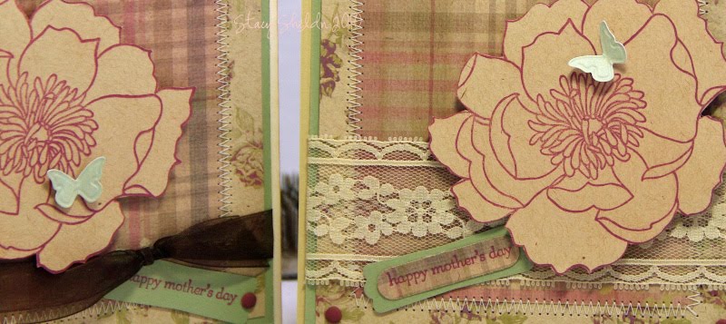
 These are 5 1/2" square. these the flowers are up on pop dots and added a butterflies punched on a scrap of green printed paper ( these were just laying on the table and thought hmmm) only the body is glued down. the brown sheer is from china the lace is vintage, the brads are lasting impressions ( burgundy ) the sentiments punched with an modern label punch.
 a few gift tags from the scraps. the just for you is from Impression Obsession, the cream button is Jenni Bowlin, the hugs & Kisses is SU, the thank you is SU, that was punched with an Martha stewart tag punch. the ribbon is cranberry crisp, and SU petals a plenty embossing folder done on a scrap of su kraft smeared over with Maroon fluid chalk ink. the larger ones are 3" square.
 Now this is a CASE to wrap around Wishes granted for Wish Rak at scs. the inside has the {wish} definition stamped from define your life in it... Versafine ink on oatmeal coversheet. these are smaller then a-2 thinking something like 3 1/2 ish by 4 something. ( don't remember ) Made a stack of them and mailed a few away before this was shot. oh and these fit my idea of clean and simple haha so this post will get that tag...
 this is the card that inspired it... every time you place an order with Impress you get an hand-stamped thank-you card that is handwritten inside. ( this tickles me to no end ) esp. when the card you receive uses the stamp you just purchased.... {Outline Poppy}
 4.10.2010
Giraffe Note
 Since the very first time i ever came across this stamp i wanted it... did not want to pay for ( what was full price when it was being made) I believe this co. has closed? ( mostly animals) or you don't see their stamps in stores anymore... got lucky on the 'bay a couple of weeks ago and got a chance to play with it...
 Audrey is stamped with versafine vintage sepia on a scrap of so saffron die cut from the (bite anyone ) card earlier in the week, the edges have some creamy brown fluid chalk ink on them ( ha this pad goes with everything) if you don't believe me ask me... the bitty buttons are from an pack at M's (thinking something like "dress it up?") they have a bit of ecru dmc thread through them. The stripe ribbon is from May Arts. the sentiments tied on to it with a piece of hemp string.
the "just a note" is from Memory box, punched with an word window punchie, the border punch (has no name on it) its one of those newer folding kinds if that tells you anything. the dot pp is from Pink Paislee "queen bee" 6" pad, the border is river rock and this is 6" square in real life.
Yippee! there is no longer a reason to hoard that river rock cs anymore SU is bringing it back in the next big book next summer. :)
Subscribe to:
Comments (Atom)