3.31.2024

Dirty Dozen April Card

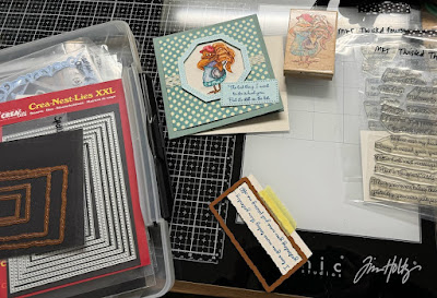
 Hi & Happy Easter :) It's not an April Fools but, tomorrow brings the start of the newest Christmas card Prompt for doing a some each month to lessen the OMG thoughts at Thanksgiving on how many Christmas cards and such you may decide you need. 

One thing I have done recently is I have been diecutting some not so great watercolor paper in silhouette shapes I have and adding watercolor to them, cleaning palettes and such. 


So, I have a little pile of these going on the side of my table in various stages of layers of paints ( mostly Daniel Smith) on some Strathmore 400 series wc paper which is not cotton) 

Not too long ago I had hosted a watercoloring challenge to use blues and make waves. And when I did that I actually walked around the table and pulled out the other palettes of wc paints I have and I unearthed this Prima one that had never been opened. There were so many greens I cut more trees and added some of these paints over the tops of the pine trees on top and these evergreens on the bottom. 


Which lead me to pushing some of them around and making this simple little scene. the background printed tree paper is from that Pad that was propping this up to see the shadows. I did end up tearing up some white mulberry paper for the "snow" foreground and then the Sizzix Evergreen was layered to that with the Prancing Deer layered flat to that and the doe from the Reindeer Flight die up on foam pop dots over it. The Sentiment ( from the Ton blizzard hugs set) is stamped on a piece of printed green texture paper Cut with a Spellbinders Framed tags die, I've forgotten who makes the mini brad in the hole at the top of it, but that is also up on foam pop dots. 

I did add some white gel pen to the eyes when the paint was dry on the deer and The colors are a little wonky. I am not sure what is going on with my camera, I am guessing I bumped one of the settings and I have not figured out which one as of yet. the deer are a little darker in real life than this though. The shots flat on the table are cell phone ones. That's about it from me, If you'd like to play along with us you can find this challenge here in the special forums set aside for Fan Club members. thanks for stopping by.


3.29.2024

Inspired by {Mackenzie Myric Studio}

 This week's inspiration destination was suggested by Angela Bode Ohmypaper! and I spent quite a bit of time admiring the line drawing art seen on the web site and I ended up eventually settling on this pin of a cute frog snapshot. I liked how the frog was tucked up inside and the colors. It gave me a nudge to dig out this old Stampassions Dianna Marcum stamp called Don't worry be hoppy. and when I first stamped it I did consider leaving it as line art as a nod but, I wanted to color it so, I ended up stamping it on some Arches Cold press watercolor paper and painting it with Daniel Smith paints. When the paints were dry I did add some white gel pen to the eyes and a bit of Nuvo crystal glaze to the pupils of the eyes and the dots and head of the lady bug. 

The mat under that is some old I think Basic grey print that was cut with an Impression Obsession crazy stitched set rectangle and the gingham is unknown. The green sheer I think is Old Olive and the base is some textured generic Bazzill ( The thin new stuff) This is 6" square in real life. I thought about tying on some secondary sentiment to the ribbon but, so far have resisted the urge. I had the idea that doing the sheer camouflaged some of the business of the pot pattern. These colors are once again a little off. I guess I am going to have to figure out what setting I messed with on my camera to get them back to closer to what they should be. That's about it from me, If you'd like to play along with us you can find this challenge here at SCS. Thanks for stopping by.


3.26.2024

Celebrating 200 Watercolor Challenges

 This week marks the 200th milestone of the Watercoloring challenge on Wednesdays at Splitcoaststampers. I have no clue where the time goes but, I can tell you that my favorite things we have been painting along the way have been the landscape scenes. And that being said Angie has asked that we revisit one of the previous challenges this week. I started poking around in the line up of pages of challenges ( you can find them all here ) And I started thinking about this beach scene one that was hosted by Brenda for week # 48. ( you can find that here) I did hunt down the painting I had done which turned out to be this one. And then later on this one

And when I started what you see here, I had no idea that I had already painted this before several times. But, the same thought is still floating around in the back of my mind. This is a visible proof I guess that the practicing is paying off. 

So, this particular painting was done on Arches 100% cotton cold press paper with a combination of Daniel Smith & Holbein watercolors with a bit of Dr. PH Martins bleed proof white and Windsor & Newton white gouache.

First rounds of wet on hmmm damp paints. 

Added some white gouache knowing it was still damp and it would fade in.


Started using different brushes for some texture to mostly the water and sand area's. 

Added in some birds and grass clumps.


Decided that line at the shore was a little too white so, I mixed some grey/brown to diffuse it a little I guess, added more details to the grass sprigs. 

Pulled off the masking tape and roughed up the edges of the paper to mount it to some shimmery pale blue cardstock on foam tape. This one finished out at A7 in real life, I did leave off the sentiment but, I think when I get around to adding one to it, if I do it to the front It will probably be placed where the watermark is on this one. Thanks for stopping by, If you'd like to play along with us you can find this challenge here at SCS.


3.24.2024

Inspired by Christena

 This week's featured stamper at Splitcoaststampers is Christena, where I found this cute cute Chicken coop card and started to smile from ear to ear. A little back story here is the very first time my husband took  me to meet his parents on the drive to their house he said in an off hand kind of a way. "Oh, you'll know if my mama is mad she throws skillets..." yeah, The funny part about this is, in all these years I have never seen her mad.

So not too long ago I came across this old Stampassions chicken holding a skillet on ebay. ( doesn't she give a visual to het up? eh) And as soon as I had seen Christena's card I knew I was going to do it. make a card for my MIL to give FIL when he is on her list..

I stamped her with some Versafine morning mist on Arches 100% cotton cold press watercolor paper and proceeded to use Daniel Smith paints to add some color to her. 


After a few more rounds of paints I used that Penny Black all in one hexagon die to cut out a pale blue scrap for a frame and a piece of dotted printed paper for the bulk of the frame, wrapped some vintage lace through the center and then popped up the top pale blue frame with foam pop dots. I stamped a sentiment from the very old My Favorite Things twisted foursome to be on the front. ( It reads The last thing I want to do is hurt you but, it's still on the list) and then I stamped one from the twisted threesome set that reads I love you more today than yesterday... yesterday you were just pissing me off. and that scrap was too wide for how much space I wanted around the sentiment so, I used a Spellbinders deckle die and cut it twice, once with the top portion to be lined up where I wanted it and then again to cut off more of the bottom so it could be a slimmer cut for inside the card. If that makes sense.


The outside sentiment was die cut with a Crelies X stitched rectangle die and that is also up on foam pop dots. I have not decided that I will totally give this to her or not as of yet, as Hubs thinks that at this point in time she might get pretty upset with it and not see the humor of it. That's about it from me, I hope your having a nice Sunday. Thanks for stopping by.


3.22.2024

Inspired by { Rent the Runway}

 Happy Friday people, This week Amy has chosen Rent the runway as the Inspiration destination. So, I peeked at their Pinterest boards and the second thing shown is a slim long Red gown. And pretty much everything I opened after that was same thing you know clothing and such. And I knew I had dress stamps and Since my brain kept seeing the red gown that is the way I went. I dug out this old Stamps Happen Divine Silhouette Stamp by Emily Adams and stamped it with some Morning Mist Versafine on Arches cold press watercolor paper.

And I proceeded to give it a red wash with some Windsor & Newton red and then when that was mostly dry I did add some Coliro Pearl ( the red-ish one) over some of the detailing. The shadow is Daniel Smith Moon Glow.

I ended up cutting it out with scissors so that the panel I (red riding hood red)  die cut with a Pink Fresh Slim Stitches die could peek out around it. The base on this one is some Textured Bazzill and the slimline die was longer than the A7 base so, I just cut it to fit across. And then I decided the shimmery pearl paint was not so obvious and I added some Christmas Stickles glitter glue in a few spot along the hem and necklines. I am not sure what I am going to do with it yet so, there is no sentiment added on. 


It's so hard to photograph red. The actual color of this is somewhere between this too dark shot ( camera) and the too washed out versions from the cell phone snapshots) At any rate I do like how this turned out. If you'd like to play along with us you can find this challenge here at SCS. Thanks for stopping by.


3.19.2024

Watercoloring Waves

 This week it is my turn to pick a video tutorial for the watercolor challenge that happens on Wednesdays at Splitcoaststampers and I have chosen this waves just painting exercise from Emma Jane Lefebvre. 

The colors caught my eye when I was scrolling for something to try and the thing is, she does make this look easier than I found it to be. 

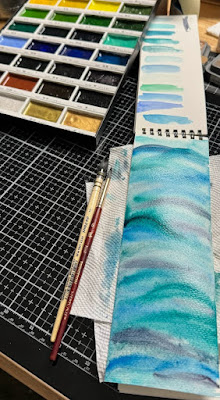
Knowing that, I decided to give it a whirl in the notebook I have of Strathmore cotton watercolor paper for the trial. and so, this is first round of paints.

When I stopped painting it looked like so, and I was frustrated with a lot of it, I know this is cotton paper but, its just not the same as Arches cotton paper and also the narrowness of the paper made it hard to swirl my hand the way I think it needed to be to make actual waves. I was tickled that the water drops made such good light spots on this through :) 

So I found a piece of Arches in the drawer that was this size, didn't measure it but, small enough for a square card front and this was first rounds of paints. 

The waterspotting worked well on this one also so, that was encouraging but, I wanted more colors so went and dug through some palettes I had not played with in a long time to mix in with the Daniel Smith paints. 

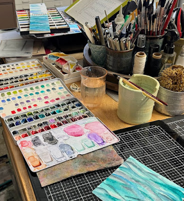
This really was a harder thing because, I have my paints mostly sorted by MFG rather than colors. but, I did come across this small one from Prima that is mostly blues and I added some of it over the top also.

And then I started thinking about water critter stamps I have and I happened across this Mermaid Crossing sign first so. out it came. Stamped with some Versafine Twilight ink on a scrap of Arches cold press.


At first I thought I was going to use it like a belly band across the background of waves but, I did end up cutting it down to the edges of the stamped part. 

Poked some holes in the parts of the stamped image where the "nails" were in the sign I guess and ran a sparkly May Arts cord through them to wrap around the background.


I diecut the background with a HoneyBee stamps deckled edge square die and then put the mermaid sign (Hampton Arts) on that. The base here is Stampin' Up Denim and its 5 1/2" square in real life. That's about it from me, If you'd like to play along with us you can find this challenge here. Thanks for stopping by.


3.15.2024

Inspired by { Polly P }

 This week Denise has shared Polly {Peeps321} Pinterest board collection as the Inspiration destination. I happened across this Sewn Easter Bunnies on her Sew Me board and just started to grin from ear to ear because, I had cut a little pile of these Sizzix Tim Holtz Cottontail Dies from Watercolor paper. And so, I focused on the Pink bunny in the center. 


Using Daniel Smith watercolors. 

When the pinks dried I added some Dr. PH Martins bleed proof white to the tail and the eye areas, it was very subtle. 

When that dried I decided to go over the eye with some black watercolor paint and that faded to grey of course.


Now, you may have remembered a few weeks ago the watercolor challenge was to do hmmm snow drop flowers? something like that. and I pretty much killed the paper from the first two attempts so I decided to see what would happent to one of the sheets since it was cotton I started just dumping more colors over the top of the flower background. There was a mixed media challenge a few weeks ago to make a watercolor background and this was as far as I got with that.


It dried like so, if you look close at the top you can see the stems of the snowdrops ha ha. So, I cut off a bit from the bottom of this panel and then used some Martha Stewart fringe scissors to make it blades of grass, then flipped the paper over and added more green paints to both sides of that strip, as it was drying I kind of scrunched it with my fingers like how you do your hair (when its long ) and you want waves. 


The background piece was wider than the size 8 shipping tag I was using as a base here. So I glued it down and cut the sides to fit the tag and then tucked those scraps into behind the bottom row of grass to give it more depth. ( the tag was run through the big shot inside a Penny Black Dot's and Dashes folder that was inked with some Distress Oxide Vintage photo ink. ( the stitched and French knot type textures on it was a nod to the idea that this started out jump started by a stitched piece) I dug out these tiny old mulberry flowers.

Decided to add a bit of white gel pen into the center of the eye and a little more black to the lid. I did add some Honey Bee Stamps vintage pearls to the mulberry flowers and a snip of Vintage lace across the bottom. The Gold shimmer and pink gingham ribbons are unknown off the top of my head. The cottontail die is up on foam pop dots on the tag and I did add a smidge more blue paint to the bow tie to give it some illusion of folds. 

The little justrite / spellbinders tag was tied on with some natural hemp string and inked with the DOX vintage photo ink also. All in all I am pretty tickled with how this turned out as my natural inclination is NOT do make pink bunnies. And I was impressed that I didn't make brown the dominate color either. ha ha right. If you'd like to play along with us, you can find this challenge here at SCS. Thanks for stopping by.


3.12.2024

Watercoloring with Masking Fluid.

 This week Linda is sharing a video on using Masking fluid. So, the challenge is you may paint what ever you like and just using masking fluid along the way. 

So, I knew that I wanted to do something that would have petals with highlights and I first thought of doing an Hydrangea and then when I pulled out this old Stampin' Up Stipple Hydrangea flower stamp I realized it was probably too small scale wise but, this is what I did.

I started out stamping it on some Arches cold press with Simon Says Stamp beige ink but, that was too light, I could not see it so I over stamped it with Morning Mist versafine ink instead.


I had used the brush cleaner on the bristles of the wet brush before I used a bit of the Windsor & Newton masking fluid on the leaves and petals here. (You can click on photos on my blog and it will open them up larger and you can hit your browsers back button to continue reading) I also started messing around with paint colors on a piece of milk glass while this was drying.

First round of Daniel Smith paints. 

And  a little more. the one thing about doing such a small image is it did dry quickly, so adding layers of paint to this was not a long drawn out process. 

Third layer of paints

At this point I rubbed off the masking fluid, you can probably see that better on the larger leaves than on the few random petals.

I did add just a bit more paint to this after the masking fluid came off and this is where it stands now. I don't have a plan for this and it will probably end up in the little wooden bin of colored images on my table for a quick card down the road. If you'd like to play along with us, you can find this challenge here at SCS. Thanks for stopping by.


3.09.2024

Inspired by { The Inspired Room }

 This week Kia has shared the Inspired room site and pinterest boards where I came across this pin of a reading nook and loved the shape and instantly thought of this new Penny Black die All in One Hexagon I have that had arrived in the mail and not been played with as of yet. For the shaping of the frame in the seat, I cut one from some Arches watercolor paper thinking this would become a window seat and The die cuts all those texture details you see so, I taped it back together on the backside of the paper before I started painting.

The sun was shining the last two days when I came home from work so, this is a first layer of paints thinking I wanted to see flowers out the window I did a simple meadow.

I did add a few more "details" to the window here and then mounted it to some Neenah earthstone that finished out at 5 1/2" square in real life. It's not quite so yellowish in person either but, I am having a heck of a time with shooting colors the last little while. I think its all the over cast days. and or the waiting until the last minute before the sun sets to do them. :) At any rate I know I am going to have a lot of fun with this die it's so different them most of my others. If you'd like to play along with us you can find this challenge here at SCS. Thanks for stopping by.


3.05.2024

Watercolring Tulips

 This week Kia has shared this video seen here on YouTube by Joanne Boone Thomas called How to paint three watercolour tulips. 


I did sketch this to start with a water soluble pencil and painting over it mostly it absorbs the lines the paint does I mean. I do have the same orange and blue she shared in the video but, I switched the yellow to cadmium yellow medium.


 Second layers of paint added.


and a little more, I did erase the pencil lines that were sticking out and not absorbed. 


I did add a smidge more shadow to a few places on the stems before I cut this with a Memory Box curved cap pinpoint layers die. The base is a pre made Spellbinders A2 top fold card base ( its thin, think 80# weight maybe thin) but, I have a package to use up so, I thought a flat one layer on it would work. This photo was very hard to edit as red is just not a color that photographs well in my cave of a space so, there is that. If you'd like to play along with us you can find this challenge here at SCS. Thanks for stopping by.


3.02.2024

Inspired by { Mackenzie Childs}

 This week Julie has chosen the Mackenzie Childs site for the Inspiration challenge at SCS. ( you can find that here) One of the first things I came across was this banner of mixed print Shamrocks. And the second thing I noticed was all the black and white check things. 

So I dug out this old Sizzix originals green shamrock die and cut these buffalo plaid printed papers with it twice. The one in the front is up on foam pop dots and they both have these tiny fingernail stickers that I found many years ago on them. That ribbon is from May Arts, the Green spotted print is a really old one from SU that was called Old Olive hmmm forget what the pack was called now, but it was just you know prints in the main shade of color. That base is Also from SU and probably celery? something like that. The sentiment here is from the AdornIt Dianna Marcum Leprechaun bait stamp, ( its the bottom line of the receipe) and it was done with some Versafine ink. Just something quick and silly. This one finished out at A2 in real life. Hope you are enjoying your weekend. & thanks for stopping by.


3.01.2024

Dirty Dozen March Christmas

 It's that time again, the first of the month and the new challenge prompt goes live for the fan club at Splitcoaststampers. For this month's theme I did this card mostly from scraps.

And pushing things around on the table, this Bear is from Impression Obession and it's name is Cocoa bear, the bow tie is from the Karen Burnston Riley & Co. tiny accessories set, I did use some black ( similar to liquid pearls) from ranger Enamel drops of his eyes. and After this was shot I did add two more layers of face to around his nose to pop that up a little bit. The tree he is holding here is from the Papertrey Ink enchanted forest set and I did use a red pen to draw the red lines under the trees on the scrap in the background where they are stamped to mimic the ones on the Tim Holtz printed paper. That lace is vintage, the button's either James dress it up or buttons galore. there is a bit of natural hemp string run through the holes. The sentiment is from the Papertrey Ink farm fresh set and I did cut it several times with a Paperrose curved rectangle die to get it down to a smaller size to let some of the paper scraps peek out around it. This cards is 5" X 7 " in real life on some textured Bazzill. That's about it from me, if you'd like to play along with us you can find this challenge here in the special forums set aside for fan club members. Thanks for stopping by.