Showing posts with label Friendship. Show all posts

10.20.2025

Clean & Simple Pumpkins

 The clean and simple challenge today at SCS is Pumpkin themed. And I received a big envelope of happy Gummiapan dies from "Color Me Nordic" and in that pile I have the Pumpkin teapot & cup. 

So, I did cut the cup twice and then a pumpkin from some scraps of Artist Loft watercolor paper and used what ever colors of DS watercolors were on the palette. ( we've been doing a bunch of Fall things lately so, its a lot of yellows and oranges and greens on mine)  


 I knew I had this sentiment ( its an old one from Verve Stamps the One Cup set) and I had already cut this Penny Black elegant frames a few times from watercolor paper when it arrived in the mail a while back so, this was a really Quick card. The base here is some Neenah solar white at A2 in real life. I have the idea I managed to get it all a little offset to the left of center here and I am debating about cutting the card up and making it a tag or something but, right now its a card and I left it alone. The shadows here are from a Zig clean brush marker in a pale grey. That's about it from me, Thanks for stopping by. 


10.11.2025

Silly Critters

 A while back I did a pissy kitty card Seen here for one of the Inspiration challenges and it ended up in the basket at work and a lady came in and loved it and asked for a couple more of them... You can click on any photo in this blog and it will open up larger and you can hit your browsers back button to continue reading... I just got my new "supposed to correct" the cataract's glasses the other day and as strong as they are compared to my old ones these photos look tiny to me on this laptop screen.


 So I dug out the Unity Stamps that I had handy and started adding watercolors to some of them.


 What she loved most I think was this particular Sentiment was with the cat so, I used it again a couple of times and then switched it up for the others. The lace on this one is from My Minds Eye.


 This was the stamps that were used on the first card. and this one is A6 in real life. The ribbon on this one is from Martha Stewart.


 That particular lady always chuckles over the snarky cards so, I did this one as well. 

I did this one with my tongue in my cheek, it has not gone to work as of yet. I tried to make the snow piles on the hat 3-D with some white gouache. I think that folded ribbon is from SU. 

I have a soft spot for puppies so I was tickled to see they made scruffy grumpy dogs as well. and I figured this sentiment worked just as well for him. I have had that printed ribbon for probably 15+ years and I have no clue where it came from anymore.

Which lead to using him again and adding some Dylusions Sentiment that was cut in half. And its A6. I am pretty sure that ribbon is from SU, but don't ask me its color name.

And then while all that was going on, I had placed another order with Unity and this pup is so far the first thing colored from that order. it just made me chuckle. this sentiment is actually from the same set as this pup. This one is 6" square in real life.

I find it fairly easy to go back and forth between two images that need drying time so, I did this pup twice while I was at it and then just used different papers and some wired ribbon to change it up a little. This one is A6 in real life. I have more stamps that need colored but, I have a to-do list of samples to make for the SCS gallery and I will hopefully be working them in here and there soon. That's about it from me, I hope you're doing well. Thanks for stopping by. 
 

5.06.2025

VSN Continued

 I had good intentions of doing a post for every project but... Life happens. So, here are the other things I have done so far for this round of VSN. ( there are still 2 more challenges left that I have not done as of yet and one I am still overthinking about )


The next challenge in the line up is this sketch seen here. And I seen after I had this glued that I missed a layer below the curved end banner one and I decided it was OK and left it alone. I had stamped and cut out this poppy and two of the leaves from the Power Poppy Poppy XL set on some watercolor paper and I cut up one of the leaves to make those pieces. I think if I were doing this again I would have stamped and colored a third leaf.


I cut the handmade paper with the botanical bits and pieces in it with a Memory Box nested globes die and then the Poppy here has foam tape under it to be up over the leaves that are just tucked in with glue dots. I found this Sentiment already stamped and diecut with the labels die in an envelope in the drawer so, I don't remember which set it came out of anymore. The base on this card is some sundance felt in natural white cut to 5 1/2" square in real life. 


 The next challenge has a row of pretty flowers across the bottom with butterflies and bees and such in the air above them. So I used this piece of double sided paper from the Ciao Bella Under the Tuscan sun pack and trimmed off some of the sky side to make it fit on an A6 cardbase, glued that along the bottom to give my self some space for the second line of this sentiment from the Simon Says Stamp poppy fields stamp set. ( that made this an 12 minute ish card yay me) 


The next challenge needs something real from Nature on it so, I dug out this piece of handmade paper that had real flower petals in it, and then grabbed the container of previously dried and pressed flowers and leaves to find these pansies. ( from 2003 and yes, they are incredibly fragile) so, I am thinking this will be my MIL's Mother's day card this year as it gets hand delivered and I do not think this card would survive in tack through the mail pressing machines. It's also A6 in real life, the printed paper under the frame of handmade paper is from Basic Grey. The sentiment here is from The clearly besotted message me set. 


The challenge before this one is one I am skipping as it is a fancy mountain fold card and I didn't look to see how complicated it was but, I am very much not doing stress still so, I jumped ahead to the next one which is to take a natural ( critter) and color it in an un-natural color combo. So I painted this bunny from the Happy Hoppers line with some Moonglow paint from Daniel Smith ( it has a lot of purple undertones to it) and then did the lips and cheeks with the bright pink ( its more startling in real life I think) There is a bit of stardream sparkle gel pen on the lines of the shoes and bag for some subtle sparkle. The Printed paper here is from the Memory Box magnolia grove pad and the base is some textured Bazzill. this one is 5 1/2" square in real life. that sentiment is an old one from River City Rubber Works. 

The next challenge is a color combo that is blue, yellow, green that uses the inspiration photo seen here. And when I was putting away the bunny I started opening the drawers under that to see just a way of thinking without really thinking, and I came across this stamp from Linda Grayson at Stamps Happen and thought if you change it a little you could easily do this as blue yellow green. So, I did. 

When I look at the IC photo of the challenge I see it as two shades of greens so, that is the way I went. I did squeak in a bit of black and red and brown but, I think its mostly greens here and is OK for that challenge. The sheer blue ribbon is unknown, I did use a Justrite tag die and then cut the stampendous thanks stamp by hand to glue to it. Its tied onto the ribbon with some black hemp string and this one is A6 in real life. 


 The next challenge is to do a Clean & Simple card with a realistic bird on it, and I knew I had a small pile of Memory Box dies in the basket of stuff I have been collecting and have not played with yet so out came this bluebird prince die set and the nest is also a Memory box die and I cut it from some Studio Loft watercolor paper and just daubed on some paints. ( it did bead up and do its own thing) 


The white panel here was cut with an Frantic Stamper Pierced rectangle die and the ribbon is unknown but, probably SU. The bird is up on foam tape to be above the nest and I did add some black enamel liquid pearls to the eye of the bird. ( which decided to to a hair sized trail of the glue as I was lifting up my hand so, it stained that paper where I scraped it off) and I am debating about adding more paint to it to fix that or not. This is an Pre-made A2 card base from Paper Source in their pool color. 

The next challenge in the line up was mine. And I had a plays well with others challenge that you need 2 living things that are not the same thing on the project. So, it could be plants or critters. and I had received this old PSX stamp in the mail recently and just went with that. I do better doing these challenges playing with what ever is in front of me for the most part. Its kind of my version of a limited supplies sorting for someone that has a lot of choices right? 


I have a feeling I am probably going to end up giving this one to my MIL as well as she collects teddy bears among other things but, maybe not until her birthday or something. not sure yet. I did cut the bear panel with Honey Bee Stamps deckle square here this one is 5 1/2" square in real life. the last challenge in the line up is to do a night sky with mixed media coloring and I am still pondering that one. That's about it from me so far. Thanks for stopping by.



5.02.2025

VSN {Naturally Nervous}

 The final VSN challenge for tonight was thrown down by Misti and her theme is that its Natural to be Nervous about a big life change. Graduation, Wedding, retirement etc. I spent a lot of time over thinking this and finally decided on this funny stamp from Riley & Co. 

Because, it was the most "nervous" thing I could think of. and I am thinking that maybe this is a card you could only give to someone very close to you so maybe it needs a "Hugs" type sentiment on the inside. I wanted it to feel like an old guy type card so, I dug out some really old Die Cuts with a view pads. and trimmed down the ticket print to fit on an A2 sized base (SU Taupe) and then used a different pad (textured grey paper) also from DCWV to cut with a Spellbinders labels die because the clipped corners look like tickets to me but, it was just too much grey so, I tilted it for interest so more of the background tickets could peek around it, added a couple of Pioneer Photo corners to that sentiment and left space for the encouragement part of the thought to go there. ( that is from an Simon Says Stamp mom's set) That's about it from me, you can find this challenge here at SCS to play along with us. Thanks for stopping by.


3.21.2025

Inspired By {K. Van Bourgondien}

 Hi & Welcome, this week Amy has chosen the K. Van Bourgondien site and Pinterest Boards for inspiration and I had some happy mail arrive mid week and I was hopeful I could use some of it and I found an entire board of just Tulip flowers Where I came across these beauties. I love that color combo. So, I used that as a jump start for these. The color I used on the tulips is Coral from Daniel Smith.


 I knew that in the past I have liked live things as no line but, the other things really need that definition so, this time around I first stamped this Spellbinders image with just morning mist ink in the Misti and after a couple rounds of that I used the Nocturn pad in the center of the image and the pieces of the right side of it so the card base and scissors with that black. and I thought OK you can work with this. This is first round of paints on some Arches cold press watercolor paper. 

I know it would probably be better to stamp these highly detailed images on the smooth hot press paper but, I like how the paints pool on the textured so, after a couple more layers of paints I did grab an Fineliner pen and add some details to the edges of the card and the eye of the mouse. 

This sentiment was stamped directly on the Basic Grey printed paper and its also from the same Creative Day set as the image. The base here is some Stampin' Up! Soft seafoam and the finished size is 5 1/2" square. I am finding that the envelopes of that square size are going for just a couple stamps instead of parcel prices like 6" square cards so, there is that. The more I look at this the more I think it needs just a bit more shadow around the mouse and his hands on the stems so, I may tinker with it just a tad more. That's about it from me, if you'd like to play along with us you can find this challenge here at SCS. Thanks for stopping by.


6.28.2024

Inspired by { Twig & Tweed}

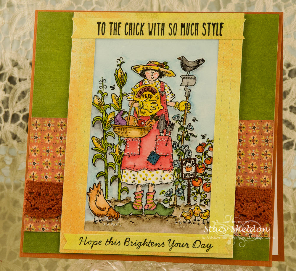
 It's my turn to host the inspiration challenge and this week I have chosen this collection of boards by Twig and Tweed. Their web site can be seen here. Usually I leave an email to my self with a link to the photo I chose to CASE and this week, I forgot to do that. The one I chose is the last photo in the challenge post. Which is a gal with her chickens in front of an Orange VW bug bus. I found this on the "all pins" section and it does not tell me what boards its on, it tells me she pinned it from country living magazine. and the thing I took away from that photo was "Coral" not Orange. ha ha. so, I seen after I had painted her apron Coral that the main colors were orange and green. 

So I tried to find some papers that kind of sorta looked like a bridge between what the photo was and how I painted her. This is Franny Farmer from Stampin' Up! (and this is the first time I have colored her) She was stamped on some Arches cold press watercolor paper and painted with mostly Daniel Smith watercolors. I did add some white gel pen to the cheeks and the stitches on the apron pocket. and some brown fine liner pen to the words Chicken Feed on the sack she is holding. 

The yellowish frame was cut with an Time for tea stitched frame die and both of the sentiments were stamped on its drop piece. the top sentiment is from the Unity Stamps set called Coolest Chick ever and the bottom sentiment is from the Spellbinders house mouse set called Flower Market. these were both cut with a lawn fawn every day banners die. That whole panel with the painting and sentiments is up on foam tape as that lace is thick and clunky what's the word. clunny lace? something. mind went blank again. The green solid paper is from an old Graphic 45 pad and the print and yellow are Basic grey. This is on a piece of textured 6" square Bazzill. That's about it from me, if you'd like to play along with us you can find this challenge here at SCS to play along with us. Thanks for stopping by.


4.05.2024

Inspired by {On Sutton Place}

 This week Julie has chosen the On Sutton Place site and collection of Pinterest boards where I came across this Farmhouse scene with a pitcher of blooming vases and I started to grin because, earlier in the week Kia had chosen a paint a blooming cherry branch tutorial which you can find here. So, out came some more cold press Arches Watercolor paper that I cut with the Lawn Fawn Canvas & Easel dies set.

So, I used the last painting I did for the Watercolor challenge as the inspiration for the smaller scaled bloom branch that fit onto the lawn fawn diecut. The stool and easel started to get layers of paints to give them a rustic vibe. 

More paints layered on.

I had originally wanted to place the canvas of blooms on the easel but, it covers it up a lot and I liked how the colors dried as so, I cut some printed paper that picked up those colors to use as a "rug" in the scene with all those white washed boards on the background print. The Painting and the easel are up on foam pop dots. 

The sentiment from the Stampin' Up feels like home set was stamped with some Versafine Crimson red and diecut with an Stitched MFT square die. The base is some textured pink from Bazzill cut to 6" square in real life. If you'd like to play along with us you can find this challenge here at SCS. Thanks for stopping by.


1.27.2023

Inspired by {Mud Pie}

 This week Amy has shared with us the Mud Pie site & Pinterest Boards where I came across this pin on the same weekend that had started making "Galentines" cards. (it's the day before Valentines to send cards to your gal pals...) (you'd think it would be the day after so that candy would be half price lol...)

Okay back to the card. I had started out flipping through my stamps with "hearts" or scenes with hearts that I could wiggle into becoming "galentine" notecards more or less so, when I seen that baby boy's birthday party color combo I had just seen this Stamps Happen Cat & Hearts Stamp where the index sticker has a mostly Patriotic color combo on it. 


So, I stamped one off on some Arches cotton watercolor paper and painted it with Daniel Smith watercolors ( the red is Windsor & Newton red) tucked in the sentiment from the Taylored Expressions Love everywhere set. The red textured layer is from Provocraft. The stripe print is from a Park Lane pad. The chevron ribbon is unknown as is the red fiber & tiny heart brad. I did use real sewing pinking shears on the water colored panel as it just cuts better than the "deco" scissors. I have a pair dedicated for papers in the drawer. And I think this turned out pretty cute. ( even if it does not look all that much like the shot that jump started it) That's about it from me, I hope you all are doing well. If you'd like to play along with us this challenge can be found here at Splitcoaststampers. Thanks for stopping by.

4.26.2022

Watercoloring Drills Odd Brush Butterflies

 This week marks the 100th Water Color Wednesday daily challenge at Splitcoaststampers. And it happened to be my week to host. and something funny along the way, I have never done anything really "in order" and recently after all this time just for the first time started making swatches of mixed colors of paint and doing that, I came across this practice drill to get those non round brushes wet and see what they will do pattern/stroke wise following along with this tutorial seen on YouTube here.

 So, I pulled the non round brushes out of the ceramic handle-less mug I have them in and funnily enough quite a few of these still had the sizing on them and had not been wet when this was shot.


 So I grabbed my Strathmore practice strokes pad, and this happened to be the last page in it available.


and I jotted down notes under the "wings" so I could remember what I did since I have more than a handful of brushes.


Second layer or paint doodles were added with ha, you guessed it a round brush.

And I decided my favorite was the one that says it was made with the 1/4" stripper. So I tried to recreate it below. yeah, we can see how well that went.. And Then I grabbed an odd sheet and tried it again with colors I like instead of just random colors. 


And I liked my abstract moth butterflies much better seeing them in similar shades of blues and greens.


So I chopped that sheet up and started messing around with sentiments on similar shades of cardstocks.


And ended up with a couple of cards. 


This one that sentiment is from Stampendous. This one is 6" square in real life. the blue mat was part of a premade cardbase that was for an A7 size from paper source but, it was not wide enough for 3 panels to go across it so, I used two of them here and then used the third on a second card seen below.


This one is 5 1/2" square in real life and the blue panel was cut from the back side of that first card that I chopped up and the green here is SU soft seafoam. the long sentiment "how to fly" is from Penny Black and the bottom one "spread your wings" is from Impression Obsession.

The whites on both cards are Neenah solar white. the painted panels are Strathmore 400 series cold press. That's about if from me, I hope you are enjoying playing along with these challenges as we learn together. You can find this challenge here at Splitcoaststampers. thanks for stopping by.


4.08.2022

Inspired By { James Street Home Decor }

 This week Kia has shared with us the James Street home decor store and I came across this Chicken baby blanket and my eyes totally focused on the pink chicks and my brain started thinking Easter. And then I started actually digging through my chicken stamps. And what I found is almost 99.9 % of my chickens are fully grown hens and roosters and tend to be larger sized stamps. I really do not have much in the way of bitty peep cute chicks. So, I started out stamping some of these Stampin' Up & Whipper Snapper Designs chickens with Memento Sand ink on some Arches cold press watercolor paper. The other ground spots were stamped with Mello Moss.


And the blanket was so busy to my eye that I knew I wanted it to be simpler as a card, and so, I left off the ladybugs, red fern shaped leaves and the whole filling all the white space aspect. I did leave a lot of the creamy background that the blanket has though and I did add lib those fern type foliage with the paintbrush as none of my stamps were the right scale for these chicks. This panel was cut with a Lacy Layers A7 die from Waffle flower and the Art Impressions sentiment was cut with a Trinity stamps stitched mini slimline die and that is up on foam pop dots over the chicken panel. The printed paper here is a really old one from Basic Grey that picked up some of those pinks and greens and the base is a Powder Pink one from Stampin' Up. I am thinking about adding Happy Easter or Happy Spring to the inside but, I have not gotten that far with it yet. That's about it from me.  You can find this challenge here at Splitcoaststampers to play along with us. Thanks for stopping by.

2.26.2021

VSN Mini {Parks & Rec}

 Last weekend there was a Mini VSN hosted at SCS and there were three challenges, the first was to do something inspired by Music in the park. (so you had to have an element from each) The birds and tree trunks dies here are from Impression Obsession. the Music/Lyric stamp is from Hampton Arts Cosmo cricket line and the tag is a very large one ( larger than a size 8 shipping tag, I need to measure it) It was run through an Anna Griffin snowfall folder and where the line is when I ran it through the second time to extend the pattern, That is where the sentiment strip goes across.

the second challenge was to do something with Butterflies on it. And this was the newest set in the room that had an un-inked butterfly in it. ( Colorado Craft Co. Anita Jeram's 4 leaf clover set colored simply with pencils real quick to fit the time frame.

And the third was to have snow covered mountains on the project. This one the halfdome scene is from Crafters Companion. The sentiment and eagle are from Club Scrap. And this one finished out at A7 in real life.


And like always you have a one hour time limit for the construction. the thinking can be an how ever long it takes but, the execution is timed.  So, for my third one I also combined it with this week's featured stamper Dawn who had this gorgeous Purple mountains scene card here

You always need at least two changes from the FS card you are casing so, I did move the eagle up in the design and chose a mountain scene image with the water below the bridge of the half dome so, that I could just color the blue there and have less layers. 

I think the main event for this VSN happens in a few weeks in March. And I find my self looking forward to that. Thanks for stopping by.


6.13.2020

Inspired by {Kawaii Pen Shop}

This week Angie has shared with us a fun little Japanese pen and stationary site for inspiration hunting. and I ended up being stuck in my tracks by this constellation pencil roll.


Before I made this I really thought I had a constellations background that looked more like the roll but, if I do it is hiding. I did try stamping this reverse constellations background from Hero Arts with some linen pigment ink but, it did not have enough contrast to show the pattern so, it was stamped with some Versafine on Neenah and then the Concord & 9th (city stacks set) sentiment was popped up on foam pop dots over the May Arts crochet ribbon. the bitty silver star is a beading jewelry spacer. This one finished out at A6 in real life.

The pencil roll can be seen here in their site and you can find this challenge here  at SCS to play along with us. thanks for stopping by.

5.31.2020

Smoking Hot

This week's featured Stamper is Chrysi and I came across this card fun card that made me smile from ear to ear. and I instantly thought of what you see here ( stamp combo) 

 So, this is Madge from Art impressions stamped with some versafine ink on Neenah solar white, she is colored with a combination of copic markers ( skin ) and polychromos & prisma pencils. That panel was cut with a Waffle flower A7 rect die and matted with some gilded ink recollections paper that the dark spots really look like gold ( see below) the whole pad looks like variations of alcohol ink backgrounds with some gold bling spots. So, to work in some changes I did diecut the Riley & Co. sentiment with an Avery Elle Party tag die and tied that onto the sheer ribbon with some fibers by the yard baby blanked yarn. and it is up on foam pop dots.

I did wrap the ribbon around the top of the stamped panel because, the sheerness I think just blends a little with the wispy look to the printed paper. but, from this tilted angle you can see how the gold glimmers. That's about it from me, thanks for stopping by.

4.20.2020

Inspired by {tags}

Not too long ago I picked up a new computer which ended up being an exercise in fustration trying to remember and reset so many passwords. and one of the sites that was the hardest for me was pinterest. but, I finally got into my real original account and I decided to look at things I had saved. and one of them was this board from Linda Shulist that has incredibly 6K+ tags saved to it.
and I started scrolling through that and found this tag from Stamping Mathilda, which just made my jaw hit the floor. and lead to me digging out every piece of clear packaging I could chop up in my room. ha ha

 And so this is what came from that. The bird is from Judi Kins, the diecut leaf is from sizzix Tim Holtz, the clear packaging was from some Sizzix steel ruled dies I picked up both for Christmas last year and some after Christmas holiday sales in January.

 And I started messing around with various embossing folders and tag dies.  but, the thing that kept annoying me was that packaging, its really scratched so the tag when held upright you see all the scratches really well. And then I thought OK just make them distressed and vintage feeling not an issue. but, I really like how the totally clear bird tag turned out so, I had also received a few bottles of new Alcohol inks in the mail last week and thought ok, if you add a bit of color it will hide the scratches. And so it did.
 The sentiment here I added to the bottom of the tag with red liner tape and then used a second strip of cardstock across the back at the same place so that it hides the tape and it made the tag taller. ( this sentiment is from Hero Arts Snarky Christmas messages set, the large snowflake is a Sizzix die the tiny blue one is from either lawn fawn or lil inkers ( I have both of their sitched snow sets and they are similar in scale) The tag was embossed with an Anna Griffin cuttlebug folder.

 This one the sentiment is from Unity Stamps and the holly/berries that are from the hero arts set called Holly Jolly, ( its dies made to cut a stamp set but, they work just fine for felt) The embossing folder here is from cuttlebug called goochie script.

 Now these are Sizzix dies that have a matching embossing folder. the one on the left was run through the goochie script folder and the one on the right was used with the folder that matches the die. the gold piece on the left was part of some frilly layered set I had cut a long time ago to get something out of the middle ( a spellbinders set) and I had saved this drop piece thinking it would be useful some day. the sentiment on these are from the Mama Elephant Merry Christmas Messages on the right and I am pretty sure the left is also a Mama Elephant sentiment but, my mind has gone blank.

This one I had cut the fa la la (Mama Elephant scripty) a long time ago from some cherry cobbler. ( the tree, Sizzix originals Christmas tree #2 die) is a drop piece from something I made years ago. you are getting the idea that  this batch of tags really went along the lines of what ever was in front of me was tossed on them right? I had used a gold leaf pen to trace along the edges of the star above and decided to add some gold to the berries of this holly embossing folder that was used on this tag. There is a bitty SU pine cone charm tied on this one at the top. I think the for you stamp is probably a Hero Arts one.  The two tags that are not finished yet really curled when they came out of the big shot so they are being pressed flat. That's about it from me so far, if you'd like to play along with us you can find this challenge here at SCS. thanks for stopping by.