5.29.2014

Stardream Chevy


One last card for May as the Prickley Pear's guest designer. this car is the 53' Chevy from the newest release. This is the larger version of this image. So this card is A-6 in real life. This is stamped with Memento on Neenah and colored with copic markers, gellyroll glaze pens, wink of stella pens, fabercastell pens. and the Metal Journey plate is unknown.


The mat under the stamped panel is an diecuts with a view shimmery teal color and the base is Stardream aquamarine which is a shimmer cardstock. I did add some score lines to this for texture. 


Another angle hoping to catch the glimmers and shines on this. Thanks for taking a look and most esp. to Michelle for asking me to play along here with these fun Prickley Pear stamps and dies this month I have enjoyed it. 

5.25.2014

Experimenting


So, I think you may have seen this notebook in one of the WOYWW shots a couple of weeks ago. this is the cover of it. the Pink painted watercolor paper was just laying around and was big enough to cover the printing on the cover. the poppies were done somewhere after the embossing folder print was done maybe on Thursday maybe Friday. ( forgot already) The vintage dictionary page has a definition of "wonderful" visible. 


just an angled look even with all the layers its still pretty flat except the metal parts on the left. 


This was the first page just had swirls from the top of a foam dispensing acrylic paint tube ( ranger distress) the cheescloth is a scrap that was done for some Prickley Pear things this last month and the butterfly was also done for that ( never used it have a pile of them left over) its heat embossed and colored over with a marker) 


and then I had second and third thoughts about even posting these pages because, they are not "journal-ed" maybe that will come later right now they are just a collection of things I have been playing with and or what ever I learned from that process. its mostly a memory book for me. 


This was done following coming across Dina's sanded pencil tutorial ( found here) but, I had taken all my watercolor pencils in the house so after I watercolored some ranger inks through this stencil and it dried I spritz it with some water ( it was too much ) and then I sanded some Koss Pastels (that water activate) onto this there was some darker green at the top right corner and then haha I used the same piece of sandpaper for the bottom left corner with a brown and I whacked the back of the sand paper harder that time to get the crumbs to jump ship into the water right? and then I decided to mop this excess water up with a paper towel and dragged it towards the bottom and that is where the streaks came into play. it was actually all fairly neat and orderly before that. 


off to the side is the center of a heart shaped food doily that was applied with some Claudine Hellmuth Matte studio medium ( it's something like modge podge kind of a thing) which I would have used if I had found any in the closet. ( guess I used it up and forgot about that) and I learned that it does not do well with ink. the sentiment was stamped with some stream adirondack and where the matte hit it it started to run in the T of the heart. So, its a good idea ( for me ) to have something that is not expected to be come a finished piece that is for someone else or even for sale later. kwim? 

5.23.2014

Embossing folder Mono Print backgrounds.


Old Olive dye ink brayered onto this Cuttlebug folder and spritz with water to create a "stamp" for this background done on some watercolor paper. I really liked how that turned out so, respritz the folder 3 more times and have two more pieces that you will see someday I assume. This is an Hero Arts two flourish flower colored with watercolor crayons and water stamped over the embossed printing. 


This is A-7 in real life, the sentiment's from My Favorite things just my type cut with an labels trio die. the photo corners are from Pioneer and the base is Gina K fresh asparagus cs. 


one of the skinny scraps, with an Hero Arts A real flower drooping done with watercolor crayons. 


CAS from scraps on the table more or less. the sentiment is from SU cut with an Martha Stewart hand held punch. the green texture is from Bazzill this one is A-6 in real life. the flower I did dot some metallic gellyroll glaze pen dots on the petals. There is a tutorial for this embossing folder stamping found here on SCS. from Audrie.

5.22.2014

water colored Lily Medallion


So, the water coloring experiments continue. This is an Outlines lily medallion stamp done 5 times on watercolor paper with India Ink black and colored with Derwent inktense pencils. 


I ended up filling in the "white" spaces with some stickles glitter glue. and all these pieces have just been laying around since last week. There are layers of 1/16" pop dots between all the layers and the center has an green rhinestone in the center. 


This is 5" square in real life, the ribbon is from Stampin Up. The sentiment I have to find it. ( thinking it's from a clear set) I had stamped and die cut it some time ago. the base is bazzill. Funny true story the ways to use it challenge to day is to repeatedly stamp and image and pop it up. I figure since I started the pieces of this last week I am not going to claim it for that even though I finished it today. 

Wishful Times


This is actually the first thing I made when Michelle asked me to do this guest spot for Prickley Pear this month and I put off posting her to be able to post her with that little guy below from the newest release. so, It's an two-fer day. This is the girl with an basket found here. She is stamped on Neenah with Memento and colored with copic markers & gelly roll pens. this panel is inked along the edges with some creamy brown fluid chalk ink. and up on pop dots. above the neenah millstone layer. 


a closer look at this gal. They have such a fun selection of vintage feeling images at Prickley Pear that its fun to color them. this ribbon/trim is really vintage with an pre-printed wish ticket and an Making Memories heart brad. this is all tied together with some May Arts Burlap string. 


This is A-7 in real life, the scrip printed paper is from echo park, the dots is from bo bunny and the base is night of navy. 


A closer look at the coloring and the hemp string tied like an Bolo tie. He is stamped with Memento on Neenah and colored with Copic markers & Faber-castell Pitt pens. After blending the horse's body I did use an 000 marker to move some of the ink on the horse's end to give him that dapple look.
 This whole panel is up on pop dots. 


This little guy is Bobby Bronco from Prickley Pear's new release and the sentiment is also an single stamp found here. This is also A-7 in real life, the brown mat paper is from 7gypsies, the gingham pp is from Pebbles. the clock button is unknown, there are seed beads tied to the dangling ends of the burlap string and the photo corners are from Heidi Swapp. 

5.21.2014

What's on your Work desk? Wenesday #259

Happy WOYWW Ladies! not a lot of of chatter today so hopefully the extra mugshots will make up for that. If you'd like to play along you can find all the details on Julia's Blog Here where this blog hop starts. 


I have not had much free time to play since last week so, most everything that was on the table then is still here with all the new shopping purchases that have followed me home since then. 


We ended up on a road trip weekend and the farthest we went was Portland where I found an papersource store in the same shopping center as the Apple store and that is where all the colored folded card bases and envelopes came from. all the loot to the left of that is from an Ben Franklin's stop in Eugene. 


The white envelope in the front of this pile is an gift from Brenda ( Tessaduck) because, we also got to spend a good portion of the day there with her poking around a fabulous garden nursery ( hauled home some things that will need planted this weekend) had a really fun & interesting lunch, met her friend who teaches card club classes at Bens. the salt and pepper shakers and the McCoy planter in the back near the left light were yard sale finds last friday we went to an Estate sale down in Merrill.


Now this is the cool thing, I have been looking for something ( see through ) that I could put bobbins of lace into for a while now and came across this tiered holder at Sur La Table ( same shopping center as Apple & Papersource ) it's supposed to be a veggie/fruit holder for a counter in a kitchen but, I think since we will be empty-nesters soon that this is way too big for the amount of food it would hold that would go bad before we got to it so, I did buy this on purpose to bring upstairs. I still have a huge basket full of lace ( vintage ) that needs wound and empty bobbins in the closet. I am thinking I can park this on the desk across the room next to my sewing machine where I can see it all the time. 


Just because looking at the textures of lace makes me smile inside and out. hope your having a great day too. I have lots of cleaning to do so I can see the table and play again. 

5.16.2014

Water colored Poppies


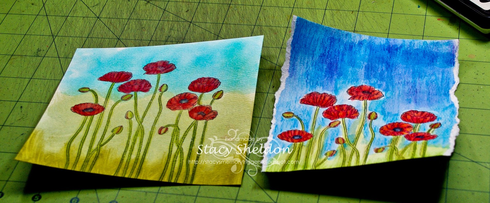
Just messing around the one on the left ( both of these were on the table Wednesday night if you caught the WOYWW post) is the one that the base was done with some acrylic distress paint daubers and distress stain daubers. the one on the right is just derwent inktense pencils. the interesting thing I learned doing this is, the watercolor pencils look more true to life on an acrylic painted background than and Stained background the blooms in the "sky" the sky bleed through so, it took 3 layers of pencils drying times to get reddish poppies instead of purple undertones poppies. another side note the one that is just watercolor pencils on the right dried a lot more warped than the painted first background.


a closer look at the stamped part of the one on the left, I have not done anything with the one on the right as of yet. 


This is 6" square in real life, the fibers are unknown, the trust are Tim Holtz labels stickers and the your heart are from an Donna Downey Unity sentiment set called Empowered words. 

5.15.2014

Fish Late


Is that not the coolest sentiment for summer or what? I love this and know I will get a lot of use out of it. its from the newest release at Prickley Pear and I have used it with this fishing silhouette image also from them. These were both stamped with some Versafine ink on some old basic grey printed paper that I had inked with some distress inks ( that did not show up) and then the bottom edges were torn and also inked which did show up since the core was white. The top of the card base it self was run through an cuttlebug distressed stripes folder ( twice ) because the card is landscape style it was very easy to see where to place the folder to line it up and get no line. 


remember last week's gift card butterfly? that was cardstock that was underneath this cheese cloth. it was spritz'd and sprayed with some Adirondack butterscotch, glimmer mist sea glass & Heidi Swapp seafoam color shine sprays. so, I did open it up and wind/wrap it loosely around the stamped panel between its mat panel. the edges of these have some teeny Karen Foster screw brads to help hold the layers together. This card is 5X7 in real life. 


while I was messing around with that I had thought this stamp was wide enough for an shipping tag, so this was also stamped in Versafine on an previously stained tag ( green ) and the skyline was over colored with some orange copic markers to give it that end of the day feel and then I added in the happy birthday sentiment also from Prickley Pear and tied on some scrappers floss. 

5.14.2014

May 14th WOYWW 258

If your curious about why the mess is on display head over to Julia's blog and play along. 
there are why and how to pages at the top of her blog. 


It's still Wednesday in my world for a few more hours.  this week has still been finding me playing with the watercolor pencils and paints. I think so far the attempts look mostly like a third grader colored them but, I think that is just a water control thing right? I dunno yet, the jury is still out on if it will "grow" on me, I like other people's water coloring so, I am hopeful its just a matter of playing with it enough for that to happen. So, monday I seen this cool texture used on something Vicki Gould made that she said was "snow tex" and I had some time to kill tuesday morning between arriving in the city where I pick up the ice for work and Costco opening so, I ran into Micheal's and asked the checker if she had ever heard of it, she had not but, she got on the phone and some mystery person told her it hides in the back corner near the restrooms in their store. I found it, have not opened it yet, I also picked up a little notebook that said it is a mixed media like sketch book. ( the pages look like they will tear out later if you wanted) so, today I was messing around with swirling an acrylic paint dauber on one liked how that looked its in the far top right of this photo. so, started another piece doing the same thing but on watercolor paper and then added some darker green paint to the bottom in streaks started thinking flower meadow here. ( yes, this is really basic no planning behind it ) and the sky was ranger distress stains. and I have since stamped some blooms on it and put one layer of watercolor pencils & water over that. I had stamped these same flowers on just neekid watercolor paper and colored them first with only the pencils and this piece has dried warped and the piece that you see on the table that has the acrylic & stain on it, it has dried flat. ( that's a cool thing to me to see) anyways sorry for the long winded ramble and thanks for stopping by! 

5.12.2014

Sweet Bebe { in Pinks }


Today the challenge for try a new technique is to do something not your own style, if you normally do layers or shabby or cas or mixed media do something not normal for you. The problem I had with that is, there is not much I don't do as far as style goes. but, I do not  I mean I really Dislike to watercolor. ( seriously ) it's messy, there is so little control ( closet control freak here) I even went so far as to ask for ( and received ) a set of Derwent  inktense pencils last year for Christmas. trying to get over this mental hump. I think this is my mom's fault. sometimes she says things like OOh is it watercolors? or watercolor pencils? ( she likes these things - go figure, eh?)  and so, I just took them out of the tin last week and colored that Bunnies Mothers day card. ( and I was seriously not real thrilled with that either) So that being said. yes, its a "me" styled card but, I colored it in a way way way out of my comfort zone. 


I have the I think its 72 pencils set ( this seems very limited to me ) I did make myself an color cheat sheet since the leads do not look much like they do after melting with the water or blending what ever you call it. and there are no light shades in this set and nothing that really looks like anything close to a skin tone. SO, this baby's skin what I finally ended up doing ( this is the second version mind you the first version turned into scratch paper for this one) is I scribbled some Tan and some Carmine Pink next to each other on the scrap and took the aqua brush and kinda blended those two colors together on the scrap and transferred it to this image.
It's not perfect but, it's as good as I could come up with without pulling out my hair. 
the other colors used are:
blanket/pillow = Payne's Grey
Hair = Sicilian Yellow & Tan
Bow on the bedding is straight Carmine pink
The lips and bloom are Poppy Red 
and the Eyes are Iris Blue.


This is A-7 in real life, the watercolored baby is up on pop dots over the Mystical Embrace die cut done with some coredinations cs. the base is Bazzill and the sentiment was done a long time ago on a pink SU scrap most likely with Crimson Red Versafine ink. there are also a bit of Recollections mini brads and some Treasures by shabby chic rhinestones on this with some Swiss Dots sheer ribbon. at any rate if you'd like to play along the details are found here

Dear Coffee...


My other faceless gal ( and even hubs noticed... first thing he said was she has no face) so, I said will as far as coffee goes every coffee addict will see their own face. ( sounded good on paper anyways) This is Kimmie girl from Angie Blom's line at Unity Stamps. she's stamped with Memento on Neenah and colored with Copic's. The sentiment makes me grin and think of Chautona because, she starts so many sentences with Dear.... 


This is 5 1/2" square in real life, the watercolor paper was stained with some various brown ranger stains a week or so ago. The edges were all done with some vintage photo distress and an finger dauber. the mat under the sentiment was cut from the captivating squares die, the studs on that are from Prima, this panel is up on pop dots. the green textured strip is just an unknown mfg scrap that was on the table. the swirly sheer ribbon is ( I can never remember this line scrapbook store by the yard stuff) 

5.11.2014

Framed Wings FS379


A closer look at the center, I think if you click this one to enlarge it the bling of the wink of stella shows up pretty good on this particular monarch.


Happy Mother's Day! This was totally inspired by Nancy's gorgeous card seen hereI love every single detail about her card esp. the colors but, I knew I needed some changes So, some of them are the script panel was stamped on some textured bazzill and inked over with distress inks then I used both sides of the negative pieces from the Penny Black die with a dauber and vintage photo ink to add the "branches" to that panel. the other changes are there is no piercing and I switched the ribbon out for an sentiment tab. The mat was enlarged and was done with some ranger stains. This whole panel is up on slim pop dots. The Monarch butterfly (all night media) was covered completely with wink of stella after coloring. This one is 5 1/2" square in real life.  


5.08.2014

Love Butterflies


Is this not the prettiest butterfly ever or what? as soon as I had seen these in the set from Prickley Pear I knew they would make an awesome wedding/anniversary type card. These were stamped on vintage cream cardstock and heat embossed with some Zing baked sugar powder. I did cut these out by hand because, I could not figure out a way to hold the diecut stamped version without rubbing the powder off before I could melt it. Its colored with some markers and has some bitty recollections pearls on the bodies.


This card is A-7 in real life, the sentiment is from all my memories they are round stickers with round bubble hard stickers that make them like little faux type keys with no framing or something. 


an angled view, I had taken some glue dots and rolled them into a line to put onto the back of the butterflies bodies so they would have that just landed look for dimension on the card front. the basse and the layers of diecuts are all done in some stardream shimmery opal cardstock and the crinkled silk ribbon is unknown. 


This was just a quickie 4" gift card my son had bought an wedding gift for his friend a couple of weeks ago and once it was wrapped he was very shocked to be told his gift needed a card on it so they knew who had given it to them. so, this was done from things laying on the table. the butterfly die is from Prickley Pear and it was cut from an scrap I had spritzed and sprayed for something you get to see here next thursday haha. 

5.07.2014

WOYWW Wednesday #257


Hi, From Millan.Net Welcome to the mess. I know it's not as big of a mess as some you will come across but, pretty much this is just about as messy as it gets here unless its an Dare to get Dirty week. or something like that. 
and if your curious about why the mess is on display head over to Julia's blog and check it out. 


to the left are some of the Unity Angie girls who came in the mail last weekend colored waiting to become something, the Alcohol & Salads bitty stamp is also from this new batch of happy mail. to the right is some Artful stamper smooching images over some things that were stained last weekend and a scrap I attempted to do an pillowbox background on ( without graph paper underneath) 


There was a try a technique challenge at Splitcoast on monday to over stamp the sentiment over the image, so this fairly large wineglass image is from Rubbernecker and the sentiment is from Unity stamps and there is an A between eating and salad but, it is in the stem haha.
so, I wasn't really all that thrilled with this and decided to play with the watercolor pencils I got for Christmas and so, 


This particular version of Smooching was stamped on some Fabriano Bianco paper ( because, it's a little thicker than normal smooth cardstock but, not as pitted as watercolor paper the first one I did on neenah smooth and the paper ended up pilling.) scribbled some of the derwent inktense pencils in side and wet them with an aqua brush. so, the next thing on the list is to make an cheat sheet of what these colors really look like. ( wet and dried) I am so used to Prisma pencils it was a big shock to me to see that there was only 2 gray's in the whole 72 count container. ( and no pinks...) so, this is the hot pepper red for the pink spots in the image. The Hero Arts sentiment was stamped over it with Versafine and I think I probably should have waited just a minute more of drying time it looks a little blurry to me in the happy. The lace is vintage and that whole panel is up on pop dots. 


5.04.2014

Guardian Wings


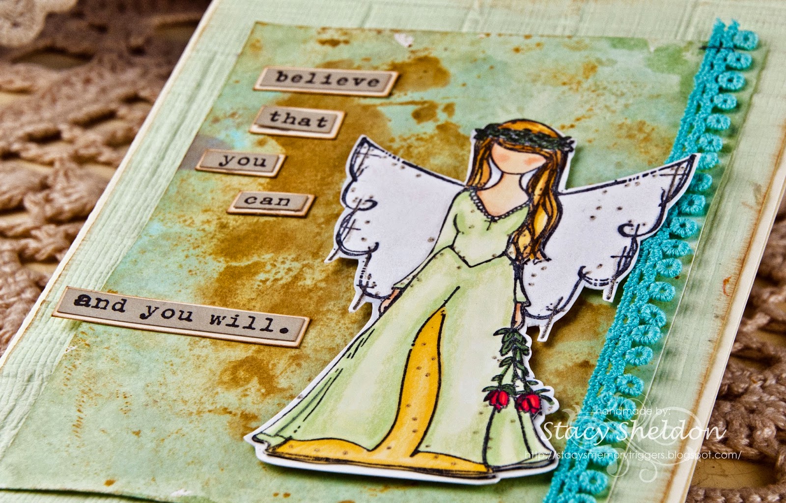
Well, I have finally found an person image with no face that I was willing to cave on to buy, in fact I had seen this angel used exactly one time and went on a mission to buy her. The gal who had used the stamp did not give her name in her upload so, it took me a while of hunting. This is Arianna Girl by Angie Blom at Unity Stamps. I was so excited when I seen the mix challenge was winged things as she landed in my mailbox yesterday. I have paired her with an Donna Downey sentiment from the Empowered words set also from Unity Stamps. 


just some angled crop shots, Arianna is stamped twice on the Neenah and cut out and the top piece ( the gal is layered to a second image of the wings. and the edges of the top piece have been traced around on the backside with an grey copic marker to blend the white edges. 


so, that panel is up on pop dots to raise the wing above the vintage trim. She is colored with Copic Markers, Gelly Roll Stardust glaze pens, FaberCastell Pitt Pens, Prisma Pencils & Zig wink of stella ( clear brush) 


this is probably the only shot you have a ghost of a chance of seeing the wink of stella on the wings. 


This is 5X7 in real life, the mat under her was done earlier as a blotter for some watercolor paper I had stained in shades of brown and so, then I added some green and blue stains to the whiter spaces on this blotter sheet and really liked how it turned out. and the colors of this card were built around that scrap blotter piece ha ha. The sentiment's mat is inked along the edges with some creamy brown fluid chalk ink as is the storebought handmade paper. a couple of teeny tim holtz staples holding on the trim finishes off the list of what-all is on this one.