This week Amy has chosen the Miss Jophiel site & pinterest boards where I found this pin where the gown had Green Leaf trim. And I knew I had this spool of Satin leaf trim from May Arts and decided to just roll with it.


This week Amy has chosen the Miss Jophiel site & pinterest boards where I found this pin where the gown had Green Leaf trim. And I knew I had this spool of Satin leaf trim from May Arts and decided to just roll with it.
a few weeks ago the featured stamper was Sioban and she has this Fishing card ( seen here ) That I thought it was pretty cool how she did the line/pole out of the box. and I had been poking around in my people stamps so, I grabbed these really old Stamping Bella fishing people and decided to mask them together into a closer space.


The sentiment here is from Art Impressions and then the happy anniversary is from A Muse. The panel I did use a stitched die to cut it out with and then distressed the edges of all the mats to make changes from her card. the ribbon trim on the side is an old Christmas one from either Joann's or Micheal's. ( I never remember that kind of thing sorry) The green textured base is Bazzill and this one finished out at A7 in real life.

I don't really have any people cards finished on hand so, this is one that also got to come out and play its from Kaly Cole stamps and its stamped with some Versafine morning mist on textured Arches cold press watercolor paper. and it didn't stamp perfectly so, I figured painting it would fill in the blanks and your eye would skip over those spots.
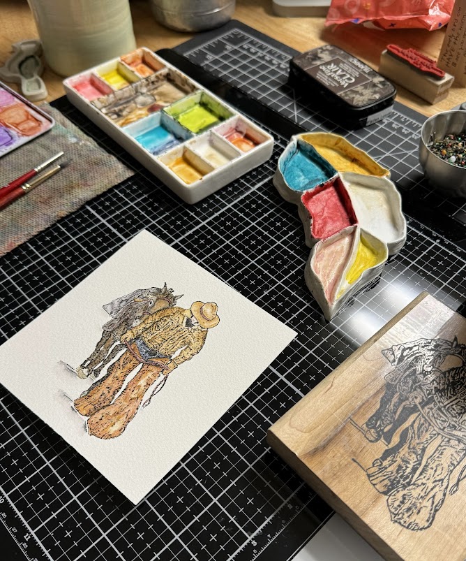
I just kept the stamp out so I could kind of guess what parts were what.

I ended up using that generic stitched scallop frame embossing folder on him, and then used scissors to take off the parts that fell outside the stitched lines. the wood grain print here is from the Crafts consortium pad and this one finished out at 6" square in real life. there are no words on this one.
a little bit after this there was a clean and simple challenge to use splatters and I thought well, why not. I had seen before that there were some really cute Chicken cards moving through the gallery at SCS for the featured stamper challenge that particular weekend but, when I opened my chicken stamps drawer I was curious to see if these would work together in a scene scale wise.

I had gotten the wing of the excited chick too close to the package being delivered via airmail so, I did cut a couple extra wings from a scrap and added grey paint to them for shadows and implied feathers.

A few more layers of paints & splatters this one turned into a Hen Party card with the Stamping up its a sign greeting added on. not sure how "clean" it is but, I did link it up to that week's challenge.
The Inspiration that same weekend went to a Liz Marie blog and I kept looking at all the mug shots of white washed ship lap walls with black framed mug shots and such. ( they were arranged differently every time they redecorated kind of a blog) here's a pin from them. I think that is so interesting but, I don't want to dust all that in my house so, that makes it more fun to build cards jump started by things like that in my head I guess.

It was really hard in my head to edit it down, what I needed was an graduation card for my second oldest nephew's oldest daughters highschool graduation and I am guessing this should have arrived there by now. the wood grain print is from the same Crafters Consortium pad and the black frame was cut with Reverse Confetti stitched frames. the sentiment & hat here are from the Unity Stamps Snarky Graduation set. also cut from that same stitched square set. this one was 6" square in real life.
In the end of April there was a weekend when Jenn was the featured stamper and she ( her Mama is a retired Nurse) so, she has a lot of Nurse cards in her gallery and I came across this one.
And I decided I could use that as a jump start for this one. The gal here is from My Favorite Things and She was colored a really long time ago. ( I had the envelope of colored people on the table during VSN and it was still out and I had seen the pile of nurses in it) I never used any of them as I didn't like how they turned out with the pencils so, I did add some watercolor paints over the top of the pencils on her.


This week Linda is sharing this tutorial found here on YouTube by Wendy Powell-Jones called Meadow Flowers. When I watched it as I was watching her sketch it I thought "Oh, I have that old PSX Queens Anne's Lace stamp..." and if you glance at it, the buds almost have a thistle shape to them..
So, I stamped it on a piece of A7 Arches cold press with some Simon Says stamp beige ink.

And I could not see it at all. So, I left the stamp out on the table and tried to create something similar without sketching and without really thinking about the field she painted. One thing I have learned along the way is that my limit for "Loose" only goes so far. So, this is loose for me.

I did use the masking fluid to put some cloud shapes in approximately the areas where there are some on the stamp index. I also for the first time used a black silver brush for this, and it was pretty difficult to get that masking fluid off the bristles of that brush. I have not had this kind of a time with that using the Princeton Neptune brushes. hopefully I will remember that part next time I try to use it. (and I did wet and roll the brush in the cleaning jar first like usual)

Once the fluid was dry this was first rounds of paints. ( mostly Daniel Smith)

More paints, some shadows and leaves and such.
the Painting did grow a little larger than the stamped image but, I think I still had the gist of it with the wild grass and stems going along.


I wanted more texture to those white blooms and adding all the shades of greys and indgo shadows they still looked a little flat to me so I dug out some Dr. PH martins bleed proof white. put on a bit on the blooms and splatters a bit also.

This week Brenda has shared this water coloring tutorial on doing a loose geranium pot seen here on YouTube by Paintinghyun.

I cut a piece of Arches cold press to just under A2 in size and sketched on a pot with some spots above it with a water soluble pencil.

Starting with this first layers of paint.

And another. started thinking that perhaps the flowers and leaves would look better if they were larger.

Another layer of paints.

This week Angie has shared this tutorial that Dina did for using powdered watercolors such as brusho's seen here at Splitcoaststampers. there is also a video you can see on the site or YouTube linked up on it.

So, in the past I have A made mud with these and B made the pigments travel through the air to every thing on my table. and that is not my thing, I can deal with inky fingers but, finding stray pigments waiting to be activated on everything irritates me, you tend to find them in the worst places. that being said I decided to put some Strathmore 400 series wc paper into my spray box on the floor. I did do all the sheets this way. this is the first two colors on the first sheet. and then I added a third because this was not all that interesting looking to me.

this is what that one looked like with three colors, and then I decided I had already started with the mess might as well do some more I had started with a 12" square sheet of WC paper so, each of these squares is 6" X 6" in real life.

These are sheets 3&4 evidently I didn't shoot the second sheet. and these I found out that one of my powders was really a liquid and it decided to drip every where and through my box so, after this was shot I spent a bunch of time cleaning carpet. ( this is the only room we have with carpet our house has hardwood floors and tile so, the one place where I could make a mess, I tend to not to, I'd rather play than clean)

a glimpse at the table at the moment, these are still struggling to dry. we are supposed to warm up here starting tomorrow but, it was snowing yesterday so. this is as far as I got with them. If you'd like to play along with us you can find this challenge here at SCS. Thanks for stopping by.
Way back earlier in the month Julie had picked the cup of needles for the Inspiration destination and I knew I had an embroidery hoop die from Sizzix so, out it came and I did a couple of cards inspired by their pinterest boards. ( seen here )

The insert of the hoop was stamped with an SU canvas background and then pierced with an Ellen Hutson Piercing plate and then when I put it into the Sizzix dies, it pierced it for a second time ( so it's extra textured) I used some Daniel Smith metallic watercolor on the metal parts. the scissors are a die from the Greetery's noteable die set. I did use an tiny recollections mini brad to hold them together. That shiny gold paper is from a Tim Holtz pad.

The sentiment here is from the Gina K Designs Nana's needlework sentiments set. the pink lace is not vintage. The tiny crochet blooms my mother in law made for me a long time ago and there are some mini brads in the centers of those. that floral paper is from Anna Griffin and the base is some textured Bazzill. This one finished out at A7.
I needed one more card for Mother's day and I thought if I kept it more simple it would look a little more like what is on the collection of pins so, the same sizzix die was used but, I stamped the center piece with a SU linen background and did not pre pierce it. I did use wood grain printed paper to cut the frame part and then used some DS watercolors for the metal clamp part.


