5.27.2025

Watercoloring aShades of Blue Landscape

 This week Brenda is sharing this video seen here on YouTube by Nasim Art called easy painting of trees Lovely watercolor painting for beginners. Which is an landscape with a forest done in shades of blues and greys, in 8 minutes or so not counting drying times.


So I started with a square of Arches cold press cut to 4 1/4" square and I let this mostly dry before I started the trees. well, actually I did one tree trunk and found it was not really that dry so, after that I let it sit.

and I did add it more tree trunks, a few branches. Some foreground shadows and popped a couple of birds flying into the scene from the distance. 


I decided I liked this how it looks with the shadows on the ground under the trees and I did not add the dog walker figures to the scene.


 I used an Spellbinders mat basics 6" square die to trim the painted panel, ran the Tim Holtz blue texture through an Penny Black embossing folder and took a piece of sand paper to that to bring out the script a little more. The grey corrugate is from an DCWV pad and that ribbon is from May Arts. The base here and the liner are some Neenah ( navy linen & solar white) This one is 5 1/2" square in real life and I have not added a sentiment to it as of yet, but I am thinking it may become one of the Father's day cards this year. Not sure yet. That's about it from me, If you'd like to play along with us you can find this challenge here at SCS. Thanks for stopping by.

5.23.2025

Inspired by {Cotton & Crete}

 It's my turn to host the inspiration challenge at Splitcoaststampers and I have chosen this site called Cotton & Crete. Then also have pinterest boards you can see here. I had saved quite a few things and kept coming back to this wrapping paper seen here. I knew I could stamp something or paint something very similar but, I decided to dig out some really old pads of printed paper and went with these. 


 I did start with that floral printed paper and its from an Authentique pad called Irresitable and its from 2013. The stripe along the bottom is from an My Minds Eye pad called Gingham Farm that is newer from 2019. The lace tied along the seam of them is vintage and the sentiment is from an Ellen Hutson set called "Besties" this was stamped with some versafine on some Neenah solar white and cut with an Spellbinders labels 18 die ( as were its layers) those layers of flowers were from the white canning jar but, I am pretty sure the sheer one on the bottom layer is from Making Memories, the center one is probably Prima and the top one with the pearl is from Hobby Lobby. This is A6 in real life. I know its more frilly than the sample paper and I find that I am OK with that. I think this will still mail as a one stamp card rather than a parcel rate card I am hoping. That's about it from me, If you'd like to play along with us this holiday weekend you can find this challenge here at SCS. Thanks for stopping by.


5.20.2025

Watercoloring Clean & Simple Leaves

 Hi, & Welcome back. It's my turn to host the Watercoloring tutorial challenge at Splitcoaststampers this week and I have been totally under the weather as it is full swing allergy season here and I was so glad I had picked something easy when I was looking haha. 

You can find this video here on YouTube by CreationsCeeCee Called fresh and simple watercolor cards. I had intended to do a small stack of things but, this is the only one I have done so far.

I had an A6 scrap of studio loft watercolor paper on the table so, that is what I used. that is some Daniel Smith watercolor paints here and I did let this dry after this.


The addition of a leaf, it looked a little skinny but, not a bad shape so I kept going.


 I used this fountain Pen nub to do some veins on the leaf.


 Then I popped in a second leaf as the first was just too skinny in that block of color to my eye.At this point I really was just winging it as I knew I had seen the block go on get dried and then a leaf over the top but, that is all I remembered. 


 These sparkle paints were still out from (probably last week) and so I did add some shiny gold dots to the background below and above the first leaf.

I used a Frantic Stamper pinprick rectangle die to cut the hole into the top of the cardbase and then trimmed the watercolor panel slightly to fit behind it so the painting is countersunk here. The sentiment on this is from the Waffle Flower Inside sentiments birthday set done with some Versafine Ink. That's about it from me, If you'd like to play along with us you can find this challenge here at SCS. Thanks for stopping by.
 

5.13.2025

Watercoloring Brights

 This week Linda has shared this video seen here on YouTube by Cailey called Aesthetic Way to Mixing Multiple Vibrant Colors in Watercolor Florals/Beginners. it is short and uses some bright shades of Mission gold watercolors (which I have so) I dug mine out.


 I did tape down two small enough to fit on A2 card front pieces on a piece of chipboard and started using the bright color of paint on the top panel.


 I didn't really like the brown "grounding" effect, probably picked the wrong shade of brown here.


 While that top piece was drying I decided to try it again on the bottom sheet using more primary colors and some water.


 Tried adding some flowers to the top panel. This was hard, its hard to see those petals on the dark background to my eyes.


 tried adding more water to the bottom panel as it is so dark you cannot see the petals at all, I ultimately tossed this panel in the bin after a few more attempts after this. That did not get photographed.

This is where I stopped with that top panel, I have some gold shimmer paint dots on the background and some dark green for the stems here. After the fact I think I added some gold dots to the centers of the blooms trying to get them to look in front of that background. This is as far as I got with this. My thought about this is, it probably works better with a bigger piece of paper so you have room to do the water between the colors. If you'd like to play along with us, you can find this challenge here at Splitcoaststampers. Thanks for stopping by.
 

5.09.2025

Inspired by {Rikumo}

 This week Kia has chosen the Rikumo site and pinterest boards and I came across this crumpled looking wrapping paper assortment here and I knew I had various printed papers that were very similar. So, I found this old scrap of Karen Foster paper first so, that was what I used. I also had received this set of Poppy dies from Simon Says Stamp earlier this week so, I cut the pieces twice from some studio loft watercolor paper and started adding paints to them.


 I did add more layers after this but, this gives you the idea. of the process. some of these pieces are pretty small in real life.

I knew I wanted to have the crumpled paper be the main pattern so, I cut some recollections kraft with an time for tea stitched rectangle frame and inked the edges with some DOX vintage photo ink. The poppy pieces were layered and arranged on the edge to allow more of the paper to peek through. The stems have a bit of Raffia around the stems and the sentiment is an letterpress style one from Spellbinders a little message sentiment done on some of that spellbinders betterpress cotton paper and I did use the die that fits it and this is up on foam pop dots to be above the frame and stems.

The base on this is some cream and was finished out at A7 In real life. I am half way thinking the white of the sentiment is a little white for this card so, I did use some bright white as the liner inside the card. That's about it from me, if you'd like to play along with us you can find this challenge here at Splitcoaststampers. Thanks for stopping by.


5.06.2025

Watercoloring Butterflies

 Hi & Welcome back. This week Kia is sharing these watercolor butterflies where you can see the video here on YouTube. The video is called Watercolor butterfly tutorial for beginners by Create with Aura.  I did watch it and I thought as I was watching it that maybe it would work for doing paint on Diecut butterfly shapes. So, out came this Hero Arts nesting butterfly die.


 And I started adding paint in a similar way as what is shown in the video. My thought was I don't need any butterflies at this time as the next bunch of Birthday cards and Father's day cards coming up are going to guys so. I thought maybe if this works I'd have a little stash of previously colored butterflies. 

These are mostly Studio Loft and Strathmore watercolor papers ( so not cotton ) and what I found is its easier to use the water to push the paint to the edges on the larger diecut pieces. 

So far this is what I have done. I did not do any of the "body" die cuts or maybe its antennas, there is one other piece in these die sets and I only did the wings. And I am pretty excited about adding these to my stash. If you'd like to play along with us you can find this challenge here at SCS. Thanks for stopping by.


VSN Continued

 I had good intentions of doing a post for every project but... Life happens. So, here are the other things I have done so far for this round of VSN. ( there are still 2 more challenges left that I have not done as of yet and one I am still overthinking about )


The next challenge in the line up is this sketch seen here. And I seen after I had this glued that I missed a layer below the curved end banner one and I decided it was OK and left it alone. I had stamped and cut out this poppy and two of the leaves from the Power Poppy Poppy XL set on some watercolor paper and I cut up one of the leaves to make those pieces. I think if I were doing this again I would have stamped and colored a third leaf.


I cut the handmade paper with the botanical bits and pieces in it with a Memory Box nested globes die and then the Poppy here has foam tape under it to be up over the leaves that are just tucked in with glue dots. I found this Sentiment already stamped and diecut with the labels die in an envelope in the drawer so, I don't remember which set it came out of anymore. The base on this card is some sundance felt in natural white cut to 5 1/2" square in real life. 


 The next challenge has a row of pretty flowers across the bottom with butterflies and bees and such in the air above them. So I used this piece of double sided paper from the Ciao Bella Under the Tuscan sun pack and trimmed off some of the sky side to make it fit on an A6 cardbase, glued that along the bottom to give my self some space for the second line of this sentiment from the Simon Says Stamp poppy fields stamp set. ( that made this an 12 minute ish card yay me) 


The next challenge needs something real from Nature on it so, I dug out this piece of handmade paper that had real flower petals in it, and then grabbed the container of previously dried and pressed flowers and leaves to find these pansies. ( from 2003 and yes, they are incredibly fragile) so, I am thinking this will be my MIL's Mother's day card this year as it gets hand delivered and I do not think this card would survive in tack through the mail pressing machines. It's also A6 in real life, the printed paper under the frame of handmade paper is from Basic Grey. The sentiment here is from The clearly besotted message me set. 


The challenge before this one is one I am skipping as it is a fancy mountain fold card and I didn't look to see how complicated it was but, I am very much not doing stress still so, I jumped ahead to the next one which is to take a natural ( critter) and color it in an un-natural color combo. So I painted this bunny from the Happy Hoppers line with some Moonglow paint from Daniel Smith ( it has a lot of purple undertones to it) and then did the lips and cheeks with the bright pink ( its more startling in real life I think) There is a bit of stardream sparkle gel pen on the lines of the shoes and bag for some subtle sparkle. The Printed paper here is from the Memory Box magnolia grove pad and the base is some textured Bazzill. this one is 5 1/2" square in real life. that sentiment is an old one from River City Rubber Works. 

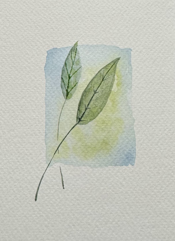
The next challenge is a color combo that is blue, yellow, green that uses the inspiration photo seen here. And when I was putting away the bunny I started opening the drawers under that to see just a way of thinking without really thinking, and I came across this stamp from Linda Grayson at Stamps Happen and thought if you change it a little you could easily do this as blue yellow green. So, I did. 

When I look at the IC photo of the challenge I see it as two shades of greens so, that is the way I went. I did squeak in a bit of black and red and brown but, I think its mostly greens here and is OK for that challenge. The sheer blue ribbon is unknown, I did use a Justrite tag die and then cut the stampendous thanks stamp by hand to glue to it. Its tied onto the ribbon with some black hemp string and this one is A6 in real life. 


 The next challenge is to do a Clean & Simple card with a realistic bird on it, and I knew I had a small pile of Memory Box dies in the basket of stuff I have been collecting and have not played with yet so out came this bluebird prince die set and the nest is also a Memory box die and I cut it from some Studio Loft watercolor paper and just daubed on some paints. ( it did bead up and do its own thing) 


The white panel here was cut with an Frantic Stamper Pierced rectangle die and the ribbon is unknown but, probably SU. The bird is up on foam tape to be above the nest and I did add some black enamel liquid pearls to the eye of the bird. ( which decided to to a hair sized trail of the glue as I was lifting up my hand so, it stained that paper where I scraped it off) and I am debating about adding more paint to it to fix that or not. This is an Pre-made A2 card base from Paper Source in their pool color. 

The next challenge in the line up was mine. And I had a plays well with others challenge that you need 2 living things that are not the same thing on the project. So, it could be plants or critters. and I had received this old PSX stamp in the mail recently and just went with that. I do better doing these challenges playing with what ever is in front of me for the most part. Its kind of my version of a limited supplies sorting for someone that has a lot of choices right? 


I have a feeling I am probably going to end up giving this one to my MIL as well as she collects teddy bears among other things but, maybe not until her birthday or something. not sure yet. I did cut the bear panel with Honey Bee Stamps deckle square here this one is 5 1/2" square in real life. the last challenge in the line up is to do a night sky with mixed media coloring and I am still pondering that one. That's about it from me so far. Thanks for stopping by.


5.03.2025

VSN {Weather}

 This morning Misti starts us off with an show her the weather on your project. and the wind blows here, almost every day. not quite the same as what you'd see in New Mexico with the whole dust storms but, still big gusts of wind and a breezy thing that picks up in the afternoons. So, I had a few stamps of gals with their hair blowing in the wind and chose this one called "Windy Day" by Katzelcraft and Stamped her with some Versafine Clair Morning mist ink on Arches hot press (smooth) watercolor paper.


 I added in the Simon Says Stamp sentiment after the watercolor paints had dried. The base here is some SU soft seafoam cut to 5 1/2" square. the coat here was painted with one of the sparkly paints so it shimmers slightly in real life. That's about it for this one, if you'd like to play along with us you can find this challenge here. Thanks for stopping by.


5.02.2025

Inspired by {Art dot com}

 This week Julie has chosen the Art dot com site and I found this Pin of Georgia O'Keeffe poppies painting and stopped looking. I knew I needed to do something really simple because, I am hosting one of the VSN challenges tomorrow night and I have spent a bunch of the free time this week making samples for that.


I had this Caio Bella Under the Tuscon sun Paper on the table as I used a sheet of it for one of tomorrows VSN challenges and decided to not overthink this challenge. I pulled out this double sided piece, Cut it not in equal halves and tied some rust-ish sheer ribbon over the seam. That bow is a narrower piece that was tied onto the piece wrapped around the seam. The get well sentiment is a die cut from Paper Smooches done from some textured Bazzill that I had cut it a long time ago. The base here is some Neenah classic cream and its A6 in real life. If you'd like to play along with us you can find this challenge here. Thanks for stopping by.


VSN {Naturally Nervous}

 The final VSN challenge for tonight was thrown down by Misti and her theme is that its Natural to be Nervous about a big life change. Graduation, Wedding, retirement etc. I spent a lot of time over thinking this and finally decided on this funny stamp from Riley & Co. 

Because, it was the most "nervous" thing I could think of. and I am thinking that maybe this is a card you could only give to someone very close to you so maybe it needs a "Hugs" type sentiment on the inside. I wanted it to feel like an old guy type card so, I dug out some really old Die Cuts with a view pads. and trimmed down the ticket print to fit on an A2 sized base (SU Taupe) and then used a different pad (textured grey paper) also from DCWV to cut with a Spellbinders labels die because the clipped corners look like tickets to me but, it was just too much grey so, I tilted it for interest so more of the background tickets could peek around it, added a couple of Pioneer Photo corners to that sentiment and left space for the encouragement part of the thought to go there. ( that is from an Simon Says Stamp mom's set) That's about it from me, you can find this challenge here at SCS to play along with us. Thanks for stopping by.


VSN {Would you Wood Please?}

 Melody has a use wood on your vsn project seen here. And I have a metric ton of printed paper woodgrains and embossing folders. and I thought about it and found a pack of previously stamped and heat embossed wood panel sheets that were done ( years ago) for some challenge or another and decided I liked the colors of this one. And I had this painting pushed to the side as I started it thinking it almost would work for one of the challenges coming later but, pivoted from this to something else and thought this would be a pretty focal point for the wood background. 


This is an old Stamps Happen stamp that hubs won on eBay for me fairly recently and I had it out on the table when the list of VSN challenges hit my desk as well. So I stamped this on some Arches cold press and started washing in some pale purples and pinks to the background. 

This was mostly using up paints in the palette. and they don't count your drying times against you for VSN just the assembly of the project needs to take less than an hour so. I was also adding paints to some of the other things you will see here and have already gone live as I have been working on the samples for a week or so now. 


What the stamp looks like, sometimes when I stamp a detailed stamp on watercolor paper I don't always see the details of the stamped image so, it helps my brain to look at the index sticker and say oh, those round blobs are dried pod things that I have no clue what their real names are haha. but, you get what I mean right? 


So I tied a piece of sheer aqua ribbon around the diecut painted panel and then put that up on foam tape over the embossed/inked woodgrain. This is Up on foam tape over that. The textured bazzill was cut to A6 in real life. I did end up using some white gouache for the birds in the scene but, I am not so sure they really look like birds. That's about it from me, thanks for stopping by.


VSN {Natural Metals}

 Vikki Jo has a use Natural Metals for her VSN challenge (seen here) and so, I found this scrap of Silver metallic paper that I had previously stamped an Stampin' Up filigree background on it and heat embossed it with clear powder to give it that engraved metal look. ( I save these kinds of things old backgrounds, esp. if you make a mess doing them) which comes in handy on VSN nights as I didn't really have to do much more than score and cut for this card. 

I found a scrap of this golds and silvers glitter paper ( recollections) in the stash and then just trimmed the engraved panel and then When I was looking in the drawer with previously stamped sentiments in it, I came across this one done on the black cardstock with gold powder and just kind of laughed. ( its a hero arts sentiment) and decided to use a black base to tie it together. 


I am not so sure either of these shots display just how sparkly this particular card is but, it is very glimmer-y in real life. It's A6 in real life. That's about it from me, thanks for stopping by.


VSN {Naturally "Free" Watercolor}

 Teri has a challenge to do free flowing watercolor and then doodle over the top of it. and I did not read the words correctly before the whole challenge was written. I seen it as do a loose painting and make it make sense with ink over the top. and loose watercolor is such a challenge. I decided I needed something as to where to drop some paint because, 99.9 % of the loose things I have painted for samples in the daily thing are things I have zero use for as my brain needs to see them as something not abstract things..

So I was looking for a stamp for something else when I came across this old Stamps Happen sweetpeas stamp in the drawer. and its very "loose" and I squinted at it and thought maybe you could paint something like this. 

So I propped up the stamp to be the "inspiration" for the painting. I added a very light wash of purples, blues and pinks to a piece of Arches cold press watercolor paper and let it dry. so the background would not be stark white.


Once that was dry I dropped in some purples and corals in random shapes and then used a script brush to wind in some stems. (and I let this mostly dry) 

And I splattered this a few times with the same shades of paint while it was wet and after it dried so they could be different drops of paint shapes. Then did the vase & petal shape outlines real quick with a micron pen. 


I did diecut this with an rectangle die from the waffle flower A7 set and made a base from some textured (close enough colored) purple cardstock so that it could be A6 in real life. I left off a sentiment as I am not sure what I am going to do with this as of yet. That's about it from me, if you'd like to play along with us you can find this challenge here. Thanks for stopping by.


VSN {The Natural Look}

 Kim is kicking off this Spring VSN with a challenge that is an two fold to use Polly's (peeps321) gallery to be inspired to make a Sympathy themed card. So, I chose this particular card Because, I really liked how she gathered the diecut hollyhocks and used them for framing on her card. So, I totally copied that part but instead of doing cut from a pulled transfer paper I cut mine from watercolor paper and daubed on some paints.


 And I chose some Studio Loft paper ( cheaper) as I knew they were not going to have much water on them, but it did still bead up a little on the bits and pieces.

After a second round of paints dried I did diecut an Lacy Squares die for the background from some Studio Loft watercolor paper so it would have the same base shade and texture as the flowers. 


The wired ribbon wrapped along the bottom mimics the curves of the lacy open spots. The base on this is Gina K Designs and its 5 1/2" square in real life. If you'd like to play along with us you can find this challenge here at SCS. Thanks for stopping by.