4.30.2025

May Dirty Dozen Christmas

 This month's prompt from the Dirty Dozen at Splitcoaststampers to get some Christmas done early can be seen here in the special forums for Fan Club Members. I gave it a lot of thought and I decided this would be a tag for me this month rather than an actual card. I find that I do not actually mail too many Christmas cards that are snowmen. but, I do a very small few of "winter" cards or seasonal things and I have so many of them I thought maybe I should start doing a few as tags..


 This is a Joy Crafts snowman in a jar die that I found at Frantic Stamper a long while ago and I bought it because, I actually have a dry snowglobe of a snowman in a Blue vintage canning Jar that I picked up at a Shepherds Market booth a few years ago and I just thought that was the neatest thing. When I was poking around in my dies to do this I thought Oh, maybe it would work on a tag. ( its kind of small in real life) So I cut it from a scrap of cold press Arches and added a layer of Daniel smith watercolor to it.


 An even longer time ago I had these pre-made tags that were just plain white and I sprayed them in solid sparkly spritz colors I have on hand and set them aside for someday. I fished out one of the Aqua sparkle ones for the background here, cut the string off and then fished through a piece of fluffy white yarn that came to me in a fiber swap as a long time ago. The sentiment is tied on that with some Sparkly iridescent cord from May Arts and has a stamped sentiment from Lili of the Valley tied on. I thought about adding some stickles glitter glue to this but, so far have resisted that thought. That's about it from me, I hope you are doing well & thanks for stopping by.
Watercoloring Lilac's

 This week Brenda has shared this Lilac's watercolor painting by Harriet De Winter seen here on YouTube

So I did start with sketching some stems on a piece of Cold Press Arches wc paper that had been cut to fit on an A7 cardbase.

And as I did the one on the right I decided the top of the vase was way too high up for this bloom so, I took an eraser to all the pencil lines you see here when it was dry and drew them again.


Added some leaves, more blooms and the top of the vase.


 I added some color to the vase and the stems in the water and then realized I needed said water in the vase ha ha and it was a little on the brown side from the blurry stems.

I did consider adding "shading" petals to the bottoms of the front blooms but, when I go out side and look at mine. they are darker at the tips. they start blooming/opening the flowers at the bottom of the cluster so, I left this as is. I did use a Crealies Cross stitch die to cut it and then I used an IO sentiment die from one of Anna Wights IO stitched sets to do the Clearly Besotted sentiment that was stamped on some soft seafoam cardstock a week or two ago. ( yes, I did straighten the sentiment after this was shot) it's one of those things, you see things more clearly after you photograph it. Which does help me with the painting process as well to flip through the snapshots. At any rate this is A7 in real life and that base is some textured Bazzill. If you'd like to play along with us you can find this challenge here at SCS. Thanks for stopping by.
 

4.25.2025

Inspired by {Streetangels}

 This week Amy has shared the streetangles site where I came across this polkadots Printed top that I really liked the color of. So, I started looking at stamps I have that would work for a birthday card and chose this Penny Black one.


 The actual color of this card is closer to the colors of the top online but, for some reason, it photographed off. Worse than a red card or an all white on white one. ( who knows why) its been overcast for days here so maybe the lights in the studio just read wrong. The white paper here is studio loft watercolor (Micheals) and the cat & dog (Penny Black Funny Present) was diecut with an Hero Arts circle die and the Happy Birthday ( also Penny Black) was diecut with an Impression Obesssion stitched circle die. The ruffled ribbon here is from Stampin Up, that printed paper I have since forgotten and the Base here is some PTI Ocean tides. I am thinking some of those gems are Altenew, Some were from kits. ( I have bought in the past kits from Hero Art and SSS and they have unmarked little things in the packs some times) so, they were just in the blues bits and pieces box. I think the teeny tinest one is a recollections pearl. I did mix up the color and sizes and such though not trying for a too much matchy matchy.  I am still debating if I like this as I hardly ever use circles and I really do lean more towards rectangles and squares for things. At any rate its one more done. That's about it from me, If you'd like to play along with us you can find this challenge here at SCS. Thanks for stopping by.

4.22.2025

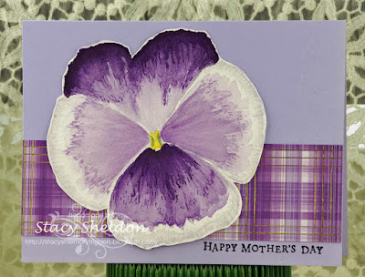
Watercoloring a Pansy

 It's my turn to host the watercoloring tutorial challenge at Splitcoaststampers this week and I happened across this Pansy by Katherine Skorka seen here on YouTube and I liked the detailing to the petals and thought that looks cool.


 I know the one in the video is huge so, with that in mind I did cut this Arches cold press to about 4 inches square ( something like 4 or 5 times larger than a real pansy for sure) I used an water soluble pencil for this sketch. 


And started adding layers of watercolor paint to it. 

the one thing about this is I did not save enough white space between the end of the purple color and the edges. and I decided to just keep going and see what happened anyways.


 another layer of paint with a little bit of detailing redone over the first layers. I am not liking the center much here the color and shape is kind of odd to me. 

after all this time I figured out what's wrong with this flower. (seems to me she says its a 4 petal bloom and really that large dark one in the back should be two petals overlapping each other but, I didn't paint it to have a lap in the center so, I just added more paint and let it dry.


 yet again another layer, I am not real impressed with this so far but, it does look better with each new layer of paint ( I am guessing now, it doesn't really look that much like a real pansy to me but, its not a total fantasy bloom either so there is that) 


I decided to add in a more pink-ish purple to the side petals after this layer and then cut it out with scissors to put it on the card below. 

The card base here is some Stampin' Up always amethyst cut to A6 in real life, the plaid border here is from the Memory Box Madras Blue & Violet plaid pad and the glimmer you see is gold foil on that plaid. The sentiment here is an old one from Hero Arts done in some Versafine ink. That's about it from me, I hope you are doing well. If you'd like to play along with us you can find this challenge here. Thanks for stopping by. 


Framed Love

 This week's featured Stamper at SCS is Carol and I did look at here gallery a little bit on Easter when she was chosen but, I didn't have time to play until this afternoon. I knew I need some Anniversary and Wedding cards in the back of my mind as I was looking at her gallery and I ultimately chose this pretty card because, I love the lace. I knew I wanted to keep it as simple as possible and I wanted to use printed papers. ( I have more than I can ever use up ) 

So, I started with the background stripe print ( it has some DOX vintage photo along the cut edges and the base is some textured bazzill. I thought I was going to go more browns than black and cream but, I found this frilly paper in an Authentique pad and decided if I cut a window into it, it would become a really neat frame. The Love die here is from Papertrey ink and I cut it (twice) from some Neenah solar white and stacked them for depth. I considered cutting another layer out of a glitter paper and decided to just trace along the inside edges of the Heart O instead.

An angled view, I did use some lace along the bottom edge and its not as large but, I thought it had a similar shape to the tips of it as Carols. I think I will add the rest of the words to the inside when its time to gift out the card and it could go either way in my head at the moment, Wedding or Anniversary. That's about it from me, I hope you're doing well & thanks for stopping by.


4.19.2025

Inspired by {AmiCreative}

 This week Denise is sharing the Amicreative site for the Inspiration challenge at Splitcoaststampers. I happened across this color combo Pin and my first thought was do a chicken card and so, out came this cute one from the Unity Stamps coolest chick ever set. 

I stamped her on a drop piece of Studio Loft watercolor paper that was laying on the table with Versafine ink and then I used Daniel Smith watercolors to paint her. She was diecut after that panel dried with an stiched rectangle die and the edges of that got some Distress Oxide vintage photo ink on them. The scalloped mat was diecut from a scrap a long time ago and came out of an envelope of those in the drawer as did the sentiment tag. Its tied onto the Martha Stewart ribbon with some black hemp string and there is a foam pop dot near the tail end to keep it in place there. This one is A2 in real life. If you'd like to play along with us you can find this challenge here at SCS. Thanks for stopping by.


4.17.2025

Odds and Ends

 A while back one of the Clean and simple challenge was to do spring and I happened to start adding more watercolor paints over the top of the (marker?) color to this previously started and set aside Penny Black snail and then when it was finished I decided it was not really all that Clean looking with that printed paper. So, I never linked it up.

I fished that sentiment out of one of the envelopes in the drawer so, I am not sure who makes it off hand.but it was die cut with a spellbinders labels trio die. The snail panel was probably cut with a Simon Says Stamp wonky stitched rectangle but, I do have similar stitches from one of the UK companies that has a set in A6 size so, one of those your guess is as good as mine now as to which one it was. That textured printed paper I think is Die cuts with a view. 


This is a little bitty gift sack that has an Tag for J for Easter this year. The butterfly is a sticker that she gave me, the tiny tag I sprayed with some shimmery paint spray a long time ago, That gold ribbon is probably Offray and the black hemp string is maybe lawn fawn? ( once you take the wrapper off its hard to say anymore) The tiny J tag was done a long time ago I have a little plastic envelope of letters I use frequently die cut in it and this was fished out of there the color of the tag was a nearly perfect match to the purple flowers on the tissue paper. That's about it from me, Hope you are doing well & thanks for stopping by.

4.16.2025

VSN is coming soon


The theme is going to be the Natural Look. I am sure if you think about that for a few moments you will get some kind of an idea of a few of the challenges if you are a person who likes to gather some supplies and or images ahead of time. The link to the pre event chatter thread is here at Splitcoaststampers. (and Yes, I have one of the challenges at nearly the end of the line up on the second night) Hope you are doing well & thanks for stopping by. 

4.15.2025

Watercoloring a Flower Basket

 This week Linda is sharing this video by Shelly Cluff Art called Easy flower Baskets seen here on YouTube for the watercoloring tutorial challenge at SCS. I Did watch it and then immediately painted one so, I had more memory of what I had seen then when there is a few days gap ha ha. 


 This is first layers of paint on Arches cold press cotton paper with Daniel Smith watercolors.


 I added a few more sprigs and some detailing with lavender paint to the centers of the purple blooms and white gouache to the centers of the blue flowers. 

I ended up adding more to the centers of those purple flowers. ( it kept fading away to nothing) at this point I do not know that the centers look all that light purple but, I did  end up with 3 layers of paint there. 

This is 5" square in real life, the base is some soft seafoam and the aqua dot is a scrap, ( unknown) the Happy Easter is a Penny Black stamp. I did even sign this one. That's about it from me, If you'd like to play along with us you can find this challenge here. Thanks for stopping by.


4.11.2025

Inspired by {BonTon}

 This week Kia is sharing the Bon Ton site where nearly right off the bat I found this girl Easter Bunny. And I just decided to roll with that as I had started adding color to a Missy Bunny last weekend. 

She was stamped with some Versafine Clair Morning Mist ink on Arches cold press 100% cotton watercolor paper and I was glancing at the index sticker on the stamp block when I started painting this, So the hat and clothing got a little brighter than I think I would normally pick as color combos from me personally. I guess in my head Easter is Bright. 

After I had added a few more layers of paint I decided to cut her panel down with an Stiched Simon Says Stamp square die. The gingham print here is from Graphic 45 and the textured paper under that on the left is some Woven Paper from Diecuts with a view. The base here is some Sundance Felt Natural (textured) cardstock. The base on this is 5 1/2" square and that salmon velvet is unknown. The Happy Easter is from the Clearly Besotted Message me set on an Scrap cut with a Spellbinders Justrite die. The salmon brad is unknown. the two larger flowers are the Hobby Lobby or Micheals brand as I am certain June gave them to me and the smaller one might be a Prima flower but, I really don't know for sure anymore. ( I have all my mulberry flowers in clear vintage canning jars on the shelf and I toss the packaging when I get them) 

That's about it from me, If you'd like to play along with us you can find this challenge here. Thanks for stopping by.


4.08.2025

Watercoloring a Loose Bunny

 Please join us in welcoming Suz and her first challenge she is issuing for the watercoloring tutorials challenge at Splitcoastampers This week which you can find here. She has chosen this video seen here on YouTube by Emma Jane Lefebvre called Easy Watercolour Bunny. I did watch the whole video before I started the painting and I could not remember every detail but, I think I ended up close.


 I knew there was loose grass while it was damp but, I forgot the legs/feet. so I did let this dry here knowing I needed it dry to add the face.


 I did add some details to his face with Brown paint and let that dry trying to decide what to do with the gaps between the bottom and the body bottom and the grass.


 I finally decided he needed some folded knees or something at the bottom so, I did get that whole grassy area re-wet, added some greyish knees and then did more grass over the top of the bottom again. This is Arches cold press watercolor paper and Daniel Smith paints.

Sometime last week I had seen there was a Burlap challenge and I spent a ton of time looking for mine, I know I have some but, it is well hidden. While I was searching for that I came across this Hessian embossing folder from Lisa Horton, ran it through the big shot with some Kraft cardstock and slightly inked it with some DOX vintage photo ink and decided it was not really "burlap-y enough" to pass so, it was sitting on the table when I was ready to finish this card. The background texture was pretty neutral and close in color/texture hints as the painting and the kraft panel so, I just tucked the bunny panel under the embossed strip and used this Taylored Expressions tag your gift sentiment on a scrap piece of studio loft watercolor paper that had been previously diecut in a tag shape. I have a little milk glass tray on the table that has blank things I have cut from scraps and a few Christmas sentiments already stamped and diecut in it and I fish things out of that tray most of the time when I am putting something together. The ink color here is Versafine pinecone. That sheer cream ribbon is an scrap and unknown. this is 5 1/2" square in real life. That's about it from me, I hope you are doing well & thanks for stopping by.


Bunny Basket

 This week Pam has asked for Easter Bunnies for the clean and simple challenge and I have the Stampassions Missy Bunny being painted on the table but, I know I want her to become a little bit frilly in the end as that's what I did with Mr. Daper bunny a week or two ago so... I started looking through bunny stamps I have collected and not stamped and this Whipper Snapper Designs Basket bunny trio won. I stamped it with some versafine on Arches cold press watercolor paper.


 And added some pale washes of Daniel Smith paints to it, I did add some white gouache straight from the tube after the watercolors dried. I wanted to add some kind of a stitched pattern to the panel but, I had cut it in a fairly rectangular shape so, my circle dies were not working ( they were already on the table haha) and then I decided to use this Penny Black zig zag stitched die and I wanted it cut more to the image than having so much white space, so I cut it twice lining it up in the cut lines of the vertical sides so that I could get the zig zag pattern across the bottom of the image. 


I spent some time poking around in my printed papers I almost thought about making the whole card front a pattern to be simple but, I kind of really like this soft seafoam colored cardstock ( a lot like A Lot haha) so, I trimmed down this piece of Bo Bunny plaid to be a "ribbon" haha. I added the clearly besotted (message me) sentiment directly on the cardfront with some pinecone ink as I had inked the edges of the painted panel with some DOX vin. photo ink. ( I hardly ever put that pad away) And that's about it from me, if you'd like to participate in this challenge you can find the details here. thanks for stopping by.

4.06.2025

Inspired by {Kristina's gallery}

 This week Nancy has chosen Kristina's gallery where I seen some pretty cute House Mouse cards among other things but, I was in the mood to color spring flowers so... I ended up coming back to this pretty spring rose card

So I started out stamping this Paper Parachute tulip basket stamp on some Studio Loft watercolor paper with Versafine ink as the blooms are pretty small in real life so, I knew it was not going to take an extreme amount of water to color this. 

First layers of Daniel Smith watercolor paints. 

adding more along with some shadows. I had a hard time trying to decide where the leaves were in the center of the cluster so, I eventually just made the centers between the things I could identify a soft green wash.


 I just kept adding more paint to it every time it dried in between helping hubs with some two people parts to the new greenhouse assembly and so, I am pretty tickled with it in the end. I did also paint that frame and cut it out with scissors. I used some Distress Oxide vintage photo ink on the scissor cut edges of this panel and the textured embossed scrap seen below on the card as well.


 That corrugate is the drop piece from the Snow lady baker card I did for the IC this week and the bottom texture is the drop piece from the Watercolor challenge card coming live in a few days. One thing on her card was some gems in the one corner so, I moved some sheer ribbon into a knot in the other corner and left off the sentiment. I have not decided yet if this is going to be an Easter or a Mother's day card but, I am thinking I will just put the sentiment on the inside when it goes out. That's about it from me, Hope you are doing well & thanks for stopping by.


4.04.2025

Inspired By {Rasberry Creek Fabrics}

 This week Julie has chosen the Raspberry Creek fabrics site for The inspiration destination The also have Pinterest boards seen here.  I came across this stripe nearly instantly in the site and just decided to roll with that. 


I started with stamping this really old Darcies baker snowman with a garland of gingers on some Arches hot press watercolor paper with Versafine morning mist ink. and adding layers of Daniel Smith & windsor & newton paints.


 Second layer of paints with some of the Windsor & Newton white gouache straight out of the tube for texture on this layer. 

I did add more layers and some shadows to the face and such but, the red in the apron? clothing was so dark I felt like the edges of the cookies disappeared so I did add some fine liner pen around the edges of the cookies and to the smiles of their faces. ( I had used black paint for the eyes.) I decided it needed more sparkle so, the red & white stickles came out as well as a stardream gelly roll pen on those stars in the image. The Corrugate paper here is from Die Cuts with a view and the stripe is a hobby lobby print. The red base here is an pre-made one from the Paper Zone and the lace is vintage. That Joy typewriter word ( Simon Says Stamp) was cut from some shimmery blue paper a while back. 


She is 5 1/2" square in real life and I shot her back lit against the window this evening while the glitter glue was wet so, it looks slightly darker than reality here but, you can see the catch lights of the glitter so, there is that. That's about it from me, if you'd like to play along with us you can find this challenge here at SCS. Thanks for stopping by.


4.01.2025

Watercoloring Loose flowers

 This week Kia is sharing this video seen here on YouTube by Liesel's Artistic Studio. They are fantasy flowers with a limited palette for the theme.


 She uses a mop brush for her painting and I have a couple both are daVinci ones and I did use this smaller one as the notebook is on the slim side. I also tried to half way sketch the droopy flower to start. 

Second petal and greenery added. 

While that was drying I decided to try an open version of the flower so, this is the back petals. ( very wet )

as a larger flower this ones petals are taking a lot longer to dry and it is also a ton of water on it as well.


the bottom petals were still damp when I decided to add the center ones and so there was some bleeding and I did add in more yellow to the bottom petal as well.


 I did add in some brown for the center and tried to do some lines for petal dividers on this one. 


Added  a stem to the bottom bloom and decided to let this try to dry completely. ( its still drying) and I think this looks really pretty on her video but, I am also thinking it will take a few more tries at these loose blooms to get ones you really love. ( I think I would like them better with a different brush and maybe on a larger scale) but, since I mainly make cards or tags I tend to try these paintings on small pieces because it gives me a more realistic scale for what I would do with it after it all dries. That's about it from me, if you'd like to play along with us you can find this challenge here at SCS. Thanks for stopping by.

well, I could not resist adding more paint to the bottom bloom and so it now looks like this.