4.26.2024

Inspired by { Daily Paintworks}

 This week Amy has shared the Daily Paintworks pinterest boards and site for Inspiration and I happened across this painting of Oreo cookies and started to laugh out loud as I have some vintage stamps of them and I also know my friend at work's hubs loves them so... this was done very simply.


The base is 3" square just some Neenah solar white and I stamped the RubberStampede Oreo with some Versafine Fallen Leaves ink. I did do a second one on a scrap of Arches cold press, added a bit of Daniel Smith watercolors to that one, cut it out and popped it up on a foam dot. The sentiment here is from Impression Obsession Cookie sayings set. I probably should have swiped on a shadow for them but, wanting to add the sentiment I decided to leave it clean instead. If you'd like to play along with us you can find this challenge here at SCS. Thanks for stopping by.

4.23.2024

Watercoloring with Pencils

 A while back I came across this video on YouTube  from HulloAlice that shares some tips on using watercolor pencils. now be advised that she starts off with all the things you should not do with watercolor pencils. And considering I had never watched a pencil video and I have done All those things that should not be done multiple times I decided this would be an interesting thing to do for the weekly throw down. You can click on these photos to enlarge them and then just use your browsers back button to keep reading.

I have in the past tried Prisma watercolor pencils, Derwent Inktense pencils and some other kind that must have been a more affordable option. ( not sure now) but, I had these Faber Castell ones on my wish list at Amazon and my son bought them for me as a gift maybe for mothers day or my birthday ( a long time ago now) and the results I had gotten with the other brands I was skeptical if they would be any better. So, today was the day that box got opened.

So I grabbed this image that had not stamped well on some Neenah to just try what I seen in the video. 


I was not all that impressed with these on this paper so, I decided to be fair I should try something on good paper. 


Found a scrap of Arches cold press 100% cotton paper and this stamp was on the wall by the table so, it had some open spaces and I decided it would work for learning. These brush tips were colored with the Faber castell pencils 


 This pink tip on the left was done with this pencil. Studio 71

The bigger pink brush in the center here was done with the derwent pencil. and Its a close second to the faber castell. as far as I can tell, not quite as smooth to use but, not horrible. 

That pink on the far left was done with this Prisma watercolor pencil. and this is just not something I enjoyed. it caught on the texture of the paper and just does not have that smooth melting that the faber castell and derwent do. Maybe its me.


Added a little more color to this with the faber castell pencils. I am thinking that if you were going to invest in pencils and you do not already have any I'd personally save my money and go for the faber castell and not waste the funds on the pencils that are more affordable because, dust catcher pencils that you don't use will not bring joy is just my take on it. 


So, that all that being said I decided that I wanted to do something perhaps a little sketchy looking to try painting with these pencils. And this Stampendous sketched Horse was the first "sketch-y" style stamp I thought of.  I used some Acorn Versafine ink thinking I was going to make it a little cinnamon colored in honor of my first horse I ever had but, these pencils I have not even done an cheat sheet yet and they turned out to be a little more yellow-ish rather then red-ish. So, this is a first layer of pencils on Arches cold press.

When the first layers dried I they seemed so pale so, I did add another layer and then a third to this. The eye on the left is bugging me I keep thinking there is too much white on it, and I am considering adding a lot more black to it.

The watercolor panel was cut with a Spellbinders 6" mat die and so was the Crafters woodgrain print. The bazzill is 6" square in real life. The sentiment here is from the Stampin Up set called Birthday Whimsy just because, I am way low on Birthday cards here.

The challenge this week is to paint what ever you would like and if you have pencils dust them off an use them. If you don't have pencils same thing, you may still paint what ever you like. If you'd like to play along with us you can find this challenge here. Thanks for stopping by.


4.22.2024

VSN Continued on Sunday Afternoon


Well, there was larger than 12" of room to play on the far side so, I did get 4 more cards done for the VSN challenges. 

Jean has a take it with a grain of salt challenge so, I grabbed this previously started background and got it re wet and salted. 

When it was dry it you could not see any salt dried texture patterns so, out came more water and I cleaned off a pallet over it and set it aside to dry.

While that was going on I had you know a scratch paper list of all the challenges and I started poking around in the already colored images to see if anything might work. Dug out this bear Stampabilities gruffy bear-ied in paperwork because, Brenda's challenge was a Murphy's law sorry or get well challenge. So, mine went a little sorry not sorry. I have a stack of these file folder card bases I cut years ago when I was on a kick and I had dug them out to start using them up. the sentiment (river city rubber works) here was cut with a paper smooches word bubble die and the bear got a little bit of watercolor shadows added to him. ( he's up on foam dots) 

A few weeks ago I started painting a couple of these hen lady images and they were in that mess on the other side of the table, I had stacked them up with potential printed paper pads and decided to just glue one together.

For Misti's madder than a wet hen challenge. The gal is "hen Party" from Stampassions, the oh, no you diten is from the paper smooches slang gang set and the cluck it sentiment is from the Picket fence studios hot chick set. the May arts ribbon was stapled to that with a Tim Holtz stapler. both of these sentiments were stamped and die cut from scraps a long time ago so from the drawer.


Misti also has a "Bless your heart" challenge. This angie gal from Unity Stamps the dream of being is one my favorite one that Angie Blom has drawn. I've colored her a lot and the woodgrain is a drop piece from something I did last week I think. The special sentiment is from The rubber cafe and the tiny bless is from Hero Arts. They both fit on the mid size Jumbo stitched banner die from Impression Obsession. 

Kim's first challenge was "when I was your age" my thought was you had to walk to the tv to turn the knob to change the channel. and I only really thought of it because, I had this tv cut and watercolored on the table from sometime when I was on a cut up that strathmore paper.. the American Art stamps was already colored and I figured she worked as most the people I know are all watching all the cooking shows... the tv is up on foam tape, the wood panel wall is My Minds Eye printed paper and the green textured mulberry paper is supposed to make you think green shag circa 1970 carpet. That's it from me, there are 4 more on the scratch paper and I am not sure if I will get to them or not, the salted background got minimal texture when I looked at it this morning before work, so its been pressed inside the big shot all day trying to straighten out.


4.21.2024

Virtual Stamp {Night} in progress


So, I seen late friday night there was an VSN underway at Splitcoaststampers. And this is what I walked up the stairs to find late Saturday AM when we got home... So, after a few hours of creative stacking, shuffling and a little bit of putting things away... I did manage to do 4 of the challenges so far.

the theme this go around is "famous last words" and the challenge here was thrown down by Rebekah and the saying was put a rose on your nose. Which I have never heard or read ever. but, the gist was to put a rose or a nose on the project. So, after some thought I grabbed this Crafters companion venetian lace folder and ran it through the big shot with some Strathmore 400 series watercolor paper. added a bit of Daniel smith paints from the pallette to it. found this already stamped and diecut sentiment in the drawer. popped that up on foam dots and decided it was a little too brown for the background and dug out these pioneer photocorners in a kraft color to add a smidge more brown to it. The base is an unknown color of pink and its A7 in real life. The thing with VSN challenges is you have an hour to assemble them. the thinking time can be as long as you want. And I tend to make better cards if I think about them a bit.

the second challenge I did was from Lisa called "we're in the same boat


The evernote file told me I had this sentiment on the Besties set from Essentials by Ellen and I grabbed it but, when I opened the drawer I thought would have vehicles ( and ships) stamps in it, I found critters and started to laugh seeing this Pooh bear floating along from Unity Stamps Rainbow searching set. I stamped these on one of the drop pieces from that same sheet of Strathmore watercolors. Added a bit of DS paints and cut that panel with a Honey Bee stamps deckle edge sq die. The chevron pattern printed paper is from My Minds Eye and the pale grey base is unknown. This one is 6" square in real life. 

and then life interfered and I worked on other things for hours and stole a little more time later in the evening to do two more. 

Melody has a challenge called "I've told you a million times not to exaggerate!" And the idea was to have lots of numbers on your project, so I pulled out this old Emerson image called "I'm 22" from American Art stamps thinking I had one of those old cuttlebug folders that is covered with random numbers but, I actually don't own that folder and then I came across this old Tim Holtz bingo card folder and pressed a piece of Basic Grey print the color looked pretty close/coordinated with how I colored her dress to my eye. ( with the words upside down of course) and it cracked but, that did not bother me much so, I just inked the cracks with some Vintage photo DOX inks and mounted the whole thing to a pre-made A2 Pool card base. 


The last one I finished was for Lisa's "let sleeping dogs lie" challenge and I knew I have hundreds of dog stamps, not an issue but, the sentiment stumped me. I ended up picking this dog from the Penny Black Doggone sweet set, stamping him with Versafine acorn ink towards the top on a skinny scrap of Arches watercolor cold press paper and using some DS paints on him. This was trimmed down with the center die of the creative expressions stitched weave die, so the watercolor paper and the printed stripe paper were all done with 3 different dies from that set. ( which is a pain to line up I think) and then the sentiment, oh, seems to me this bugged me last time also. I stamped off one line of this from the Taylored Expressions Simple strip woof set and then decided against using their matching die on it, instead grabbing a banner from Lawn fawn and although it was tapped down, it did travel and get crooked in the big shot. Such is life. the edges of all the light colored panels got a bit of Vintage photo on them and the base on this one is 4" x 6" so a skinny A6 style. I hardly ever make open on the side landscape styled cards so, that was something interesting. And that's where I am at so far. There are 8 more challenges on the list and one of them I may be able to wiggle into working with today's featured stamper. ( I hope ) but, no guarantees. Hope your having a good weekend also, thanks for stopping by.


4.19.2024

Inspired by {Whistlefish}

 This week Denise has shared the Whistlefish site and Pinterest boards. But, I happened across these blue leaves in her write of of the challenge and it stayed stuck in my head until it was time to make something so, out came this old Penny Black leaf spray stamp


That I stamped on some Arches 100% cotton cold press watercolor paper with Adirondack stream ink and then added Daniel Smith watercolors over the top of that. 

I had used this Reverse Confetti stitched square die last weekend so, it was still out when the leaves were dry and I decided it would be a subtle edge. The base here is some textured Bazzill and this one is 6" square in real life. And also much more vibrant. I am liking how this turned out, I never would have made leaves blue if I had not seen that shot offered up so, its a fun thing when you do something unexpected and you like it. If you'd like to play along with us you can find this challenge here at SCS. thanks for stopping by.


4.16.2024

Watercoloring an Orange

 This week Linda has shared this tutorial from Nikki Hess seen here on YouTube to make an orange circle have some depth to look like an loose orange fruit. I did watch the video all the way through before starting and I knew I have not spent much time doing circular strokes so, I grabbed the notebook pad and decided to use it.


Not really wanting to sketch the circle I just winged it with a paint brush. ( this is an Strathmore 500 series travel pad) which is supposed to be cotton but, its not the same quality of cotton as Arches, so I feel better about practicing on it than on 400 series Strathmore student papers. 

next layer of paints and keep in mind these photos are cropped so, I actually could see the detailing better after I had shot the snap shots with my cell phone, cropped them and uploaded them to a computer screen.

Which is when I decided I did not like that line near the top third of the circle so, more paint and water came out right after this was shot.


 next round of paints 

I did add a smidge of green to that orange in a couple of spots but, the orange over powered it and you really can't see it.

At this point I decided I really don't like this scrubbing in circles motion and I just wanted it to be done ( and not have such lines. but, I know that part of that is this paper. 

Added a shadow and a little more orange to the very bottom edge. I did not let it dry completely from the last layer so, this is where I stopped. not so sure it looks like a fruit orange but, I have a hard time with "loose" most of the time :) That's about it from me, if you'd like to play along with us you can find this challenge here at Splitcoaststampers. Thanks for stopping by.


4.14.2024

Watercoloring Western Stamps

 Last weekend when I started Mancell's birthday card I also got out you know some of the other western stamps I have and I stamped off a pile and started painting them off and on this week after I finished his card. 


This is cowboy Ralph from Rubbernecker stamped on some Arches cold press 100% cotton watercolor paper and painted with Daniel Smith paints ( same for the cards below) That sentiment here is also from Rubbernecker and I cut it out with an MFT stitched dome die. Ralph was cut with a Studio Katia darling ribbon & Dotted frames die. The printed paper for the wall is an old one from Basic Grey. I thought it looked like wall paper. The natural hemp string was tied in a knot and just tucked in around behind the papers. I had originally thought to use a tie and knot and hang on sentiment with him but, ended up going this was because, it struck me funnier. This one finished out at 6" square in real life.

This couple, I do not know their names but, they are retired from Art Impressions. I did stamp them, the hay bales on Arches cold press and used DS paints on them. They were all cut with scissors and some have pop dots under them. That sentiment is also from Art Impressions stamped on some Neenah earthstone. It actually looks like a fairly close enough match with the watercolor paper not being exactly white or cream kwim? The dance floor was cut from some Kraft cs from SU with a Penny Black wood floors die and then I did use ds paints on it. and it was a little too narrow for the square shaped card so, I picked up the drop piece and glued it to the bottom and just added in more of the same colors of paints to it also but, it left me with this odd blank space to the left so, I started stamping off bales of hay and cutting them out, I am thinking I should have done one more and cut in half so, it looked like it stacked out of the scene to both the left and up on the right of these but, I will probably leave this as it is. That horse shoe print is really old from Flair. 

Which leads me to the third one I finished. I have not done 3 cards on a weekend in a long time and none of them were for samples for something else so, that was fun. I still have a few more on the table so, if I get another done this afternoon I may just edit this post. Carrie is from Rubber Romance and it always strikes me funny that her leg is in there air. So, over the years I have looked for things to perch her foot on. I did pick up this buried wagon wheel from Commotion stamps on ebay a month or two ago just to see if it would fit scale wise with her. not knowing if it would work. I did stamp it on a scrap and cut it out, and decided that was "OK" it just added more depth to the scene but, I think I may cave and buy a kitchen table or a barrel stamp to try someday down the road. That panel was cut with crealies cross stitched square die and the corners have vintage lace wrapped around them. That red dot print is unknown and the brown tiny dot print is from My Minds Eye. this one the base is some white washed coordinations in a picket fence color that its kinda tan on the flip side. The sentiment here is that same one from Rubbernecker. That's about it from me, its been raining quite a bit here this weekend so, I am playing in my studio while moving the laundry around. thanks for stopping by.


4.12.2024

Inspired by {A Beautiful Mess}

 This week Kia has shared this A Beautiful Mess site where I came across this whole family dressed as Cowboys from the Toy Story cartoon. and I was off and running digging out a bunch of my Cowboy stuff to play with. Now, I actually have a woody stamp ( of course right?) but, its a tiny little stamp in reality and I needed a card for Hubs hunting buddy who turned 74 yesterday. 

So, I started to narrow it down to Slim ( he's retired from Art Impressions but, I still see him go up for sale on eBay fairly often) He was stamped with some Versafine morning mist on Arches cold press watercolor and I started layering on Daniel Smith paints.


After a few more layers of Paints I decided to cut some my minds eye printed paper (the darker brown here) with an Penny Black full bloom stitched die, it kind of sorta had this look to the "stitch" that made me think western. I picked out this really snarky Riley & Co. sentiment for the front. ( he has has more than his share of misfortunes the last couple of years) and then diecut that with an old Spellbinders labels die. there were holes poked for the orange brads to go through. That wood grain print I think is also from My Minds Eye. The sheet off to the right was glued to the inside and those tiny pistol charms were found at Hobby Lobby last weekend. ( they are in the Jewelry beading isle) 

I think scale wise it does fit him but, in hind sight I wish I had figured out a way to cut off the loop and maybe cut a slit into the design so that the barrel is behind the image and only the handle peeks out of that.

But all in all its not too bad for a first attempt at this.  I did try to keep some of the leathers and wood grains on the yellow tinted side as Woody has a lot of Happy Yellow in his shirt, and that color just jumps out at me every time I see him. If you'd like to play along with us you can find this challenge here at Splitcoaststampers. Thanks for stopping by.


4.09.2024

Watercoloring a Daisy

 This week Brenda has shared this Daisy painting tutorial seen here on YouTube by Karen Rice art. 

So I sketched a rough single daisy with an Water soluble pencil on some Arches cold press.


Then I layered a wash of colors to the background and sprinkled on some table salt.

When that was dry more paint went onto the flower parts, I was not real impressed with how the background dried towards the bottom nor with the stem and leaves so, I did add more paints to this a few more times. I felt like the background closest to the bloom I should have done much darker, I knew it would dry paler but, I think for shadows and a little pop I should have done more of the dark dark green closer to the bloom.


So I did add in more shadows under the petals and along the top edge of the flower also. Along with some yellow splatters but, those really faded in. When that dried I cut this with an Penny Black Zig Zag stitched rectangle die with more of the top background showing than the bottom. I "almost" added in some more greenery to the bottom but decided to leave it looking more like what was shown. ( I almost added more white spots to the background to be the rest of the Daisy flowers but, managed to rein in that thought)

The painted panel is up on foam tape here on some Stampin' Up Dijon cardstock. I left off a sentiment as I am not sure what I will do with this as of yet. If you'd like to play along with us, you can find this challenge here at Splitcoaststampers. Thanks for stopping by.


4.05.2024

Inspired by {On Sutton Place}

 This week Julie has chosen the On Sutton Place site and collection of Pinterest boards where I came across this Farmhouse scene with a pitcher of blooming vases and I started to grin because, earlier in the week Kia had chosen a paint a blooming cherry branch tutorial which you can find here. So, out came some more cold press Arches Watercolor paper that I cut with the Lawn Fawn Canvas & Easel dies set.

So, I used the last painting I did for the Watercolor challenge as the inspiration for the smaller scaled bloom branch that fit onto the lawn fawn diecut. The stool and easel started to get layers of paints to give them a rustic vibe. 

More paints layered on.

I had originally wanted to place the canvas of blooms on the easel but, it covers it up a lot and I liked how the colors dried as so, I cut some printed paper that picked up those colors to use as a "rug" in the scene with all those white washed boards on the background print. The Painting and the easel are up on foam pop dots. 

The sentiment from the Stampin' Up feels like home set was stamped with some Versafine Crimson red and diecut with an Stitched MFT square die. The base is some textured pink from Bazzill cut to 6" square in real life. If you'd like to play along with us you can find this challenge here at SCS. Thanks for stopping by.


3.31.2024

Dirty Dozen April Card

 Hi & Happy Easter :) It's not an April Fools but, tomorrow brings the start of the newest Christmas card Prompt for doing a some each month to lessen the OMG thoughts at Thanksgiving on how many Christmas cards and such you may decide you need. 

One thing I have done recently is I have been diecutting some not so great watercolor paper in silhouette shapes I have and adding watercolor to them, cleaning palettes and such. 


So, I have a little pile of these going on the side of my table in various stages of layers of paints ( mostly Daniel Smith) on some Strathmore 400 series wc paper which is not cotton) 

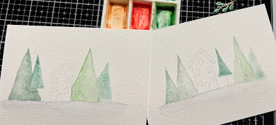
Not too long ago I had hosted a watercoloring challenge to use blues and make waves. And when I did that I actually walked around the table and pulled out the other palettes of wc paints I have and I unearthed this Prima one that had never been opened. There were so many greens I cut more trees and added some of these paints over the tops of the pine trees on top and these evergreens on the bottom. 


Which lead me to pushing some of them around and making this simple little scene. the background printed tree paper is from that Pad that was propping this up to see the shadows. I did end up tearing up some white mulberry paper for the "snow" foreground and then the Sizzix Evergreen was layered to that with the Prancing Deer layered flat to that and the doe from the Reindeer Flight die up on foam pop dots over it. The Sentiment ( from the Ton blizzard hugs set) is stamped on a piece of printed green texture paper Cut with a Spellbinders Framed tags die, I've forgotten who makes the mini brad in the hole at the top of it, but that is also up on foam pop dots. 

I did add some white gel pen to the eyes when the paint was dry on the deer and The colors are a little wonky. I am not sure what is going on with my camera, I am guessing I bumped one of the settings and I have not figured out which one as of yet. the deer are a little darker in real life than this though. The shots flat on the table are cell phone ones. That's about it from me, If you'd like to play along with us you can find this challenge here in the special forums set aside for Fan Club members. thanks for stopping by.