Showing posts with label masculine. Show all posts

8.22.2025

Inspired by {Lamps Plus}

 This week Amy has chosen the Lamps Plus site for inspiration and their pinterest boards here. I came across this chair with a collage/bird print fabric on it and went from there. 


 I have spent a little time this last week diecutting some of my scraps with new to me dies and this Creative Expressions Sam Poole Cheesecloth background from one of those old SU brown colors ( its the one that is darker than Chocolate Chip whose name escapes me..) that was how this card started as the envelope of these was laying front and center, So I dug out this old PSX decoys stamp # G-1737 from 1995 and stamped it with some Versafine Clair Pinecone ink on some Neenah classic cream cardstock. I ended up adding the sentiment from the Woodware happy birthday set ( this only has two sentiments in the set) with the same ink as I liked the font and my dad's birthday is next week. The scripty text printed paper is from Hobby Lobby and the base here is some textured Bazzill. This is 5 1/2" square in real life. I did use a Simon Says Stamp notebook edge die on the cream cardstock stamped panel and then used some DOX vintage photo ink along the edges of the paler shades of papers here. I thought about adding an Egg image or two to the collage but, I needed to get this in the mail so, I just left the birds as line art and did not color them either. That's about it from me, I hope you're doing well & thanks for stopping by. If you'd like to play along with us you can find this challenge here at SCS. 

5.23.2024

A catch up post

 a few weeks ago the featured stamper was Sioban and she has this Fishing card ( seen here ) That I thought it was pretty cool how she did the line/pole out of the box. and I had been poking around in my people stamps so, I grabbed these really old Stamping Bella fishing people and decided to mask them together into a closer space.


I did start water coloring them even though they were stamped on some Neenah solar white to see if they would look good scale wise together. 


The sentiment here is from Art Impressions and then the happy anniversary is from A Muse. The panel I did use a stitched die to cut it out with and then distressed the edges of all the mats to make changes from her card. the ribbon trim on the side is an old Christmas one from either Joann's or Micheal's. ( I never remember that kind of thing sorry) The green textured base is Bazzill and this one finished out at A7 in real life. 

I don't really have any people cards finished on hand so, this is one that also got to come out and play its from Kaly Cole stamps and its stamped with some Versafine morning mist on textured Arches cold press watercolor paper. and it didn't stamp perfectly so, I figured painting it would fill in the blanks and your eye would skip over those spots. 

I just kept the stamp out so I could kind of guess what parts were what.


I ended up using that generic stitched scallop frame embossing folder on him, and then used scissors to take off the parts that fell outside the stitched lines. the wood grain print here is from the Crafts consortium pad and this one finished out at 6" square in real life. there are no words on this one. 

a little bit after this there was a clean and simple challenge to use splatters and I thought well, why not. I had seen before that there were some really cute Chicken cards moving through the gallery at SCS for the featured stamper challenge that particular weekend but, when I opened my chicken stamps drawer I was curious to see if these would work together in a scene scale wise. 


I had gotten the wing of the excited chick too close to the package being delivered via airmail so, I did cut a couple extra wings from a scrap and added grey paint to them for shadows and implied feathers.


A few more layers of paints & splatters this one turned into a Hen Party card with the Stamping up its a sign greeting added on. not sure how "clean" it is but, I did link it up to that week's challenge. 

The Inspiration that same weekend went to a Liz Marie blog and I kept looking at all the mug shots of white washed ship lap walls with black framed mug shots and such. ( they were arranged differently every time they redecorated kind of a blog) here's a pin from them. I think that is so interesting but, I don't want to dust all that in my house so, that makes it more fun to build cards jump started by things like that in my head I guess. 

It was really hard in my head to edit it down, what I needed was an graduation card for my second oldest nephew's oldest daughters highschool graduation and I am guessing this should have arrived there by now. the wood grain print is from the same Crafters Consortium pad and the black frame was cut with Reverse Confetti stitched frames. the sentiment & hat here are from the Unity Stamps Snarky Graduation set. also cut from that same stitched square set. this one was 6" square in real life. 

In the end of April there was a weekend when Jenn was the featured stamper and she ( her Mama is a retired Nurse) so, she has a lot of Nurse cards in her gallery and I came across this one.

And I decided I could use that as a jump start for this one. The gal here is from My Favorite Things and She was colored a really long time ago. ( I had the envelope of colored people on the table during VSN and it was still out and I had seen the pile of nurses in it) I never used any of them as I didn't like how they turned out with the pencils so, I did add some watercolor paints over the top of the pencils on her.


  I changed the type of stitched framing I gave her, and instead of scalloped mats I gave her busy printed papers. Made the base Square, did add some Stickles glitter glue to the shoes and stethscope and clipboard as a nod to all the sparkle on a few of Jen's and The sentiment here is from Unity Stamps work of heart set. 

Way back in April Beth was featured stamper and I came across this card in her gallery. And at that same time I had received this sentiment stamp designed by Lisa Hindsley as a free gift from an online seller. ( I buy quite a few used older stamps online) and it was out while I was coloring this gal from the Old SU set called stamping fun for everyone. Changes were made to the mat switching it to a frame that went up on foam pop dots. I was going to make her gloves white, but some of the paint bled onto one so, they became purple. When I did this, I had added a tiny puffy heart sticker to the sentiment banner as a nod to those butterflies but, it fell off between the table I made it on and the dresser top where the shot was done. I really  had not even seen that. its funny how photographing things makes some things more obvious than just looking at them does. ( for me anyways) That's about it from me. Thanks for stopping by.


5.26.2019

A few challenge cards

 A week or two ago there was a sketch challenge that came out around the same time I seen the theme of this months Dirty Dozen Christmas card challenge and I combined them both with this card. The wee on reindeer is from whiff of joy and the sentiment is from Stampin up. This finished out at 6" square in real life.

 This last week the clean and simple challenge was to not use coloring mediums on the project. so, you could use papers or what not that had color on its own. and I had these two newish dies on the table. the wood frame is from Hero Arts and where you see the texture, its a cut line not embossing, so when the frame comes out of the die you can see daylight through it and have to smoosh it all together when gluing. the shirt is the larger size in the set of dress shirt dies from Paper Smooches. the sentiments are from the Mama Elephant Birthday greetings set. These are glued to a hero arts A2 card base.

This week's featured stamper is Joanne who has a beautiful gallery filled with quilts and flowers and really pretty cards. I spent a long time going back and forth with ideas and finally decided on this thinking of you card of hers because, I hardly ever use circles and I started with this double sided carta bella spring market paper and then I realized her card uses a sketch so, I did try really hard to keep it to the lines and I did mix lots of mfg's to build this off of that paper. The sentiments are from the casual fridays tag you're it set done with some versafine clair shady lane ink. the stitched circle is from Memory box, the chain link circle frame is a MFT die, the flowers are all from the Simon Says stamp modern flowers die set. I did embed those and added some prima watercolors and a little pink stickles over the petals. the white dots were done with some White nuvo drops and this one finished out at 6" square in real life.

4.14.2019

VSN {so far}

 Jeanette has a challenge to include a map on the project, so when I finally found a piece of map paper it had such a vintage color to the Minnesota roads map I ended up going vintage for the whole card. that old truck is from Hero Arts and the sentiment is from My Favorite things.

 Kim has a challenge to be inspired by the trip advisor web site and there are all these boxes with things to click on to go here or go there and I really had no where I wanted to go when I was looking at the site and I had seen this travel poster printed paper on the same pad the map paper came out of ( Carta Bella are we there yet) and thought ok do not over think this. that sentiment is from Paper smooches.

 Ann has a challenge about duck boat travel, so you needed a boat and a duck and my ducks are those tiny ones in the sky flying in formation... I ended up adding just a few pencil shadows to this after the fact but, this one squeaked by in the time limit because, I kept hitting the watercolors with a heat gun.

 Melody has a challenge to show some luggage. the one on the right is from Deep Red and the fancier bags on the left are ( unknown at this time but, guessing Unity) and that sentiment is Gina K.

 Lisa has a challenge to show shoes. and I still have no clue where I got this sentiment from but, the combat boots are from Deep Red. the topo map printed paper is from Kaiserkraft.

 Polly has a challenge to show what you do while you are in hurry up and wait mode while traveling and I drink coffee and watch people... the gal is from Unity Stamps and the sentiment is from My Favorite things.

Misti has a challenge to show a street legal vehicle ( for a road trip) and I have had this Crafters Companion stamp a long time now so, I googled old Route 66 signs and colored the sign that way but, the old signs the letters and numbers are white on the signs... and that ended up clashing for the red I gave the bike so, I may just add more red to the sign later... there is a bunch of stardust gelly roll pen and clear wink of stella on all the chrome too so this one sparkles in real life. the other sentiment are from the Paper Smooches set. and that's what I have done so far. thanks for stopping by.

10.15.2018

a few Challenge cards

 This last friday Lydia had a challenge for the mixed Media forum for a debossed piece so, there is a video here in the thread for that which shows the how to behind this look. I started with a piece of Neenah solar white that has that Hero Arts stencil into acrylic paint on a gel press. when that was lifted up then the countersunk side of this Sizzix snowflake folder was used to pick up the paint print. The mat paper is an older one from Basic grey and the lace is vintage. the diecut sentiment is from the Penny Black set called winter cheer.


 A closer look at the layers of texture. this is actually pretty flat to the touch.

 This week's featured stamper is Angel who has this pretty card that looked like stained glass on the floral panel so, with that in mind and the need to make changes I did flip my (different) floral panel up to vertical and instead of stamping a background I used an Anna Griffin floral ground folder. the Hugs die on this one is from the Papertrey Ink set called big hugs. ( I did this way late at night on saturday after dark so, I did fix the scratchy look to the inking on the word after this was shot.)

 The peony panel was heat embossed with SU pewter powder and colored with Distress Oxide inks. ( tattered rose & spun sugar & evergreen bough. This card finished out at A2 in real life.

It's been a while but, there was a Clean and Simple challenge to "frame" it. so, this deer is from the Nobel deer set, and the sentiment is from Art Impressions and the garden frame is from Elizabeth craft designs. I did scribble some pencil over the top of the ink on the frame and it did give it a horn look rather than a twigs look but, either way you view it, it still works in my mind.
The craft like a crazy chick thing is still on-going and I will have more booth things to post soon. (maybe with less words haha) thanks for stopping by. 

9.29.2018

Inspired by {Orvis}

This week Anne has directed us to Orvis online, and any time someone says that to me the first thing I think of is fly fishing. ( and gloves) I have a few pairs of their gloves that look like this  a man's small fits me just fine for driving, I have fairly big hands for a girl. 


So, knowing that the very first thing I stopped on was this fly fishing vest. and I knew I had a Karen Lockhart stamp of one so, I was pretty excited. and then I dug out the stamp. and mine must be what a "loaded" vest looks like hahaha. plus it had a plaid shirt, so back to the store and I found this Orange plaid shirt and started coloring.
The orange lawn fawn paper is not so yellow looking in real life. these were stamped on some Neenah desert storm with Versafine inks. the vest was done in Vintage Sepia and the fishing lines were done in smokey gray. ( that is an Impression Obsession stamp) that I placed in the corner of my Misti and then stamped and turned the sheet 4 times to make a big background of it. The happy birthday was done on a scrap of Recollections kraft and diecut with a Memory Box Mainstreet pinpoint tags die. there is a mix of chocolate and natural hemp strings to tie it on as the vest panel is up on foam pop dots.
A closer look at the shirt, I think my husband actually has one this color in real life too hahaha. Thanks for stopping by, you can find this challenge here at SplitcoastStampers to play along with us.

7.14.2018

VSN Staycation {night 2}

 This kids challenge this time is being hosted by Kim and she has a link in the challenge thread to a quick 3 minute video of blowing soap bubbles with paint to make these backgrounds. ( totally cool) I did make a few and was able to have them dry completely between layers of paint bubbles rotating between the three sheets. I used some Strathmore Mixed Media #140 weight paper and it had minimal warping after. the Poinsettia on this ( Penny Black ) was heat embossed with SU pewter and colored with pencils at work last February during one of those 30 day coloring challenges I think. the sentiment ( I am looking for this, it has this "clearly besotted" feel to me but, I am not seeing it in evernote and it has a hard time searching through script sentiments so..)

 a closer look at the bloom.

 a look at the backgrounds I had done, I did mix these paint colors and I did use green dawn dish soap but, I do not think the soap left much pigment into the mix.

 Lisa has a challenge seen here  to do a holiday themed card, so this PSX bear was stamped with versafine and colored with pencils and has a little bit of glitter gel pen on the wings and halo a while back and the sentiment is from Tim Holtz great outdoors set. this one is A7 in real life .

 and this printed paper is from the MME sugarplum pad, the centers of all those flowers are a little bling-y. I don't know if you can see the glitter on the image this way or not. ( my eyes are tired as I type this)
 So, being a person with piles on your stamp table tends to be a help when there is something like VSN going on as there are things that had been worked on and set aside in those piles, such as this gold fish jar. I made one of these one day for a featured stamper card, and took the card to work monday AM to show June and she bought it, so that monday night I had the stuff still sitting out and made another one.. for Jean's challenge is a scavengery hunt and the three things that make mine work for this is, there is something Orange, the printed paper to me looked like the tile you would see as the trim in a Hotel Pool and the sentiment is one you would see on a Postcard...
Okay its a stretch

 Misti has a second challenge to do a Pool Party theme and I knew I had this gal, but I was thinking I had just a bikini stamp and I never did come across it so, I found this printed paper ( kaiserkraft) and thought that looks like pool colors and then found this gal ( Art Impressions Blanche) and thought ok if you do just the paper and the gal you have time to color her. Polly has a Mixed Media challenge this week to layer your coloring mediums also and I had seen that yesterday and I do that pretty much on everything but, I wanted to do this as something I did now. which kind of was a good thing and a stressful thing because, for me coloring is a relaxing thing not a hurry you only have an hour thing and I have not touched my copic markers in a long time but, I knew I could get a base layer down quick with them. ( and I jerked my  hand out of the lines over and over haha) that is what I get for hurrying. This sentiment is from the lil inker designs keep it sassy set. and  the ric rac is vintage.

 Tracie has a challenge to show us your bike. and so, these are from two new to me Hero Arts sets from the basket of happy mail ( un-inked etc) basket and so, I started with the bike stamped with some versafine red and then masked around that for the rest of the scene. 
 Chris has a coffee themed challenge. and I had colored this Impression Obsession latte last fall sometime in anticipation of using it during last winters coffee blog hop... and never did it. the sentiment is from Lil Inker designs.

 This is a flat cell phone shot hoping to catch some of the sparkle on the steam and such.

 Angie has a challenge to make a Lemony Yellow card. I thought those Tim Holtz stitched square dies ( that came out of the happy mail basket on the floor) looked a little bit quilted with the double stitches along the edges so, I roughed them up and pulled them up with my fingernail. the Sentiment is from PTI. and this one is 6" square in real life.


 Sonja has a challenge to do this "passport" fancy fold that gives you a pocket on the inside (seen below) to hold a gift card and still having a spot for a note. and I ( yes, I know you are smirking) I only took this apart twice building it. the pieces I ran through the cuttlebug for the binding and seam binding cover they split when I folded them, so I guess the cardstock was dry (and old). *shrugs*
I actually like how this turned out and I will probably do it again. the dinosaur is from My Favorite things and I have been searching for this sentiment since I made this. ( the sentiment was in a file of pre stamped and die cut sentiments) and I want to say its rubbernecker but, I don't see it in their site, I am not sure its Riley and Co. either so another possibility is River City Rubber Works. ( so, I am still looking)
 This sentiment is from either hero arts or mft ( I have to look)

 These sentiments are from Hero Arts.

 Sharon has a challenge to visit the zoo and tell her a story about that. So, this tiger is from Kidstamps ( its really old) and this scrap plaid print was laying on the table since last weeks Sketch challenge and I thought the colors mimiced how I colored the grass close enough and then added the unity stamps sentiment real quick.

 Kim had a challenge yesterday to do a masculine card with score lines and a BBQ theme. and I over thought about  this for the whole time. I knew I had this bbq but I did not want to use any of the sentiments that came with it, and then today people have been you know chatting about the weather and how hot it is... and I remembered I have this river city rubber works sentiment so, this actually came together really quick. there are score lines across the lower right side of this card.


And then there was me, I have a challenge to do a "tank of gas" get away, to show some place you can visit from your home on a single tank of gas, and the whole time before I made this sample I had intended to do a woodsy forest scene card... and then I seen Michelle's challenge and decided it was too close to the same thing. and I had the compass on the table and thought well, I had also seen this double triangle fold come out for the tutorial of the week a few weeks ago and thought, ha that looks do able ( it is, the hardest part is not wiggling it when you cut the diagonal)

The sentiment is from the lil inker designs clean lines for the guys set and the cuttlebug inked piece has some antique linen on it. There is also a green brad in the center of the compass. The blue mat was cut with a Reverse Confetti stitched square die.

which leaves me with one last challenge to complete. ( maybe tomorrow) its another fancy fold :) thanks for stopping by.
6.17.2018

Fathers Day

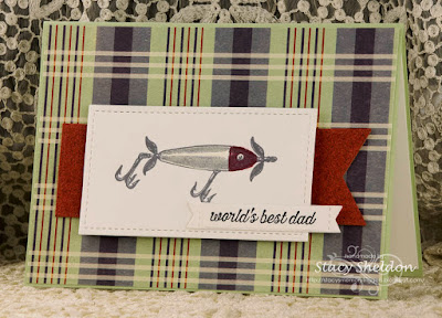
 This one is for my Husband this year, the idea came about because, I had seen that Anna had a "fish" theme for the Mixed Media challenge this week  and I knew I had some of these water wave backgrounds I did a long time ago and I had pulled one out of the file cabinet thinking it would work maybe with that Hero Arts kit that was coming in the mail and when it arrived the scale was wrong so, this was just sitting on the table. then I came across this fun card in this weeks featured stampers gallery and it all just kind of fell together pretty easily from there.
The changes from Jeri's card is that I did create that background with reinkers and shaving cream and a waves stencil (you can find a tutorial for this here) so, that is the mixed media part ( ink and shaving cream) and I made the fish and sentiment one panel and added in the flashy trim. because, what I can tell you is although you don't see my husband wearing bling, I think as a lure collector he is a little attracted to some flash haha.
so that flashy trim is vintage, the silver parts are elastic of some kind.

A closer look at the trout. this is a vintage PSX stamp that was done with versafine olympia green on Neenah solar white, I colored it with some zig clean brush markers, there is some white gel pen on the eye, a little bit of polychromos pencils and clear wink of stella, so it is also layers of coloring mediums. The sentiment is from the clearly besotted message me set and the finished size of this card is 4 1/2" x 6" in real life. I did give the fish panel a color wash of some tumbled glass distress ink and then rubbed on some broken china oxide on the edges of both the die cut panels. ( there were white spots) Hope you are all having a good weekend too, thanks for stopping by.

6.13.2018

WOYWW #471 {mostly guy cards}

Happy desk peeking day, if you'd like to see more spaces or play along 
the link up for this blog hop starts here at our hostess
 
This is the aftermath of 2 more car birthday cards (nearly the same as the one below but, in shades of blues) 6 assorted Fathers day cards and one Featured Stamper card over the weekend, and evidently I have not processed the photos for all the dad cards yet. but, they did go out in the mail haha. & 1 CAS thank-you card monday ( seen below) so, I have not cleaned or had time to do anything else since then.
We had a hard freeze also over the weekend so there was a lot of stop and haul pots and baskets inside and cover gardens time, uncover them and do it all again the next day.
So tuesday after work found me finally planting the last of the flowers I had hauled home last week.
 This car (& sentiment) are from the Unity Stamps all cylinders set.

 And I am not real sure if that tiny lower left part of the car is colored or is chrome so, I went with colored ( and around the wheel well too) so, life goes on. It did not want to photograph but, all the chrome, window, lights and hubcaps have clear wink of stella on them.

 The printed paper is from Magenta and both of these are 5" x 7" in real life, and this one is the one I am going to actually send to my gpa not the red car I did for the challenge on Saturday.

 The lure is from Judikins, This sentiment is from SU in the going global set. I did a search inside evernote to see what I had "fathers" themed and came up with some things that had not seen ink.
(so, the other thing I noticed is the last few years nearly all my fathers day cards are brown or green) and so, I tried to do some in more cheerful colors too. 

 This sentiment is from Taylored Expressions ( what is on the inside)

 This was done messing around with that going global set, the globe was stamped with Stayzon on to a piece of alcohol ink covered Yupo background and cut with a circle die, that texture is from a Paris Map? cuttlebug folder. this one is A2 (USA) size.

 so, the hard part was finding a circle that was not a huge halo after the image and I nearly always get circles crooked. and I decided to use it anyways.

 This one the top sentiment on the yellow is from that same Taylored Expressions set and the fathers day is from Hero Arts. the tiny truck is a brad.

 The sneakers on this are from SU. the sentiment is from Hero Arts.

 The glasses were diecut twice, once in white and once on the blue scrap and I glued and taped it all together on the back side and then covered the whole thing with diamond glaze.
This is the one hubs picked for his dad.

 This week's featured stamper is  Cindy, and I loved this CAS card she did here so, to make changes I used a embossed heat resist background in similar colors, and then my white thank-you die cut got lost in the background so, I cut a couple more, stacked that 3 times and then added in a banner of cherry to pop it a little. I also switched out the gems for the heart brad.

This week the CAS challenge is to add a banner to it... so, the whole card is Neenah earthstone cs, the birch texture piece is a Tim Holtz sizzix folder and I added some old paper and pumice stone to give it some shadows, my banner was cut with a MFT pierced fish tail die and it was a little long to do this on an (US) A2 cardfront so, I cut it a second time with the same SSS stitched rect. die at the top to shorten it a little. the house is from an really old SU set called Garden Pleasures. it was colored with some polychromos pencils.
so, Today I really should come home, clean this up and get some samples going for my Inspiration challenge coming up this next weekend and possibly even some VSN and DTGD samples. ( I have to make a list) I have not hosted a VSN for a long time so, the fact that this one comes around a couple of weeks ahead of DTGD will be tight and I may as well start making samples sooner rather than later is the thought of the day. :) Thanks for stopping by.