Showing posts with label slimline. Show all posts

10.31.2024

November Dirty Dozen Christmas

 Hi, Welcome back. It's that time of the month again when the Dirty Dozen shares a prompt for Fan Club members and Dirty Girls (& guys) who want to get some of their Christmas crafting done ahead of the holidays. This month's prompt can be found here inside those special forums. I started with this (really old) Neenah Collum's Red Pepper cardstock and cut it to become an Slimline (4" x 9") card with a gate fold opening. So the scores are at 2" on the long sides. I found this stripe printed paper from the paper studios Vintage Christmas pad (Hobby Lobby) and I ran that through the big shot inside a Leane Creatief Stars Background folder. Where the paper broke I rubbed some DOX vintage photo ink over that, trimmed it to 4" wide and cut that down to two 2" wide strips to be the center background.

I then found a sheet of some dotted print from the Photoplay Kringle & Co. pad that I liked the rustic ness of and cut it with the Sizzix Primitive Star die and instead of using its matching embossing folder I used the Sizzix softly falling dotted folder on it. I backed this with a kraft non embossed star cut with the same die as I knew it would be visible from the back side when the card was opened. and this gave it some more stability to build layers on. The Merry Christmas one of Dina's designs from Impression Obsession was stamped with the Crimson Versafine and diecut with an really old Spellbinders deckled oval die. The star has some older Christmas ribbon ( either Micheal's or Joann's from years ago) plaid wrapped around it's middle. The star printed paper die cut was done with the Simon Says Stamp Bundle of Stitches heart die and the metal star on that is from Making Memories. I did ink the edges of the star and the oval with DOX ink also and I like the rustic vibe this has paired with the bright white. ( I tend to lean more towards the creams when I go rustic so, this was fun to see it worked)

So, this morning I went upstairs to pick up the mess so I would have a blank table to do the IC sample for tonight after work. ( I know what I want to do) but, I picked up this drop piece of Kraft that had the star cut out for the backing on the card above and I had that Hobby Lobby pad on the table so I started laying it on the papers in the pad looking to see and found this pinecone sprig paper that did not look bad with Kraft so, as I put away the folders I used above I pulled out this pine sprig one also made by Leane Createif and inked the edges of that with a DOX vintage photo pad.


 I had it in my head to make this card A6 with some of the white print peeking around the outside edges of the kraft but, I got it crooked when I cut the star so it did not line up perfectly so, the white parts peeking out were whacked off, the edges were scruffed up the hemp string tore the kraft before I even tied the knot, it just acts like dental floss and will do that. The tiny pine cone charm was found on Amazon recently (here) its more golden in color and smaller than the old Tim Holtz ones. I really like the scale of it. The sentiment is also from that LOTV hexie tags set done in pinecone ink on Kraft, the bitty brad came from Micheals a long time ago and this was also inked. the dots in the embossed part were colored over with a white gel pen and I am leaning towards looking at this after work in the daylight and thinking about going over that with some snowtex or bleed proof white. we'll see. for reals this time. That's about it from me, Thanks for stopping by.


11.25.2022

Inspired by Colorful Images

 This week Amy has shared with us the Colorful Images site & Pinterest boards and as soon as I seen this address label my brain said. "Lee has a Pink Trio challenge for VSN.." so, I changed the colors. and I also made it a little more clean and simple with only one dramatic bloom.


I had received this Memory Box Poinsettia watercolor floral die in the mail not too long ago and decided to cut it out from Arches hot press watercolor paper. I did have to use a metal shim to get the whole pieces to cut out since it is just one die with intricate detailing. And then I decided since they are calling it a "watercolor" die, I decided to do just that. this is first layer of Daniel smith paints drying


Second layer of paints which when really dry needed more to get some contrast between the layers so, the finished one below has more paint on it.

This only has glue dots in the center of all those layers so the edge pieces are free floating and it gives it fun depth and shadows. 

The cardbase on this is some Stampin' Up blushing bride cut to standard slimline size 4" X 9" and the plaid here is an scrap from a really old piece of Basic Grey paper. The sentiment Creative Expressions snowman kisses was stamped on a scrap of Neenah earthstone with Versafine nocturn and die cut with a Trinity Stamps mini slimline die. The ribbon here is maybe offray or maybe generic Joanns ( not sure anymore there is not much left of it) So, its probably hard to see since I think the colors are so similar but, I do think I managed to squeak in at least 3 shades of pink here. If you'd like to play along with us, you can find these challenges here & here. hope you are doing well & thanks for stopping by.


8.26.2022

Inspired by { Peanuts Worldwide}

 It's my turn to host the Inspiration Challenge at Splitcoaststampers this weekend because, I was fortunate enough that Amy switched weeks with me so, I could spend more time with my son and his girl while they were here. And a while back I came across this fun Peanuts collection on Pinterest seen here and knew it would be a fun thing to play around with. And the last few years I have spent some time collecting old stamps on eBay and Etsy. So, a handful of theme are Peanuts gang ones and I wanted to do something that mimicked the comic strip layout so, it was more of a scale thing to fit these 3 in to the spaces inside this Newton's Nook die. and I picked this particular strip as it had me smiling.

I had "won" the smooching snoopy stamp a few weeks ago while the seller was on vacation and it really just arrived in the mail last night. ( what timing) but, I was pretty surprised by how tiny it is in real life. So, the Penny Black sentiment I tucked in here probably makes it a little too sarcastic when you notice that Lucy is frowning in these scene's. The card stocks here are Neenah earthstone and Papertrey Ink smoky grey. So, I barely got the paintbrush wet to add color to the blocks. You can find this challenge here at Splitcoaststampers to play along with us. Thanks for stopping by.


4.30.2022

A catch up post of Featured Stamper CASE cards

 There have been so many featured stamper challenges I have played along with the last few months and I have not actually taken the time to blog about any of them. So, I decided to just let this be one big post. 

This is one I did for my son when he moved recently. and it was jump started by this scrapbooking layout here seen in Lynn's gallery. That scene I kept black and white as her photos are sepia and then I did add some color to the flag here. The sentiments are from the Simon Says Stamp home sweet home set.

This one was jump started by this cute card in Nancy's gallery and the fact that the spring chicken sentiments were new to me via eBay at the time. The spring chicken is from Art Impressions, as is the goofy things sentiment. the two spring chicken sentiments are from the cottage stamper.


These tags were jump started by these cute tags in Diane's gallery seen here. Each of the birdhouse stamps are old retired ones from Imaginations. 

When it was Colleen's turn as featured stamper I seen this birdhouse card of hers and loved those colors. But I had also you know put my birdhouse and a few bird stamps on wood blocks out on the shelf behind the table I stamp at after I packed the snowmen away. So, This is the first time this stamp had been inked too. 


Kristine has this sweet card here and I have not made a card with all the pretty layers like this for a while and that was fun to do. The girl and her dog on the swing are from lili of the Valley and that sentiment is from Taylored Expressions woof strips set. 

When Gayle was featured stamper I came across this cool vintage photography themed card and I have very similar stamps that she used but, I wanted to just play with the theme of it and so, I changed mine to be a little more CAS so I could highlight that silly Riley & Co. sentiment here inside the big Darkroom Door frame. The gal is from an old Stampin up set called stamping fun for everyone and I did cut off the bows off her shoulders as I am not so much of a frou frou type of a gal.


4.05.2022

Watercoloring Eggs

 This week Kia has shared with us the link to Debby Hughes water coloring bird eggs video. Seen here on YouTube. You know that I am a huge fan girl of Debby's so, this was a little intimidating to me to try as I dug through my egg stamps and most of them are teeny tiny so, I ended up spending some time free handing them and trying to mix colors. and I knew this would be one of those trial and error error things. The first two sheets I did as trial runs, are in the third photo down here. They tell you that comparison is the thief of Joy but, seriously when you are comparing your self and how much you have improved it really just gives me a thrill.

these are Daniel Smith paints on Arches cotton cold press.

And I realized that I had room for a third so, I added another one. these are imaginary bird egg colors not from any particular breed. You can click on any photo here to enlarge it and use your browsers back button to continue reading.

This gives you the idea, the top two sheets are the practice trial runs on some Strathmore 400 series cold press. Which just does not work as well as the Arches Cotton cold press ( bottom trio) which you can see. These are nearly the same shade of the same paints with the same brush. 


I did cut a frame with a die from Whimsy stamps called Slimline scenic country side twice from the same almost Kraft cardstock from Neenah. I do own the same reverse print sentiments that Debby used on her card, and I think that is just so perfect but, I was not trying to duplicate her card so, I did leave this as a blank one. That's about it from me. You can find this challenge here at Splitcoaststampers to play along with us.  Thanks for stopping by.


3.31.2022

Dirty Dozen April Christmas Card Challenge

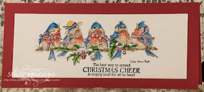
 It's that time of the month again when the newest prompt for those of us playing along with the Dirty Dozen Christmas card challenge this year see the new theme. So, I knew which stamp I wanted to attempt to color and I have been feeling lately that some of the really complex stamps with tiny detail areas are going along easier for me with watercolor paints rather than say pencils or markers.


I had also decided to open that pad of Arches Hot Pressed 100% cotton watercolor paper because, the rumor is it smoother than the cold press and I knew that with the tiny details of this stamp I would be frustrated doing it on cold press. So, I stamped it with Versafine and used the index sticker on the block for a general guide on this first round of paint.


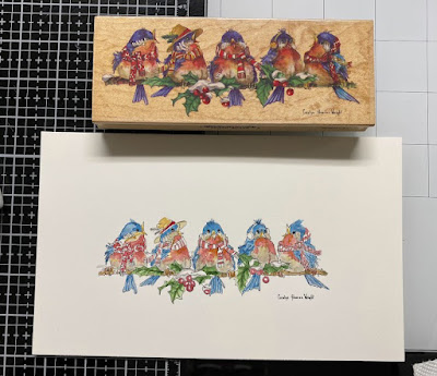
I added a second layer of paint to some spots, filled in other spots I skipped while it was wet so it would not bleed too badly and added this Stamping Bella sentiment from the Festive Gnomes set. I figured it would work well since the name of this Stamps Happen Carolyn Shores Wright stamp is Christmas Caroling. I just love all her birds and I am pretty tickled with how this turned out. The base (SU ridinghood red) was cut to be a Slimline and I used a Waffle flower die to cut the watercolor paper. That's about it from me, You can find this challenge here in the special forums for fan club members inside SCS to play along with us. Thanks for stopping by.


12.04.2021

Inspired by { Touch of Class }

 This week we are taking a look at the touch of class store & pinterest boards and I came across something called a "Cardinal Globe" ( It looked like this, in fact just like this) but, what I found is they are one of those stores that when something sells out the photograph goes POOF from their store and their pinterest boards...


So, I decided that I could recreate something similar fairly easily and to make a change I decided to go slim line view with it. and the first time I seen those globes I thought they were on falling snow. So I grabbed an Anna Griffin slimline snowflake folder and used it on some Papertrey ink cardstock vellum. the frame here is some Neenah solar white that was cut with an Spellbinders classic flutted rectangle die. and those dies are kind of pale copper color, so it left a little bit of that color behind in all the cuts it made. The bird here was a free gift from Simon Says Stamp / Tim Holtz last year during die-cember and I cut it with some Arches watercolor paper ( cold press) the branches ( same paper ) are from the Penny Black set called Nestled. I did cut the end piece off one of the other branches to give the feet somewhere a little more horizontal to perch. The sentiment here is a really old one from Hero Arts. These were colored with Daniel smith paints. I decided the snow needed a little something so there is some white opal liquid pearls and crystal stickles in a few of the snow flakes.

And since I was cutting up paper to do this, I just did two at the same time. This one only got one branch and the sentiment here is from the Altenew Holiday wishes set. both of these birds have the tiniest black pearls from recollections in the space for the eyes. ( which since I lowered the exposure so you could see the texture of the snow it really blends in with the black mask of the face) These are both 4" x 9" in real life. You can find this challenge here at Splitcoaststampers to play along with us, thanks for stopping by.


11.13.2021

A few Christmas cards


This was done totally inspired by this umbrella after my brain focused in on the upside down bird on the line. So, I just flipped this paper upside down after stamping the bird and I started out using colors similar to the umbrella and then once I got to the Santa hat I started going darker. added in some squiggles of paint to the body for feather movements. There is some stickles glitter glue on the hat trim also. This one is A6 in real life. The sentiments from Riley & Co. and the bird is from Woodware's fuzzy robin line.
 

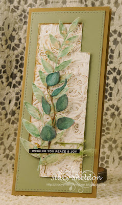
Now this was done jump started by the October dirty dozen Christmas card prompt. the tall leaf is a Simon Says Stamp die etched tall leaf, and the shorter eucaluptus is a stitched one from paper rose. these have watercolor paints on them. the texture panel (TH engraved folder) was inked and cut in to strips to layer. this one is a full sized slim line 4X9.

This Emerson chick (American Art Stamps) was a gift from Hubs as he has been seeing me collect them lately. so, I colored up a couple of her and did two versions. the sentiment on this one is from Hero Arts.

The sentiment on this one comes with the image.

this was done from scraps on the table the white parts were cut from watercolor paper and the sentiment here is from the Simon Says Stamp fa la la set.

This one the dog is from Impression Obsession ( baxter) and he was painted with wc paints. and this was done after seeing this cute card inside Ema's gallery when she was featured stamper this week. the Sentiment here is from Stampendous. 


This old Elyzbells stamp was dug out after seeing Jocelyn's card here when she was Featured Stamper. the sentiment on this one is from the Simon Says Stamp Joy for you set. 

Now this was done because, I bought this pad of Memory Box printed papers and thought really you could just let it shine ( so added stickles to them) and silly sentiments. The sentiment on this one is from Impression Obsession.

The Sentiment on this one is from Our Daily Bread Designs.

The Fallidays tutorial on November third is a disappearing 9 patch from scraps project. (tutorial seen here) So, I ended up using deco scissors to trim the outside edges of the mat I gave mine and they don't cut completely anymore after all these years so, I took the point of some other scissors trying to "fix" the cuts, and after a while just grabbed some Antique linen distress Oxide to color dust along the edges. The holly here is a sticker that has an almost "felted" texture to it, it was a gift from June for my birthday this year, it came with some Poinsettias in the pack too from Hobby lobby. The sentiment here is from Tim Holtz great outdoors set.

This I finally finished from earlier in the week, I did add a smidge more paint to the bottom right corners of the top to bulbs to mimic the shadow I gave the bottom bulb when it was wet. The sentiment here is from the Altenew Holiday tag sentiments set. I added more of the white gel pen in a few spots where it was more of an outline rut from the first time around too.

This week Kia has us looking at the Putti fine furnishings for inspiration and I came across this metal tree.  And I had seen that Lydia has her first Fallidays challenge to do one of the old Watercolor Wednesday prompts that you may not have already done. and I knew there was a Christmas tree in a pot one seen here. ( I only did the one that looked on the Charlie Brown side) and while I was waiting for the last minute to make this, I had also seen Cathy issue an "Mini" slimline card challenge, so this fits that too. ( the cardstock was cut to 7" x 6" and scored at 3 1/2" on the 7" side) I know this will fit inside an A6 envelope but, I am also thinking I may have picked up a mini You can find this challenge here at SCS to play along with us. Thanks for stopping by.


8.24.2021

Shared Landmass

 This week the team for water coloring Wednesdays ( a daily challenge at SplitcoastStampers) has welcomed me to join them. and this week we are taking a look at tiny light house loose paintings with ink. And seeing the link my first thought was I finally have that old Stampin' Up set called coast to coast and its kinda sketchy looking so, I decided to use it.

The lighthouses were stamped with Versafine Clair Nocturn ink on some Arches 100% cotton watercolor paper ( cold press) and colored with some Daniel Smith paints. These were diecut with some Hero Arts postage stamp edged dies and are up on foam tape over the base. This sentiment is from the Simon Says Stamp Miss you Missy set. This was diecut with a spellbinders rectangle die. You can find this challenge here to play along with us, Thanks for stopping by.

8.22.2021

Some more from Dare to Get Dirty.

 There were 49 challenges in total this year for Dare to get Dirty week at SplitcoastStampers. I have not done them all as of yet, the good news is the inspiration stays up on the site for future use. So, here are the rest of the ones I have done so far. I cannot tell you what the challenge is but, I can say what I did or used. This will be a really photoheavy post so, grab your cup and enjoy.


This was done for Lydia's first challenge, this girl Unity Stamps Just Sorry was stamped with versafine on Neenah and watercolored with some Karin Markers ( skin & hair) and Daniel Smith Watercolors on the rest of the image. The sentiment here is also from Unity Stamps the Crappy Day set. ( its up on foam pop dots)

The front panel here I have cut a hole into the top end of it to tuck the girl from behind and used the same acrylic paint on the edges of her panel as the front to make it a little more seamless. I did run that textured panel through the big shot a few times to flatten it a little more. ( its Masking tape with covered with gesso and paint) I thought it looked like a messy bed. And this one finished out at A7 in real life. 


For Dina's first challenge I used this So Many Hearts girl from the precious moments line at Stampendous ( this is a really old one) colored with pencils and copic markers (skin) and the sentiment here is from Hero Arts Many everyday messages set. the door is an Alexandra Renke called wing door. This one is A2 in real life. 

So a week ago the inspiration went to a home design magazine site and I being an alumni dirty girl also had access to the master list of challenge knew what Lori C's first challenge would be so, I combined these two. The home design photo that jump started mine can be seen here. What an awesome back yard hmm? So, I picked up the My Favorite Things perfect pool stencil when it first came out and this is the first time it has been removed from the packaging. so I decided to tape it down to a piece of cheaper canson watercolor paper and "paint" through the exposed holes. It did bleed a little bit, and I did go over the top of some of the bleeds with white Gouache after the stencil was lifted and the Duck was stamped with some Cheerful (yellow) Versafine Claire and watercolored with Daniel Smith paints, I cut a slit into the water panel to tuck his tummy into and taped over this on the back side to help keep him flat. The sentiment here is from The My Favorite Things you float my boat set, and it finished out at A7 in real life.

This was done for Gem's challenge and I used a Spellbinders hemstitched rect. die on the cover of the cardbase and Their shapabilities Joy set for the center. The letters are up on foam pop dots and the pearls are from Kaiserkraft, ( they are a blush color but on the barn red texture they may show up as cream on your monitor) the inside was lined with some Neenah because, I always put white cardstock on the insides of my colored bases to write on. This one is A6 in real life, and the first Christmas card I have done in months and months. which poked my brain into looking at more of the challenges thinking and over thinking to see if they could be modified to become Holiday cards too. 


Which lead me to Lee's challenge, the base stamp here is a background from Simon Says Stamp that was heat embossed with white SU powder on some pink shimmer DCWV. the Vellum layer is an older holly berry house that was also heat embossed on the top side and then I used water base markers in spots of the back and I really thought that gave it a kaleidoscope look. So, I added some dots of glittered stickles glue in a few spots too. this one is 5 1/2" square in real life. 

I found this image Our Daily Bread Designs the mighty sea already colored with some pencils in the envelope on the table and so, I used some previously made watercolor background for the framing and then while I was looking at this, I have had my Daniel Smith watercolors on the table for a few weeks now, I decided to add some paint here and there over the pencils. The sentiments on this are from the Altenew camp life set. and this one finished out at A7 in real life. 

So Kia has a challenge that I decided I would watercolor for it, and this is the center piece of a frame diecut and so the bloom is from the eclectica3 kay carley 47 the pretty flowers were a feast for the eyes set and heat embossed with white powder over the paint. I did go over the center with white Gouache and some stickles glitter glue. That sentiment, I spent hours over several days trying to figure out which set it came out of. I cannot find it in evernote so, I will probably end up poking around in the stamps them selves here and there and edit later. I found it in the file cabinet in one of those pockets of previously stamped and diecut sentiments. the center panel is up on foam tape and this one is 4" x 9" in real life. 


So this is the actual entry into her challenge and its also a slimline card. the homes and sentiment are from the Concord & 9th city stacks set. 

a closer look at the painting from the card below. The road runner is "on the run" the Wil E Coyote is called "Yipes!" the center has some shimmering from Stampscapes ( but, it is a small stamp, so I deliberately used the paints in lines to add more streaks around them.)

The silhouette in the back is from the sweet n sassy landscape silhouettes set and the sentiment is from Impression Obsession pandemic humor. 


The painted panel is on foam tape above the base and this one finished out at 4" x 9" in real life, the edges were cut with deco scissors. 


You might remember this panel, it happened to fit Pat's challenge so, I did some layers of speckled Neenah cardstock to frame it trying to detract from the fact that I had taped the tape across the top crooked when I painted it a while back and that was one of those hunh moments when it was revealed. 

I probably could just mix up some more blue ish paint and touch up the top left corner but, so far I have resisted the urge to do so. This one finished out at A7 in real life. 


 Done for Liz's challenge, the Victoria's Secret is from the Emerson line at American Art Stamps, the bra-less is from Art Impressions. She was colored with Karin markers and Daniel Smith watercolors with some stardust gelly roll pen on the glasses. 


Some where around Wednesday the watercolor prompt came out and it was to do some free hand blooms and I had a mess of yellows on the palette at that point and I knew what the DTGD line up looked like so this ended up being made for 4 different challenges, the Wednesday watercolor, Jen, Holly & Ann's DTGD challenges. the Sentiment here is from the Penny Black A little bird set. 


You may have remembered seeing this dog face ( Impression Obsession) being painted when he arrived in the mail, the sentiment came out around the same time too, so this was done for Bev's challenge. 


This was done for Shelly's challenge. the birdhouse is from the old SU set called scene in a garden. The sentiment here is a reverse printed one from Simon Says Stamp ( some spring set) That red panel is vellum with alcohol inks on it and to allow the light to flow through like a window, the front panel of the card also has a window cut into it from the inside of the base. This one is A2 in real life. 

This was done for Mary's Challenge. The sentiment is from Riley & Co. the Oscar reading the paper is from Art Impressions ( this was stamped twice as the top colored layer is paper pieced into the scene.) the rest of the room are from two different My Favorite Things sets, Cozy Companions and Our Story. the main layer here was all colored with Daniel Smith paints. 


 Now this I did not make, this one came to me the other day in the mail from Shelly with a sample of some gold leafing flakes to play with and the sticky note that said do not open with the fans running. This is one of her samples she made for DTGD and it sparkles so beautifully in real life. Thanks Shelly!


 Which lead me to playing with them for a little something for Judy's challenge. the cat is from Art Impressions, the sentiment is from the Shut up and Color set from Dylusions. this one is A2 in real life. that pale aqua color is an shimmer cardstock from Micheal's recollections line. 


This week the Inspiration destination is looking at Nordic Wall where I found this piece of art 

and my first thought was you could paint that. ( not a normal thought for me) and my second thought was, you could have a two-fer card and use it as a sample for Tracie's challenge. So, I did this is Daniel smith watercolors with a bit of White Gouache. the sentiment here is from the My Favorite Things anything but basic birthday wishes. It's 4" X 9" in real life. 


 Which leaves me with something I had done for Jayne's challenge. the teabag here was paper pieced back into the design using a used dried coffee filter. the other color around it and on the tag are DS watercolors. the sentiments here are from the Verve Stamps one cup set. the embossing folder is one I had borrowed a while back from my MIL and I have forgotten its name, but there is a heart underneath the image panel in my card on it. the lace here is vintage from the notions dept. and this one is A6 in real life. I do have something drying / de-fume - ing for Jayne's second challenge and hopefully sometime soon I will get it done. I hope you enjoyed this, thanks for stopping by.


Decided to just edit this post with the last card, this was done for Jayne's first challenge. the butterfly was painted last April some time, the cardboard was painted along time ago too. the background panel was run through the big shot inside a Cuttlebug goochie script folder and it has some Antique linen and Salvaged Patina DOX over the top of the leaf pattern. and I realized the reason I never used this butterfly is. I did not leave space to give it a body. ha ha. ( did you notice that before I wrote it?) ( I didn't) 

I did actually get a group mug shot of them all before I started mailing some out.