Showing posts with label Clean and Simple. Show all posts

5.20.2025

Watercoloring Clean & Simple Leaves

 Hi, & Welcome back. It's my turn to host the Watercoloring tutorial challenge at Splitcoaststampers this week and I have been totally under the weather as it is full swing allergy season here and I was so glad I had picked something easy when I was looking haha. 

You can find this video here on YouTube by CreationsCeeCee Called fresh and simple watercolor cards. I had intended to do a small stack of things but, this is the only one I have done so far.

I had an A6 scrap of studio loft watercolor paper on the table so, that is what I used. that is some Daniel Smith watercolor paints here and I did let this dry after this.


The addition of a leaf, it looked a little skinny but, not a bad shape so I kept going.


 I used this fountain Pen nub to do some veins on the leaf.


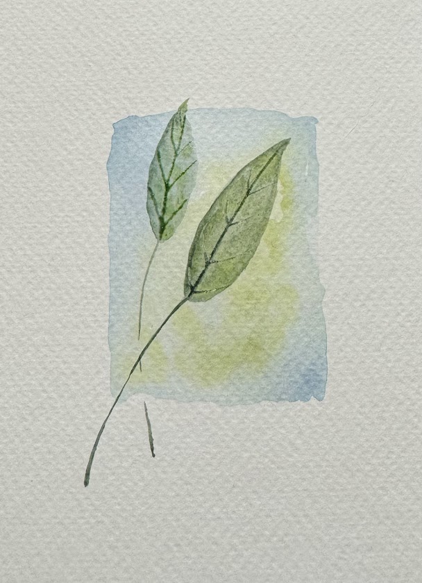
 Then I popped in a second leaf as the first was just too skinny in that block of color to my eye.At this point I really was just winging it as I knew I had seen the block go on get dried and then a leaf over the top but, that is all I remembered. 


 These sparkle paints were still out from (probably last week) and so I did add some shiny gold dots to the background below and above the first leaf.

I used a Frantic Stamper pinprick rectangle die to cut the hole into the top of the cardbase and then trimmed the watercolor panel slightly to fit behind it so the painting is countersunk here. The sentiment on this is from the Waffle Flower Inside sentiments birthday set done with some Versafine Ink. That's about it from me, If you'd like to play along with us you can find this challenge here at SCS. Thanks for stopping by.
 

5.03.2025

VSN {Weather}

 This morning Misti starts us off with an show her the weather on your project. and the wind blows here, almost every day. not quite the same as what you'd see in New Mexico with the whole dust storms but, still big gusts of wind and a breezy thing that picks up in the afternoons. So, I had a few stamps of gals with their hair blowing in the wind and chose this one called "Windy Day" by Katzelcraft and Stamped her with some Versafine Clair Morning mist ink on Arches hot press (smooth) watercolor paper.


 I added in the Simon Says Stamp sentiment after the watercolor paints had dried. The base here is some SU soft seafoam cut to 5 1/2" square. the coat here was painted with one of the sparkly paints so it shimmers slightly in real life. That's about it for this one, if you'd like to play along with us you can find this challenge here. Thanks for stopping by.


3.07.2025

Painting Bunnies

 I had it in the back of my mind to maybe watercolor some bunny images, thinking maybe I would use them for Easter ( or not) but, I used to have a stash of colored images and I really have not added to that in a long time so, either way it was something to do that didn't require thought like when you are trying to fit the perimeters of a challenge prompt. 


I'm pretty sure I have never colored these guys but the chick magnet is from Whipper Snapper designs and that row of bunnies in pots is from Penny Black. so, I stamped them with some Versafine Morning mist on some Studio Loft watercolor paper and started adding some Daniel smith paints to them.


 Another layer, the colors are being inspired by the index sticker art. so that makes it kind of mindless to do. although I am going to have to add some detailing to the little snail on the rim of the center pot, it didn't quite stamp all the way on the texture. 

Then I decided to give the sky a slight blue wash and these are propped up on the edge of the palette to let the water/color flow up into the sky rather then pool along the edges of the images. 


And then I got side tracked because, I seen the Clean and Simple challenge was to do Squares on monday and I like to do square cards but, I decided that the bunnies under construction were too big and too busy to be CAS cards so, I knew I wanted to do some kind of embossed texture square frame so I started by cutting a piece of studio loft watercolor paper with the scalloped edge die in the Waffle Flower lots of squares die set and then I cut that smaller scalloped die out of the center of that piece, and then I used the Stiched circle detailing die in the center of that. ( all these pieces are taped together again on the back side with scotch tape) and the outside frame was run through the big shot in an Stampin' Up! quilt top folder. So, that tiny drop piece in the center I stamped a tiny PSX bunny on that with the morning mist ink and added just a bit of greys to him. The sentiment here is from Lili of the Valley's hex tags set and the tiny brad came from Recollections ( years and years ago) This is 5 1/2" square in real life. And that's about it from me, thanks for stopping by.


3.02.2025

Swearing Helps

 Ha, maybe its even true eh? I have spent some time thinking the last couple of days that when you lose your mama you lose your biggest fan. I knew my mom read this blog and She was also the person who always excitedly asked if I watercolored something ( even years ago before I owned a paint brush) so, I had the encouragement as I have been learning that also. It just struck me hard when I had seen the home page of her cell and she somehow ( I don't even have this) has a short cut to this blog on her home screen.

It was just a "wow" moment for me. So, yesterday I had some free time when I would normally be painting the next weeks sample or watching the video anyways and I started cleaning off my desk and I came across this Penny Black How's Tricks? dog on the other side and so, I stamped him on some Artist loft watercolor paper with Acorn ink and added a layer of Daniel Smith paints to him.


The humor of this dog being a scaredy cat just makes me smile. I have a lot of second hand stamps I picked up over the last couple of years that have not seen ink (by me) yet and or that I bought knowing they would tickle my mom's funny bone. I know I have a sentiment that reads "don't be a scaredy cat" but, I didn't see it when I was thinking of what to do with this. and that lead me to go see if anyone had ever posted a card with him in Splitcoaststampers. ( and if they did, they didn't use the name of the stamp on the upload as it didn't find anything for me to see with this particular pup) but, I did see the sample makers for the Featured Stamper challenge had started loading to the gallery so, I pivoted and went and looked at Cyndi Evan's Gallery and kept coming back to this Emerson Chick ( which I own I think I probably even have that die) but, I knew I could work to tweak the idea of this with this dog. So, I did. 

I did add more paints to the pup, and a little tiny bit of black fineliner pen to the pupils and the nose lines of him when the paints were dry. Cyndi's gallery has a lot of fancy backgrounds for her cards and I just thought, well if you cut a hole and counter sink the image behind some printed background paper it would give you another change. I kept the humor and the clean and simple style, but I changed the stamps and made my card square. This brick print is from the BoBunny Once upon a lifetime collection pad and the Sentiment here I used my Misti to do it twice and get it so bold. is from The Casual Fridays This Sucks set. This card is 5 1/2" square in real life, I did use some DOX vintage photo ink along each the cut edges of the printed paper. And that's about it for my Saturday evening, I hope you all are doing well & thanks for stopping by.


2.14.2025

Inspired by {A Makers Studio}

 This week Denise is sharing the A Makers Studio site and pinterest boards for the Inspiration site and The very first photo in the challenge thread is an alcohol ink background with mixed colors and metalics. So very pretty. And I had it in my head I had seen the watercolor challenges I had missed while I was gone and one of them was the one Angie shared that you could do a splatter background as the third option and some pen work to sketch the blooms over the dried paint. So in my head this was an easy two-fer challenge idea. 


I chopped up some artist loft watercolor paper and started the splatter background process using up paints on the palettes. 

And after the palettes were clean then it was just a matter of mixing up some other colors. 


I decided the first round of splatters needed more depth so, there was a second layer of paints between the photo above and this one. when the second layer was dry I used a Micron pen to doodle the sketchy blooms with heart leaves.


 This scripty sentiment has pale purple-ish/blue rubber and was unmounted years ago. I had the idea that it's possibly from SU but, I am not certain on that front anymore. 

I mounted these flush to some SU pale plum and some textured Bazzill finishing them all at A6 in real life. I do like the simplicity here and the fact that I was able to do a stack at once to have a little stack done quickly. If you'd like to play along with us you can find the Watercolor tutorial here and the Inspiration challenge here at Splitcoaststampers. Thanks for stopping by.


11.08.2024

Inspired by {Bronner's Christmas}

 This week Kia is sharing the Bronner's Christmas site for Inspiration at SCS and I came across this Ornament seen here. What caught my eye besides the red and white combo was the sparkle and the whole you could do a lot of CAS off of that. 

So, I pulled out this Sue Wilson die from Creative Expressions and cut it from some cheap watercolor paper, painted it red and when that dried.

I decided to go over the top of it with some red-ish sparkle paint and it really does not sparkle that much unless you tilt it just so but, that is on there. 


I had some happy mail arrive that I bought my self for my birthday this year and so, ( you can see that loot pile above haha) in it was this Penny Black Classy Frames die set and that Lisa Horton Rustic Hessian Slimline embossing folder. So, I cut the frame from the same paper as the words were cut from and I grabbed a scrap of what looked like hmmm, possibly Sundance Felt natural white and ran it through the folder. I trimmed it down to the just the piece of the embossing and then cut that at 5 1/2" to make a band for the front of the card. (the cardbase here is totally glittered red on the front and back from Paper Accents) and I hauled home that ribbon from Micheals? or Joanns sometime last summer and the words just got lost so, I grabbed the drop piece end of the embossed panel and tucked it over the ribbon and under the frame to park the words on. I did after the liquid glue dried tuck in some small folded in half glue dots under the parts of the frame that were floating as the ribbon and embossing is not exactly flat here. That's about it from me, If you'd like to play along with us you can find this challenge here at SCS. Thanks for stopping by.

8.27.2024

Watercoloring Abstract Blooms

 This week Brenda has chosen this video seen here on YouTube for doing a simple abstract row of blooms. titled "An easy way to paint flower with watercolor " by nasim art.

I did start this on a scrap of Arches cold press with some Daniel Smith moonglow moving into shadow violet (both of these are granulating colors) 

I had made myself a cheat sheet the week that I did the Solalite Trans red oxide landscape challenge and I thought this was interesting. You can find an complete list of granulating colors Daniel Smith has here on their web site. 

They have a complete list of colors here. ( I do not own all the colors but, I do have probably between around 75 ish of them I'd guess.) 

I did add some shadows and stems to this while it was still damp.

And a few more trying to  blend in some more shadows the way it was shown more of a wet into dryish paper so, it did get some harsh lines. 


Did add some stray grass blades and more splatters to the bottom and decided this did not look too bad for a trial run and finished it into a small A2 card.

The cardbase here is some old Stampin' Up! Going grey and This actually has a little more soft purple tones to it in real life than this photo shows. I am not sure what I am doing with it as of yet, so I just saved some space for a greeting in the lower corner. That's about it from me, if you'd like to play along with us you can find this challenge here at SCS. thanks for stopping by.


8.09.2024

Inspired by {Quiet joy at home}

 This week Kia is sharing the "quiet joy at home" site and pinterest boards for the inspiration destination. and On the blog/site I came across this article about 20 beach cottage ideas: decorating and I seen this mug shot #11 that is a wall of sea grass baskets with greenery in them. 


So I started with stamping this old Personal Stamp Exchange empty basket with Versafine Clair Sand Dune ink on some smooth Arches hot press watercolor paper and painting it with Daniel Smith watercolors. when that dried I added a shadow underneath and doodled some greenery in one corner. 

I spent some time debating with my self if I should mask in more empty baskets but, most of mine either the scale or the style just did not work with this basket and then I found this sentiment when I was looking for something else and decided to keep it very simple. This today printed paper I think may be MME. The base is some textured Bazzill and that sentiment was added on with the Versafine fallen leaves ink. It's from the Unity Stamps Thankful Oaks set. This is A6 in real life. I hope you are doing well and Thanks for stopping by. If you'd like to play along with us you can find this challenge here at SCS.


3.09.2024

Inspired by { The Inspired Room }

 This week Kia has shared the Inspired room site and pinterest boards where I came across this pin of a reading nook and loved the shape and instantly thought of this new Penny Black die All in One Hexagon I have that had arrived in the mail and not been played with as of yet. For the shaping of the frame in the seat, I cut one from some Arches watercolor paper thinking this would become a window seat and The die cuts all those texture details you see so, I taped it back together on the backside of the paper before I started painting.

The sun was shining the last two days when I came home from work so, this is a first layer of paints thinking I wanted to see flowers out the window I did a simple meadow.

I did add a few more "details" to the window here and then mounted it to some Neenah earthstone that finished out at 5 1/2" square in real life. It's not quite so yellowish in person either but, I am having a heck of a time with shooting colors the last little while. I think its all the over cast days. and or the waiting until the last minute before the sun sets to do them. :) At any rate I know I am going to have a lot of fun with this die it's so different them most of my others. If you'd like to play along with us you can find this challenge here at SCS. Thanks for stopping by.


10.31.2023

Dirty Dozen November Card

 This was done for the November prompt for the Dirty Dozen Christmas card challenge found here at Splitcoaststampers in the special forums set aside for Fan Club Members. 

Since I waited for the last minute, and this was not what I thought I would do all year when I glanced at the list of challenges and knew it was coming up. SO, its pretty simple but, I really wanted the print to shine. with that thought in mine as the red berries on the print are foiled in real life, the gold mat is some Stardream shimmer and the green textured bazzill is also shimmery. The red is a printed paper from Recollections cut with an Impression Obsession die. and this is very flat one postage stamp to ship it YAY. :) pretty good deal for an A7 sized card. It's early days though so, its possible I will get the other first idea done this month. I hope you are all doing well & thanks for stopping by.

8.29.2023

watercoloring Pumpkins

 This week Brenda has shared this watercoloring tutorial by Dina Kowal on watercoloring pumpkins.

It is a short and sweet video so, I watched the whole thing and then this is where I went with it.

This is a piece of Arches cold press watercolor paper with Daniel Smith paints, first layer.


Second layer of paints, I had considered doing some grasses or something else besides the shadow but, this is what I did .


I die cut that painted layer with a Penny Black Framed die ( this is the largest one on the set) and all those pieces are taped together on the back side here to keep it on the clean and simple side. The base is some Stampin up most likely mellow moss and this is 4" square in real life. I left off the sentiment as I do not know what I am going to do with it as of yet. That's about it from me, I hope you all are doing well. If you'd like to play along with us you can find this challenge here at Splitcoaststampers. Thanks for stopping by.


2.17.2023

Inspired by {Brooke Giannetti}

 This week we are taking a look at the pinterest boards curated by Brooke Giannetti. ( seen here

Because, this mug shot of the embroidery caught my eye.


So, I started poking around in my embossing folders and came across this really old one ( right) from Cuttlebug called Flourished Frame and I ended up stamping this silly sentiment from River City Rubber Works with some Barely Beige ink from Simon Says Stamp. ( this panel is mounted to a base of the same Neenah earthstone cardstock in an A2 size) and since I had the other half of the sheet sitting there I did the card on the left from the scraps. The embossing on that one is from the Anna Griffin cut and emboss series called Oval frame layer. The sentiment on that one is from Elyzbells also using Barely Beige Ink. the floral frame on that one is up on foam pop dots and there is a little bit of opal liquid pearls in the centers of embossed blooms. That's about it from me, I hope you all are doing well. If you'd like to play along with us you can find this challenge here at Splitcoaststampers to play along with us. Thanks for stopping by.

11.21.2022

Pair of Simple Trees

 So, I am cleaning my room. ( kinda, sorta, halfheartedly) and one of the piles I am shifting through is a stack of images I stamped off intending to color. and these two trees were "saved" and not tossed immediately for being not complete images because, they were stamped on cheap watercolor paper over a year ago. they were "almost" and I told my self, its WC paper, just get it wet and fix them...

I had seen these in the pile before I started looking at this week's Featured Stampers gallery and then I came across this blinged out tree in Sarah's gallery and I thought you could work with that. ( you always need to make change to their design anyways)

A closer look at the tree on the right. there is a bit of clear stickles glitter glue in between the red & gold watercolor bulbs here in the garland and at the top. the gold paint is iridescent in real life. ( so, these have some shimmer)

The tree's here are from Penny Black called Tannenbaum and it was stamped with some I thought this old post was going to give me the ink color name but, I had done other tree's that stamped completely at that time and its either Versafine or Distress Oxides. I didn't really get the tree all that wet adding the garlands to them so, it could be an Distress color. The edges of these panels were chopped in a Tim Holtz deckle edge trimmer and then I did add some Distress Oxide Salvaged Patina & Speckled egg to those cuts for a visual layer. The sentiment here is from the Waffle Flower cozy holiday sentiments set because, I just cannot put it away yet. The card bases here are pre-made ones found at Hobby Lobby and these are A6 in real life. That's about it from me, I hope you are all continuing to do well. Thanks for stopping by.


11.11.2022

Inspired by { Indigo!}

 This week Kia has chosen Indigo as the destination for inspiration this weekend at Splitcoaststampers and I found these salt box house ornaments that I swooned over. and I thought, those would make awesome tags. 

So I had a pile of left over scraps of strathmore 400 series watercolor paper from the pumpkin adventure and I decided to use some of that with the idea here as I wanted to paint the edges. ( this is just left over browns that were on the palette from Daniel smith paints) the thing with that paper is it just resists the paint rather than letting it flow across it like cotton paper does so, the lines are not so smooth but, for the primitive aspect of the design I am thinking it works. 

After the homes were dry I found some off white tags that had been previously cut from scraps in the bin and used some May Arts burlap string for the holes on them. All the homes are up on foam pop dots.

The scallop edge square tags are a die from Papertrey ink tag sale quilted die, the smooth rounded top large tags are from the Ellen Hutson tag trio die set, the long skinny tag on the bottom right is from the My Favorite Things tall tag duo and the skinny tag on the lower left is from the Sizzix XL Library pocket by Brenda Walton. the sentiment here is from the Hero Arts Holly Berries set, the ones where the sentiment was not stamped directly with the Avery Elle kraft pigment ink those were die cut with a Spellbinders die. If you'd like to play along with us, you can find this challenge here at Splitcoaststampers. That's about if from me, I hope you are all doing well. Thanks for stopping by.


8.05.2022

Inspired by {Minted}

 This week Julie has shared with us the Minted site where I seen so many thing I bench marked as possibilities but, I kept coming back to this simple shades of green with all the movement piece of art work seen here. I also loved all the white space it has.

In the back of my mind as I have been looking at the sites that I am doing samples for at the moment, what I need are a few Guy birthdays and a few Anniversaries. And I also knew I had this pad of printed paper from Micheal's recollections line called Gilded Ink. ( it looks like alcohol ink backgrounds )  


 And so, this was done really quickly using the main sentiment from Riley & Co. and the tiny sentiment from A Muse. with some Versafine clair nocturn ink. The cardbase here is something from my unknowns folder and it finished out at A7 in real life. The dark spots in the ink pattern are really some what looksl ike gold foiling. ( it was a little hard to shoot and not have it appear totally black)I am thinking the shimmer from the gold really kicks it up a little into special even though it is a fairly flat design. That's about it from me, I hope you are all doing well. If you'd like to play along with us this challenge can be found here inside the "Inspiration" forums at Splitcoaststampers. Thanks for stopping by.

6.28.2022

Clean And Simple Watercoloring

 This week Angie has shared with us this quick tutorial from Lydia about using the delicate frog tape to do quick little watercolors. And I have some, I bought it years ago from something she shared but, I have no memories of seeing this particular video ( seen here on YouTube )

So, as I was looking at the video I had the idea to do something ( not floral) and I knew if I kept the angle for the strip I had this encouragement sentiment stashed and thought it would be pretty easy to make a side of a hill/mountain with tree tops on it. So, I picked up a quarter sized sheet of some Canson 120# textured watercolor paper I have ( as its not flat so as a test to see if there would be "leaks" under the grooves) and the good news is that tape sealed to the grooved paper pretty well as you can see in the next shot. but, I did tear a corner of it. 

As I was removing the tape, So I grabbed the Hero Arts rectangle dies to cut it down smaller. 

It finished out as an A2 card on some "Pool" pre-made cardbase. That sentiment is from the Club Scrap Dahlia Jumbo set that I am sure is not made anymore as its a rubber stamp. That's about if from me, Thanks for stopping by. If you'd like to play along with us you can find this challenge here at SCS.


6.14.2022

Watercoloring wings values

 This week Linda has shared with us this tutorial on creating depth with values of paint layers. You can see the video here on YouTube. So, I decided to just use this Penny Black blue wings stamp as it's pretty big and I figured I would have wiggle room to see the paint flow on it. I stamped it with some pale green Memento ink on Arches cotton cold press paper. I did switch out the third color of pink for green and I think this works OK.


First layer of paint ( while wet ) 

Second layer of paint also still mostly wet.

Third layer when more on the dry side and looking at it I decided that it needed a little more shadows on the edges in spots and also decided to add some dark green paint to some of the veins of the wings and such. 

When I pulled the paint off I had a leak of it on the bottom right corner so, I ended up cutting the piece down to fit a 6" square. Thought the pale green of this shade of bazzill played well with the other colors and left it blank. You can find this challenge here at Splitcoaststampers to play along with us, Thanks for stopping by.


5.21.2022

Inspired by { Crazy Dog T-Shirts }

 Hi, It's my week to host the Inspiration challenge at Splitcoaststampers and I had stumbled across a silly fishing tee shirt from Crazy Dog T-Shirts and thought this may be fun for jump starts for Fathers Day. They also have Pinterest Boards that hide here


I have really been enjoying being able to just pop cards into the mailbox without having to stand in line to mail them this last little while so, I knew I had this Hero Arts nested T-shirt die set and that it would be really easy to make some Clean and Simple tee shirts. I laughed at this shirt in particular And started digging out my Fishing sentiments and some tiny fishing images. I cut a stack of the largest t die and then I scored some thin 80# white accent opaque cardstock to be folding bases for the tops to layer on, the fold is slightly under the collar of the neckline ( which you can see on the tee shirt on the left here as that one is a one layer card. the others with "crisp" corners on the collar are layered cards.

I think that rounded look is "OK" too, I do think the fishing lines ( Impression Obsession) are a little too big scale wise for the die but, this was just for play so, I paired it with a Sentiment from stamping Bella as it went nearly side to side on the shirt front. The one in the center the small fishing scene was a block with no mfg info on it and hubs found it on eBay a while back, that sentiment is from Heather and the larger fishing scene on the right shirt is from the old SU set called Angler, that sentiment is from Inky Antics.

So I decided to try some with just sentiments. The shirt on the left the sentiment is from Rubbernecker and I believe the one on the far right is also a Rubbernecker stamp but, I don't see it online in their store anymore and its not in the evernote file. the one in the center is from Impression Obsession. These the corners of the outside edge of the shirt are too wide to fit into A2 envelopes like this so, I have put them crooked into A6 envelopes. That's about it from me, hope you are doing well. If you'd like to play along with us this challenge hides here at SCS. Thanks for stopping by.