Showing posts with label Nature. Show all posts

7.15.2025

Watercoloring a Salted Abstract Cherry Tree

 This week Suz is sharing this video seen here on YouTube from Emma Jane Lefebvre called Create Cherry Blossom Trees with Watercolor & Salt. So, she says you need to experiment and find a way that works. And my trial notebooks are not the paper I normally paint on ( Arches) So, I grabbed a piece of Arches cold press and Daniel Smith watercolors with table salt.

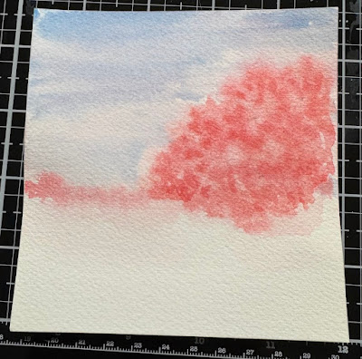
the first round of paint looked like this (wet with salt on) 

My horizon of trees are a little high up the page but, I am assuming I can still make it work bring the main tree in closer to me. (if the salt works) 
 

At 2 am I could not sleep through the smoke rolling through the windows. ( we have forest fires burning south, west and east of the valley I live in (not close to us we are safe here just the air gets trapped in valleys along the base of mountain ranges frequently) So, I got up closed all the windows peeked at the dried painting above and decided to put a whole second layer of water over that and try it again. 


 At 6:30 am this is what the second layers of paints and salts dried to look like. not much Wow factor going on, figured its cotton paper... wet it again, so I did this is round 3 of paints and salts wet.

We'll see what it looks like when I get home from work today, I have a feeling you could do this 50 times before you start getting a consistency to your water/paint level that allows it to fracture like hers did. I have had success with this in the past with snow paintings ( during the winter when its cooler and we have some humidity so, now I am in wait and see mode.) 
 

So, this is how it dried when I brushed the salt off again after work today and I decided I did not have time to mess with trying different papers or brands of paint and I would just keep using this sheet. the salt fractures are not even remotely as dramatic as what is shown in the video and maybe it was the paint. I have no clue, probably there was also a water quantity amount issues as well. 


So I added some water to the ground area and some paint and walked away. I did try to get the horizon line a little darker than the foreground as I am thinking there should be shadows in those areas. We shall see how that translates when its dry. 


 After that layer was dry I did add some branches, a trunk and a few sprigs of grass here and there to the scene. 


 So where I stopped with a few more (taller grass) towards the bottom and a few more branches. The colors did not photograph that well as this is not quite so Pink its more of a coral shade in real life. I guess its not too bad for a first trial but, I just ran out of time to make a bunch of them to get a really dramatic Salted tree here. That's about it from me, if you'd like to play along with us you can find this challenge here at SCS. Thanks for stopping by. 


3.25.2025

Watercoloring a 4 stroke Bird

 This week Brenda is sharing this video from Debbie Walker art on YouTube called paint a 4-stroke watercolor bird. I did watch the whole thing, if you are short on time the painting starts around 10 minutes in. there is discussions of her paints, palettes and papers before that. along with some practice S curve strokes that are used on the bird. As always you can click on these photos to view them larger then hit your browsers back button to continue reading.

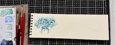
So I had my little sketch pad handy and I sketched on a branch. my thought when I was watching the video was she made it harder on her self then it didn't have to be when she started with the bird and did the legs straight down, my brain said. do the branch first it will make the legs do their angles to perch. 

I decided to do the background before the bird thinking I was going to overlap the bird over the very faint background foliage. ( well that was the thought anyways) 


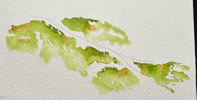
Decided to add a little golden brown to the foliage areas with more water while it was still wet.


 And more water to soften some of the lines.

Then I came back after that was dry, did the bird. ( his head was too hunchback looking) kept going , did some splatters, and blue in the background, some smaller branches.

Decided against the gold shimmer paint and used some ocean instead. 


added some ocean leaves to the skinny branches and a black dot for the eye and decided it wasn't that bad for a practice thing. and then thought, do the bird again. 

this time around on a scrap of Arches cotton cold press used the same sap green to do the hint of where the branch should be on the panel. 

After the foliage in the background dried, I added in the branch, bird, skinny branches and leaves. splattered it a little with the ocean shimmer paint. I thought my bird has a quail look to it. ( the way the head is shaped and I am OK with that, its better than the hunchback look ha ha. )

I used some Mellow Moss card stock for the A2 base here and the sentiment is also something SU as well. ( from one of the not too old Chicken sets I am guessing) and that's about it from me. If you'd like to play along with us you can find this challenge here at SCS. thanks for stopping by.


2.28.2025

Inspired By {Welcome to Nana's}

 This week Julie is sharing the Welcome to Nana's site and pinterest boards for the Inspiration destination. And I stopped looking when I came across these rice crispy treat bird nests. And I knew I had not done any thing with a bird nest for some time so, I just started poking around in the drawer that holds birds and nest stamps in my studio and fished out this very old seasonal borders mini #1 set from Stampin' Up.


 I stamped it with some Versafine Clair falling leaves ink on a small scrap of Arches cold press watercolor paper and added a little bit of Daniel Smith watercolors to the image. I did cut this twice with an My Favorite Things Stitched basic edge die to make it have a little more interest. 


I knew I wanted it to be on an A2 Sized card and so, When I opened the drawer of pre made card bases I had intended to do this on a white card base to keep it simple but, the colors of this Tim Holtz card caught my eye and it went darker. The sentiment here is also from Tim Holtz the occasions sticker pad. And it was just that simple. I am totally looking forward to spring. If you'd like to play along with us you can find this challenge here at Splitcoaststampers. Thanks for stopping by.

12.24.2024

Watercoloring a winter scene

 This week Linda is sharing this quick little video ( drying times excluded) from AhmadArt on YouTube. 

I did sketch a couple of lines with a soluble pencil for the water/reflection area. and added in some paint for the sky.

I was kind of in a hurry and walked away at this point until the next day. this is some Arches cold press watercolor paper and Daniel Smith paints.

Used the same color tried to make it more intense for the background mountain and realized it was way too bright so, I grabbed a paper towel and dabbed some off.

So, it wasn't that great but, it wasn't horrible so I kept it and kept going.

Added in the third hill. maybe a river streak. 


This first round of snow was some Dr. PH Martins bleed proof white. It pretty much faded away when dried so, the next bunch of snow is Winsor & Newton white gouache. 

I did honestly think it was kind of odd that the snow was on the bare tree branches like foliage so, I did mine a little tighter to the branches. Or in the shape the branches were growing I guess. 


My falling snow splatters are all on the very subtle side. I was considering adding some snowtex to this to pop that up and add some depth but, have left it alone so far. 


 The base on this is some Stampin Up blue bayou? something like that cut to A2 in real life. the Sentiment I had diecut a week or so ago and was in a little tray of things on the table.Its the Trendy Merry Christmas from the stamps of life and it looks like its on their to be retired list now. the base is Vellum PTI cardstock and the top layer is some Neenah solar white. That's about it from me, if you'd like to play along with us you can find this challenge here at SCS. Thanks for stopping by & Have  a Merry Christmas!


12.21.2024

Inspired By {Levtex Home}

 This week Denise has chosen this Levtex Home site for the inspiration at Splitcoaststampers and I happened across this pillow. ( seen here) 

 I liked everything about it and in my mind I thought I had wrapping paper nearly the same, so I wrapped my gift and started this tag.

And then I realized that the pillow had deer with the trees haha. This tree was part of a kit of the month from Hero Arts years ago. and the Fa La La La stamp is from RedLead paperworks. the Be Merry & Have joy is a stand alone stamp from Unity Stamps that I think could very well be one of my most used Christmas Sentiments. the pinecone charms came from Amazon. The letter J is a die, the little cardinal bird is an Impression Obsession die. the cotton thread through the hole came off of something I bought recently ( it was holding a price tag more than likely and just happened to be laying on the table ) so, I was in the middle of wrapping so, I decided I would keep going with a woodsy theme and add deer. 

This one the wrapping paper came from Pier1 imports (years ago) the deer is a poppy stamps die cut from watercolor paper and painted real quick. the tag shape is the new Holly Tag from Simonsaysstamp. the sentiment here is from Papertrey Ink. the circle was cut with an Impression Obsession die. That check ribbon is (really old) from Joann's and the red wired felt is either Micheals or Joanns. I tend to pick up rolls when it goes on discounts around the holidays and so. 

Which then lead to this tag, I think the tag die may be a Hero Arts one ( it was in a bin on the table) I ran it through the bigshot inside a Tim Holtz birch folder and added some watercolor to the shadows/texture real quick. The Hohoho is an Impression Obsession die (cut twice and stacked for depth) the little tag is an pinpoint mainstreet one from poppy stamps and I think that letter M was from the ellen huston letterboard set. (but, I do have other letter board die sets so, I could be wrong) That red ribbon is (older) from Micheals. That was about it for being jumpstarted from that pillow but, I do have more tags to share soon. Thanks for stopping by.


11.12.2024

Watercoloring a Snowy Forest scene

 This week Brenda has chosen this video seen here on YouTube by Julia Lis art doing a simple forest scene with trees "out of the box" or oval as it happens. 


I did use an water soluble pencils to do the slightly wonky oval here. 

First layer of paint and I walked away from it at this point to let it dry. this is Indigo and black. 

second layer of slightly deeper shades of the same paints. I was hoping for a reindeer shape to my silhouette and I am thinking this is not too bad. 


added a little more and the first round of white splattering was done with Dr. PH Martins bleed proof white. (which faded when dried) this is some artist loft (cheap) watercolor paper.

More bleed proof white added with also some Windsor & Newton white gouache. ( which also faded away) so, the final card has a bit of Tim Holtz distress picked fence paint ( I think it may be acrylic) and I used an acrylic paint brush to add a few more dots to the finished card below.


The mulberry paper has hints of blues to the grey so, I felt like it blended well with the paints in real life. ( this did not want to photograph for me those blue undertones) the base here is Neenah solar white. The sentiment here is from Red Lead stamps and done with some Versafine ink. this one has finished out at A7 in real life. That's about it from me, if you'd like to play along with us you can find this challenge here at SCS. thanks for stopping by.


7.16.2024

Watercoloring an Autumn Lake scene

 This week Angie has chosen this watercolor tutorial seen here on YouTube from Ahmadart on doing a Autumn Lake scenery. So, I had some already cut watercolor paper in the drawer and I had a suspicion it was the strathmore (not cotton arches) but, putting down the first layers of water confirmed that and so, I kept painting anyways.

The paper curled instantly taped to the glass mat. and I let this dry like this. 

It actually flattened out when drying so, I did add more tape and do the water part of the scene. 

I did not have the same colors used in the tutorial for the sky/water but, I think the mountain & reflection are the same colors although no matter how much I mixed mine, they just did not have that little bit of water to be more mud like, when I got the paint thicker it dried all the way in the pallet. ( its hot here and the humidity is very low) 


So, when I pulled off the second piece of tape I seen that the water bled into the sky/mountains so, I thought this is just a trial run anyways to see if it will work on this paper.

And  then I had the bright idea to add water to the back side of the painting and the glass mat to let it stick. ( it did not stick like a cotton paper would have) so, I put this into my big shot and smooshed it under the rollers and let it dry there being pressed flatter.


The horizon line is pretty dark here to me but, I also found that none of my brushes are all frayed so, I started with a small flat brush but, that made more lines than splotches so, I just grabbed an Size 6 round and started making dots for the leaves. 


I did add some detailing ( dark) to the shadows of a few of the branches and the trunk and some white lines to the still water and some "highlighted" leaves but, I am not seeing much difference here with it yet. I am waiting for it to be finally dry to decided if it really needs something else. 

I did end up just a few more spots of paint to the previously white lines in the water and the leaves as what was there dried to almost gone so, I touched them up and then mounted this to some very pale blue/grey textured cardstock that was cut to 5 3/4" square in real life. That's about it from me, if you'd like to play along with us you can find this challenge here at SCS. thanks for stopping by.


6.25.2024

Watercoloring Windy shore Grass

 This week Linda is sharing a video tutorial seen here on YouTube from Paul Clark on adding movement to watercolor and I chose to do the wind blown grass rather then the horse although I did consider using a stamp for a moving critter or person stamp and trying this idea with one of those and I may down the road this seemed like a good trial thing to give a whirl. ( grass is pretty easy to me now and a few years ago it stressed me out) 

I did not sketch this I just did something similar to what I remembered seeing in the video. ( I watched this last week and did this painting this afternoon after work today) 


I cut a piece of strathmore 400 series wc paper to 5 1/2" square because, I think I remember him saying this would work better on not cotton paper. I did give the back side of this two washes of plain clear water along with a layer of water under that on the glass mat. ( It does not work as well as it does on cotton paper but, I gave it a whirl) 

I let it get to damp status ( which happens fast at 90 degrees outside) and added some grass as a base layer and a little more color to the ground area. 

And then I did the dunk the corner of a paper towel in the clean water to drag some of the paint to the right as the wind is blowing from left to right in this scene. 


I did let the paper dry before I added all the bits you see to the foreground here and then I did add more as seen below. 

Added a little more grass and some more color/texture to the ground. Probably should have more grass here looking at his painting but, I am pretty tickled with how this turned out for adding the movement to the grass. I did add lib some flying birds into the sky and at some point when I make a decision I may add a sentiment to this and finish it into a card. ( that's debatable right now) I am also considering adding say a person in beach attire to the scene and just paper piecing them in done on a different sheet of wc paper. So, this is where things stand now. If you'd like to play along with us you can find this challenge here at SCS. Thanks for stopping by!


4.19.2024

Inspired by {Whistlefish}

 This week Denise has shared the Whistlefish site and Pinterest boards. But, I happened across these blue leaves in her write of of the challenge and it stayed stuck in my head until it was time to make something so, out came this old Penny Black leaf spray stamp


That I stamped on some Arches 100% cotton cold press watercolor paper with Adirondack stream ink and then added Daniel Smith watercolors over the top of that. 

I had used this Reverse Confetti stitched square die last weekend so, it was still out when the leaves were dry and I decided it would be a subtle edge. The base here is some textured Bazzill and this one is 6" square in real life. And also much more vibrant. I am liking how this turned out, I never would have made leaves blue if I had not seen that shot offered up so, its a fun thing when you do something unexpected and you like it. If you'd like to play along with us you can find this challenge here at SCS. thanks for stopping by.