Showing posts with label People/Characters. Show all posts

8.29.2025

Decorate the Season

 I don't know about you but, I have a little stash of these old sweet Penny Black kids that are just a lot to color. So, I have not colored any of mine before today I don't think.

So, as a trial I stamped her on some Studio Loft watercolor paper with Versafine morning mist ink thinking I did not want any dark black lines and I had to laugh at my self because, once the paint was dry I ended up taking a black micron pen to most of the edges of that panel. I cut her out with scissors and put foam pop dots on the back. The plaid paper here is from one of the Simple Stories pads and that aqua trim with the faux red stitching is the back side ( drop piece) from the plaid. I cut the red ric rac ( IO die) from some shimmery red paper and just wrapped it around the edges. The red base here is something from SU. Probably ridding hood red as its one of my go-to colors and its finished out at A2 in real life. I did use the white gouache straight from the tube so it would dry 3-D and I am pretty tickled with how she turned out. Thanks for stopping by. 

At the same time I was painting the one above, I had a second panel going in shades of Pastels.

So, since the simple stories plaid worked well with the one above I did nearly the same thing on this one as well. The plaid on this one was from one of their Winter pads. The pink ric rac was cut from scraps with the IO trims die and the plaid mat under the painted panel was from one of their other pads. ( simple stories) and those are up on foam pop dots. The base here is something I want to say an herb type name from Neenah and its A2 in real life. I am debating adding a little more color to the birdhouse here as the creamy color kind of fades into the scene I guess. I think I like the contrast of the darker one on the top more but, she is still cute. That's about it for her at the moment. 

8.26.2025

Watercoloring Human Doodles

 This week Linda is sharing this video tutorial by Stephen Coats doing quick sketches of people from the back in simple scenes and watercoloring them. The video is called Watercolour Doodles Human Figures seen here on YouTube

 So, I started doing sketches of people after watching the video in these sketch books. 


 And I thought OK this is not so bad as the mental thought of drawing people or even sketching people so, I picked up a second sketch book with watercolor paper that I had not used as of yet and did a larger couple on it. This is a link to this particular pad

And then right before I started painting it I remembered that you were supposed to ink over it and I actually remembered to test it on a scrap. 


 I grabbed an Micron pen and found it bled with just water so, I went online and found this multipack of the Uni Pens in the video on Amazon here. And then I scribbled on some of the black from that pen on the same scrap of Arches paper 


 And it looked like this pen bled more than an Micron pen... so, I decided that I would use the pen and let it sit for a while incase there was some drying time needed. 


 I did try to mix some plum paint from the ultra marine and some red (not a what ever red he used and I did not really see the paint move as well on this paper. I will have to look for a link for this particular sketchbook but, it is not Arches paper for sure. 

I did drag the paintbrush below their feet trying for some blurry shadows in the rain um, reflections type movement.


So, after that paint dried I added on some more shadows at the feet for a reflection and Sketched inked shadow lines as the paint had dried by this point. And this is where I stopped. I did not have time to build a scene and I am OK with that, I still grin about the whole "carrot" people comment but, I was glad to see this explained in more depth as the first time I had heard him say that during the beach scene tutorial from Last month seen here I did not try to add legs and feet like I did there and this is more realistic to me so that was a cool thing to learn. That's about it from me, If you'd like to play along with us you can find this challenge here at SCS. Thanks for stopping by. 

7.31.2025

Dirty Dozen August 2025 Christmas

 Happy August :) This was done using the Dirty Dozen August prompt to jump start this shaker card. I recently played along with the Tim Holtz & Simon Says Stamp Christmas in July class doing collage things and so, since I have a lot of those bits and pieces of papers, layers, chipboards. Not only Tim Holtz but, also some from Simple Stories and others. And I'd like to make a dent in using it up. With that thought in the back of my head it was pretty easy to turn this Chipboard window into a Shaker card. the inside of the shaker is also some of that new "Snowflake" mix that came in the class kit from Ranger. ( its Mica flakes, glitter, rock candy maybe other things mix ) It is very sparkly in person. 


 I am planning to hand deliver this so, the thickness of the card is not a factor here. I do have a layer of the Simon Says Stamp foam tape behind that window pane to give it wiggle room to shake. The let it snow below her feet is also printed chipboard but, not high up as the window frame. The woodgrain printed paper here is from Impression Obsession, so it has a little gloss to it the same way the paperdoll and the printed tree layer do. I did tint that paperdoll with some of the Tim Holtz crayons and the stickers on her hands are from last years Christmas sticker pad. The layers of printed paper that looks collage-y in the top left corner are from the Simple Stories simple vintage fresh snow ephemera package. The Dec 25 red block is also from one of the TH packages. The printed snowflaked edge acetate inside the window frame on the top was in one of the baseboard packs with the chipboard frames and then I just used some plain (thick) acetate from Crafters Companion to contain the shaking bits on the back side. That snow flaked edged one was not quite long enough to go across the width of the frame so, it is off set to the left and then I used the paperdoll girls body to cover over the exposed right side. That's about it from me if you'd like to play along with us you can find this challenge here at SCS. Thanks for stopping by. 

7.13.2025

Create Together Collage tag Trio

 The third project in Create Together the class that is Tim Holtz & Heidi is some size 5 shipping tags that get totally collage covered with the ephemera papers. and then layered up over that. So, I did start with picking out a handful of bits of paper to cover 2 of the tags, but as I trimmed the edges of the first one. I walked around the table where I have piles and picked up more bits and a third tag. This turned out to be something I really enjoyed the finished tags of. 

I did try to minimize some of the mess by using a piece of plastic packaging for the collage medium smears for using a glue brush. 


A closer look at the base layer of those tags. 

I did use a piece of plastic packaging to lay the tags on the glass mat as I did the seal them with the medium with your fingers step. off to the left out of this shot is a box of baby wipes and now I am not as nervous about getting it on my skin as I was before I started but, they do mention you need to get this off your fingers while its wet or you are wearing it for days. That freaked me out a little and I almost put on rubber gloves. 


Once they were dry shiny cello tape stickers came out to play along with more Paper dolls and shiny foliage bits. and then some stickers that were cut up to look more ransom note type style. the people and foliage are all up on the foam dots from the kit and surprisingly enough they felt a little more sticky adhesive wise than the ones I have been buying so those have now gone on the mental shopping list to get more of when I get low again. I found I do not have a 1/4" hole punch. ( who knew?) so, that went on the wish list as well but, I used a 1/8" hole (4 time haha) which made little funny shapes in the hole of the tag so, then I tucked in some red skinny velvet yarn fiber through the hole. I am pretty tickled with how these turned out and I know I will be making more of them at some point. This class has an hashtag of #SSSHolidayCollage if you are playing along. Thanks for stopping by. 

7.12.2025

Create Together Tim Holtz & Heidi Holiday Collage Card

 A funny true story. I have a ton of Tim Holtz products, you knew this already right? but, I don't really use much of the papers and chipboard pieces I think I am more of a collector of them more than a collage person. I use a piece here and there so, I was really excited about the live class they were offering from Simon Says Stamp and teaching it as an YouTube video. (you can watch the replay here) I also had assumed that the 11th was going to be a Saturday when I bought it without looking at a calendar so, I heard part of it at work yesterday between payroll and customers and our IT guy coming by so, This morning I started watching the video where I could just sit and watch it. It starts with a collage card. 


I opened my box this morning so, no homework done here. I do have packs of some of these packages from last Christmas that are open in a container so, I picked and chose from both the kit box and my Tim Holtz papers stash box.

This is what I was thinking my card might turn out to look like. 

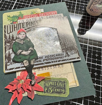
I built my shaker frame piece and I had not used that liquid glue much and I got it too close to the acetate and I thought ok, you're going to have all this shaking sparkle inside anyways it does not matter, but the glue leaked out the front of the frame under where you see this girl sitting. and I thought OK but, as I was moving piece around to do the collage building part I thought, you know you could move her to the other side of the frame the way her back is in the mugshot she'd probably look more natural posed there, so. I did. I also stacked one of the smallest poinsettias tilted on top of the medium one under her feet so, the flowers are a little 3-D here also. 

I think she turned out pretty cute, I shot all of these photos with my cell phone and the colors are a little off to me but, not in a this is terrible kind of a way. (that card base is a very deep green color in real life) I did use the Candied Apple crayon on her hat and the mowed lawn green on her coat for tinting, the cheeks are worn lipstick. I had not ever thought to do this, and I love how that turned out.  

I am excited to see what the next project is. I am also thinking I just may add some stickles or something to the center of that poinsettia for a little more sparkle. I probably could have added a little more to my shaker window but, I do like that you can see the corner bit of the layer under it as well so, there is that. 

The bits and pieces I did not end up putting on the card, some have been inked with the iced spruce ink. I am thinking I may also add some of that cello tape to the top of the green ticked under her feet as well but, I have not gotten that far. I have replenished my cuppa Joe however and this means the creating can continue. I hope you are having a really creative Saturday as well, Thanks for stopping by. 

and I stopped the video too soon, they added tape after I thought they were done with the cards haha.


 So I cut a piece of the tape sticker and used it at the top and bottom and decided the flower stamens just needed that sparkle as well. I am not sure how it works but, this class has a hashtag that is #sssholidaycollage if you are playing along on maybe Facebook?  I know there are some people from Splitcoaststampers who have also bought the kit and will be playing along, so I am just going to try the hashtag there in the gallery as it is keyword driven. That's about it for the moment. Thanks for stopping by. 


4.11.2025

Inspired by {BonTon}

 This week Kia is sharing the Bon Ton site where nearly right off the bat I found this girl Easter Bunny. And I just decided to roll with that as I had started adding color to a Missy Bunny last weekend. 

She was stamped with some Versafine Clair Morning Mist ink on Arches cold press 100% cotton watercolor paper and I was glancing at the index sticker on the stamp block when I started painting this, So the hat and clothing got a little brighter than I think I would normally pick as color combos from me personally. I guess in my head Easter is Bright. 

After I had added a few more layers of paint I decided to cut her panel down with an Stiched Simon Says Stamp square die. The gingham print here is from Graphic 45 and the textured paper under that on the left is some Woven Paper from Diecuts with a view. The base here is some Sundance Felt Natural (textured) cardstock. The base on this is 5 1/2" square and that salmon velvet is unknown. The Happy Easter is from the Clearly Besotted Message me set on an Scrap cut with a Spellbinders Justrite die. The salmon brad is unknown. the two larger flowers are the Hobby Lobby or Micheals brand as I am certain June gave them to me and the smaller one might be a Prima flower but, I really don't know for sure anymore. ( I have all my mulberry flowers in clear vintage canning jars on the shelf and I toss the packaging when I get them) 

That's about it from me, If you'd like to play along with us you can find this challenge here. Thanks for stopping by.


3.31.2025

Dirty Dozen April Christmas

 This month's photo prompt can be found in the special forums set aside for Fan Club members at SCS here. I had decided to do the angel as my focus and stamped her ( Stampendous WireWorks Angelicia) with some Versamark on Papertrey Ink vellum cardstock and heat embossed with some Ranger detail white powder. ( the tips of her top wing did not get inked and I didn't notice that until the powder melted.)

I knew I wanted a sparkle from the lights so, I grabbed a copper and gold gelly roll pens and colored spots and lines on her both on the top of the vellum and on the back side. I did die cut this with a The Greetery arch die and then ran her through an Xyron to make her have solid adhesive on the back side like a sticker. The printed paper night sky treeline paper is unknown, ( my best guess is either Recollections or I really don't know. I don't save too many Blue papers and so it was a lucky find in the drawer. I trimmed it down to just slightly less than 5 1/2" square.) I wrapped some vintage lace across that and added the same glitter gelly roll pen dots to the sky and stars as well.


I decided I'd add some pearls to the wing and I came across these translucent ones in the stash from SU.  its kind of an in between copper and gold and had two sizes so I just plunked on a trio of them. 


The sentiment here is from Red Lead paperworks and was diecut with a Tim Holtz labels die. The base here is some textured linen Navy Cardstok. It's not quite this dark in real life but, I was messing with the contrast so you could see the colors in the gown and the gems. That's about it from me, if you'd like to play along with us, we would love to have you. Thanks for stopping by.

3.28.2025

Inspired by {Antique Farmhouse}

 Sometime last winter I had came across this site as an alternative to one I had been considering for the Inspiration destination. And at that time I looked mostly at the Christmas offerings and even though it's months later I still want to have a few Christmas things done well in advance of the holidays. I just need that less stress in my life, so with that thought in mind I chose this Santa with the wood background as the jump start for this card. 

I am kind of amazed about this as I tend to take out my cell phone and shoot a couple shots of layers of paint going on images and with this one I have none. Yep, surprised me as well. The image here is an old one from Stampington & Company called Jolly Basket. I did stamp it on some Arches hot press watercolor paper and then diecut it with an Impression Obsession Anna Wight stitched circle die ( it has you know, its not a perfect stitched circle, the stitching varies and I like that I think it plays well with the folk art vibe the image has and the rustic layer the printed woodgrain paper print brings. The burgundy ribbon is unknown and I left off a sentiment for the moment because, as much as I like to color Santa images there are not actually that many people on my Christmas card list I mail Santa cards to. This one is 5 1/2" square in real life. If you'd like to play along with us you can find this challenge here at SCS. Thanks for stopping by.


2.08.2025

Inspired by {Nicebai}

 Hello, it's been a long while. I know, I have been Well, there's no nice way to say it but, my Mama passed away last month the morning after her 75th birthday. So, the grief comes in waves between the rounds of doing what needs to be done. And so the travel time also factors in there. This is the first thing I have tried to create since then. Kia is sharing this Nicebai store online that also has an Pinterest boards seen here. I came across this shirt with the Vintage printed cowboys. And my first thought was, I think I have paper like that. And I fished out this old "wanted" pad from Cosmo Cricket and I found this paper that had the colors right but, no cowboys on it haha. I trimmed it down to 5 1/2" square. So, I pulled out the Wild Wild West stamps from Stampin' Up! and stamped this cowboy herding that cow directly on the paper and added some watercolor paints over it.

 That didn't really go well, the ink beaded up on the paper and so did the paints. So, I grabbed a piece of Arches cold press watercolor and stamped it again and started adding just a little bit of paint to it. I did end up adding a few more shadows this morning after we got home from the round of grocery shopping and cut that out with a Memory Box stitched rectangle die and just layered it over the directly stamped image. I found this sentiment stamped and diecut in the little milk glass tray on the table and my mind is completely blank as to who made it an such.

The base on this is some really old as well SU creamy Carmel cut to 5 1/2" square. I am probably going to pop it in the mail for my step dad as one of his favorite things to watch are the old cowboy movies and shows like gunsmoke. If you'd like to play along with us you can find this challenge here at SCS. That's about it from me, I hope you all are doing well. Thanks for stopping by.


12.07.2024

VSN The holiday Edition {Part 1}

 There is a VSN going on at SCS and ( if I knew ahead of time you guessed it I forgot a long time ago) so, I spent a little time off and on today peeking in between other projects and playing along with making some mostly reds and white gift tags as I had gotten out some previously started red & white bits and pieces for the IC tag I did yesterday after work. 

The first challenge is Kim's and she wanted a Star ( or multiple stars) on the project. So, this one went together really quick for me as all these pieces were on the table. 

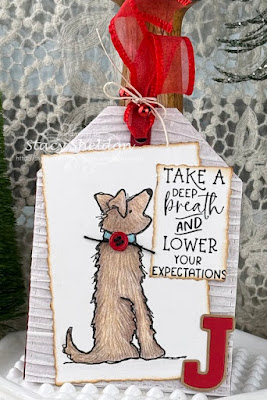
The next challenge I did was Vicki's Christmas critter one, and I did go fishing in the previously colored images bin and found this dog from Impression Obsession and I'm guessing I colored this a couple of years or more ago as it looks like it was done with pencils to me. That silly sentiment is from Taylored Expressions and it made me laugh. I did cover up the heart that is part of the dog's image but, I needed room for the sentiment. 

Lisa Has a "sparkly Santa" challenge and both this tag with this paper and this All Night Media Santa gift tag image ( water colored and stickled a while back) were both already on the table in different bins so this was my 5 minute tag.

Susan has a Splattered Snow challenge with the explanation of what you did. So, (this is a wet shot by the way) I had found this previously stamped and had one layer of watercolors paint on it Snowman and thought OK you can fix this. ( I have a few more skills than I used to so, I am getting braver with making the paints deeper and or more layered ) So, this received another layer of paint and while it was damp I splattered it with some pretty wet White gouache with a round watercolor brush. 

So as it started to dry I hit it with the gouache a couple more times with less water in the paint to get smaller splatters. This tag was diecut a long time ago ( not sure off hand which die it was but, want to say probably Sizzix.) the tiny snow is falling tag is an lili of the valley stamp that I had stamped on a scrap of water color paper and cut out with scissors, my friend at work does "happy snow dances" all year long so, this will most likely go to her and the oh joy, I know she will chuckle over. That's about it so far from me, I forgot to count how many challenges there are but, I am thinking about a few of them off hand but, we are hoping to get some more of the Christmas decorating done this weekend so, we shall see how it goes. Thanks for stopping by.


12.02.2024

December Dirty Dozen Christmas

 I can not hardly believe it is already December. I have to laugh at my self as even just a couple of years ago I thought time moved quickly. It's sped up again for me. At any rate the very last prompt for playing along with the Dirty Dozen and creating for Christmas is up here in the forums for Fan Club members at Splitcoaststampers and I ended up going this away for my sample. 

I ended up stamping this Santa Hat (from The Stamp Pad) on some Artist loft watercolor paper and painting it with Daniel Smith and Windsor & Newton (red) paints. When that was dry I cut the watercolor paper with an Honeybee stamps deckle square die and inked the edges with some DOX vintage photo ink as it was a similar color as the crackle in this paper I found in an Craft Consortium Test of time pad. Lately I have been trying really hard to not pay package type postage costs for my cards, so. I have been keeping them at 5 1/2" square and fairly flat so they will slid through that slot at the post office. with that in mind. I did just cut off two snips of this ribbon and wrapped it around the printed paper layer and just under the edges of the painted layer so, there is not ribbon twice across the whole bottom of the card. the corner of the sentiment panel (Stamp is from the Taylored Expressions Santa stop here set) and cut with an old Spellbinders mega deckle rect. die I just folded my glue dot in that bottom right corner in half as that edge was up slightly because of the ribbon above it instead of you know putting foam pop dots under the whole thing. 

I did go over the berries with a white gel pen ( which was not very visible with all the rest of the white) and a bronze sparkle paint on the jingle bells ( again not much shimmer as there is also a lot of brown on this card) so, I decided to add some Nuvo Crystal glaze in those areas. It is still pretty subtle even in real life.  That's about it from me, Thanks for stopping by.


9.20.2024

Inspired by {European Splendor}

 I came across this Christmas tree collar inside the European Splendor site that Denise has chosen for this weeks Inspiration place. And I knew I had this Unity Stamps Farm Fresh girl. I also have an older Papertrey ink set that has a similar type theme sign stamp in it but, its larger than the sentiments in the Unity set.

And once I had her stamped on some Hot Press Arches watercolor paper I knew that it was going to introduce more colors into the design than the simple colors of the store ad. This is first layers of Daniel Smith watercolors with some White gouache. 


I did stamp both sentiments from the set on a drop piece of the same watercolor paper so the colors would still work and then the Tree sign part I did run through this Memory Box arched die twice so I could trim it closer to the sentiment. 

I cut the largest pinpoint tag die with some grey woodgrain print and a second in plain white cardstock for the backside of the tag. I diecut the gal with an Impression Obsession Deckled frame die ( the largest one in the set) and the sign is up on foam pop dots here so that it had room for me to tape the vintage lace to the backside of it. The gal and the top tag have some Vintage Photo Distress Oxide ink along those edges. I never did get around to adding more paint over that first layer but, I did add a slight amount of stardust gelly roll pen to bits in the tree, her hat and sweater band. I don't know anymore who made that rustic brown heart brad, but the Merry Christmas was cut with the same Poppy stamps mainstreet pinpoint tag in the smallest size as the base tag. I kept thinking maybe this would have been closer to just do the sign with some white, wood and greenery and did these little 3"X3" cards from scraps after the fact.


The sentiments were die cut with the smallest blanket stitched die in the Pinkfresh set and the woodgrain on the white one was cut with a deckle square from the set from Honeybee stamps. the bitty black brads are really old from Micheals. the outside frame of the white one was cut from the Stamp Market's shaker card dies (for 3X3 cards)  That's about it from me, if you'd like to play along with us you can find this challenge here at SCS. Thanks for stopping by.


9.17.2024

Watercoloring an Rainy Autumn Scene

 It's my turn to host the water coloring tutorial challenge at Splitcoaststampers this week and I have chosen this one from Marena Art watercolor Autumn Landscape girl under an umbrella. That you can see the video here on YouTube

I did not do anything fancy, just did a slight sketch of the girl & umbrella directly on the cold press Arches watercolor paper. This was cut to A6.

Did a slight layer of neutral tone and some clean water with a size 12 round brush, but the water splatters were just huge so after this was shot and viewed I did add a little more paint and smaller brush splatters and set it aside to dry.

So, I did add color to the skirt area (twice) some to the trees and the umbrella ( which I kept making larger and larger and really over worked this part. and I decided to walk away and let it dry to see if it was fix-able with another layer later. 


hopefully, this will add some more. but, I let it dry after this shot again also. I think I started with the colors too deep so, trying to add shadows to the ribs of the umbrella is not going well. 

So, the drop piece got the same style girl sketched on it and so it begins again.


neutral tint from Daniel Smith

I started out with a more watery shade of orange for the umbrella this time around.

Added some of the tint to the ribs of the umbrella.


Decided to use an Avery Elle postage die for a frame and was going to have this be A6 and then realized it was crooked so, that piece I cut away from the back of the fold of the card and started to trim that down closer to the edge of the postage and cut it crooked. So, out came some scissors to distress that edge. I decided that it needed more contrast for the next layer since it had more layers than Originally planed.

I did add the Dr. PH Martins bleed proof white for catchlights on the umbrella and I left off a sentiment since, I am not sure what I am going to do with this as of yet. If you'd like to play along with us you can find this challenge here at Splitcoaststampers. Thanks for stopping by.


9.11.2024

A Christmas Sketch

 This week the sketch challenge at SCS caught my eye and I came home early (rainy day) and I did not have to go out side and water so, I decided to give this challenge a try. 

I had hit print on the sketch at work before I left because, that is the only way I can get even close on a sketch challenge is to have it in front of me. I started with Stamping that Impression Obsession Wooden Door Frame with some Versafine Clair Artic blue ink on white neenah and then proceeded to add some Distress Oxide inks over that to age it. Antique Linen, Weathered wood, Evergreen bough & Vintage photo. I did cut that out with scissors and cut out the plain center of the door to make it a square frame. I used a grey fineliner pen to add a little bit of detailing to the hinges and door handle and then later when I was adding gold sparkle watercolor paint to the berries on the holly panel I added some gold to the center of the hinges and the handle also ( but, I think it mostly faded into all that ink) I actually used some papers right out of the pads for this so, I left them on the table so I could remember to say what they were. The young elf/deer image is a corner of a piece of the paper from the Prima pad and the faded plaid & Christmas collage prints were from the Hobby Lobby Vintage Christmas pad. The velvet ric rac is only glued to the top not wrapped around because, its kinda thick so. I did end up having to put the door panel on foam dots to raise it steady/flat over that. 

I didn't really see the flower part of that sketch, my brain seen it as a small circle on top with layers so, I dug in my little box of previously diecut tags and pulled out this white round one and that bitty red one ( an old SU one that came that way before people owned dies) the Believe metal tag is something from Tim Holtz and it has one of those gold goosebumps covering up the hole. I was so thrilled to see that lawn fawn came out with red hemp string. I may have to order another spool before I forget because, I can totally see my self using that All.the.time. :) That holly folder that was used on the old green WC scrap panel is from Sizzix Basic Grey powdered Sugar & snowglobe set ( I am not sure which folder is what name but, the other folder is a stripe) That's about it from me, thanks for stopping by.