6.30.2014

a Shutterbug day


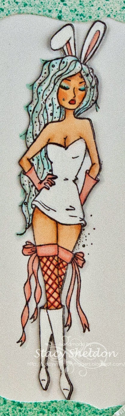
Love this mouse the holding the cheese just makes me grin. this version was colored with some Derwent watercolor pencils on Neenah ( which warped the cardstock) and so that panel is up on popdots. 


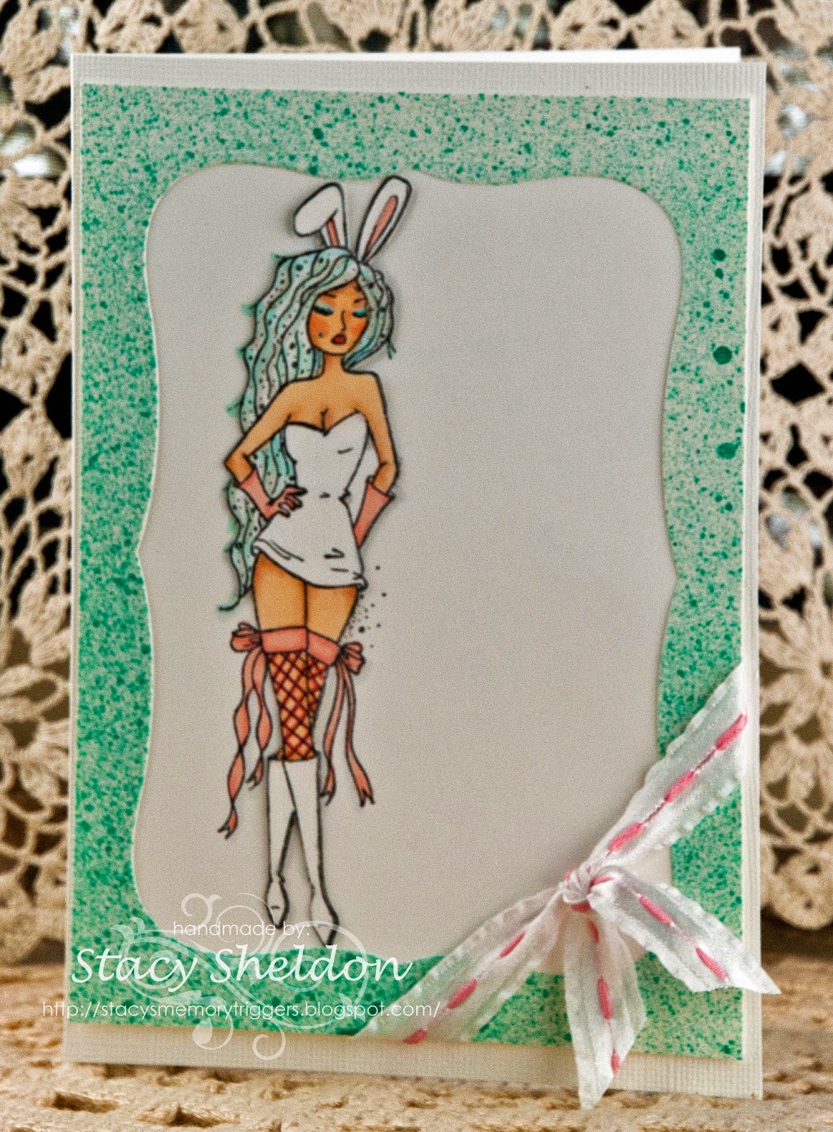
I thought the colored cheesecloth gave it that "studio drapery effect" kwim? the printed paper is from Kaiser and the base is bazzill with some Heidi Swapp photo corners and unknown brads. the sentiment's from Stampendous. this was either 5 1/2 or 6" square but, it was tossed together quick, shot and given away without any of the details being jotted down. 


our family had a picnic at a local park a week ago and that was the day before my gpa's birthday.this was done quickly for him. 

Gpa and Hubs June 22, 2014 @ Wiard Park. There is a big discussion going on at SplitcoastStampers about people who post links to their blogs to see more information about projects and then post "personal" stuff on it. that just cracks me up that people assume other people have "craft only blogs" I guess I need a tag that say's this blog will contain what ever I feel like putting up on it. Yes, I took a few dozen photos at the park but, they probably will be emailed out to the people. but, I am also going to assume that if you are reading this blog and you have a question about what ever information is not here that you feel like you can click the email me button and ask. if this is your first visit here any photo I put up on my blog if you click it, it will enlarge and you can hit your back button to resume reading.

6.29.2014

FS386 Train of Dreams


It took all day to get this done and "close enough" that you can see the inspiration piece in it. This is Barb Mann's card I CASE'd today. Mine is 6" square in real life. changes I made were ( all stamps and the colors slightly ) the dry embossed panel I did ink the opposite side of the folder than Barb did and also I added more "stuff" to mine. There are layers of pop dots between the stamped train panel and the mat under it. The stamped panel was cut from the largest reverse wonky rectangle die, so the mat was done by tracing around the outside of the die on the backside of the textured paper used for its mat. this was cut and distressed with scissors so it blends the its been cut by hand look. 


These colors look so wonky to me on the monitor, the blues are more of an faded denim type shade and the browns are not so darkly tea stained looking in real life. the gear die cuts are from cheery lynn ( from last weeks loot pile ) with some Kaiser pearls in the centers. the sentiments are from Verve. the train is an old one from ImaginAir designs. the speckletone sand was drug across the craft sheet that had some tea dye, old paper, antique linen and vintage photo distress re-inkers on it with water. the vintage dictionary page was treated the same way but with old paper distress ink from the pad. then I blotted it because, it was too wet and it lost the dreamy look and just looked uniformly dyed. It's OK its mostly hidden anyways. The circles diecut has been laying on the table for a while and it just kinda migrated to the bottom of the card because, you can't do too much matchy  matchy stuff without twitching. or I cannot. and the ampersand ha I spent a long time looking for an ampersand stamp small "enough" and then finally had a v-8 moment san's the slap that I own scrapbooker alphabet die sets bwahahahah. I had to dust the binder. That particular one is from Quickutz and the font was Abigail Classic.  

More Thanks


This one is hubs fault, He has said to me over and over I don't understand why you don't just make 2 of everything... esp with a card you like how it turned out. So, this was done with nearly the same things as the Starfish card with slightly different colors. So this one will go into the stash.


This is 6" square in real life, the Nautical blueprints seahorse was stamped (twice) with Versafine smokey gray and memento gray flannel. ( its paper pieced into the layer) and I got it a little too wet activating the pastels so the tail is not as cut out as it could be. The texture is from Hampton arts stamped with Adirondack Pebble, the Stampabilites sentiment is done with london fog all are on some My Favorite things primitive cream cut with an justrite vintage labels 4 die. The eye is a kaiser pewter pearl and the mini brads are from recollections. that grey chevron pp is an scrap ( unknown) the gingham is from colorbok, the mat is Die cuts with a view, The fibers I have had a very long time not sure where I got them anymore. 


the seahorse was colored with some Distress antique linen marker, Cretacolor Bronze pastel, water & over the top is some gold gelly roll glaze pen. the background was sprayed with some Glimmer mist ( sage ) and Colorshine (seafoam) The edges of the sentiment panel and the image panel were rubbed with some colorbox fluid chalk ink ( creamy brown ) 


this one is headed out in the mail tomorrow. I had looked at the featured stampers gallery this morning while I was notifying for the favorites thread and came across a card to try. ( this only has two things in common with that card) they are not even kissing cousins so, this is not linked to that. will try it again in a bit. the cardfront base was run through one of those we r memory keepers 6" folders. ( that is so nice I hope they make lots of designs in that size ) I have had good luck with these folders. I do have one other 6" folder from another co. ( will have to look later ) its a disappointment as far as how well / deep it embosses. ( should try stamping with it some time I guess) 


The hardwood background was heat embossed with ranger distress weathered wood powder which gave it a touching sandpaper effect and the hearts are from a sheet of Authentique printed paper. they are only stitched in the centers. normally I tend to run pinking shears on things before they are sewn, but this one was trimmed after so, the printed gingham ended up looking a little aged and worn because, it is way harder to hide the freehand thing when you go backwards like this. 

A Blessed Star


I am in need of thank-you cards again and when I was digging for plaid papers yesterday for the inspiration challenge I came across this plaid and the fancy pants corrugated so, this card started with those papers. the Nautical blueprint starfish is stamped twice and is paper pieced into this background. It was colored with an cretacolor cloud gray oil pencil and an Staedtler cobalt blue watercolor pencil and has some gellyroll sky star blue glitter pen over that. this button is vintage I think it is either seashell or bone its heavy and cold to the touch tied with some chocolate hemp string found at wallyworld.


This stamped panel was over stamped with an hampton arts antique texture then sprayed with some heidi swapp color shine ( seafoam and teal?) and then has some distress weathered wood color dusted on top of that. ( dragged on with an dry brush ) the sentiment is from Stampabilities and cut with an justrite vintage labels 4 die. this panel is up on pop dots and the two bottom layers were machine stitched before it was placed on the card front. this one is 6" square in real life. other ink colors are Adirondack Pebble, Versafine Smokey Grey, memento london fog & gray flannel. funny true story Memento London fog and Distress Iced spruce are nearly the same shade... the iced spruce is a teeny twinge more green. 

6.28.2014

Mad for Plaids


The inspiration challenge at splitcoaststampers today takes you to this site for men's fashions so the challenge was to find something to be inspired by and this is what I found.


I loved all those crazy plaids in the jacket with the textures behind the model but, I knew if I had some plaid papers in these color it would not be many and it could end up being way too busy of a card If I had used it all. I have not uploaded this to the gallery yet as I am waiting to hear back if that sentiment will be allowed in. The sentiment's from River City Rubber Works and the glasses are from Taylored Expressions "Spectacular" the glass was scribbled over with an Stardust gelly roll pen. The plaids are scraps and the textured was done with an 6" square embossing folder from We Are Memory Keepers.


6.27.2014

Hopeful Tulips with some loot


This one is 6" square in real life, the cheesecloth was colored with spritz and sprays then scrunched in my hand to mix the colors. the Rubbernecker watercolor tulilps were done with those oil based water activated pastels I picked up the other day. the Sentiment ( also from Rubbernecker) was stamped with some Versafine Spanish Moss ink. That panel is up on thicker pop dots. 


It did drip just a bit as I had applied the crayons direct to rubber then sprayed with water then stamped the flower on the Neenah. 


a side view. 


 a closer look at the crayons used on this flower the another thing I have tried with them besides direct to rubber is direct to an embossing folder which was spritzed with water and then "stamped" and they work really well that way too. no staining on the folder and that was easier to clean up then gelatos. 


We hit an estate sale this morning and this is the loot that followed me home, except the missing thing is a vintage box of Crayola Crayons that I picked up for .50 cents. ( the ways to use it this week is to use crayons) and I have to go re read it to see if these oil ones I used on the card above will "count" or not. 


I have been finding my self picking up pieces of hobnob type milk glass this last year and even though this one is an ashtray ( I think ) I think the division in the center will just make it that much more interesting for sorting small things. the knob has the screw on the back still and the tiny sugar cube tongs I think I will use to hold things I need to melt with my heat gun because, it really does get scary when you catch your nails on fire with the dang thing. ( ask me how I learned that eh?) ;) 

Make a Wish Bunny


I bought this gal (Vivianne) from Unity just because I wanted to color her. with copic markers and gel pens. I love the hair and made it teals and silvers. the garment and boots were swiped with an white gel pen it almost gives it a vinyl look She is stamped twice with the main body, boots etc all the top layer the ribbons on the stockings are all the bottom layer. but, there are no pop dots so the dimension is subtle and better seen in real life. funny true story, I have an Aunt named Vivian who has the coolest hair. ( its not teal however, but it is very long and curls on its own) :) 


The frame was splattered sprayed before die cutting and that ribbon came from walmart many years ago. This one is 5X7 in real life. I am entering her in the Unity friends with flair challenge today seen here.

Updated this card has won a gift from unity for this posting :) you can read about that here.

6.24.2014

WOYWW 264 Edition

Well, if your curious why the mess is on display head over to Julia's blog and check it out. you will find the links to find all the other desker's projects / or work spaces who are playing along this week there.


I have not created a thing in maybe 3 weeks now, that has not stopped me from shopping.


this is the haul from 3 different stores today. a few stencils, dies, embossing folders a couple stamps, foil sheets, a watercolor mixing pallet, think that's about it. 


The Dylusions sprays I have never played with nor, the oil based water activated pastels so this will be something interesting to try. they were "pretty" colors compared to my regular water color crayons, I'm intending to use them the same way. not shown in these photos are some huge sheets of hot press watercolor paper to cut down and play with. 

6.11.2014

What's on your Workdesk Wednesday #262


I will have to link this up later, it looks like Julia's blog post is not up yet for this week. I have not been online for days and days more or less. Our son graduated from High School this last weekend and left for Marine bootcamp on the same day. which brings me to this photo, last week this AMAZING gift arrived in my mail box, as stampers you know that set is rare as hen's teeth and the fact that she has son's who are serving is like just WOW that she would gift me with this set, and the cool card too. to the right is some things I was tinkering with a few weeks ago. I have not made a thing lately but, I did take this up the stairs tuesday night to shoot this shot for today. 


and a glance across the table shows the sewing desk with the lace filled veggie stand set up. that vintage table cloth with the embroidered pansies was an gift from Pansy last year and I tend to drape vintage table cloths and old towels on things around the room so that when I do come upstairs I can have way less to dust before I can play. the fabric on the top of the sewing machine cover is ( someday ) going to go on the chair seat ha ha) and the wall is nee-kid because, I found some really cool old windows for 2.00 and 3.00 each but, I am planning to remove the glass and then install some chicken wire in them for hanging cards I receive from friends in. Display boards I guess. So, that will be another post some day.