4.12.2022

Watercoloring values aka Cotton Ball Tree

 This week the Watercoloring challenge is taking a look at this tutorial about watercolor values with a limited palette and a simple tree with puffs of color to resemble cotton balls. You can see the video here on YouTube.


This is a shot of first layer of paint drying on the table. The shell pink I used is this one from Holbein and it feels a little thick and Gouache like to me, not quite as transparent as Daniel Smith paints.

Second layer of paint with a swatch of the paints used and the brushes. I did prefer the artist version with the gel pen dots added to the scene but, the only gel pen I have good results with is a white one or a clear stardust one and I felt like, this was something that would look better with a darker shade of ink so, I skipped that step.


I wasn't really sure if I would actually do anything with this painting so, it surprised me that I did make it into a little card. the square dies from the Spellbinders 6" square sets ( A & B ) were used here to cut the Papertrey Ink smoky grey paper frame to go over the painting for a CAS look. This one finished out at 5 1/2" square in real life. That's about it from me, thanks for stopping by. If you'd like to play along with us, this challenge can be found here at Splitcoaststampers.


4.08.2022

Inspired By { James Street Home Decor }

 This week Kia has shared with us the James Street home decor store and I came across this Chicken baby blanket and my eyes totally focused on the pink chicks and my brain started thinking Easter. And then I started actually digging through my chicken stamps. And what I found is almost 99.9 % of my chickens are fully grown hens and roosters and tend to be larger sized stamps. I really do not have much in the way of bitty peep cute chicks. So, I started out stamping some of these Stampin' Up & Whipper Snapper Designs chickens with Memento Sand ink on some Arches cold press watercolor paper. The other ground spots were stamped with Mello Moss.


And the blanket was so busy to my eye that I knew I wanted it to be simpler as a card, and so, I left off the ladybugs, red fern shaped leaves and the whole filling all the white space aspect. I did leave a lot of the creamy background that the blanket has though and I did add lib those fern type foliage with the paintbrush as none of my stamps were the right scale for these chicks. This panel was cut with a Lacy Layers A7 die from Waffle flower and the Art Impressions sentiment was cut with a Trinity stamps stitched mini slimline die and that is up on foam pop dots over the chicken panel. The printed paper here is a really old one from Basic Grey that picked up some of those pinks and greens and the base is a Powder Pink one from Stampin' Up. I am thinking about adding Happy Easter or Happy Spring to the inside but, I have not gotten that far with it yet. That's about it from me.  You can find this challenge here at Splitcoaststampers to play along with us. Thanks for stopping by.

4.05.2022

Watercoloring Eggs

 This week Kia has shared with us the link to Debby Hughes water coloring bird eggs video. Seen here on YouTube. You know that I am a huge fan girl of Debby's so, this was a little intimidating to me to try as I dug through my egg stamps and most of them are teeny tiny so, I ended up spending some time free handing them and trying to mix colors. and I knew this would be one of those trial and error error things. The first two sheets I did as trial runs, are in the third photo down here. They tell you that comparison is the thief of Joy but, seriously when you are comparing your self and how much you have improved it really just gives me a thrill.

these are Daniel Smith paints on Arches cotton cold press.

And I realized that I had room for a third so, I added another one. these are imaginary bird egg colors not from any particular breed. You can click on any photo here to enlarge it and use your browsers back button to continue reading.

This gives you the idea, the top two sheets are the practice trial runs on some Strathmore 400 series cold press. Which just does not work as well as the Arches Cotton cold press ( bottom trio) which you can see. These are nearly the same shade of the same paints with the same brush. 


I did cut a frame with a die from Whimsy stamps called Slimline scenic country side twice from the same almost Kraft cardstock from Neenah. I do own the same reverse print sentiments that Debby used on her card, and I think that is just so perfect but, I was not trying to duplicate her card so, I did leave this as a blank one. That's about it from me. You can find this challenge here at Splitcoaststampers to play along with us.  Thanks for stopping by.


4.01.2022

Inspired by {DIY Craftland's Blog}

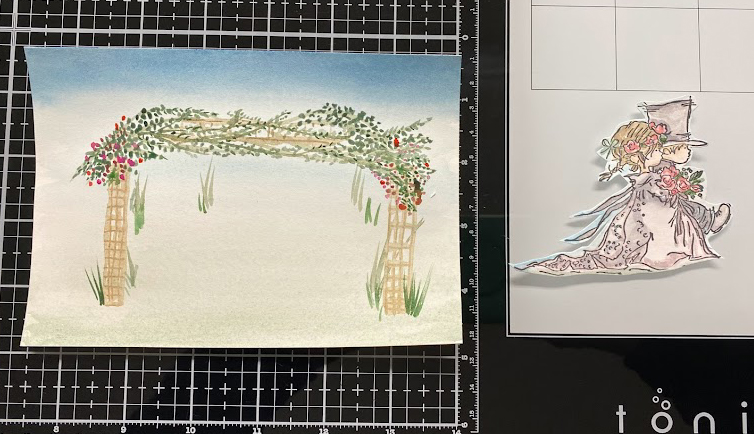
 This week we are taking a look at DIY craftland and I came across this pretty Wedding scene shot. ( the top main photo in this post) the one right under the title and I thought Oh, I have some Stamps happen floral frame type stamps and maybe 30 minutes before I had seen that I had been messing around with watercolor paints and did some wedding kids (because, it was already stamped and I was trying for skin tones) And I thought oh this will work.


And then I came home and dug out those scene stamps and the flowers were wrong or they were Portrait orientation one thing or another I dismissed all the stamps I owned. and I had this scrap of Arches hot press paper on the table so, I said to my self you could probably paint something that would work. ( and its a cartoon image so, it does not have to be the most accurate thing) So, this was first round of paint. 


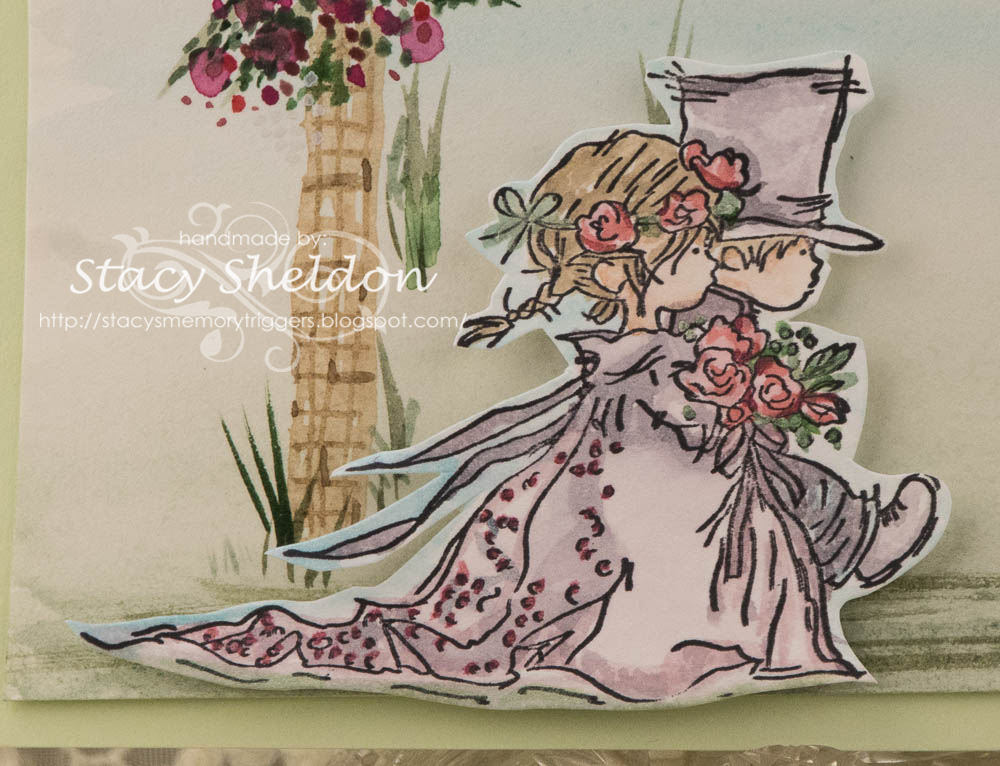
I had cut the kids out with scissors as they were stamped on some Smooth Neenah solar white, which if you do not use much water will work for paints but, Then I had added blue to the sky and green to the ground and pilled the paper. So, after it was cut out I did put foam pop dots under the image and added a few touches of some metallic watercolors to the detailing. 

I did add a few more larger drops of pink paint to the trellis the next day and a few more sprigs of random grass and streaks of green to the ground. A little bit of White gouache ( that faded to nothing in the scene) and decided to just let it go before it became another mess. The base here is Stampin Up Soft seafoam and this one is A7 in real life. You can find this challenge here at Splitcoaststampers to play along with us. Thanks for stopping by.


3.31.2022

Dirty Dozen April Christmas Card Challenge

 It's that time of the month again when the newest prompt for those of us playing along with the Dirty Dozen Christmas card challenge this year see the new theme. So, I knew which stamp I wanted to attempt to color and I have been feeling lately that some of the really complex stamps with tiny detail areas are going along easier for me with watercolor paints rather than say pencils or markers.


I had also decided to open that pad of Arches Hot Pressed 100% cotton watercolor paper because, the rumor is it smoother than the cold press and I knew that with the tiny details of this stamp I would be frustrated doing it on cold press. So, I stamped it with Versafine and used the index sticker on the block for a general guide on this first round of paint.


I added a second layer of paint to some spots, filled in other spots I skipped while it was wet so it would not bleed too badly and added this Stamping Bella sentiment from the Festive Gnomes set. I figured it would work well since the name of this Stamps Happen Carolyn Shores Wright stamp is Christmas Caroling. I just love all her birds and I am pretty tickled with how this turned out. The base (SU ridinghood red) was cut to be a Slimline and I used a Waffle flower die to cut the watercolor paper. That's about it from me, You can find this challenge here in the special forums for fan club members inside SCS to play along with us. Thanks for stopping by.


3.29.2022

Watercoloring {Birch Trees}

 This week Brenda has shared with us a quick abstract Birch Tree line scene seen here on YouTube.
I was really amazed by this because, I assumed it would be such a difficult thing to paint. So, I loved the tape off the sheet with masking tape tip of the video. And I did do that. I did flip mine to landscape view as I did not have sky above the trunks or soil below them in the scene.

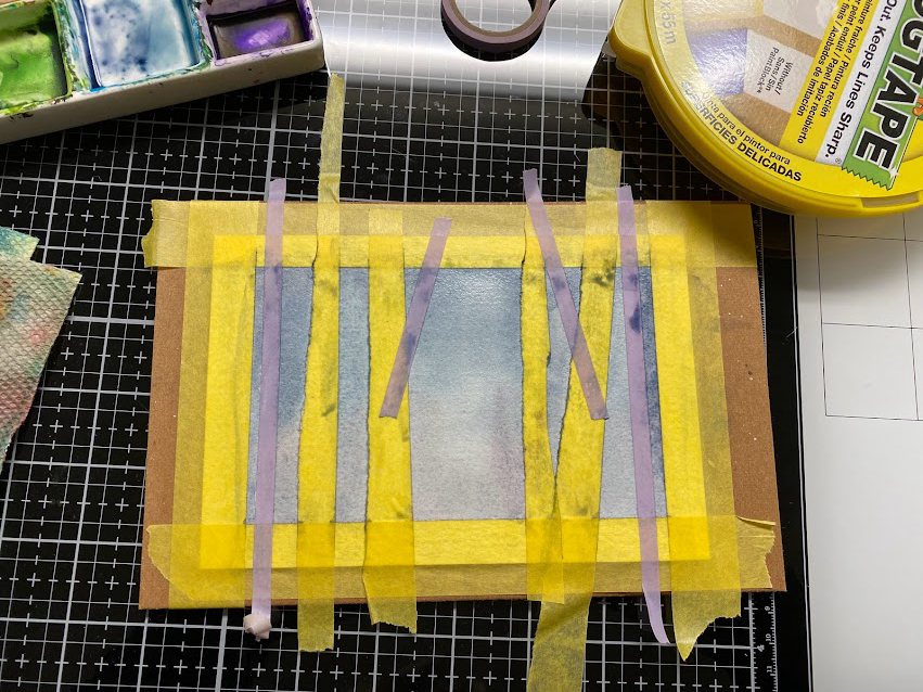
A view of what it looked like wet as I walked away from the first round of paint. I did use some really wide Frog tape so I tore it to be skinnier and not so perfect for the trunks. 

I had assumed that If I added a few more Skinnier trunks/branches to the view that they would have that first round of pale wash for a base. I didn't cut off the tape edges off the board as I knew I had to peel them up at some point.


Peeled the strips off and I used a brush to add these trunk details and a few bare branches towards the top. I did not use the card method shown in the video because, I have never seen one of these trees look like that. ( it was a little too abstract for my tastes) and so the trunk details are shades of browns, greys and greens here. 

This finished out at A7 in real life, I did not add a sentiment as I am not so sure what I am going to do with it yet. I did add more shading to the edges of the trunks after the last round dried and a little more stripes/ detailing to the trunks. You can find this challenge here at Splitcoaststampers to play along with us. That's about it from me, thanks for stopping by.