5.11.2014

Framed Wings FS379


A closer look at the center, I think if you click this one to enlarge it the bling of the wink of stella shows up pretty good on this particular monarch.


Happy Mother's Day! This was totally inspired by Nancy's gorgeous card seen here. I love every single detail about her card esp. the colors but, I knew I needed some changes So, some of them are the script panel was stamped on some textured bazzill and inked over with distress inks then I used both sides of the negative pieces from the Penny Black die with a dauber and vintage photo ink to add the "branches" to that panel. the other changes are there is no piercing and I switched the ribbon out for an sentiment tab. The mat was enlarged and was done with some ranger stains. This whole panel is up on slim pop dots. The Monarch butterfly (all night media) was covered completely with wink of stella after coloring. This one is 5 1/2" square in real life.  


5.08.2014

Love Butterflies


Is this not the prettiest butterfly ever or what? as soon as I had seen these in the set from Prickley Pear I knew they would make an awesome wedding/anniversary type card. These were stamped on vintage cream cardstock and heat embossed with some Zing baked sugar powder. I did cut these out by hand because, I could not figure out a way to hold the diecut stamped version without rubbing the powder off before I could melt it. Its colored with some markers and has some bitty recollections pearls on the bodies.


This card is A-7 in real life, the sentiment is from all my memories they are round stickers with round bubble hard stickers that make them like little faux type keys with no framing or something. 


an angled view, I had taken some glue dots and rolled them into a line to put onto the back of the butterflies bodies so they would have that just landed look for dimension on the card front. the basse and the layers of diecuts are all done in some stardream shimmery opal cardstock and the crinkled silk ribbon is unknown. 


This was just a quickie 4" gift card my son had bought an wedding gift for his friend a couple of weeks ago and once it was wrapped he was very shocked to be told his gift needed a card on it so they knew who had given it to them. so, this was done from things laying on the table. the butterfly die is from Prickley Pear and it was cut from an scrap I had spritzed and sprayed for something you get to see here next thursday haha. 

5.07.2014

WOYWW Wednesday #257


Hi, From Millan.Net Welcome to the mess. I know it's not as big of a mess as some you will come across but, pretty much this is just about as messy as it gets here unless its an Dare to get Dirty week. or something like that. 
and if your curious about why the mess is on display head over to Julia's blog and check it out. 


to the left are some of the Unity Angie girls who came in the mail last weekend colored waiting to become something, the Alcohol & Salads bitty stamp is also from this new batch of happy mail. to the right is some Artful stamper smooching images over some things that were stained last weekend and a scrap I attempted to do an pillowbox background on ( without graph paper underneath) 


There was a try a technique challenge at Splitcoast on monday to over stamp the sentiment over the image, so this fairly large wineglass image is from Rubbernecker and the sentiment is from Unity stamps and there is an A between eating and salad but, it is in the stem haha.
so, I wasn't really all that thrilled with this and decided to play with the watercolor pencils I got for Christmas and so, 


This particular version of Smooching was stamped on some Fabriano Bianco paper ( because, it's a little thicker than normal smooth cardstock but, not as pitted as watercolor paper the first one I did on neenah smooth and the paper ended up pilling.) scribbled some of the derwent inktense pencils in side and wet them with an aqua brush. so, the next thing on the list is to make an cheat sheet of what these colors really look like. ( wet and dried) I am so used to Prisma pencils it was a big shock to me to see that there was only 2 gray's in the whole 72 count container. ( and no pinks...) so, this is the hot pepper red for the pink spots in the image. The Hero Arts sentiment was stamped over it with Versafine and I think I probably should have waited just a minute more of drying time it looks a little blurry to me in the happy. The lace is vintage and that whole panel is up on pop dots. 


5.04.2014

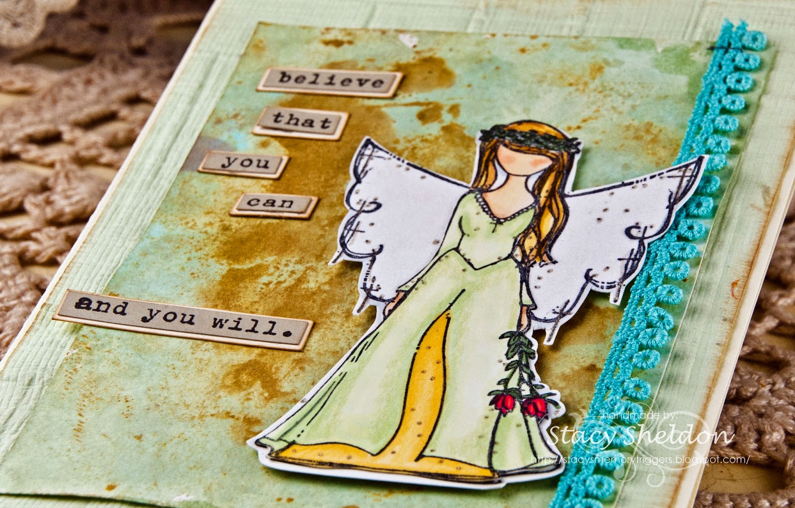
Guardian Wings


Well, I have finally found an person image with no face that I was willing to cave on to buy, in fact I had seen this angel used exactly one time and went on a mission to buy her. The gal who had used the stamp did not give her name in her upload so, it took me a while of hunting. This is Arianna Girl by Angie Blom at Unity Stamps. I was so excited when I seen the mix challenge was winged things as she landed in my mailbox yesterday. I have paired her with an Donna Downey sentiment from the Empowered words set also from Unity Stamps. 


just some angled crop shots, Arianna is stamped twice on the Neenah and cut out and the top piece ( the gal is layered to a second image of the wings. and the edges of the top piece have been traced around on the backside with an grey copic marker to blend the white edges. 


so, that panel is up on pop dots to raise the wing above the vintage trim. She is colored with Copic Markers, Gelly Roll Stardust glaze pens, FaberCastell Pitt Pens, Prisma Pencils & Zig wink of stella ( clear brush) 


this is probably the only shot you have a ghost of a chance of seeing the wink of stella on the wings. 


This is 5X7 in real life, the mat under her was done earlier as a blotter for some watercolor paper I had stained in shades of brown and so, then I added some green and blue stains to the whiter spaces on this blotter sheet and really liked how it turned out. and the colors of this card were built around that scrap blotter piece ha ha. The sentiment's mat is inked along the edges with some creamy brown fluid chalk ink as is the storebought handmade paper. a couple of teeny tim holtz staples holding on the trim finishes off the list of what-all is on this one. 

Flutterings


a closer look at the trio of wings. the diecut pieces were sprayed with ranger Adirondack butterscotch, some heidi swapp color shine, seafoam & teal, and some glimmermist sprays. the upward center butterfly was heat embossed with some brown sugar Zing powder and cut out by hand. The pewter pearls on that are from Kaiser. 


done as an CASE for this week's featured stamper you can view Jeannie's card Here. the changes I made to my version is this card is 4 1/4" x 8 1/2" in real life and so it does not fit inside a std. business envelope I changed the blues to a green shade and there are no printed papers on this except for the scrap the hero arts sentiment is stamped on a pti double ended banner die was used for this then trimmed to fit. the watercolor paper was run through an cuttlebug folder ( Goochie script ) twice before the Prickley Pear butterfly die was run through that panel 3 times ( which helped fade that center over lap line you get when you emboss a sheet twice) this was then stained with some pumice stone, vintage photo & walnut stain distress stains. the base is Bazzill. the burlap string and chocolate satin are from May Arts and the trim is vintage. the flower i think is prima. 


some of the other scraps. the one on the left is 3" square and the one on the right fits inside an A-6 envelope. the butterflies are from either the Clear butterflies stamp set from Prickley Pear or the die that matches it. the thanks is from Stampendous and the Happy Birthday is from rubber soul. the lace is vintage. the yellow key tag is an staples Martha Stewart find. 

5.01.2014

Vintage Joy Tag

Today is my friend Alice's birthday ( Happy Birthday Chickie!)


This is an side view of the gift tag on her birthday gift . It's an larger shipping tag that measures 4 1/4" x 8 1/2" in real life. the base was stained with some vintage photo, pumice stone & walnut stain ranger distress stains. as were the avery key tags. 


These blooms were made with the Prickley Pear Poinsettia Leaf die found here. I guess I should mention that yes? I was asked to do an guest designing stint for Prickley Pear this month and the things I have made for them will be posted on each Thursdays this May. The linen type texture on these bloom die cuts was done by cutting them from vintage cream cardstock and pressing the die face down onto an Ranger adirondack latte pad. That is the pattern of the top of the ink pad. I did pull all the petals upwards towards the centers and then added an gold sequin and a drop of bisque liquid pearls to the centers of that. the plain looking petals were cut from some shimmery opal stardream cardstock. 


a glimpse of the whole tag. the sentiment is cut from an tattered book of quotations and stained with some antique linen distress stain. It reads "Joy is not in things, it is in us." Richard Wagner (1813-1883) the Gingham ribbon is from Micheals, The hand dyed silk I have never known the mfg info of and the tatted trim is vintage. The tag in the middle ( left side) is from recollections and that one is that color out of the package. 


I had wanted the swirls ( also cut from some vintage cream cardstock) this is an new die out from prickley pear Flourish  it was cut 3 times and I wanted the swirls to be a little dimensional also like the floral tags were growing on this as a vine so, it has a few glue dots under parts of the key tags and a few of the end pieces the rest is able to pop up. there is also a few random liquid pearl dots on it also. There is also a bit of May arts burlap string in the centers of the key tags.