4.19.2019

Inspired by {Nature fine art Photos}

I have mentioned it a few times the last few months that the organizing my stamp collection is an 
ongoing situation, and the last time I was trying to decided what we should do next time it was my turn. I was not looking at a calendar but, a horse stamp. ( not the one below) and wanting to play with that. So, I came across the Nature fine art photos and chose it because, the horse shot below really grabbed my attention and then I happened across this Serendipity stamps mustang in the box of horse stamps and thought maybe just maybe I could color it to look like a paint.

.
 So, this was stamped on some Neenah solar white with Versafine Onyx black and I tried to really keep the colors to black and white with shades of grey kind of like a black and white photo.
The sentiment is from the Stamping Bella a little horse set, and this one finished out at 6" square in real life.
 This was a trial thing because, there was not too many details on the nose so, I decided I could make the spots cream/taupe so, I could flick in some hair direction. I think if I had left it white there just would not have been as much texture. I also did not get the dark spots as dark as the photograph and I am totally OK with that because, I think that is the beauty of an inspiration challenge is you are using the photo weather it is a trinket or fine art as a jump start.

You can find this photograph here inside the store along with a few others. You can find this challenge here at Splitcoaststampers to play along with us. Thanks for stopping by.

4.18.2019

A few more from VSN


 Jacqueline has a challenge to create a galaxy background using one of the tutorials linked to in the thread so, I chose the Jennifer McGuire version with the distress oxide inks on watercolor paper. The star splatters were done with some ranger distress paint and a white gel pen. that sentiment is from the club scrap firecracker set. So, that whole panel is up on foam tape above the pool colored cardbase and it finished out at A7 in real life.

Melissa has a frosted coffee filter technique challenge and I combined it with this week's featured stamper jump started by this pretty card in Diana's gallery seen here. I did spray my filter with water and crumple it and spread it out and dry it and do it again moving the colors around and so, it does not have that unblended look like camo but, I do like how this turned out, the filter was cut with the largest spellbinders hemstitched oval die and the top sentiment is from Impression Obsession and the happybirthday and bitty cup are from Stampin up.

Dawn has a challenge to use Acetate and one of the tutorials she linked to in the thread went to this Acetate tent card and I gave that one a whirl, I did originally have a piece of Hero Arts ( they sent some acetate card bases in one of those kits somewhere along the line and I cut one in half and then when it was all done the card leaned forward from the top, and that looked odd to me so, I carefully tore it apart and found an old box of ink jet transparencies in the closet ( that now look yellowed in their box) and cut one of those a little larger than A2 and now it leans towards the top. I did do some logging and removed the center trees from the tree line in the outside front of the card so that the deer were more easily seen. I think I will do this again sometime and without the time constraints of a VSN I think I would add some clear stickles to the inside layers of the scene so they pop a little better. I think I have 5 or 6 more left but, I have not really counted yet, and there has not been time to do anymore during this week yet. That's about it from me, thanks for stopping by.

4.17.2019

WOYWW #515 {piles}

Happy desk peeking day, if you'd like to see more spaces or play along 
the link up for this blog hop starts here at our hostess
There is also a new Instagram hashtag of #WOYWW
 
 So, from this angle things do not look too bad, you can see the last card I made after work on Monday and (its below) was done following a tutorial at SCS for making a sunrise card ( found here ) and a bit of the pile to the left of new things ( which has kind of grown)

 I followed this pretty closely, and when I got to the adding blacks to the ground part, at the last minute you guessed it, I got some black in the sun. so I grabbed a baby wipe and mopped and it sucked up all the yellow too, so, when I went back with a tiny makeup brush to add some yellow to tit again, it got a little dark. the sentiment is from the reverse confetti God is good set, and the tree & grass are from the sweet n sassy silhouette landscape borders set.

 but, when you see the same thing from the side you see the piles are spreading so, this is what I came home to on Tuesday and I decided I "had to" clean up before I started playing again. And I still need to make my sample for this weekends IC. ( I am hosting) there is no minute like the last one right?

 So, the piles of new stuff on the left kept falling off the table and I decided maybe I should you know get the stamps out of the wrappers and put some off the table. and I happened to flip over that package of dies that says paper hug on the front side...( the hello die is on the back hahaha)
Made me laugh. there were some sales and new releases what can I say, I have not done a bunch of shopping in a while and it all just came out together the last little while.

Oh, and this is here because, I am not sure what you all thought was a Tim Holtz thing but, the thing on the cart is a metal ( galvanized) tin type serving thing that I picked up from Pottery Barn a few years ago that they were selling for people doing back yard bbq type parties to organize the food things outside. (and I thought the bottles would all be corralled on it nicely) and then after I shot this one I glanced up at the ink on the back of the door and it irritated me enough to start reorganizing that, so really I have a bigger mess this morning than I started out with. Those suitcases normally have the pads of paper in them where I can close the lid and slide the one on the floor under the cart, but when the pads start getting mostly used I tend to rip them up and sort them by colors into hanging files in the file cabinet and since the buying these pads does not seem to be ending that will be another sorting thing soon I guess. and yes, there are still two stacks of stamps on the floor. soon, I hope I will get back into finishing that off. I hope you all have a beautiful Easter Weekend if you celebrate.
So, that's about it from me, thanks for stopping by.

4.16.2019

A catch up post

 A week or so ago there was a clean and simple challenge to make it funny, and at the time this was what my desk looked like at work...
The bear is from stampabilities and the sentiment is from club scrap woven strands greetings set.

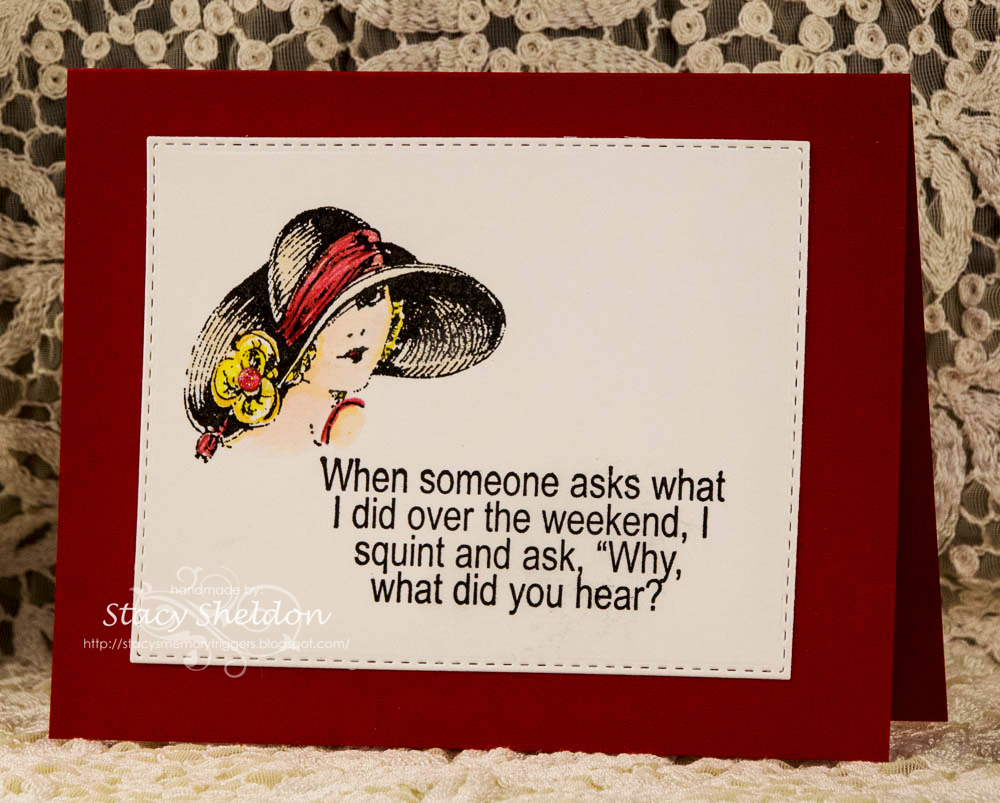
 This was something else that occurred to me at the same time but, i figured since the base was red it wasn't all that "clean" so, I never uploaded this one. The gal is from Inkadinkado and the sentiment is from Riley & Co.


 There was a Try a new tech. challenge to use your clear block with ink as a background around the same time the funny cas happened and then later in the week there was a ways to use it called something along the lines of 4 squared. ( or something like that) and so combining both of those challenges I did this background with a small 1" block 4 times behind the poppy.

 The stripe poppy is from Impress. that sentiment is from Mama Elephant birthday greetings set.

 And then the featured stamper challenge that same week had Angie being the destination and I found this card in her gallery that made me think oh, long tall sally... so, I started digging in my girl stamps looking for a tall one that had not seen ink for a while and ended up using this Stamps Happen Dolly Mama and adding the My Favorite Things sentiment up the side.

I had used those arteza pencils for her because, the colors are a little brighter ( and more outside my comfort zone) I figured she called for brights and then added some liquid pearls and star dust gelly roll pen over the top of the pencils. I am not having much luck blending them as of yet without streaks, I might try mixing in some prisma and polychromos pencils with them next time around.  Thanks for stopping by.

4.15.2019

Pretty Colors this week

This week Karen has chosen Lovely Lipstick, Mint Macaron & Vanilla as the colors with a side of roses. So, I started with a cream-ish piece of mulberry handmade paper that had been turned into a gelli print with acrylic paint and a Tim Holtz embossing folder. of the three colors I do not have the lipstick color from SU. and so, this is guess work. The rose border is a stamp from The Ink road that was stamped with some versamark on Vanilla and heat embossed with some Ranger Sage powder. which actually looks pretty close in real life to the mint cs. I colored the flowers and leaves with some distress oxide worn lipstick & bundled sage inks and then added some shadows with polychromos pencils. ( I used a reverse confetti stitched hex tag die to cut that) the Penny Black sentiment was stamped on some really old speckled cream su cardstock and cut with a Taylored expressions postage stamp stacklet die, the edges were inked with some Distress Oxide worn lipstick ink. The little heart brad in the top of the tag is unknown, but probably My Minds Eye. ( figured it worked with the sentiment even though the color is a little more faded than the paint) You can find this challenge here to play along. thanks for stopping by.
4.14.2019

VSN {so far}

 Jeanette has a challenge to include a map on the project, so when I finally found a piece of map paper it had such a vintage color to the Minnesota roads map I ended up going vintage for the whole card. that old truck is from Hero Arts and the sentiment is from My Favorite things.

 Kim has a challenge to be inspired by the trip advisor web site and there are all these boxes with things to click on to go here or go there and I really had no where I wanted to go when I was looking at the site and I had seen this travel poster printed paper on the same pad the map paper came out of ( Carta Bella are we there yet) and thought ok do not over think this. that sentiment is from Paper smooches.

 Ann has a challenge about duck boat travel, so you needed a boat and a duck and my ducks are those tiny ones in the sky flying in formation... I ended up adding just a few pencil shadows to this after the fact but, this one squeaked by in the time limit because, I kept hitting the watercolors with a heat gun.

 Melody has a challenge to show some luggage. the one on the right is from Deep Red and the fancier bags on the left are ( unknown at this time but, guessing Unity) and that sentiment is Gina K.

 Lisa has a challenge to show shoes. and I still have no clue where I got this sentiment from but, the combat boots are from Deep Red. the topo map printed paper is from Kaiserkraft.

 Polly has a challenge to show what you do while you are in hurry up and wait mode while traveling and I drink coffee and watch people... the gal is from Unity Stamps and the sentiment is from My Favorite things.

Misti has a challenge to show a street legal vehicle ( for a road trip) and I have had this Crafters Companion stamp a long time now so, I googled old Route 66 signs and colored the sign that way but, the old signs the letters and numbers are white on the signs... and that ended up clashing for the red I gave the bike so, I may just add more red to the sign later... there is a bunch of stardust gelly roll pen and clear wink of stella on all the chrome too so this one sparkles in real life. the other sentiment are from the Paper Smooches set. and that's what I have done so far. thanks for stopping by.