9.30.2024

October Dirty Dozen Christmas Prompt

 Continuing this years theme the challenge prompt for October has gone live here at Splitcoaststampers in the special forums set aside for Fan Club members to create a little every month and have less "to do" stress during that traditionally mad rush crafting season that happens before the holidays for a lot of people. On this month's sample I started with a sheet of double sided Bo Bunny press paper that had random snowflakes on one side and mostly solid with some script and collage elements on the flip side.


These skinny tags and star re-enforcers are from the Mama Elephant slim tags trio die set. I love this set, I have cut it so many times I have considered buying it again to be able to cut more of them at once. I was thinking in my mind of something corset like for a pattern with them. 

But, I did end up arranging them not in a straight line where they tied up and flipping the pieces around so that it was a little more like coordinated random. I kept thinking the whole time I was building the background that I would tie on a dangling snowflake and maybe a sentiment on that. something snarky about snow was the way my brain was going but, then I came across this bitty little snowman in the previously colored images pile and cut it out with scissors to fit on this other stitched tag diecut from the same doily/wood grain printed paper. It's hard to see but, after the tags were arranged I did add clear stickles glitter glue to the centers of all the snowflakes on this and the hat trim for the snowman also as the white gouache I added to that did not want to photograph. 

I am not sure who makes the snowflake charm but, that sentiment is from the Lili of the Valley Christmas sentiment tags set done with some Brown Acorn Versafine, cut with scissors and then has some DOX browns inked along the edges. That snowman is from Hampton Arts when they used to make Studio G dollar bin stamps. It was probably stamped with Versafine and it looks like it was water colored. The doily wood grain printed paper is probably MME but, was ripped out of a pad so not certain anymore and the base here is some of that brown kraft that looks like paper bag paper. This is A2 in real life. That's about it from me, thanks for stopping by. 



9.27.2024

Inspired by {Poster Store}

 This week Amy has chosen the Poster Store for the Inspiration site and I knew I wanted something quick and easy to do. So, I started looking at the Christmas section and came across this poster of the simple cup filled with gingerbread cookies and smiled. 


I did seriously dig out some Teacup dies and started eyeballing gingerbread stamps and dies and thought. I may come back to that idea later when there is more time and started poking around in stamps that I have not inked and found this Whipper Snapper Designs one called ginger in a mug appropriately enough haha.

Stamped it with some Morning mist versafine on Hot Press (smooth) watercolor paper and proceeded to paint it with some Daniel Smith paints.  I did add both some Windsor & Newton white gouache and Dr. PH Martins bleed proof white to the white places and then added a bit of grey fineliner pen to some nooks and crannies after the paint dried. This panel was cut with an Impression Obsession crazy stitched die and then inked along the edges with gathered twigs & walnut stain Distress Oxide Inks. the base here is a premade one that has that whole paperbag kraft thing going on. ( its thin) but, I am still working on using up all these premade card bases so, This one is also A2 in real life. The sentiment here is from the Impression Obsession set called Gingerbread kisses. That's about it from me, if you'd like to play along with us you can find this challenge here at SCS. Thanks for stopping by.

9.24.2024

Watercoloring Simple Christmas Foliage

 This week Linda is sharing this video tutorial from Liesl's Artistic Studio Called everything you need to make endless Christmas card possibilities. I did watch the whole video and instead of doing card front's I decided to cut some Arches cold press watercolor into Tag shapes. (both of these dies are older ones from Papertreyink) 


I decided on the dot flowers with pine springs for the first tag and handily enough, it has a groove cut along the edge so that was easy to run the brush along with shimmery gold paint. 


Decided on berries, holly & pine sprigs for the second and added some gold paint to the faux stitch detailing along the edge. 

for the second square tag I decided to do the dot flowers again with holly berries and pine sprigs. and then I added some white Dr. PH Martins bleed proof white in some spots. 


When the third one was dry I did add some gold to the stitches and more (darker) green to the pine sprigs to it. I am not so sure what I want to do with these yet so, I have not added sentiments to them as of yet. I am considering cutting a few more tags. I did for the heck of it try the pine cone she had shown on some scratch paper some where between tags but, it did not look like hers. my best guess is she used a mostly dry/damp brush and then just had (thick) paint on only the tip of the brush. because, if you do a wet brush you will get solid color pressing like she does. but, I ran out of time to try that idea. I don't do well with the whole very little water thick paint thing so, its all good. I am pretty tickled with how these have turned out so far. If you'd like to play along with us you can find this challenge here at Splitcoaststampers. That's about it from me, Thanks for stopping by.


9.20.2024

Inspired by {European Splendor}

 I came across this Christmas tree collar inside the European Splendor site that Denise has chosen for this weeks Inspiration place. And I knew I had this Unity Stamps Farm Fresh girl. I also have an older Papertrey ink set that has a similar type theme sign stamp in it but, its larger than the sentiments in the Unity set.

And once I had her stamped on some Hot Press Arches watercolor paper I knew that it was going to introduce more colors into the design than the simple colors of the store ad. This is first layers of Daniel Smith watercolors with some White gouache. 


I did stamp both sentiments from the set on a drop piece of the same watercolor paper so the colors would still work and then the Tree sign part I did run through this Memory Box arched die twice so I could trim it closer to the sentiment. 

I cut the largest pinpoint tag die with some grey woodgrain print and a second in plain white cardstock for the backside of the tag. I diecut the gal with an Impression Obsession Deckled frame die ( the largest one in the set) and the sign is up on foam pop dots here so that it had room for me to tape the vintage lace to the backside of it. The gal and the top tag have some Vintage Photo Distress Oxide ink along those edges. I never did get around to adding more paint over that first layer but, I did add a slight amount of stardust gelly roll pen to bits in the tree, her hat and sweater band. I don't know anymore who made that rustic brown heart brad, but the Merry Christmas was cut with the same Poppy stamps mainstreet pinpoint tag in the smallest size as the base tag. I kept thinking maybe this would have been closer to just do the sign with some white, wood and greenery and did these little 3"X3" cards from scraps after the fact.


The sentiments were die cut with the smallest blanket stitched die in the Pinkfresh set and the woodgrain on the white one was cut with a deckle square from the set from Honeybee stamps. the bitty black brads are really old from Micheals. the outside frame of the white one was cut from the Stamp Market's shaker card dies (for 3X3 cards)  That's about it from me, if you'd like to play along with us you can find this challenge here at SCS. Thanks for stopping by.


9.17.2024

Watercoloring an Rainy Autumn Scene

 It's my turn to host the water coloring tutorial challenge at Splitcoaststampers this week and I have chosen this one from Marena Art watercolor Autumn Landscape girl under an umbrella. That you can see the video here on YouTube

I did not do anything fancy, just did a slight sketch of the girl & umbrella directly on the cold press Arches watercolor paper. This was cut to A6.

Did a slight layer of neutral tone and some clean water with a size 12 round brush, but the water splatters were just huge so after this was shot and viewed I did add a little more paint and smaller brush splatters and set it aside to dry.

So, I did add color to the skirt area (twice) some to the trees and the umbrella ( which I kept making larger and larger and really over worked this part. and I decided to walk away and let it dry to see if it was fix-able with another layer later. 


hopefully, this will add some more. but, I let it dry after this shot again also. I think I started with the colors too deep so, trying to add shadows to the ribs of the umbrella is not going well. 

So, the drop piece got the same style girl sketched on it and so it begins again.


neutral tint from Daniel Smith

I started out with a more watery shade of orange for the umbrella this time around.

Added some of the tint to the ribs of the umbrella.


Decided to use an Avery Elle postage die for a frame and was going to have this be A6 and then realized it was crooked so, that piece I cut away from the back of the fold of the card and started to trim that down closer to the edge of the postage and cut it crooked. So, out came some scissors to distress that edge. I decided that it needed more contrast for the next layer since it had more layers than Originally planed.

I did add the Dr. PH Martins bleed proof white for catchlights on the umbrella and I left off a sentiment since, I am not sure what I am going to do with this as of yet. If you'd like to play along with us you can find this challenge here at Splitcoaststampers. Thanks for stopping by.


9.13.2024

Inspired by {House of Jade}

 This week Kia has chosen the House of Jade as the inspiration destination and I found this pin with the gingerbread cloche fairly quickly and made my self stop looking. ( its a deep rabbit hole this week) 


 I started with cutting this Tim Holtz Bell Jar with Pedestal die and (cut the base 3 times for thickness) and then the top with vellum cardstock once. ( I did tuck that lid into between the layers of the base pieces) and the kraft cardstock was inked with Vintage photo DOX and has some Dr. PH Martins bleed proof white streaked across it. 

I dug out every "house" gingerbread die I had along with cake stands and such, I really thought I might do a trio of things like the pin but, the scale just did not work. in that photo above the Large gingerbread house is an Hero Arts die. ( the MFT things one I own is even larger) that bitty one is actually a cookie also a Tim Holtz Sizzix die. 

So, then I decided that it needed something green to tuck with it as the house had a little too much white space around it and I grabbed this Honey Bee die Market cart Christmas add on knowing the tree on it would be scaled smaller than any of my actual "Christmas tree dies" know what I mean? the gingerbread house got some crystal stickles as did the tree branches along with some more Bleed proof white, I did let the paintbrush wiggle so it would give it a little more of that iced by hand look. 

The lace is vintage, the sentiment here is from the Lili of the Valley Christmas sentiment tags done on a scrap of watercolor paper and also inked with the same DOX. the bitty brad is from Recollections and this has foam dot's under it also. 


 The stripe textured bazzill was also inked with some vintage photo and the card base here is textured woodgrain from Ellen Hutson. This is actually A2 in real life and I think I am going to keep playing with this idea and do a few others. Maybe with Christmas trees and maybe more color. we'll see. That's about it from me, If you'd like to play along with us you can find this challenge here at SCS. Thanks for stopping by.


9.11.2024

A Christmas Sketch

 This week the sketch challenge at SCS caught my eye and I came home early (rainy day) and I did not have to go out side and water so, I decided to give this challenge a try. 

I had hit print on the sketch at work before I left because, that is the only way I can get even close on a sketch challenge is to have it in front of me. I started with Stamping that Impression Obsession Wooden Door Frame with some Versafine Clair Artic blue ink on white neenah and then proceeded to add some Distress Oxide inks over that to age it. Antique Linen, Weathered wood, Evergreen bough & Vintage photo. I did cut that out with scissors and cut out the plain center of the door to make it a square frame. I used a grey fineliner pen to add a little bit of detailing to the hinges and door handle and then later when I was adding gold sparkle watercolor paint to the berries on the holly panel I added some gold to the center of the hinges and the handle also ( but, I think it mostly faded into all that ink) I actually used some papers right out of the pads for this so, I left them on the table so I could remember to say what they were. The young elf/deer image is a corner of a piece of the paper from the Prima pad and the faded plaid & Christmas collage prints were from the Hobby Lobby Vintage Christmas pad. The velvet ric rac is only glued to the top not wrapped around because, its kinda thick so. I did end up having to put the door panel on foam dots to raise it steady/flat over that. 

I didn't really see the flower part of that sketch, my brain seen it as a small circle on top with layers so, I dug in my little box of previously diecut tags and pulled out this white round one and that bitty red one ( an old SU one that came that way before people owned dies) the Believe metal tag is something from Tim Holtz and it has one of those gold goosebumps covering up the hole. I was so thrilled to see that lawn fawn came out with red hemp string. I may have to order another spool before I forget because, I can totally see my self using that All.the.time. :) That holly folder that was used on the old green WC scrap panel is from Sizzix Basic Grey powdered Sugar & snowglobe set ( I am not sure which folder is what name but, the other folder is a stripe) That's about it from me, thanks for stopping by.


9.10.2024

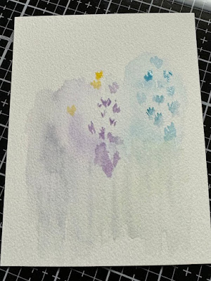
Watercoloring Loose flowers

 This week Linda is sharing this video seen here on YouTube doing loose wildflowers watercolors from Liesl's Art Studio. I loved the fact that there were blurry distance blooms in the scene and the variety of blooms in the foreground. So, I started with a piece of Arches cold press cut to 4 1/4 ish by 5 1/2" ish. and I knew there was no way to squeeze the scale of those blooms into something that would fit on a card front.

So, instead of trying to recreate her flowers I kept the idea of loose blooms with the variety of brighter colors moving across the paper. 

And I just kept adding to it, but I had to laugh at my self most of the flowers turned out to have the same shape.

And I just decided to keep going as I didn't have time to start over again. And then I decided it needed some splatters.


And I drug a wet brush through some of the splatters at the bottom to smoosh more of that brighter green around. This did not have a ton of water on it but, it did warp a little so, I decided to die cut it with a curved cap Memory box die and let it sit in the big shot pressing for a while.

The pink/brown ribbon tied around the bottom is from Martha Stewart (a long time ago) and the Happy Anniversary sentiment is from the Stampin' Up! teeny tiny wishes set. its tied onto the ribbon with some natural hemp string. The stripe printed paper is from Graphic45 and the distressed looking text print is unknown. The finished size of this one is 6" square in real life. If you'd like to play along with us you can find this challenge here at SCS. thanks for stopping by.


9.09.2024

A Cowboy Christmas

 You may not know this but, I have lusted after this old Stampin' Up! stamp set ( Wild Wild West) for nearly as long as I have been collecting old stamps. When I first started buying used stamps on the bay this set sold for between 75.00 and 100.00 dollars... and I said I would never pay that much money for a used stamp. during that time frame I did have a couple of PSX botanicals that were over 30.00 if that gives you an idea. and the last maybe 10 years or so, this stamp set seems to start at 150 and go up. I've had a set I've been watching a few months that they did lower the start price from 250.00 down to 150 but, I just shook my head over it. And hubs knew it. 

and this set ( not the one I was watching ) arrived in the mail last week. if you heard any squealing I will say it may have come from over here. My first thought was you should see if he will work for a Christmas card. and I kept trying to think of which tree should go into the scene. 

to start with I grabbed this scrap of script paper and stamped him with some Pinecone versafine and then added a first layer of Daniel Smith watercolors to "Da Man" as he is known. 


A few more layers of paints and I started looking at Christmas papers. and they were just too Christmas-y. so, I seen this sheet of Basic grey stripe in the "browns" file folder and thought the colors were pretty close to how I had painted him. after a lot of over thinking, I used an Memory Box pinpoint cap die to cut the arch window into the sheet and then layered him behind that. The pine boughs here were cut from some Die Cuts with a View textured paper and then the bitty bow is from the Spellbinders Parcel & Post Christmas Decorations set. That lace is vintage and the chipboard sentiment is from Tim Holtz. ( I have a plastic container of his chipboard things and I did not save any of the packaging for them, when I cave and buy one it just gets opened and poured into the container. Those big photo corners are from Heidi Swapp and there is some Vintage Photo distress ink on the edges of them and the window opening of the archway here. I did link this up with the September Christmas card challenge going on now for the Fan Club members that you can see here. That's about it from me, Thanks for stopping by.


9.08.2024

Anniversary Bears

 Hubs parents will have their 65th wedding anniversary later this week. Can you imagine? :) She happens to collect teddy bears among other things so, I have quietly gathered a pile of bear stamps intending to make cards for her with them and I think time has just gotten away from me. So, yay for me I dug one out. 


This is Grenville & Beatrice are best friends from Uptown Rubber stamps, stamped on some smooth Arches hot press watercolor paper with some Morning Mist ink. I did decide to add some grey to the fur as people married that long are actually in their 80's. This was first layers of paints. 

After a little more paint I added some sparkle gelly roll pen stardream to the dots on her gown and the centers of their eyeglasses. 


The image panel was die cut with an Stitched rectangle from the Waffle flower lacy layers A7 set and its up on foam tape with some Antique linen DOX ink on the edges. The lace here is vintage and it kind of reminded me of the lace edging on her gown. The sentiment here is from Hero Arts and I am debating adding a small flower or something to the corner of the A where it did not stamp all the way. That's about it from me, Thanks for stopping by.


9.06.2024

Inspired by {DIY Inspired}

 Happy Friday everyone, this week Julie has chosen the DIY inspired site as the inspiration challenge destination. They also have a collection of Pinterest boards here where I found this shot of hanging wreaths I think this was a wedding thing but, I cannot remember now and they have a bunch of joint boards. (where other people are all pinning things to the same board) 


I had recently pulled this Juniper set out from The Greetery a while back because, I was cutting trees and pine sprigs and thought I might cut some of these since I have not played with them as of yet and so, I also decided to use some Strathmore Mixed media paper as it will take a little water and its smooth. (thinner than good watercolor paper)


Which lead to cutting some pine branch sprigs also trying for a mix of needles into the wreath shape.


I started out giving the juniper sprigs a wash of Holbein Shadow green (right side) and the pine sprigs some Green Apatite Genuine.


the thing with the mixed media paper is the white tends to show through the paint and it takes a lot more paint darker to get something not so white so, I ended up adding some Jadite green over the top of the shadow green (right) and then some Undersea green over the apatite genuine.

When I started using some glue dots with the first round of sprigs on a piece of Hobby Lobby crepe paper I thought it had holes in the left and bottom sides so, I cut two more and added paint to them.I just trimmed that crepe paper in the paper trimmer not a die as I did not want it to lose its dimension and shape texture. 

I did end up backing that with some white washed wood grain print ( maybe Micheals?) maybe Hobby lobby ( its thin) and the natural hemp string is tied in a bow and then the drop pieces were tucked in to make it look like it was hanging from the top. I am not sure what I am going to do with this as of yet so, I left off the words but, I am leaning towards Christmas rather than say a wedding type card theme. That's about it from me, if you'd like to play along with us you can find this challenge here at SCS. Thanks for stopping by.


9.03.2024

Watercoloring Quirky Birds

 This week Kia is sharing this video on a quirky bird seen here on YouTube. Called lets paint a quirky bird from Diane Antone Studios.

My first thought was, maybe do two birds facing each other as they could be having a snarky conversation. So, I did sketch two loose bird shapes in the notebook of Strathmore cotton watercolor paper I have and started a layer of paint leaving a large space for the eye.

first round of paint on the other bird.


a little more paint, including feet and plumage on the head for the bird on the right.

After that paint had dried I did dig out my watercolor pencils and added some of them to them.


 I remembered reading she thought her bird was mixed media because of the pencils but, I thought well you may as well add ink to the mix and I picked an Elegant writer pen as I know them to be water reactive and changing colors as the water mixes with the ink. 


a few white gel pen doodles joined the party here.


and it finished (remains) like so in the notebook. That's about it from me, if you'd like to play along with us you can find this challenge here at SCS. thanks for stopping by