7.30.2024

watercoloring dot butterfly & bloom

 This week Linda is sharing a video from watercolor easy tutorials seen here on YouTube. Yes, this is one of those things that she makes look very easy. I decided to give it a whirl on some (good) arches paper cut to an A6 size using Daniel Smith paints. 


this is where I stopped with this I really did not like the wings here and I did do them free hand from what I remembered of the video. 


So I tried sketching the wings the way the video shows them then did some more free hand wings on the top right empty space corner of the first painting.

I happened to snap a shot of some while I was watering earlier as a way to see the shadows on a white daisy type shaped bloom.


 and then I did the second one on the left this one is smaller but, also on Arches cold press with Daniel Smith paints. 

I think the flower turned out better on the first one but, that's OK. I don't really have a plan for these and this is where I stopped. 

Taking a photo with a camera did darken the colors a little. It's I am sure the back lighting coming through the window behind where I shoot mug shots in the evening. such is life. :) If you'd like to play along with us you can find this challenge here at SCS. thanks for stopping by.

7.23.2024

Watercoloring Dot Flowers

 This week Brenda has shared a tutorial on doing flowers that start with dots of paint color seen here on YouTube. 


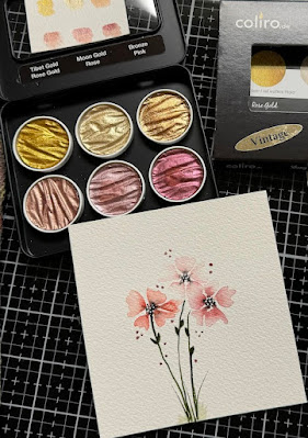
I had a piece of Arches cold press that I cut in half to start these on. I did the one with three with shades of mauve on the right first and then I decided to do more blooms with the yellow peachy ones on the left.


I did add the white Dr. PH Martins bleed proof white to the centers of all the flowers and some stray grass to the bottom.

The flowers on the left I added some of the moon gold to it as stray dots. and then added some 


Bronze and rose gold to the one on the right. 


The one on the right here is 5" square and the Happy Birthday is from the Hero Arts  and the sentiment on the left is from Hampton Arts it was a dollar bin sentiment that came with a trio of gifts on the side and I had cut this apart to use the words without the gifts. The Card on the left is 5 1/2" square in real life. That's about it from me. If you'd like to play along with us you can find this challenge here at SCS. Thanks for stopping by.


7.19.2024

Inspired by {Elizabeth Bradley}

 This week Denise has chosen the Elizabeth Bradley needlework site for the Inspiration and I came across this bee hive pillow design. And my first thought was to grab one of the bee hives I have and use an embossing folder for the pattern. but, when I got out my bee stamps most of them are on the pretty small side so, I seen this Betsy the bee keeper ( shes an older one from Stampin' Up!) I decided that I would use her instead of a hive. I stamped her on some watercolor paper and used some Daniel Smith watercolors on her. 

This was shot with a cell phone on a table hours before the finished card and the colors are not quite right. And I did add more to her. And so, there are deeper colors with some shadows.

In real life this dress apron has a little more of an turquoise color to it. the green is a shade brighter than this and so. I did take quite a few liberties with that pillow design. This is A6 in real life. that lace is vintage and that paper probably is also its from Teresa Collins and I've had it a long time. that sentiment is from the recent Adorn It set by Dianna Marcum called Honey Bun Cake set. That's about it from me, if you'd like to play along with us you can find this challenge here at SCS. Thanks for stopping by.


7.16.2024

Watercoloring an Autumn Lake scene

 This week Angie has chosen this watercolor tutorial seen here on YouTube from Ahmadart on doing a Autumn Lake scenery. So, I had some already cut watercolor paper in the drawer and I had a suspicion it was the strathmore (not cotton arches) but, putting down the first layers of water confirmed that and so, I kept painting anyways.

The paper curled instantly taped to the glass mat. and I let this dry like this. 

It actually flattened out when drying so, I did add more tape and do the water part of the scene. 

I did not have the same colors used in the tutorial for the sky/water but, I think the mountain & reflection are the same colors although no matter how much I mixed mine, they just did not have that little bit of water to be more mud like, when I got the paint thicker it dried all the way in the pallet. ( its hot here and the humidity is very low) 


So, when I pulled off the second piece of tape I seen that the water bled into the sky/mountains so, I thought this is just a trial run anyways to see if it will work on this paper.

And  then I had the bright idea to add water to the back side of the painting and the glass mat to let it stick. ( it did not stick like a cotton paper would have) so, I put this into my big shot and smooshed it under the rollers and let it dry there being pressed flatter.


The horizon line is pretty dark here to me but, I also found that none of my brushes are all frayed so, I started with a small flat brush but, that made more lines than splotches so, I just grabbed an Size 6 round and started making dots for the leaves. 


I did add some detailing ( dark) to the shadows of a few of the branches and the trunk and some white lines to the still water and some "highlighted" leaves but, I am not seeing much difference here with it yet. I am waiting for it to be finally dry to decided if it really needs something else. 

I did end up just a few more spots of paint to the previously white lines in the water and the leaves as what was there dried to almost gone so, I touched them up and then mounted this to some very pale blue/grey textured cardstock that was cut to 5 3/4" square in real life. That's about it from me, if you'd like to play along with us you can find this challenge here at SCS. thanks for stopping by.


7.12.2024

Inspired by {Free People}

 This week Kia has chosen the free people store and pinterest boards. I can actually say I own some of their tops and they are huge. and comfy. ( stay at home tops) So, that was a fun thing for me to go poking around in there to see what was new and I happened across this patriotic colored scarf seen here. I loved the colors and thought. ( ha ha) that this would be easy enough to do as an quick abstract loose watercolor...

well, It was quick but, I probably should have sketched something first. instead of just tossing some paint on the paper. but, I started it like this. 

I let that dry, (mostly) at 99 degrees it dried very quickly so, I started thinking maybe it should be vines and leaves rather than something what ever was on the scarf at this point all I remembered were the bursts of red on that pale ish blue. I used Daniel Smith Cerulean blue and Windsor & Newton red here. 


Little more paint with some splatters, I decided there was entirely too much white and I wanted it softer so, after this I went over the top with water. and a very pale wash of blues. 


I did even after this add more water and more paint as seen on the finished piece and I thought OK cut a strip out of the middle and make a CAS design because, its a scarf... So I grabbed this Pretty Pink Fresh border die and when it was cut on both sides I thought why not use all the pieces. 

So I did that, this base is A6 in real life and I have a little pile of sentiments I stamped the other day thinking I might use them soon and this one happened to be on the top of the pile its from Impression Obession and I think its a cute way to say I miss you. That's about it from me, if you'd like to play along with us you can find this challenge here at SCS. Thanks for stopping by.


7.09.2024

Watercoloring Loose Snapdragons

 It's my turn to host the watercoloring challenge and a few months ago I chose this one for loose Snap dragon flowers. ( It did not stop me from ordering the SU set that just came out but...) I figured it would still be something interesting to try. Loose style painting is a challenge for me. You can see the tutorial here on YouTube by Art Like That. So couple of weeks ago I started this painting like so.

on some cold press Arches watercolor paper. I did set this aside and in the mean time our temperatures here went up 25+ degrees. So, I have no clue if I was supposed to add more to this later, I find I am not thinking much in this heat and I decided this looked mostly ok to me as a loose thing and I knew I wanted to use an old Inky Antics sentiment with it so, I added a few more green pieces to the stem and trimmed it down a little.


The background paper I think might be from Basic Grey and the printed paper under the sentiment is from MME. The sentiment was stamped on some bright white sundance textured cardstock and I just kind of eye balled it to fit on top of the Frantic Stamper arched frame. That is up on foam dots over the painted panel. The base is some textured yellow Bazzill, which finished out at 6" square in real life. If you'd like to play along with us you can find this challenge here at SCS. Thanks for stopping by & stay hydrated out there.


7.05.2024

Inspired by {Shelterness}

 This Week Julie is sharing the Shelterness site and pinterest boards where I happened to look at the "Faux wood finishes board" and found this how to white wash wood pin. And I started to smile as I knew that gave me an easy card idea to just have a mostly white with whitewashed wood background. 

So, I grabbed this Stampendous watercolor wish image and kept it mostly white and grey and brown. I did on purpose add paint around the lettering so that it would have the slight blue tint to it. The printed wood grain print was fished out of the file cabinet ( so, I don't remember white pad it came out of anymore sorry) the Memory Box doubled stitched frame die was cut 3 times so that the frame has a little depth to the painted panel. I did trim this down just a smidge so that the pale grey textured bazzill could peek around the edges. This one finished out at 6" square in real life. If you'd like to play along with us you can find this challenge here at SCS. thanks for stopping by.

7.02.2024

Watercoloring Loose Orchids

 This week Kia is sharing this tutorial from Ellen Crimi-Trent seen here on YouTube doing loose Orchid flowers. I watched the video and decided to grab a small scrap of good watercolor paper to try the petal shapes and I was surprised to find them ( not hard) and I thought the blooming branch looked (not bad)


I figured out that it was not large enough to add a pot for the plant after I had made the blooms this big on that scrap. I grinned when I seen that there were pink and purple scraps on the table that were left over from the Featured Stamper card I cased last Sunday and I just used those for the base here.

I thought it looked OK as is and just ruffed up the edges of the watercolor paper and trimmed the scraps to make the base an A6 design. That's about it from me, you can find this challenge here at SCS to play along with us. thanks for stopping by.