5.30.2023

watercoloring vintage tags

 This week I am hosting the Water coloring challenge for Wednesday and these pretty tag looking shapes caught my eye when I was trolling youtube to find something a while back. She is a new artist for me and I was really curious to see the colors and if the process is similar to using your water reactive say distress oxide inks. ( it is and she does) so, if you are familiar with dropping in color and letting it dry and splattering. this is just that kind of a tutorial. You can watch it here on YouTube. the title is playing with watercolour and stamps by TheCreativeCove. If you watch the first 13 minutes the rest of the video is very similar and the only thing that really changes is in the last 30 seconds she does flash a few finished pieces from a similar style of water coloring stamped image panels as tags. 

I was really curious to see what colors she chose and I knew I probably would not have the same colors so, I just looked at my palette and went with Paynes grey blue, Prussian Blue, Geothite, Sepia, Transparent red oxide, & burnt sienna ( mixed with paynes grey blue), and some Prima #53 "glaze" a gold-ish shimmer color. 

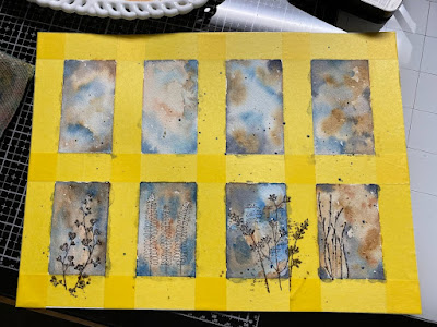
I grabbed a sheet of Arches cold press watercolor paper and taped off some spaces. ( its not measured just eyeballed) my inner control freak said using this wide tape left me enough wiggle room to make them straight if needed later. 

Using a round size 8 brush.


I barely remembered to take a photo of the bottom row with some stamped foliage before I started painting them oops. the one on the far left is the tip of Penny Black "all you need is love", the one with the trio of almost fern like leaves next to it is unknown, the next to that with the script between the stems I want to say is Unity Stamps and the one on the far right is tall seaweed from All Night Media.


randomly dropped in more paint to the stamped sections. This is the wet version of where I stopped.

what it looked like dry. 

So, I knew I needed to pick a gold shade for shimmer and just laid this cheat sheet from a Prima palette on the top of the dried paint. I decided to start with the top right corner and the Antique shade in the top right corner of the palette. 

but, it really just made harsh lines and no shimmer so, I switched over to the allure (#51) color.


a few more splatters and I decided to let it dry again before trying some free hand foliage on the top. If I had been thinking I would have stamped the top row as I would have a place for my hand on the glass below the bottom row ha ha. 


I only free painted some foliage into the top outside sections of the top row and decided to keep two as just color as little blocks of color that I may build on later someday.

and when the paint was dry I pulled the masking tape off. If you'd like to play along with us you can find this challenge here at Splitcoaststampers. Thanks for stopping by.



5.23.2023

Watercoloring Loose Butterflies

 This week Linda has chosen this video from Diane Antone Studios. And I have been given and collecting some different brands of Cotton watercolor paper notebooks and decided to grab this one from Strathmore. You can click on any photo to enlarge them, just hit your browsers back button to continue reading.

I decided that even though a whole bunch of these video's the person is teaching how to paint something scaled to say frame or hang on the wall, I tend to paint things that will fit on a card front and with that thought in the back of my mind I am going to spend some time the next little while trying their ideas on smaller scaled paper. I have found this paper in a larger size on Amazon but, this one in particular seems to be sold out at the moment.


 I did use a water soluble pencil to sketch this first one on the left, and that being said it may have been a better idea to use a pen or a pencil that was not going to be absorbed by the paints. ( if you were going for that sketchy look after the paint dries) 


First round of paints on that first butterfly. These were Daniel Smith paints used here with a size 8 round brush.


This smaller blues one has a little bit of one of the iridescent green ish colors dropped in. (Ocean? something like that it shimmers. will edit.) 


Decided to go yellows & oranges for the third. 


and a combo of pink/purples for the 4th. adding a few more pencil lines over the top as it was drying.

I forgot the splatters but, I am OK with that. I think since this is a skinny landscape that the splatters may have overwhelmed the wings here. At any rate I really enjoyed watching the paints move on these and may do it again some time. If you'd like to play along with us you can find this challenge here at Splitcoaststampers to play along. Thanks for stopping by.


5.16.2023

Watercoloring Silly Sheep

 This week Brenda has chosen these sheep in watercolor from Diane Antone's YouTube channel seen here. 

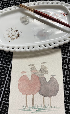
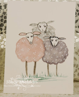
And I decided to do a trio of sheep instead of a handful after watching the video, I also changed the colors also.I did mix these using various shades of greys moonglow, shadow violet, maybe janes grey?  with some hematite in one of them.


First round of paints

Which lead to a second with some white gel pen for accent doodles on the dried paints. This was done using Daniel Smith Watercolors.


 If you'd like to play along with us you can find this challenge here at SplitcoastStampers. I hope you are all doing well, thanks for stopping by.


5.02.2023

Watercoloring loose birds

 This week Kia has chosen this video on 5 little birds from Diane Antone studio seen here on YouTube

 I did watch the whole video then started the simple sketch which turned into 3 birds from me.

Although I have seen pink birds on pinterest it's not really something that comes easily to mind to me so I decided to just go bright, with green, yellow blue for the colors. the branch got a little thick at the end and that was an Oops so. 


Second layers of paint. 

a little more details added to the faces.

some splatters and more twiggy looking to the branch which was still a little off so, more paint followed over the days after that until I came home from work this afternoon and so this is where I stopped.


I do like the curve to the main branch but, the thickness of it at the end still bugs me and adding all the extra branches really didn't help. I also decided to add some white gel pen dots to the eyes which were a little big for the scale of their eyes and a little bit of darker shades of the paints on the top of the heads and sides of the birds bodies. Is it still loose? I don't know. If I had to do it again I would seriously try for a skinnier branch. That's about it from me, If you'd like to play along with us you can find this challenge here at Splitcoaststampers to do so. Thanks for stopping by.